
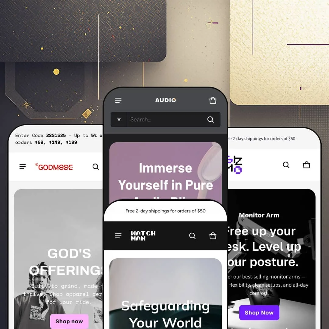
Most electronics themes sell atmosphere: dark heroes, glowing product shots, a mood. Electro sells information. For $200, eComX ships an Online Store 2.0 theme with four preset demos (audio gear, security cameras, streetwear, and desk setups) built on one conviction: buyers of technical products decide on facts, so put the facts everywhere. I spent time in all four demos to see where that conviction pays off and where it starts working against you.
A native product-comparison system, three surfaces deep
Electro builds product comparison into the storefront at three separate points: compare checkboxes on collection-page product cards feeding a floating tray, a dedicated compare page in the navigation, and a comparison module rendered on the product page itself pulling options, stock, and specifications side by side. No app, no integration project. For electronics merchants with multi-attribute catalogs of 20 to 200 SKUs, whose buyers habitually weigh two or three near-identical models before committing, this replaces what would otherwise be a paid comparison-app install plus the styling work to make it look native.
Specifications travel all the way to the product card
Key attributes render as compact strips directly on product cards ("10kg Capacity · Piston Lift · VESA Standard"), and the product pages back them with full structured spec tables driven by metafields. Shoppers shortlist from the grid itself. That compresses the browse-evaluate loop that normally forces a buyer through five product pages, because the differentiating facts are visible before the click, not after it. For merchants running 50 to 500 spec-driven SKUs in considered-purchase categories like audio, security hardware, or ergonomic equipment, this is the feature that justifies the theme's whole identity.
How much selling can a menu do?
In Electro's case, a lot. The mega menu supports category columns with live product feeds, promo image tiles with captions, and three levels of nesting, so the navigation itself becomes a merchandising surface: featured items, campaign banners, and referral offers all render inside the dropdown. Every menu open is an impression. For multi-category stores above 100 SKUs serving cross-shop-heavy buyers who bounce between departments in one session, the menu does discovery work that would otherwise demand homepage real estate.
Testimonials that link to the checkout
Each testimonial pairs a quote and reviewer role with a clickable product card showing price and imagery, so social proof carries a direct path to purchase instead of sitting as decorative text. Praise becomes a doorway. A visitor convinced by a specific review is one tap from that exact product, which converts the weakest section on most storefronts into a functioning sales channel. Single-brand DTC operations in impulse-leaning categories, where a stranger's enthusiasm is often the final push, get the most out of this wiring.
The headline features run on data you have to supply
The comparison system, the card attribute strips, and the spec tables are all metafield-driven, which means they render exactly as much intelligence as the merchant has entered. The theme displays what you feed it. The entire selling proposition assumes structured product data exists, and for stores that don't have it, the flagship features start as empty shells. Merchants running 500-plus SKU catalogs face a serious data-entry project, and fast-rotating dropship operations with thin supplier data may never feed the machine enough to make it worth the price.
The volume knob is stuck on loud
Countdown timers, scrolling marquees, stock counters, flash-sale tabs, and percentage badges stack across every demo. It never stops selling. A merchant can switch individual urgency elements off section by section, but the theme's default register is permanent promotion, and the presets offer no staged example of what restraint looks like. Luxury-positioned brands and single-brand houses selling considered, full-price products will spend their setup time dialing the theme down rather than up, and the aesthetic gap between where Electro starts and where they need it to land is wide.
Deep on specs, silent on fit
The feature list runs long on technical surfacing and offers nothing for fit guidance: no size-guide tooling appears anywhere in the theme's declared capabilities. Skatewear proves the visual range is there for apparel. The commerce tooling isn't, because a shopper choosing between M and L needs measurements and fit context, not an attribute strip, and Electro gives the apparel merchant the same instruments it gives the monitor-arm merchant. Streetwear and apparel brands running drop-model releases across full size runs should treat this as a structural mismatch rather than a settings problem.
What it takes to launch
Expect two to three days across hero and campaign copy, feature-callout and section text, spec-metafield population for the comparison and attribute displays, market and currency configuration, and footer menu building before any of the four presets is launch-ready.
-
What works in this preset
Landing on the audio demo, you get the pitch before you get the products. A video hero opens, collection tiles with product counts follow, then tabbed product rows split the catalog by category so a shopper never scrolls through gear they don't want. The search bar carries its own category dropdown, letting someone restrict a query to In-ear or Class-D before typing a single word, which is a small decision that mirrors exactly how people actually shop audio. That's rare attention. It shows.
The noise-cancelling section is the demo's best argument. Two paired images, one labeled ANC On and one labeled ANC Off, turn an invisible product benefit into something a visitor can see, and it does this without a line of marketing copy doing the heavy lifting. Silence is a hard thing to photograph. This preset manages it.
I clicked into a headphone product page and found something closer to a landing page than a template: a jump-anchor bar pinning Overview, What's included, Specs, and FAQs to the top, an illustrated in-the-box grid, a per-product FAQ block, and a live inventory line reading "In stock: 11." For a category where buyers open six tabs before committing, keeping the whole evaluation on one page is a genuine conversion decision rather than decoration.
-
What works in this preset
Bundles get top billing here. The hero routes straight to a dedicated bundle collection, which is the right instinct for a vertical where nobody buys one camera; they buy a kit. Staging the store around kit-first commerce instead of single SKUs shows the preset understands its own category. It's a quiet choice. It matters.
The mega menu carries a promo tile pointing to a referral-program page, a working example of the theme's in-menu promo slots doing actual campaign work instead of sitting empty. Navigation becomes ad inventory. For a security brand running acquisition offers, that placement earns attention on every single menu open without costing a pixel of page space.
Trust gets manufactured deliberately across this homepage: sustainability impact stats with photography, a smart-home compatibility banner, and an industry-award block with the certificate image displayed. Home security is a paranoid purchase. This preset stacks reassurance in layers, and the ordering (proof before pricing) reads like someone thought about the psychology rather than just filling sections.
Where it stumbles
The catalog is staged at roughly a dozen products across five collections, and that thinness works against the vertical the preset names. Security shoppers cross-compare resolutions, fields of view, and connectivity standards before buying, which means this is precisely the demo that should be exercising the theme's filtering and comparison machinery at full depth, and instead it barely gets warmed up. The staging undersells the theme's own strongest muscle in the one vertical that needs it most.
-
What works in this preset
Can a spec-sheet theme sell T-shirts? Mostly, yes. The mega menu goes three levels deep (Shop, then Apparel, then eight subcategories from jerseys to cargo pants), and the sale menu splits promotions into discount bands, giving a streetwear catalog the taxonomy depth that apparel browsing actually demands.
There's a full buy-box sitting directly on the homepage. The best-sellers section stages a featured product with its complete size run, color selection, stock count, and add-to-cart button inline, so a returning customer can repurchase a tee without ever visiting the product page. For drop-driven retail, where speed from announcement to checkout decides revenue, collapsing that path to one screen is the most commercially aggressive thing in any of the four demos.
The preset also proves the theme can carry culture, not just catalog. An editorial grid maps four named skateparks with street addresses, blog cards cover trick tutorials and streetwear history, and scrolling marquee strips announce drops in the visual language the scene expects. None of that sells a product directly. All of it sells the brand.
-
What works in this preset
I went looking for the seams in this one and found a wholesale program instead. A B2B link sits in the top navigation, one click from anywhere, framing the store for office fit-outs and volume buyers rather than treating wholesale as a buried footer afterthought. For a desk-gear brand, where a single corporate order can outweigh a month of retail, that placement is strategy.
The collection pages run the theme's discovery machinery at full density. An eleven-product monitor-arm collection carries availability, price-range, color, and product-type filters plus an eight-way sort menu, which sounds like overkill until you notice the products differ by weight capacity and joint mechanism rather than by looks. Filters earn their keep here. They'd be furniture on a five-product store.
"Shop by Space" is the preset's smartest merchandising idea: navigation organized around Gaming, Minimalist, and Productive setups instead of product categories, backed by a studio slideshow showing complete desks rather than isolated SKUs. Selling the outcome instead of the object is how ergonomics brands escape price comparison, and the preset hands merchants that positioning as a built-out pattern rather than a suggestion.
One engine, four believable stores
The audio shop, the security brand, the streetwear label, and the desk-gear store each read as purpose-built rather than re-skinned, yet they draw from the same section library. That range matters commercially: a merchant whose catalog drifts (electronics today, accessories and lifestyle goods next year) won't outgrow the theme's vocabulary, and an agency can serve four different clients from one license's worth of learned patterns.
The homepage is a complete selling surface
Across every preset, the homepage carries enough machinery for a full purchase cycle: tabbed product rows for discovery, feature sections for evaluation, proof blocks for reassurance, and in Skatewear's case an actual buy-box for checkout. A visitor can shortlist, evaluate, and add to cart without leaving page one. Electro doesn't treat the homepage as a router to deeper pages; it treats it as the store.
Standard-tier price, wide-tier spread
At $200, Electro sits mid-pack on price while shipping a comparison engine, metafield spec architecture, and four vertical identities in one purchase. The price-to-surface-area ratio is the quiet argument here, and it's strongest for merchants who'd otherwise assemble the same capability from a cheaper theme plus paid apps.
Density is the only register
Every preset answers "why buy" with more modules, and nowhere in the family is there a staged example of a quiet, editorial storefront. The theme knows one rhythm. Brands whose positioning depends on whitespace and restraint will find themselves subtracting their way toward an identity the presets never demonstrate, without a reference for what the finished result should look like.
Four skins, one skeleton
Read back to back, all four homepages follow the same sequence: hero, collection tiles, tabbed product rows, feature banner, proof section, FAQ and newsletter. The differentiation between presets is imagery and copy, not architecture. Merchants who want a homepage that's shaped differently, not just dressed differently, will be re-architecting the flow themselves rather than picking it from a preset.
★ 7.8/10
Rating
-
Comparison surfaces, metafield spec displays, in-menu promos, and a full urgency toolkit cover an electronics storefront's needs without reaching for apps.
9
-
Section editing is standard Online Store 2.0 work, but the payoff features want structured metafield data, so the first week is heavier than toggle-flipping.
7
-
The slide-out cart and sticky buy bar keep checkout within thumb reach; the dense homepage patterns translate into long scrolls on a phone.
8
-
Lazy-loaded imagery and sensible asset sizing keep pages moving, but the demos stack heavy section counts and full-width media as the starting point.
7
-
Four distinct visual identities come out of one settings layer; the density bias is adjustable, though it's baked into every default.
8
Frequently Asked Questions
-
Three. The compare tray follows you across collection pages, and the dedicated compare page holds the side-by-side view.
-
English, French, Italian, German, and Spanish theme strings. Translating your actual product content is Shopify Markets territory, not the theme's.
-
The Gizmo demo stages a wholesale inquiry path directly in the main navigation. Actual B2B pricing and catalogs live at the platform level on Shopify Plus; the theme supplies the storefront framing.
-
Version 3.2.0 shipped in October 2025, focused on supporting high-variant products in line with Shopify's platform changes. The theme launched in July 2023.
-
It displays in-store pickup availability on product pages. The pickup logic itself runs on Shopify's locations feature; the theme handles how it's presented.
-
Simple bundle products and a bundle-focused collection are staged natively in the demos. Configurable mix-and-match bundles remain app territory.
This review is based on hands-on testing of the publicly available preset demos of the Electro Shopify theme as of July 2026. Theme features, preset availability, and performance can change with subsequent updates from the theme developer.