
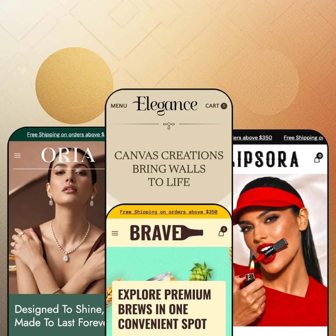
Elegance is a $250 Shopify theme that ships with four presets — art gallery, craft beer, cosmetics, jewellery — and looks like four completely different themes. It isn't. Underneath the four very different surfaces, the same engine is doing all the work, and once you see that, the question stops being "which preset do I like best" and starts being "which combination do I want to build."
Pros
A PDP structure that holds up across categories.
This is the part of the theme I'd buy it for. Every preset's product page is built on the same engine — multi-axis variant pickers, in-stock counters, sale-price markup with strikethrough and percentage badge, structured spec blocks, numbered application steps, shipping and returns sections, subscription notice wired in by default. The theme handles two-axis pickers (size and material on Elegance) and three-axis pickers (metal, weight, length on Oria) without forcing them into the standard size-and-color pattern most themes assume. For a merchant comparing themes, the PDP is the most thought-out page Elegance has, and it's the one that actually carries the conversion.
A component library that bends without breaking.
This is the second reason to like the theme. Tabbed product showcases, marquees, before/after blocks, video sections, founder reveal grids, mega menus with image blocks, press testimonial cards with star ratings and outlet logos — they're all available across the theme. The four presets each pick a different subset to lean on, but the underlying components are shared. A merchant who likes Lipsora's video testimonial row but Oria's flat hero can build that combination without leaving Elegance. If you can see a section in one preset, you can build it in any preset. Hold onto that, because it changes how you should evaluate the demos.
Multi-store pickup that actually works.
The PDP across every preset includes a pickup block with address, hours, and store details — and Brave shows you what international multi-location looks like with Texas and Berlin running side by side. For brewery taprooms, jewellery boutiques with showrooms, or galleries with physical space, this is meaningful infrastructure. Not every theme at the $250 tier supports this cleanly, and a lot of them fudge it with a free app.
Image strategy that earns the performance score.
Every preset uses the Shopify CDN with explicit width parameters on every asset. Every hero ships separate desktop and mobile crop files rather than scaling one big image down with CSS. The Elegance preset uses WebP for product cards. Video sections come with poster images and lower-bitrate SD thumbnails for testimonial rows. These are deliberate choices most themes at this price tier don't bother with, and they translate directly into faster first-paint on the lighter presets.
Editorial pacing at this price tier.
Every preset chooses restraint at the hero — big headline, single CTA, image-first composition — over the dense multi-block first-scroll most themes use to demonstrate "value." That restraint is rare under $300, and it signals the theme is built for brands that lead with imagery rather than information density. It's the thing I'd compliment first if I met the developer.
Cons
The demo data is a mess in places.
This is the part you should know going in. Lipsora ships with placeholder menu links across the entire mega menu, an announcement bar that repeats eight times, and stray sports-nutrition copy in the newsletter footer. Oria has Brave's beverage description bleeding through into its own footer. Brave has unfinished sub-menu items pointing at "#". None of these are theme bugs — they're hygiene issues — but they signal that adopting Elegance is going to take a real cleanup pass before going live, not the five-minute setup the polished hero might suggest. Budget several hours for any preset that uses the mega menu pattern.
The presets don't tell you what the theme can do.
This is the more frustrating problem. What gets surfaced in one preset's demo isn't always surfaced in another, even though the underlying section is available everywhere. The press testimonial block, the founder reveal grid, the mega menu with image blocks, the cart drawer's curated empty state — they show up in some presets and not others. For a merchant comparing demos side by side, this makes evaluation harder than it should be. You have to mentally combine features across all four presets to get the real picture, and that's work the demos should be doing for you.
Lipsora is heavier than it needs to be.
This is the performance footnote. Lipsora's homepage packs five hero slides, a video testimonial row, an inline FAQ, a blog grid, an Instagram-style gallery, and multiple marquee strips into a single page — and the marquee blocks repeat their content three or four times in source rather than animating a single set. The image strategy is strong enough that the page still benchmarks reasonably, but a leaner build would gain real ground. If you pick Lipsora as your starting point, expect to trim sections rather than add them.
-
The namesake preset runs the theme as an art and canvas gallery, all imagery and very little chrome. The hero is a five-slide carousel that doubles as a portfolio, and the homepage scrolls more like a curator's walk than a product feed.
What works in this preset
The mega menu is the first thing worth pointing at. Click "Collection" and you get a real two-column layout with promotional image blocks sitting beside the text links — not the flat dropdown most themes default to. For a gallery with maybe three or four collections that matter, this turns the navigation itself into part of the merchandising. It's a small thing that does a lot of work.
The cart drawer is the second. Open it empty and instead of the usual blank "your cart is empty" tombstone, you get four curated collection cards (Pro Art Series, Masterpiece Moments, Framed Art Prints, Abstract Adventures), each with item counts. Most themes leave that page dead. This one treats it like a recovery surface, and a shopper who clicks the cart icon by mistake gets somewhere to go besides the back button. That's the kind of detail that probably came from someone who's actually watched session recordings.
Below the founder block sits an asymmetric ten-image reveal grid. It reads like a magazine spread — images at different sizes, no tidy row, deliberate negative space — and gives the page a rhythm none of the other three presets attempt. For a gallery where the imagery is the product, that's exactly the right move.
There's a three-icon row above the fold (Expressive Elements, Artist Workshops, Seasonal Art Shows) that adds context without crowding the hero. It's a small thing but it solves a real problem: how do you tell visitors you're a gallery and run workshops and host events without burying any of it? The answer here is a clean three-column block, and it works.
The product page itself is pleasantly uncluttered. Two-axis variant picker (size and material), four-image gallery, single configured pickup location. Nothing flashy, nothing hidden, fine-art-print appropriate.
Where it stumbles
The reveal grid I just praised has a flaw. None of the ten images link anywhere. They're decoration, not merchandising. For a gallery preset where every one of those images could plausibly be a product or a collection landing page, leaving them as ambient atmosphere feels like a missed opportunity in this demo's setup. Easy to fix, but the demo doesn't fix it.
The other thing this demo doesn't bother with is social proof. There's no press block, no testimonial row, no quote slider — even though every other preset shows you what one looks like inside the same theme. A gallery owner who wants editorial validation on the landing page has to add that section themselves rather than inheriting it from the demo, and there's no signal in this preset that the option even exists.
-
Brave takes the same engine and turns the volume up. Three-slide hero, stronger color, a 3-up product-line banner row directly under the hero, scrolling marquees, and a noticeably more conversion-focused page rhythm than the namesake preset. If Elegance is the gallery, Brave is the taproom.
What works in this preset
The first thing that hits you under the hero is the three-card category banner — Oak Barreled, Bottled, Large Can Beer. Each card has its own headline and CTA, and the visual weight is high enough that they actually pull attention rather than disappearing as a generic "shop by category" row. This is how you push customers into two or three distinct catalogue branches without making them think about navigation. Smart.
The press testimonials are the second standout. Four cards, each with a quote, a numeric rating, and an outlet logo. It's a real testimonial structure — not a quote slider, not a scrolling banner, just four cards laid out so each piece of social proof gets its own visual weight. For a beverage brand chasing third-party credibility, this layout does the job.
The product page is where Brave really earns its preset. Detailed nutrition specs (serving size, calories, carbs, allergens, shelf life), ingredient certifications, a four-step "How to apply" block walking you through Chill, Crack It Open, Pour or Drink Straight, Brave the Bold. The structured content reads like someone actually sat down and wrote it, and the format would carry over cleanly to any consumables brand — coffee, hot sauce, supplements, whatever.
Multi-store pickup gets a real workout in this demo. Two locations, Texas and Berlin, each with full address, phone, ready-time. This is what international pickup actually looks like for a brewery running both a US taproom and a European distribution point, and it's the kind of thing the other presets show off in single-location form but Brave commits to. Worth knowing the capability is there.
The marquee strips ("Handcrafted, wheatbeers, Craft beers" repeating across the page) add motion without needing video, and the styling keeps them tight enough that they read as ambient texture rather than visual noise. Some themes overdo this. Brave doesn't.
Where it stumbles
The Beer Style sub-menu in this demo points at placeholder URLs — Gluten-Free, Fruit-Infused, Spiced Brews all go to "#". It's clearly unfinished demo data rather than a theme bug, but a merchant adopting Brave needs to wire those links before launch and the placeholder state isn't obvious. You'll only catch it if you click.
The press testimonials carry star ratings of 5/5 mixed with 3/5 — which I think is a placeholder data choice, but it reads weird on a real store. Why would you publish a 3-out-of-5 quote on your homepage? Production stores will want to scrub these before launching, and the inconsistency is the kind of thing a careful shopper notices.
-
Lipsora is the maximalist of the four. Five hero slides, a six-tile category grid, a video testimonial row, an inline FAQ, a four-card blog grid, and a before/after slider — all on the homepage. If you're the kind of merchant who reads "less is more" and rolls your eyes, this is your preset.
What works in this preset
The mega menu is the most thorough navigation treatment in the entire theme. Three category columns (General Makeup, Face Makeup, Lip Makeup) plus two large promotional image blocks. Where Elegance handles a lean gallery taxonomy with two columns, Lipsora handles a deep beauty taxonomy with three. Same engine, completely different presentation. This is the side-by-side I want you to notice, because it tells you everything about how flexible the theme actually is.
The press testimonials here are the polished version of what Brave does. Forbes, Vogue, Wired, Jerix, Reader — named outlets, individual star ratings, each one its own card with quote and logo. For a beauty brand chasing editorial credibility, this is the conversion moment, and it's noticeably better treatment than Brave's quotes-with-mixed-ratings approach.
But the block I keep coming back to is the video testimonial row. Five product cards, each with an embedded MP4 thumbnail, customer-style framing, the linked product, the price, and a sale badge. It works as social proof, product discovery, and category browsing all at the same time. I haven't seen many themes pull this off cleanly, and Lipsora makes it look easy. If you have creator content sitting unused, this block is worth the install on its own.
There's also a hover-label product grid where each product card carries a sub-brand label above the name — Define Beauty, Velvet Touch Studio, Brow Artistry, Glow Beauty, Pure Skin Labs, Luxe Cosmetics. For a multi-line beauty business or a store running collaborations, this is how you tag products by sub-line without making the page feel cluttered.
The product page is the densest of the four presets. Seven-image gallery, color swatches, a structured key-benefits block (12-Hour Wear, Smudge-Proof, Weightless Feel, Non-Drying), full ingredients list, four-step application instructions, shipping and returns block, gift wrapping option. It's a lot. But it doesn't feel like a lot, which is the trick.
The inline FAQ section pulls Q&A onto the homepage rather than burying it under footer links, and the four-card blog grid gives the journal real weight. Both choices work for a beauty brand that needs to do customer education on the landing page itself, and I'm always impressed when a theme treats the blog like it actually matters.
Where it stumbles
Now the bad news. Every entry under General Makeup, Face Makeup, and Lip Makeup in the mega menu points at "#". The entire mega menu, pointing nowhere. That's not a typo, it's the whole taxonomy. A merchant adopting Lipsora has real setup work to do — not a five-minute fix, several hours of link wiring before launch. If you fall in love with this preset, budget for it.
The free-shipping announcement bar repeats eight times across the top of the page in the rendered output. Eight. I assume this is either a marquee loop artifact or aggressive staging, but either way, the visual effect on first load is louder than a single bar would be. Worth checking and fixing before publishing, because right now it looks like the theme is shouting at you.
And then there's the newsletter footer on the product page, which carries leftover copy reading "Optimum Nutrition India - World's #1 Sports Nutrition Brand". Optimum Nutrition. On a cosmetics demo. Clearly placeholder text from a different demo build, and a merchant needs to catch it on their own — the demo doesn't flag it.
-
Oria is the jewellery preset, and it does the most interesting thing with the variant system of any preset in the theme. The PDP exposes a three-axis picker, the gallery includes per-variant images, and the styling is the closest of the four to a high-end boutique. If you've ever tried to sell jewellery on a theme that thinks every product has Size and Color, you know why this matters.
What works in this preset
The product page is the headline. Three-axis variant picker — Metal Tones, Weight, Length — with per-variant imagery files in the gallery. Browse the homepage and every product has its own custom variant axes: Ring Size, Pendant Type, Metal Tones, Weight, Length, Color. The theme isn't locked into the standard size-and-color dropdown, and for jewellery, watches, custom furniture, or anything sold with non-standard option sets, this is the bit that earns the preset its category fit.
There's a "22 CARAT Gold $2200" marquee running as a six-item scrolling strip, and it doubles as decoration and information. Most marquee blocks are pure ornament. This one actually surfaces live pricing or material specs across the homepage, which is more honest work than I usually see from a strip element.
The "Flat 30% Stock Up Sale" announcement marquee bakes a discount code (popzy30) directly into the strip — a stronger promo treatment than a static announcement bar, and the placement keeps the offer visible across the entire scroll without needing a sticky element. Whether you want a code called "popzy30" on your jewellery store is a separate conversation.
The designer signature block is the cleanest implementation of the founder pattern in the entire theme. Designer name, role, signature image, and a floating grid of seven product and lifestyle images arranged asymmetrically. The editorial weight reads luxury, and that matters for a category where the founder story is part of what justifies the price.
The product page on Oria is where the theme stretches the most. Full description, specifications (metal type, diamond carat, certification, clasp type, weight), care instructions, materials and craftsmanship notes, a lifetime warranty block, complimentary insured shipping, luxury gift packaging. For high-value items where shoppers expect — and need — detailed disclosure, this carries the conversion. A $3,000 pendant deserves more than four bullet points and an Add to Cart button, and this preset agrees.
The three-card promo grid at the bottom (Diamond Earrings, Signature Jewelry, Necklaces) uses hover-swap imagery and works as a secondary navigation surface. It complements the main menu rather than competing with it, which is the right design call.
Where it stumbles
The navigation in this demo is flat — Home, Shop, About, Blog, Faq, Contact — where Elegance and Lipsora demonstrate the mega-menu version of the same engine. For a jewellery brand with sub-categories that actually matter (rings, necklaces, bracelets, anklets, pendants, with sub-sub-categories under each), the merchant would want to swap to the merchandised navigation that the other presets show off. The capability is there. This particular demo just doesn't reach for it, and the demo doesn't tell you that.
The footer in this demo reads "Bold flavors, crafted with passion. Discover our premium collection..." Bold flavors. On a jewellery store. That's leftover copy from Brave bleeding through, and while it's a thirty-second fix, it's another sign the demo data wasn't fully scrubbed before this preset went live. I wouldn't trust the rest of the placeholder copy without combing through it.
The testimonial block here is the generic five-card review row without outlet logos, where Lipsora and Brave both go for the named-outlet press treatment. For a luxury category — where third-party validation matters more, not less — the merchant would almost certainly want to swap in the press version that the other presets demonstrate. Frustrating to see Oria settle for the weaker option.
Niche Suitability
Not Ideal For
-
Brands that lead with imagery and want a structured PDP underneath. Cosmetics, jewellery, art and prints, craft beverages, beauty, accessories — anything where editorial pacing matters more than information density. Multi-axis variant brands like jewellery and watches get particular value out of the variant system, and consumables brands get the most out of the structured PDP specs and how-to-use blocks.
-
Stores with very large catalogues where rapid browsing is the primary navigation pattern. Elegance treats browsing as discovery, not as search, and the homepage rhythm fights against high-volume catalogue work. Single-product brands will also find the heavier presets oversized for what they actually need.
-
Medium. The theme installs fast and the structure is sound, but the demo data inconsistencies across presets mean a real launch needs a content cleanup pass — wiring placeholder menu links, scrubbing leftover footer copy, fixing repeating banner artifacts — before publishing.
Final Recommendation
★ 8.0/10
Rating
-
Strong PDP structure across the board, multi-axis variants, multi-store pickup, stock counter, sale display, subscription support, before/after blocks, and video sections all wired in. The theme presents Shopify's standard sorting and search in a clean form, and the section library is unusually consistent across the four demos.
8
-
The page-builder logic reads clearly and the component library is consistent, but the demo data inconsistencies across presets mean a real launch needs more cleanup than the polished hero implies. Wire placeholder links, scrub stray footer copy, fix the repeating-bar artifacts before publishing.
7
-
Each slideshow ships separate desktop and mobile crops rather than scaling one image down with CSS — a meaningful detail and not standard at this price tier. Other interactive behaviors are not validated in this review.
8
-
Image strategy is above baseline for the $250 tier: Shopify CDN with explicit width parameters on every asset, separate mobile crops for every hero, WebP on the Elegance preset's product cards, video sections built with poster images and lower-bitrate SD thumbnails for testimonial rows. The theme leaves performance on the table on a few medium-impact things — Lipsora's homepage is DOM-dense, marquees duplicate their content three or four times in source rather than animating a single set, dual-image hover-swap cards load both images per card without confirmable lazy-loading. Elegance preset likely benchmarks fastest, Lipsora slowest. Not a substitute for a real Lighthouse run.
8
-
Four genuinely distinct presets, all built from the same engine, demonstrate the theme will bend to wildly different brand identities. Mega menu accepts image blocks, marquees and video sections are reusable across presets, founder reveal grids configurable, variant system handles arbitrary axis configurations rather than locking to size and color.
9
-
👑 The four presets cover art and canvas, beverages, cosmetics, and jewellery, but the underlying engine is industry-agnostic. Every preset uses the same set of section types, so a merchant in food, accessories, home goods, or supplements can pick the closest preset and rebuild the homepage from the shared component library. Oria's three-axis variant picker makes the theme particularly strong for jewellery and watches, and Brave's nutrition specs block carries cleanly into any consumables brand.
-
📱Each preset's hero slideshow ships separate mobile crop images rather than scaling a desktop frame with CSS, and that's a deliberate choice you don't see in most themes at this price tier. The detail matters because the mobile hero gets the right composition and weight rather than a cropped version of the desktop image — which is the kind of thing shoppers don't consciously notice but their conversion rate does.
-
🎨 Very. The four presets share a single engine but look completely different — Elegance reads quiet, Brave reads loud, Lipsora reads dense, Oria reads luxury. Typography, color palette, mega-menu structure, announcement bars, and section ordering all appear configurable, and the marquee, video, before/after, and reveal grid components are reusable across any preset's homepage. You're not locked into the look of the preset you start from.
-
⚡The theme makes the right calls on the high-impact basics — Shopify CDN sizing on every image, separate desktop and mobile hero crops, WebP on the Elegance preset's product cards, video sections that ship with poster images so the page renders without waiting for the MP4. Where it leaves performance on the table is DOM weight: Lipsora's homepage in particular packs five hero slides, a video testimonial row, an inline FAQ, a blog grid, and an Instagram footer into a single page, and the marquee blocks repeat their content three or four times in source. Elegance preset reads as the lightest of the four, Lipsora as the heaviest.
-
👕 Better than most themes at this price. Oria's PDP exposes a three-axis picker (Metal Tones, Weight, Length) and the gallery includes per-variant imagery files, suggesting variant-image swap is supported. Elegance's PDP runs Size and Material as a two-axis picker. The theme isn't locked into the standard size-and-color dropdown pattern, which matters for jewellery, watches, custom furniture, or anything sold with non-standard option sets.
-
🔎 SEO is largely a Shopify-level concern and the theme doesn't appear to constrain it. Product page markup is structured cleanly with proper heading hierarchy, image alt slots on every asset, and standard product schema hooks visible in the rendered output. Layer any of the standard Shopify SEO apps on top — the theme won't fight you.
-
💱 Yes. Every preset ships with a language switcher and a multi-currency selector wired into the footer, with English plus two of French, Dutch, or German depending on the preset. Multi-currency support covers around 28 markets in the Elegance, Brave, and Lipsora demos. Oria's demo only surfaces five country options, which is a Shopify Markets configuration the merchant controls — not a theme limitation.
-
⚙️ The theme uses standard Shopify section and product templates, so app integration follows normal Shopify patterns. The subscription/deferred-purchase notice is wired into all four PDPs out of the box, which is a small but useful indicator that recurring-billing apps were anticipated rather than retrofitted.
-
🛒 The four preset demos linked above are public and unrestricted — browse all of them without signing up or installing anything. Shopify's standard try-before-publish flow applies once you install Elegance into your own store at the $250 published cost.
This review is based on inspection of the publicly available preset demos of the Elegance Shopify theme as of April 2026. Theme features, preset availability, and performance can change with subsequent updates from the theme developer.