
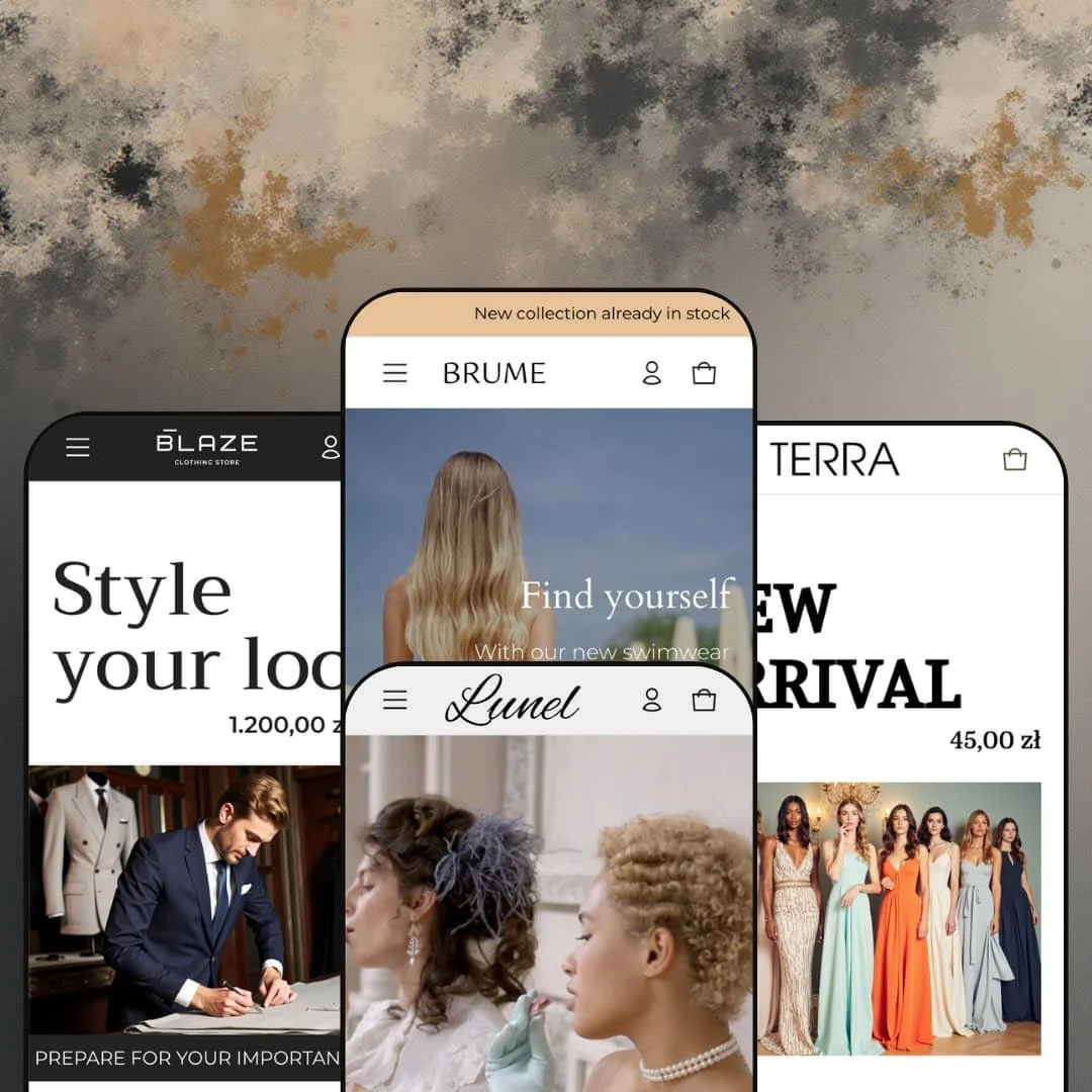
Elemento is a flexible Shopify theme aimed at merchants who want to showcase products with rich imagery and multi‑purpose layouts. It ships with four presets, and each one sets a noticeably different mood through photography, colour, and typography choices. The key pattern is consistency where it matters and variety where it shows: the shopper journey stays familiar, while the staging shifts from bold and high‑contrast to soft, editorial, or product‑first.
Pros.
〰️
Pros. 〰️
✚ Flexible presets, consistent core
Elemento’s four presets are staged to feel meaningfully different, from bold menswear energy to soft lifestyle storytelling and boutique restraint. At the same time, the shopper journey stays recognizable across demos, so you are not trading aesthetics for an entirely different structure. This makes it easier to choose a preset based on brand tone, then standardize the rest of the store around it.
✚ Visual storytelling built into the layout language
Across presets, Elemento leans on large hero sections, editorial blocks, and product‑first grids to keep imagery at the center of the experience. The benefit is that a merchant can build a storefront that feels designed, not templated, even before custom assets are added. For shoppers, that tends to translate into clearer mood‑setting and stronger brand recall.
✚ Browse-to-cart flow that reduces unnecessary page hopping
Testing showed that shoppers can move from browsing into purchase intent quickly through collection‑level actions and quick view patterns when enabled. Combined with a slide‑out cart that appears after adding items, the flow supports fast iteration without constant context switching. This kind of pacing is especially useful in fashion and accessories, where shoppers compare many items before committing.
✚ Product detail enhancements that support confidence
Elemento supports product videos and a size chart modal, which are practical tools for reducing uncertainty in apparel and fit‑sensitive categories. Product pages also surface common clarity elements like variant swatches, star ratings, and expandable information areas. Together, those pieces help shoppers understand the offer without turning the page into an overwhelming wall of text.
✚ Merchandising and upsell modules that feel native
Cross‑selling appears as “You may also like” style sliders on product pages and can also surface in the cart experience. The theme also supports tabbed product grids and slider‑based merchandising blocks, letting merchants build guided discovery without relying solely on static grids. For shoppers, this can make browsing feel curated instead of purely self‑directed.
✚ Content and retention sections that support long‑term marketing
The demos show blog integrations, Instagram placements, testimonial styling, and newsletter sign‑up blocks as part of the default storytelling toolkit. That mix is useful when the store is expected to do more than sell a single product page, especially for brands investing in campaigns and ongoing content. It gives merchants more ways to keep the homepage alive between launches.
Cons.
〰️
Cons. 〰️
🚫 Quick purchase cues can feel inconsistent across product types
Multi‑variant products can surface a “Choose options” overlay that routes shoppers to the product page, while single‑variant items can present a more direct “Add to Cart” path. That difference is logical from a product requirements standpoint, but it can create uncertainty when shoppers are scanning quickly. The result is a small hesitation moment right where the theme is trying to be fast.
🚫 Quick view and quick add are separate entry points
The quick‑view trigger is presented as a small eye icon, and it can be easy to miss when shoppers are focused on imagery and price. Quick add operates separately, which means there are multiple competing paths for “learn more” versus “buy now.” In busy grids, that split can slow browsing because shoppers may not immediately understand which interaction does what.
🚫 Some shopper-facing controls depend on configuration and preset staging
Features like sticky headers, back‑to‑top controls, and currency or language selectors are not surfaced the same way in every preset demo. That does not mean the capability is missing, but it does mean merchants need to spend time aligning the storefront so shoppers get consistent cues. The same applies to content pages, since not every preset foregrounds the same ready‑made page experience by default.
🚫 Section-dense, image-driven pages demand restraint and optimisation
Elemento’s demos lean on high‑resolution imagery, multiple sections, and carousel-style modules to maintain an editorial look. Without careful curation, the layout can feel busy, and without careful optimisation, heavy pages may be more sensitive on slower connections. Merchants get a lot of flexibility, but the trade‑off is that “more” is always an option, even when it should not be.
-
Default is staged as a sleek menswear storefront with dark backgrounds, bold typography, and high‑contrast imagery. It feels intentionally promotional, with a homepage rhythm that pushes you from statement visuals into product discovery quickly.
What works in this preset
The hero staging is unapologetically bold, using oversized imagery and prominent, stylized text treatments that set a confident tone immediately. This kind of opening is well suited to brands that want a strong first impression and do not mind leading with attitude before nuance. The contrast‑heavy presentation also helps calls to action stand out without needing extra visual noise.
This demo stacks multiple modules into a continuous flow, creating the feel of a dense storefront rather than a sparse lookbook. The effect is that shoppers get a lot to scan in one scroll, with repeated opportunities to re‑engage as new blocks arrive. For merchants, the takeaway is less about any single module and more about the preset’s willingness to run a busy page without feeling structurally chaotic.
The most distinctive interaction in this demo is the image hotspot section, where hovering reveals product information tied to specific points in the imagery. It’s a clear example of storytelling that stays commerce‑linked, since the visual does not have to be purely inspirational. When used carefully, it lets the homepage do more than “show,” turning lifestyle imagery into a guided shopping moment.
In this preset demo, the footer surfaces currency and language selectors by default, which makes the store feel internationally ready at a glance. For shoppers, that kind of visibility can reduce uncertainty when they land from overseas traffic. For merchants, it means the default staging already signals localisation, instead of relying on hidden controls.
The Default demo also foregrounds brand storytelling via its About page, which includes collapsible FAQ‑style rows. That structure keeps longer text from turning into a wall of content while still letting curious shoppers drill down. It reads as an intentional brand page rather than a placeholder.
Where it stumbles
Because the Default demo leans into many stacked sections, the page can drift toward information overload if it is not curated with restraint. When sliders, promos, social blocks, and interactive elements all compete for attention, shoppers may lose the thread of what to do next. The layout can be powerful, but it rewards merchants who prune rather than merchants who publish everything.
-
Brume is staged as a swimwear and resort‑wear storefront, built around serene photography and a softer palette. The overall impression is lifestyle‑first, with the demo prioritising mood and editorial pacing over a hard sell.
What works in this preset
The video hero and full‑width lifestyle blocks create immediate atmosphere, setting context before shoppers see dense product presentation. This staging works when the product category benefits from aspiration, like swimwear, travel, or seasonal drops. Instead of pushing shoppers straight into a grid, the demo asks them to “enter the world” first.
Brume’s homepage structure uses editorial text blocks and mood sections as connective tissue between product moments. That keeps the flow from feeling like a sequence of disconnected merchandising widgets. The result is a calmer shopping rhythm that still stays commercial, rather than turning into a magazine with products bolted on.
This preset demo also uses category tiles on the catalogue entry to give shoppers a visual set of doors into the inventory. It is a small staging choice, but it changes how browsing begins: the first step feels guided and curated rather than purely navigational. For brands with distinct lines or collections, that approach can reduce early decision fatigue.
In this demo, the footer surfaces currency and language selectors by default, reinforcing an international‑friendly feel without asking shoppers to hunt. That visibility fits the travel‑adjacent tone, since overseas shoppers are common in resort categories. It also keeps the preset aligned with a broader audience from the start.
Where it stumbles
This demo relies heavily on sliders to pace sections, and the navigation can feel slightly fussy because it asks for precise arrow clicks. When the homepage rhythm depends on many carousels, even minor friction becomes more noticeable. The preset still looks polished, but the browsing flow is smoother when shoppers can scan without repeated manual nudges.
-
Lunel is staged as a fine jewellery boutique, using elegant typography, pastel backgrounds, and subtle interactions. It feels calmer and more refined than the bolder presets, with presentation choices that aim for boutique polish rather than loud promotion.
What works in this preset
The full‑screen hero sets a boutique tone immediately, giving the demo a gallery‑like opening rather than a promotional banner feel. That first impression fits products where perceived value and restraint matter. It also gives the photography room to breathe, which can make collections feel premium even before details are read.
A standout staging element on the Lunel homepage is the live countdown timer section paired with a product slider. In this demo, that structure creates a clear urgency beat without requiring aggressive banners or heavy discount language. The timer block also provides a natural “moment” in the scroll, helping the homepage feel structured rather than endless.
Lunel’s navigation stays straightforward in this demo, listing key categories and a contact link without complex drop‑downs. This simplicity supports the boutique mood, since the header does not compete with the product imagery. For shoppers, it reduces the sense of being overwhelmed by choices before they even start browsing.
On collection pages, this demo keeps controls tucked behind a single entry point instead of spreading UI across the page. The result is a cleaner product grid that feels less tool‑heavy and more product‑first. It reinforces the preset’s minimal, jewellery‑store sensibility.
Where it stumbles
In this preset demo, the footer does not surface currency or language selectors by default. Shoppers who expect an immediate switcher may not realise the store can be set up for multiple markets unless the merchant chooses to surface it. The experience is not broken, but it is less explicit than in the presets that show selectors upfront.
The back‑to‑top control is present in this demo, but it is small enough that it can be overlooked on long pages. When the interface is intentionally quiet, tiny utility controls risk blending into the background. Merchants who keep long scroll pages may want that control to be more visually assertive.
-
Terra is staged as an earthy fashion storefront with muted tones, product‑first imagery, and an editorial narrative flow. It reads like a lookbook that gradually becomes a catalog, keeping the homepage structured around story beats rather than pure merchandising blocks.
What works in this preset
The hero staging leans into clear seasonal framing with prominent “NEW ARRIVAL” text and a direct, fashion‑editorial tone. In the demo, that helps shoppers understand the collection focus quickly without needing dense copy. It is a simple staging move that makes the first scroll feel intentional and on‑theme.
This preset demo uses category cards to guide entry into browsing, then transitions into a product grid that supports a “load more” rhythm. That progression feels natural for fashion because it mirrors how shoppers think: start with a category, then scan products, then keep going if they like what they see. The pacing also avoids dumping an endless grid at the top of the page.
On collection cards, this demo surfaces an “Add to Cart” overlay for in‑stock items and a “Sold out” overlay for unavailable products. The sold‑out treatment is especially shopper‑friendly because it prevents wasted clicks and sets expectations directly on the grid. It also keeps the browsing experience honest, which matters when shoppers are moving quickly through dresses or seasonal drops.
The Terra demo keeps the category menu clear and horizontal, listing key sections without hiding them behind deeper structures. That approach works well when the store is not trying to build a complex navigation tree. It makes the shop feel straightforward, which complements the preset’s muted, product‑first styling.
The contact page in this demo pairs the form layout with accompanying imagery, so it feels like part of the brand presentation rather than a purely functional endpoint. Even when the content is standard, the staging can influence trust, and this demo treats the page as designed. For merchants who care about cohesion, that kind of finish matters.
Where it stumbles
In this preset demo, long pages do not surface a back‑to‑top control, so returning to the start can feel more manual than it needs to be. The absence is most noticeable on pages that encourage deep scrolling through editorial blocks and product lists. As staged, the demo expects shoppers to scroll rather than offering a visible shortcut.
This demo’s footer does not surface currency or language selectors by default. That keeps the footer clean, but it can also make the store feel more locally framed at first glance. Merchants targeting multiple regions may want that visibility to match the international cues shown in other demos.
Niche Suitability
Not Ideal For
-
Elemento is best for fashion, jewellery, swimwear, and lifestyle merchants who want a storefront that leans heavily on imagery and editorial structure. It fits brands that are willing to curate modules and treat the homepage as a designed narrative, not just a product listing.
-
Stores aiming for an ultra-minimal storefront, or teams that want every utility control surfaced the same way without configuration, may prefer a simpler theme. If you want a lean catalog presentation with minimal curation and fewer moving parts, Elemento’s section-rich approach may feel like extra work.
-
Medium — The theme provides many modules and strong preset staging, but merchants will get the best results by pruning sections and standardizing shopper cues across the storefront. Expect time spent aligning configuration choices so the experience feels intentional rather than preset-dependent.
Final Recommendation
★ 7.0/10
Rating
-
Adds conversion-oriented modules such as quick interactions, a slide‑out cart experience, product media support, and cross‑selling blocks. Some shopper-facing controls and selectors are staged differently by preset, so merchants may need extra setup time to keep the experience consistent.
6
-
Building pages is straightforward in the theme editor, but the abundance of modules means merchants need time to curate the layout. Settings for quick shopping patterns and preset‑level staging choices also reward careful review.
7
-
In testing, layouts and the slide‑out cart behavior translated smoothly to smaller screens, and collection interactions that rely on hover on desktop translated into tap-driven overlays on mobile. The experience stays usable without feeling like a stripped‑down version of the desktop site.
8
-
Testing showed quick page loads and smooth animations, with minimal layout shifts in the demos. Heavy imagery and video sections can still become a drag if not optimised, especially when multiple modules are stacked on one page.
8
-
The four presets offer distinct aesthetics and many sections are configurable, giving a wide range of staging options. Some experience elements, such as back‑to‑top visibility and how selectors are surfaced, can require deeper settings work to match a merchant’s preferred baseline.
6
FAQ
〰️
FAQ 〰️
-
👑 Yes. The Default and Lunel presets are staged for menswear and jewellery, respectively, and the demos emphasise product imagery alongside conversion-minded shopping patterns. It is a strong fit when presentation and brand tone need to carry as much weight as the catalog.
-
📱In testing, the theme behaved smoothly on mobile, with grids and cart interactions adapting cleanly to smaller screens. Desktop hover interactions translated into tap-driven overlays, and navigation condensed into icon-style patterns that remained easy to use.
-
🎨 Each preset supports editable colours, fonts, images, and sections. Merchants can swap hero content, adjust section order, enable or disable countdown timers, and choose between quick view and quick add patterns depending on the shopping experience they want to emphasize.
-
⚡ Testing showed fast page loads and smooth animations, and the slide‑out cart appeared promptly after adding items. The main watch‑out is content weight: heavy imagery and video sections may slow performance if not optimised.
-
👕 Yes. Product pages and quick‑view modals display swatches and variant selectors. Single‑SKU items can open a quick view, while multi‑variant items can route shoppers to the product page for option selection.
-
🔎 The theme supports built‑in blog content and includes structured elements such as star ratings, alongside standard metadata fields. Merchants can use content sections and blog publishing to support ongoing search visibility.
-
💱 Yes. The Default and Brume demos surface currency and language selectors in the footer, and the same selectors can be enabled in other presets through theme settings.
-
⚙️ Yes. Elemento uses standard Shopify sections and templates, and it can be extended with apps for reviews, loyalty programmes, or subscriptions when needed.
-
🛒 Yes. The theme’s four presets are available as live demos via the Shopify Theme Store. Merchants can also try the theme in their store before purchasing by installing the free trial via the Shopify admin.
This review is based on hands‑on testing of the publicly available preset demos of the Elemento Shopify theme as of January 06 2026. Theme features, preset availability, and performance can change with subsequent updates from the theme developer.