
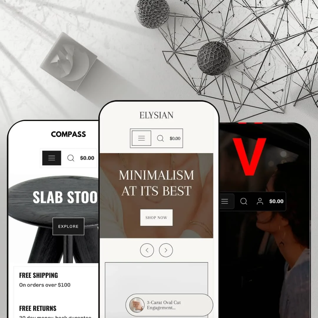
A diamond engagement ring, a competition-grade car amplifier, and a Danish-design water bottle don't usually share a storefront. Elysian, an Online Store 2.0 theme from Koding Themes, stages exactly that spread across its three preset demos: a luxury jewelry boutique, a deep-catalog car audio shop, and a monochrome homewares store. At $180 it sits in Shopify's standard tier, where buyers are paying for a complete section library and presets that do real work rather than swap a logo. The question is whether one theme can hold its shape across three verticals that have almost nothing in common.
Three unrelated verticals from one license
The presets aren't colorways; they're three different business models staged end to end: considered-purchase luxury jewelry, deep-catalog car audio, and minimal design retail. At $180 that spread lets a buyer judge the theme against their actual store type instead of extrapolating from a fashion demo. Most valuable for agencies and multi-brand operators building across product types, and for single-brand merchants in jewelry, electronics, or homewares who can adopt a preset nearly whole.
Cross-selling sits at the buy decision
A complementary product is staged directly beside the add-to-cart area, with separate related-products and complementary-products rows further down the page. Placing an accessory at the exact moment of purchase intent is how attach-rate revenue actually happens, and the theme handles placement and rendering natively rather than leaving it to an app's injected widget. Biggest beneficiaries: accessory-heavy electronics and homewares stores in the 100–500 SKU range with repeat-buyer patterns.
Discovery tooling built for structured catalogs
Navigation runs three levels deep, menu and footer links carry optional description sublines, collection pages ship breadcrumbs plus a filter drawer with nine sort options, and grids support infinite scroll. That's a discovery kit sized for stores whose catalogs have genuine internal structure, where products belong to series and series belong to families. Catalog-driven merchants past the 200-SKU mark in parts, components, or any series-organized product line will use most of it.
Five-language interface strings out of the box
Button labels, cart text, and form copy ship pre-translated in English, French, Italian, German, and Spanish. Product titles, descriptions, and prices still go through Shopify Markets and your own translation work, but the storefront chrome is done on day one. For mid-market EU brands selling cross-border into two or three neighboring markets, that removes the most tedious slice of localization.
Two reviews in two years, and the split is ugly
Elysian launched in April 2024 and currently shows 50% positive across just 2 Theme Store reviews. The thin count is its own risk signal, and the January 2026 version 2.0.0 release notes acknowledge fixing a cart bug that caused variant IDs to fail at checkout — the kind of defect that costs revenue while it's live. Merchants running flash drops or seasonal peak calendars with single-brand revenue concentration should price that maturity risk into the decision.
Pack selling runs on variant gymnastics
There's no quantity-break or bundle display anywhere in the theme, and the feature list doesn't claim one. The car audio demo's workaround is telling: speaker multi-packs sold as six separate variants in a dropdown, with no tiered-pricing presentation and inventory math multiplied across every pack size. For wholesale-enabled or B2B-adjacent merchants whose catalogs are built on pack-based SKUs, that means living with variant sprawl or adding Shopify's own Bundles app plus the configuration work that follows.
Three presets, one skeleton
Look past the styling and the demos share an identical frame: the same header pattern, the same footer composition of link columns, newsletter, and selectors, and the same product-page layout in all three. The presets restyle; they don't re-architect. That's lazy at the structural level even when the surface work is good. Brand-led, mid-market stores planning a future redesign-in-place will find the theme's structural range narrower than its preset gallery implies.
What it takes to launch
Expect a two-to-three-day pass before publishing: a full copy sweep across navigation sublines, hero text, newsletter blocks, and page narratives; replacement of demo brand content and imagery throughout the chosen preset; menu re-staging to match your catalog structure; and a review pass over the five language files if you're selling multilingually.
-
What works in this preset
The first thing you see is a slideshow cycling three collection-linked slides, and the homepage keeps that editorial pace going: large category banners for earrings and rings, a scrolling keyword strip ("Understated Designs", "Timeless", "Everyday"), an about band, and a blog grid pulling four posts. It reads like a brand site that happens to sell. For jewelry, where the photography is the argument, that's the right call.
The boldest staging decision sits mid-page. A complete buy-box for a single hero product lives directly on the homepage, with the full image gallery, ring-size buttons, quantity field, and add-to-cart, so a visitor can purchase the flagship without ever opening the product page. I clicked through to the product page itself and found the same pattern extended with a size-guide link that opens a downloadable chart and a note inviting custom sizing requests.
The "Bespoke" option deserves its own mention. The demo stages made-to-order selling as a plain variant choice alongside the standard sizes, paired with an inquiry prompt for anything outside the range, which is a genuinely workable pattern for custom jewelers who don't want to bolt on a product-configurator app for a four-SKU engagement line. Small detail, real money.
Where it stumbles
For a preset whose flagship demo product costs five figures, the staging around the buy decision is thin on reassurance. The demo presents the hero ring with poetry and photography but stages nothing about certification, appraisal, insurance, or workmanship guarantees near the add-to-cart, and high-ticket jewelry buyers tend to stall exactly there. The sections to fix this exist in the theme; the demo just doesn't show a luxury merchant how.
-
What works in this preset
Voltage is where Elysian stops being polite. The car audio demo runs dark, loud, and content-heavy: marquee text strips loop brand mantras across the page, full-bleed bands for subwoofers and amplifiers stack on top of each other, and the copy reads like a brand manifesto rather than a catalog index. It proves the theme's "fresh and bright" sales pitch undersells its range.
I spent time in this preset's navigation because it's structured like a real parts business. Four lifestyle destinations (Mobile, Powersports, Marine, In Home) lead the menu as storytelling pages, while the product side runs five collection families that each break into series-level sub-collections, three click-levels deep. That's a brand-first architecture, and it suits manufacturers and dealer-network businesses that need to sell a positioning before they sell a part number.
The commercial layer is staged with more texture than the other two demos. Strike-through sale pricing, badge treatment on cards, a contact form embedded directly on the homepage, and a footer that carries a customer-account menu alongside the standard link columns and payment icons. It feels like a store that expects repeat logins, not just drive-by purchases.
-
What works in this preset
Where Voltage shouts, Compass whispers, and the discipline is the point. Four navigation links. Two collections, Black and White, with color doing the categorization work that most stores hand to product type, and a homepage that moves hero, collection tiles, featured product, about, contact, done. For design-led homewares brands with tight, curated catalogs, this preset shows the theme getting out of the way.
The trust-badge row earns its placement directly under the hero, staging free shipping, returns, and local pickup as the first text a visitor reads after the headline. On a minimal page every element carries more weight, and leading with logistics promises rather than another product grid is a quietly smart conversion choice for a vertical where shipping anxiety on fragile goods is real.
Where it stumbles
The restraint tips into under-demonstration. With a single-digit product count and almost no section variety on display, Compass reads more brochure than store, and a homewares merchant with a hundred-plus SKUs gets no guidance on how this preset behaves under catalog load. They'd have to visit the other two demos to find out, which defeats the purpose of a vertical-specific preset.
The section library has no accent
The same sections render convincingly as luxury editorial, aggressive brand theater, and Scandinavian restraint, which means nothing in the library is aesthetically hardcoded to one vertical. That's harder to achieve than it looks, and it's the property that makes the three-preset pitch honest rather than cosmetic.
The preset family works as an implementation playbook
Each demo answers a different "how would I build this" question: hero-product selling on the homepage, series-based navigation under catalog depth, color-as-category merchandising for curated lines. A merchant in none of the three demo verticals still walks away with three worked examples of deployment strategy, which is more practical education than most theme galleries provide a buyer.
Distinctiveness is rented from the assets
Across all three presets, the photography and copy carry the personality while the layout layer underneath stays conventional. Feed it average product shots and thin copy and every preset drifts toward generic, because the theme contributes composition, not character. Merchants without strong creative assets will get less out of Elysian than the demos suggest.
One conversion psychology for three buying behaviors
The buy-path tuning is the same whether the purchase is a $50 impulse add or a five-figure considered decision. The theme adapts its visual register per vertical but never re-tunes how it sells, so merchants at either behavioral extreme, especially considered-purchase categories, inherit defaults calibrated for the middle.
Rating
★ 7.2/10
-
Cross-sell placement at the buy decision, three-level navigation, and five-language interface strings are genuine working features; the absence of any bundle or quantity-break layer caps the score.
7
-
Presets ship as complete page architectures with the homepage buy-box working out of the box, so a merchant's job is replacement, not assembly.
8
-
The slide-out menu uses a back-button stacking pattern that keeps deep navigation usable on small screens, and the sticky add-to-cart bar keeps the purchase action present on long product pages.
7
-
Homepages stay restrained in section count and lean on imagery rather than heavy interactive components; the catalog-heavy Voltage demo carries the most weight and still keeps its pages disciplined.
7
-
The presets prove a wide stylistic range, but the single shared frame beneath them means flexibility lives in styling and content choices more than in layout architecture.
7
Frequently Asked Questions
-
Yes. The menu system is theme-wide; the presets differ in how their demo menus are staged, not in what the navigation can do.
-
The jewelry demo shows the pattern: a custom option staged as a standard variant, paired with an inquiry prompt for requests outside the listed range. Workable for small custom lines without a configurator app.
-
Released January 28, 2026, it fixed a cart bug that caused variant IDs to fail at checkout and made minor styling adjustments.
-
Theme interface strings in English, French, Italian, German, and Spanish. Product content, prices, and market logic remain your work through Shopify Markets.
-
The theme controls the placement and rendering; the product pairings themselves are configured through Shopify's Search & Discovery settings, so plan a short configuration session there.
-
The car audio demo runs the deepest structure on display: five collection families with series-level sub-collections, infinite scroll on grids, and a filter drawer on collection pages.
-
Yes. Koding Themes hosts the Elysian documentation on GitBook, linked directly from the Theme Store listing, so you can audit setup complexity before paying.
This review is based on hands-on testing of the publicly available preset demos of the Elysian Shopify theme as of June 2026. Theme features, preset availability, and performance can change with subsequent updates from the theme developer.