
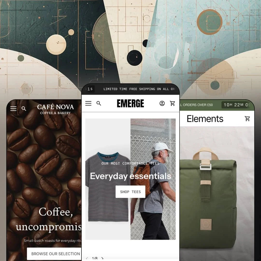
You're selling over a counter by day and through a Shopify store the rest of the time, and you need one storefront that takes both jobs seriously. Emerge, a three-preset Online Store 2.0 family from Troop Themes at $380, keeps drifting back to that counter: opening hours rendered on the homepage, in-store pickup in the cart flow, local-delivery messaging pinned to the header. The line launched in April 2017 and shipped version 10.2.0 in June 2026, which is nine years of continuous iteration on a single codebase. I spent time in the preset demos to see where all that iteration actually landed.
A storefront that remembers you have a front door
The Emerge demo renders a store section with opening hours listed by day, a street address, and a direct Google Maps link, while the cart side of the theme supports in-store pickup. The map link is one click. Your homepage becomes a digital front window instead of a catalog cover, telling walk-in customers when to come and online customers where you actually are. For single-location cafés, roasters, and boutiques selling food, drink, or apparel over a physical counter, the website and the shop finally describe one business.
The product template is a conversion set, not a page
The buy box travels. A sticky bar keeps the product name, the chosen variant, and an add-to-cart button in reach as you scroll, with a Change link for switching sizes without climbing back up the page. Around it sit a size-chart modal populated with a real US/UK/Europe conversion table, a metafield-driven custom tab for per-product content, and a Pairs-well-with cross-sell block, all functioning as one coordinated buy path rather than a pile of separate features. Apparel and footwear merchants running 50 to 200 SKU catalogs, where sizing confusion drives exchanges, get the mechanics that problem needs on a single template.
Why send shoppers hunting for the product they came for?
The Cafe demo answers by staging a complete buy module on the homepage: a featured product with its colour options selectable in place and an add-to-bag button wired directly beneath, no product-page detour required. Landing to cart, one screen. For brands running under 30 SKUs at impulse-friendly price points, that single module can do the front page's entire job.
Navigation that merchandises
The mega menu carries more than links. The Journal flyout renders full blog-article cards with imagery, and the shop flyout closes with promotional call-to-action links beneath a three-level category tree, so the header keeps working on every page view without costing a single section slot. Menus become selling surface. For single-brand stores with evergreen assortments and a steady publishing habit, this is passive merchandising in the one place shoppers reliably look.
Social proof is presentation, not data
The testimonial section in the Cafe demo is hand-typed rich text: three named customers, three paragraphs, styled nicely. That's the whole system. Nothing in either staged demo renders a star rating, a review count, or any aggregate drawn from actual customer data, so merchants selling considered-purchase equipment at three- and four-figure prices should budget for a review app and the integration time before the social-proof layer means anything.
The resting state is a sale
A countdown clock is built into the announcement bar itself, ticking above every page of both staged demos, and a discount-led newsletter popup lands before the first scroll. Urgency is the default, calm the customization. Luxury-positioned brands with evergreen assortments and no drop calendar will spend their first configuration session switching features off rather than on, and the demos give little sense of what this theme's quiet mode looks like.
Nine years old, same generation as free
Emerge runs on Online Store 2.0 architecture, the same generation Shopify's free Dawn ships on, so $380 buys the section library, the retail tooling, and a decade of refinement rather than a newer platform layer. That's a fair trade for many stores. It isn't one for agencies standardizing on Theme-Blocks-era nesting or for merchants planning 500-plus-SKU builds that lean on deep block composition, because this generation's two-level block ceiling is an architectural fact no theme setting removes.
What it takes to launch
Expect a one-to-two-day pass covering brand copy and photography across hero, story, and about surfaces, metafield population for the custom product tab, mega menu re-staging, and configuration of countdown, popup, and localization settings before launch.
-
What works in this preset
This homepage sells ritual before it sells beans. A full-bleed hero, a sourcing manifesto, a video slot, and a scrolling ticker looping "Perfect climate. The finest beans." all land before the first product grid, building atmosphere in layers. That ordering is a gamble. It pays off here because the products are $12 coffees whose real differentiation is story rather than spec.
I clicked from a bag of Solar Bloom straight into a brew guide. The product page hands off to a blog article through an image-with-text block beneath the buy area, and the homepage closes with a three-card journal row, so editorial content sits inside the shopping path instead of being parked behind a footer link. Content and catalog talk to each other. For a category where education drives repeat orders, that wiring matters more than any single section.
"Your Bag," not "Your Cart." The drawer is relabeled to fit the vertical, carries a free-shipping progress line with an order-note field, and the search overlay opens pre-staged with branded equipment running from an $18 dripper to a $1,599.99 espresso machine. Small choices, consistent register. The preset shows how far the theme's wording and staging bend toward one shop's specific voice.
Where it stumbles
The coffees themselves are staged thin. Every bean product in this demo sells as a single variant with no grind selection and no bag sizes, while the gear side of the same store happily shows colour pickers, so a roaster evaluating the preset has to imagine their real buy box rather than see it working. For a preset named Cafe, the demo undersells the theme's own variant tooling on exactly the products this vertical lives on.
-
What works in this preset
This homepage sells ritual before it sells beans. A full-bleed hero, a sourcing manifesto, a video slot, and a scrolling ticker looping "Perfect climate. The finest beans." all land before the first product grid, building atmosphere in layers. That ordering is a gamble. It pays off here because the products are $12 coffees whose real differentiation is story rather than spec.
I clicked from a bag of Solar Bloom straight into a brew guide. The product page hands off to a blog article through an image-with-text block beneath the buy area, and the homepage closes with a three-card journal row, so editorial content sits inside the shopping path instead of being parked behind a footer link. Content and catalog talk to each other. For a category where education drives repeat orders, that wiring matters more than any single section.
"Your Bag," not "Your Cart." The drawer is relabeled to fit the vertical, carries a free-shipping progress line with an order-note field, and the search overlay opens pre-staged with branded equipment running from an $18 dripper to a $1,599.99 espresso machine. Small choices, consistent register. The preset shows how far the theme's wording and staging bend toward one shop's specific voice.
Where it stumbles
The coffees themselves are staged thin. Every bean product in this demo sells as a single variant with no grind selection and no bag sizes, while the gear side of the same store happily shows colour pickers, so a roaster evaluating the preset has to imagine their real buy box rather than see it working. For a preset named Cafe, the demo undersells the theme's own variant tooling on exactly the products this vertical lives on.
-
What works in this preset
Elements is the quiet one. Where Emerge stages organic apparel and Cafe stages coffee ritual, this preset positions itself for everyday-carry goods, and Shopify's own cross-listing files it alongside bag and accessory templates. Its tagline says it plainly: versatile design, built for everyday carry.
The pitch here is durability rather than seasonality. The preset's Theme Store presentation promises layouts built around product storytelling, materials, and use cases, a brief that fits gear whose buyers weigh function and construction before they respond to campaign imagery. Merchants selling pouches, packs, and organizers get a starting register tuned to objects bought once and carried daily.
The demos behave like real stores
Both staged storefronts run on credible commercial data: a credited apparel brand's actual product photography on one side, branded coffee equipment spanning a $12 bag to a $1,599.99 machine on the other. You're not squinting past placeholder art. That makes evaluating the theme honest in a way that polished-but-fake demo data never allows.
Maintenance you can see
A theme launched in April 2017 reaching version 10.2.0 in June 2026 is a long, visible commitment, and the developer's release notes even warn buyers when a major version carries foundational changes worth testing before upgrading. This is not a parked product. The iteration history may be the strongest single thing the license fee buys.
One grammar across a wide price span
The same sections carry organic tees, $12 consumables, and four-figure equipment without the layout straining, and the register holds from apparel to coffee to carry goods. Merchants straddling product categories inside one brand get a system rather than three unrelated looks. Scaling the catalog sideways won't force a redesign.
A lifestyle-shaped family
All three presets live in one register: organic apparel, specialty coffee, everyday carry. It's a coherent world, and a narrow one. Merchants in parts, electronics, B2B hardware, or clinical verticals start with no staged reference point and will be assembling their category's visual grammar from generic sections on their own.
The look runs on photography
Full-bleed heroes, tall lifestyle galleries, video slots, and a homepage manifesto or two mean the presets quietly assume a professional asset library exists on day one. Text can't cover for missing imagery here. Brands without a photographer on call will watch the demo polish thin out faster than they expect.
Rating
★ 7.6/10
-
In-store pickup, back-in-stock alerts, age verification, countdowns, and a metafield product tab cover a wide operational range in one license. The data layer stops at that single tab; there is no spec-table grammar beyond it.
7
-
Three installable presets and toggle-level control over promo elements keep configuration inside the editor. The developer's own notes flag that major-version upgrades deserve dedicated review time.
8
-
The mobile menu stacks levels behind a back-button pattern instead of one long accordion, and recent releases concentrated on full-width mobile views and product-page thumbnail handling.
8
-
Pages run restrained section counts with lazy-loaded imagery. Even the Cafe homepage, carrying video and a ticker, stays lean where it counts.
8
-
Three accent color slots, flat-design options, and border controls allow real departures from the demos. The voice underneath stays lifestyle-editorial no matter the palette.
7
Frequently Asked Questions
-
Yes. An age verifier ships in the theme's marketing set, which matters for wine, spirits, or liqueur-adjacent shops that legally need an entry check.
-
The theme includes a native back-in-stock alert, so sold-out pages can collect purchase intent instead of dead-ending the visit.
-
Storefront UI strings come pre-translated in English, French, Italian, German, and Spanish; your product content itself still gets translated through Shopify's own localization tools.
-
Yes, with a catch: combined listing support is flagged as a Shopify Plus feature in the listing, so standard-plan merchants shouldn't buy for it.
-
Version 10.2.0 arrived in June 2026, and the release notes explicitly advise that major versions can include foundational changes worth testing on a duplicate theme before switching over.
-
A before-and-after image slider is part of the merchandising set, and the release notes show it still being refined, down to the styling of its drag indicator.
This review is based on hands-on testing of the publicly available preset demos of the Emerge Shopify theme as of August 2026. Theme features, preset availability, and performance can change with subsequent updates from the theme developer.