
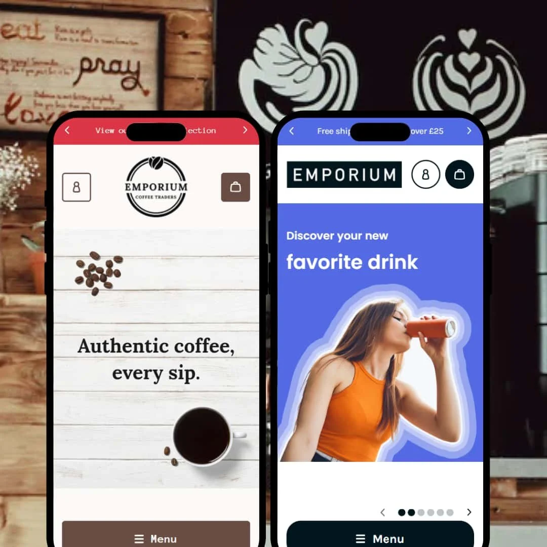
Emporium reads as a modern theme that wants products to feel tangible: big imagery, tidy navigation, and an unfussy cart experience keep the shopper moving. Both demos put a sticky header with search and a mega menu above a full-width hero, so the first tap or click is obvious. Typography is clean, contrasts well against light backgrounds, and doesn’t distract from photography. In short, the hero banner does the heavy lifting, the header does the steering, and the cart drawer closes the loop without dumping customers onto a new page.
Pros.
〰️
Pros. 〰️
✚ Clear, shopper-first navigation
Emporium keeps the header sticky and puts search where customers expect it, while the mega menu lays out categories in a single glance. The effect is prosaic in the best way: fewer wrong turns, quicker paths to a product page, and less reliance on back buttons. It’s the kind of invisible UX that reduces friction on both desktop and mobile.
Slide-out cart that closes the loop
Adding to cart opens a right-hand drawer with a free-shipping progress indicator and an order-notes field. Because shoppers don’t leave the page, the cart feels like part of the flow rather than a detour, which in turn encourages extra browsing and top-up items. It’s simple, fast and steady.
Product pages with tidy information density
Variants, quantity controls and shipping or ingredients details are presented cleanly, with secondary content tucked into accordions. This keeps the buy box focused while making deeper information one click away, a balance that helps hesitant customers commit without feeling overwhelmed.
Cons.
〰️
Cons. 〰️
− Missing quick-add and quick-view options
Across presets, product cards don’t expose quick-add or quick-view. The absence keeps grids visually calm but adds an extra click to every purchase path. Stores with high repeat purchase behaviours or many low-consideration SKUs may feel that extra step over time.
− Manual “load more” pagination
Collection and search pages rely on a manual “Load more” button rather than seamless infinite scroll. The progress text is clear, yet it breaks the browsing rhythm and can hide tail-end products behind an extra tap. It’s serviceable, not slick.
− Big header on small screens
On mobile, the sticky header can occupy a chunk of vertical space. It’s a trade-off: always-available navigation versus less above-the-fold content. Merchants prioritising first-screen impact may want to trim or consolidate elements in the header configuration.
-
What works in this preset
The Default preset leans into a bright, playful look suited to drinks and snacks. A vivid hero with bottles on pastel backdrops sets an upbeat tone and establishes the flavour-forward personality immediately. Slider dots hint at additional images and keep the top of the page feeling active without resorting to heavy animation.
Colour and imagery choices push toward freshness over seriousness. Soft pastels, airy whitespace and clear product shots carry the brand voice without needing decorative overlays. That staging works because the photos stay crisp and the type hierarchy remains simple; nothing gets in the way of the “add to cart” moment once you land on a product page.
Where it stumbles
A multi-option product (“Discount Box – Soda Pop”) accepts flavour selections but doesn’t add to cart—clicks appear to register with no change to the cart count. This is the sort of variant edge case that risks confusion at checkout time and deserves attention before launch. Beyond that, the preset doesn’t deploy any special urgency widgets or micro-animations, so promotional energy has to come from imagery and copy rather than motion.
-
What works in this preset
Arabica swaps pastels for warmth. The hero features coffee bags and earthy tones, and the supporting sections read like a field journal rather than a catalogue. That mood fits roasters and specialty food shops, where provenance and process matter as much as price.
The “About” page is treated like a mini-site: sections titled “Our people,” “Our growers,” and “Our process” pair photos with short paragraphs to build trust without bloat. The “Locations” page lists stores with “Get directions” links, which is practical when a brand’s offline presence is part of its pitch. This staging makes sense—shoppers can buy beans online but still feel invited to stop by.
Where it stumbles
The header includes a “Careers” link that lands on a 404 page. Broken links erode confidence fast, especially in a preset that otherwise foregrounds credibility. The photography is also subdued; on pale backgrounds, some pack shots recede. Merchants may want bolder, higher-contrast images to keep products feeling premium in this colour scheme.
Niche Suitability
Not Ideal For
-
Brands that value straightforward navigation, a smooth cart flow and clean, editorial product pages. If your story and photography can carry the mood, Emporium provides a stable canvas that won’t fight you.
-
Merchants who rely on quick-add speed, infinite scroll and motion-heavy promotion may want a theme that bakes those into the grid. If your catalogue is built on complex, required options, confirm variant interactions thoroughly before committing.
-
Content does the heavy lifting here. Expect to invest in strong photography and a few well-structured storytelling pages, plus a round of QA on variant setups and any header tweaks for mobile.
Final Recommendation
★ 7.8/10
Rating
-
Solid navigation, cart drawer and product-page structure, but no quick-add/quick-view and a variant hiccup in the Default preset hold it back.
7
-
Clear patterns and predictable controls make setup and shopping straightforward; manual load-more adds minor friction.
8
-
Responsive layouts work well; the sticky header can feel tall on small screens but remains usable.
8
-
Interactions feel snappy and stable; the cart drawer and page transitions don’t stutter.
9
-
Two distinct presets and a good range of sections provide latitude, though missing grid-level interactions limit out-of-the-box tactics.
7
FAQ
〰️
FAQ 〰️
-
Yes. Both demos are staged for consumables, with visuals and page types that highlight flavour, origin and packaging.
-
📱Yes. Headers collapse, menus and search stay accessible, and the cart drawer remains easy to use on phones and tablets.
-
🎨 Emporium’s sections and the two presets provide room to tune colours, typography and content blocks without custom code.
-
⚡ Pages load quickly and cart interactions feel immediate; there was no noticeable jank during common tasks.
-
👕 Variant controls are clear and integrated into the buy box, though one Default-preset product with multiple required options failed to add to cart and should be fixed before launch.
-
🔎 The theme follows Shopify’s standard SEO patterns with editable meta fields and clean markup; there are no gimmicky add-ons to manage.
-
💱 Region and language switchers are present in the footer. Configuration happens in Shopify settings.
-
⚙️ Yes. As a Shopify theme, Emporium works with apps for reviews, subscriptions, and other common needs.
-
🛒 You can preview Emporium on your store and explore live demos of its presets before purchase.
This review is based on hands-on testing of the publicly available Default and Arabica preset demos of the Emporium Shopify theme as of 21 September 2025. Theme features, preset availability, and performance can change with subsequent updates from the developer.