
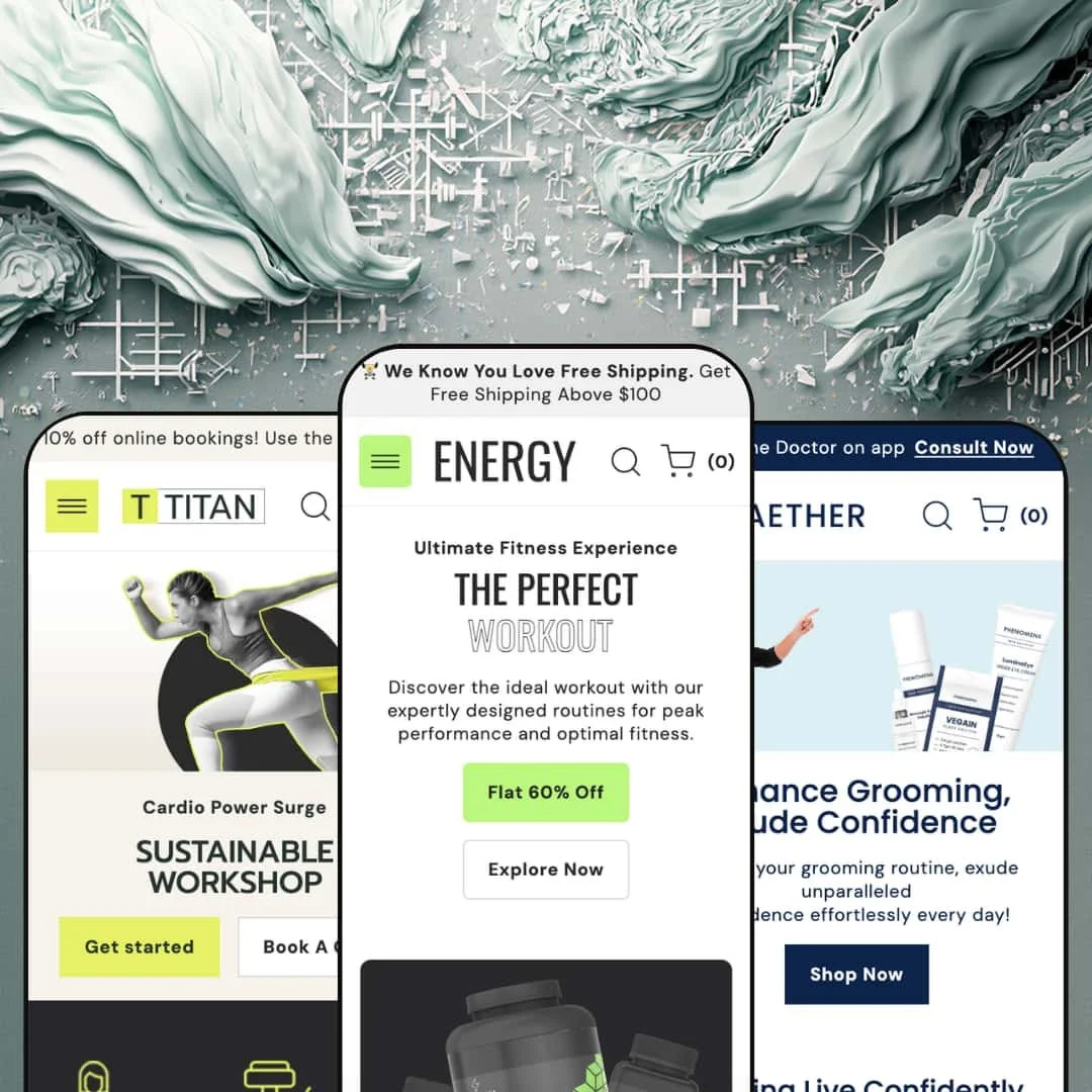
Most theme demos show you a single store. Energy shows you three, and they barely look related: a sports-nutrition shop, a men's grooming brand with a "talk to a doctor" button, and a gym that sells classes by the session. Built on Shopify's Online Store 2.0 architecture, it's a $160 theme from IT-Geeks betting that one section library can stretch across product retail and service booking. The question is what that breadth costs you in focus.
One section library, three business models
Energy's headline number is 28-plus sections, but the real story is what they let you build. The same library renders a sports-nutrition shop with a flavor-matrix featured product, a grooming brand with a before-and-after slider and expert profiles, and a gym with class cards and a tiered membership, all without preset lock-in. One purchase, three playbooks. For a single-brand operator who might pivot positioning later, or an agency building client stores across food, beauty, and fitness from one license, that flexibility is the core value.
The product page doubles as a landing page
Open a product like Biozyme Power Plus and the template keeps going well past the buy box. Accordion tabs for description, shipping, and key features sit above benefit stat-bars, a key-ingredient icon row, testimonials, a product-specific FAQ, and a how-to-use block, all built from theme sections rather than a page-builder app. It rarely stops at price. For supplements, skincare, or any considered purchase where the sale depends on education, a beauty or nutrition merchant with a focused catalog under roughly 100 SKUs gets a full sell page out of the box.
Variant handling that flexes from flavors to tiers
The variant picker does more than colors and sizes. On the supplement demo it carries a two-axis Flavor-by-Weight matrix with per-combination pricing across two dozen variants, and on the gym demo the same control sells Silver, Gold, and Platinum membership tiers. The April 2026 update added Combined Listings and Extended Variants support, so the multi-axis cases hold up. The buy box bends. For a nutrition brand with large flavor-and-size matrices, or a service business pricing access in tiers, it adapts without custom code.
For promotion-driven sellers, the conversion kit is already wired
If your store lives on urgency, Energy hands you the toolkit assembled. A countdown block, promo popups and banners, a homepage stock-and-trust row, product badges, a copy-to-clipboard discount code on the product page, and a sticky cart all ship as native sections that work together as a single merchandising kit rather than scattered add-ons. I went looking for the usual gaps and most of the promo stack was already there. The urgency stack is built in. For a flash-sale or restock-driven supplement or apparel brand running frequent campaigns, that's a real head start.
The default look is loud
Energy styles itself like a store mid-sale, and it rarely lets up. Scrolling "Last Chance Sale" ribbons on product cards, emoji-tagged headings, stacked badges, and high-contrast promo bands give every preset a busy, hard-selling surface. It looks like a shop running a permanent sale. That's an asset for a discount-driven brand and a liability for a luxury skincare line or a mid-market label trying to read calm and premium, where the work to quiet the section defaults down is real.
The product template assumes you have a story to tell
The stacked landing-page product page is a strength for storytelling SKUs and a burden everywhere else. A catalog of 500-plus near-identical accessories or commodity items doesn't have a benefit-bar narrative, a key-ingredient row, or a how-to-use sequence for every product, so much of the template gets switched off instead of used. Setup then becomes subtraction. A high-volume, low-consideration catalog will spend its time stripping sections back rather than filling them.
The personality is health-and-fitness coded
Look past the layout and the theme's instincts are tuned to one world. The default icon sets, the benefit-percentage bars, the training-and-wellness cadence of the demo microcopy, and even the stock imagery all assume supplements, grooming, or gyms. A home-goods, electronics, or considered B2B store can absolutely run on Energy, but it inherits a wellness accent it has to design out of the iconography and copy patterns. Budget time for that translation.
What it takes to launch
Plan a two-to-three-day pass: replace demo bios and expert or trainer profiles, swap placeholder contact details and benefit-bar labels, assign real products to the recommendation and featured blocks, and rework the stacked product-page sections to match your catalog before publishing.
-
What works in this preset
Land on the Energy demo and it wants to sell you something immediately. A scrolling "Last Chance Sale" ribbon runs across the product cards, a countdown block frames a weekend promo, and a featured-product section drops a full flavor-and-weight variant picker right on the homepage with a copy-to-clipboard discount code sitting underneath. Subtlety is not the goal. For a supplement or sports-nutrition shop that lives on flash sales, that energy is the entire point.
The mega menu is where the merchandising shows its range. Four image-led columns nest three sub-links each, so a catalog split across Endurance Boost, Focus Enhancers, Muscle Power, and Lean Muscle reads cleanly without reaching for a third-party menu app. I clicked through and the structure held up. The depth is real. It's the kind of header a 50-to-200-SKU supplement store actually needs.
The standout is the Compare page wired straight into the main nav. It stages a side-by-side "Energy Protein vs Other Protein" table with checkmark rows for vegan, gluten-free, and preservative-free claims, the sort of spec-sheet view that ingredient-driven buyers read before they commit. That's a real pre-purchase tool, not decoration. For a supplement or nutrition merchant whose shoppers cross-compare labels, it earns its place in the header.
Where it stumbles
The homepage leans hard on long editorial storytelling, with multi-paragraph feature blocks that assume one or two flagship products carry the brand, the way a hero supplement might anchor a small range. A wide, shallow catalog with dozens of similar SKUs has nothing to put in that space. You either write essays you don't need or strip the sections out. It's a fit question, not a flaw.
-
What works in this preset
Aether pulls a clever trick: it stops looking like a store and starts looking like a clinic. A "Talk to the Doctor" link sits in the header, an expert-profile section introduces named practitioners with bios and consult buttons, and a before-and-after slider shows a three-month hair result. The whole preset is staged around guidance, not transactions. For a grooming or skincare brand selling trust as much as product, that framing lands.
The before-and-after slider is the piece doing the heaviest lifting. It's a draggable comparison built into the theme, no app, and for results-driven categories like hair regrowth or skincare it sits exactly where a shopper expects the proof to be. I dragged it back and forth and the handle tracked cleanly. It sells the result. For a skincare or men's-grooming merchant whose evidence is visual, it's a strong default.
The header thins out compared with the supplement preset, swapping the four-column mega menu for a concern-led dropdown organized by problem area rather than product type. Browsing by concern fits how grooming shoppers actually work. The quieter navigation suits a small, curated range. The trimmed structure reads as a deliberate match to the catalog.
Where it stumbles
The clinic framing creates an expectation Aether can't fully keep. The expert section promises consultations and the homepage pushes an app promising unlimited doctor consultations, but the theme only renders the marketing for all of it; the actual booking or telehealth flow still lives in a separate app or service. A merchant who buys into the demo's promise has to source that plumbing on their own. The preset sells a service it doesn't ship.
-
What works in this preset
Titan is the odd one out, and the most interesting for it. Instead of a product catalog, it sells a gym: class schedules with dates and times, trainer profiles, a store-location block with hours and directions, and a Membership "product" whose variants are Silver, Gold, and Platinum tiers. It barely sells objects. For a studio, gym, or coaching brand, that's a genuinely useful starting point.
Using a product's variant picker to sell membership tiers is a smart reuse. Silver, Gold, and Platinum render as selectable options on a single Membership page, so the gym takes its sales through the same buy box a shop would use for sizes, just pointed at access instead of goods. The idea travels well. It won't replace real subscription billing, but as a storefront it's tidy. For a fitness or wellness operator monetizing access rather than products, the pattern fits.
The class section runs as scheduled-event cards: name, a short description, date and time, and a Book Now button per class. Paired with the trainer-bio blocks and the store-location panel with map directions, the preset assembles a credible service-business homepage out of nothing but the standard section library. Booking itself is presentation only. The real calendar lives in an app or an external page.
Where it stumbles
Titan's restraint is also its risk. Strip away the demo's photography and the homepage is mostly text blocks, schedule cards, and a single membership product, so it leans on strong imagery and a filled-out timetable to avoid feeling empty. A brand-new studio without professional photos and real class data will see the gaps fast. The simplicity cuts both ways.
One theme for both shops and services
The most distinctive thing about Energy shows only once you read all three demos together: it doesn't just recolor between presets, it changes the business model underneath. Titan sells classes, memberships, and trainer time from the same section set Energy uses to move protein powder. Energy keeps product retail and service booking under one license. That dual reach is the theme's real signature.
A ready-made identity for health, fitness, and wellness
Across every preset the theme commits to a confident, high-energy retail voice, and for brands in its native world that consistency pays off the moment you install it. A supplement, grooming, or fitness brand can publish something cohesive with little restyling, because the section defaults, iconography, and merchandising blocks already speak the right language. The look is opinionated, and when your brand shares the opinion, that's a shortcut.
Breadth comes before depth
Energy does many things competently and few things deeply. The pieces that read as advanced, real subscription billing, customer reviews, wishlists, loyalty, and the booking or telehealth flow that Aether and Titan gesture at, all still depend on third-party apps; the theme renders the marketing for them, not the machinery. A merchant who picks Energy for one of those promises should price in app subscriptions and integration work. The theme starts the conversation; it doesn't finish it.
The demos do a lot of the selling
Read the three presets side by side and a pattern emerges. The impact comes from dense, professional content as much as from the theme itself: the benefit bars need real percentages, the expert and trainer sections need genuine bios and photography, the comparison and before-after blocks need actual assets, and the stacked product page needs paragraphs of copy to look like the demo. Content carries it. A lean catalog or an early-stage brand will land somewhere short of the showcase.
★ 7.6/10
Rating
-
A deep, well-categorized section set covering comparison tables, a before-after slider, image hotspots, countdowns, and a landing-page product template, with April 2026 support for Combined Listings and Extended Variants.
8
-
No-code section editing throughout, but the stacked product template and dense homepages mean meaningful configuration time before a store matches the demo.
7
-
Dedicated mobile slider assets and a slide-out cart; the mega navigation collapses into a stacked mobile drawer.
8
-
Image-heavy demos with many stacked sections and animation; lazy-loaded media helps, but the content-dense homepages ask a lot of the page.
7
-
Three genuinely different demos prove the section library stretches across verticals and business models; the trade-off is a strong built-in personality you sometimes design against.
8
Frequently Asked Questions
-
Yes, and that's unusual. The Titan preset is built around class schedules, trainer profiles, a store-location block, and a Membership product with Silver, Gold, and Platinum tiers, so a gym or studio can run a credible storefront. The actual class booking still routes to an app or external page.
-
It's staged from the theme's own sections on a dedicated Compare page, with checkmark rows for claims like vegan and gluten-free. You supply the products and the attributes; no comparison app is required to reproduce it.
-
The supplement demo runs a two-axis Flavor-by-Weight matrix across two dozen combinations with per-variant pricing. The April 2026 release added Combined Listings and Extended Variants, so multi-attribute catalogs are a comfortable fit.
-
It can be, but expect restyling work. The default look leans busy and promotional, with sale ribbons, badges, and emoji headings, so a restrained luxury aesthetic means toning the section defaults down rather than using them as shipped.
-
Not for the page itself. Description and shipping accordions, benefit bars, ingredient icons, a product FAQ, and how-to-use blocks are all theme sections. Subscriptions, reviews, wishlists, and loyalty remain app territory.
-
Plan two to three days. The heaviest work is replacing demo bios and contact details, assigning real products to featured and recommendation blocks, and tailoring the stacked product template to your catalog.
This review is based on hands-on testing of the publicly available preset demos of the Energy Shopify theme as of June 2026. Theme features, preset availability, and performance can change with subsequent updates from the theme developer.