
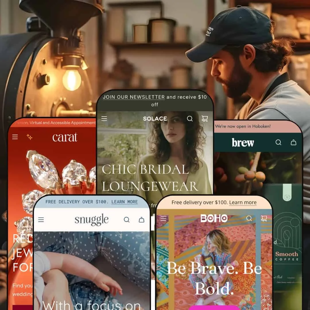
The Envy theme presents itself as a versatile choice for merchants who want polished layouts and flexible content sections. Across the Default, Boho, Carat, Brew and Snuggle presets, it stretches from airy fashion boutiques through bold swimwear and high‑end jewellery to specialty coffee and children’s wear. The Default preset greets visitors with a large hero image and a neutral color palette, while the Boho style bursts with saturated colors and playful typography, so those two demos illustrate the range particularly clearly. All of the demos lean heavily on product imagery; grids and carousels dominate, but the tone and mood shift noticeably between presets. Throughout testing, navigation stayed predictable thanks to mega menus and clear call‑to‑action buttons.
Pros.
〰️
Pros. 〰️
✚ Immersive, image‑led layouts
Across all presets, Envy leans heavily on strong product imagery and large hero sections to pull shoppers into the catalog. Grids, carousels, and editorial‑style banners give merchants plenty of room to showcase their best photography. This makes the theme especially good at selling visually led products such as apparel, jewellery, and lifestyle goods where the photo does much of the persuasion.
✚ Flexible navigation and mega menus
The demos consistently use mega menus and clear call‑to‑action buttons to keep navigation predictable, even when the catalog is large. Menus can be configured to separate categories such as accessories, clothing, home goods, or age ranges, which helps shoppers dive directly into relevant sections. Combined with a search overlay that handles invalid queries gracefully, Envy supports both browsing and direct product hunts without feeling confusing.
✚ Storytelling blocks for brand and product
Envy’s presets make extensive use of storytelling content: testimonials, lookbooks, sustainability messages, brewing tutorials, and brand‑story sections all appear in different demos. The Default preset’s feature page, Boho’s lookbook layouts, Brew’s education‑heavy sections, and Snuggle’s fabric‑quality blocks all show how the theme can handle long‑form narrative content. For merchants who want shoppers to buy into a brand story rather than just a SKU, these sections provide plenty of hooks.
✚ Variant‑rich product pages and customization
The theme is comfortable with complex products. Throughout the demos you see variant swatches, size selectors, and, in Carat’s case, engraving, metal, and financing options living together on the product page. This makes Envy a good fit for stores where configuration is part of the sales process, not an afterthought. Shoppers can work through options without feeling like they have to leave the main context of the product page.
✚ Cart drawer and cross‑sell opportunities
Envy’s demos rely on a cart drawer rather than a full cart page, and that drawer often includes suggested or complementary products. In Carat and Snuggle, these cross‑sells feel like carefully chosen add‑ons, while in Brew they pair naturally with coffee gear and companion blends. This pattern gives merchants a straightforward way to increase average order value without bolting on a heavy upsell app.
Cons.
〰️
Cons. 〰️
🚫 Inconsistent quick‑view coverage
Quick‑view is present in some presets, such as Boho and Brew, and entirely absent in others like Default, Carat, and Snuggle. That inconsistency means shoppers can enjoy fast, in‑grid variant selection in some styles but must click through to product pages in others. For merchants who prize a uniform, low‑friction browsing experience, this patchwork support makes Envy feel less cohesive than it could.
🚫 Over‑reliance on complex, multi‑variant demos
Across the demos we tested, simple single‑variant products are relatively rare. Many items require choosing a size, color, grind, or other option before purchase, and the demos do not show a straightforward “one variant, one click” flow in much detail. This makes it harder to judge how Envy feels for stores with simpler catalogs and underlines how much configuration work merchants will need when setting up variant‑heavy products.
🚫 Interactive overlays can feel fragile
In the demos, some interactive elements were less smooth than the visuals suggest. We saw quick‑view modals that loaded slowly and variant selections that reset unexpectedly in certain contexts, which can frustrate shoppers who rely on these shortcuts. Cart drawer behavior also occasionally felt clumsy, stacking multiple add‑to‑cart actions before closing, and eroding some of the polish that the layouts aim to deliver.
🚫 Demo links require careful cleanup
A handful of misconfigured links cropped up during testing, including variant choices that jumped to 404 pages and menu items that dropped us into generic “Shop All” or broad best‑seller collections. While these are demo issues rather than hard‑coded theme bugs, they highlight how fragile complex navigation and product wiring can be. Merchants adopting Envy should budget time to audit every important path once their own catalog is loaded.
-
The Default demo highlights a sophisticated clothing boutique with an emphasis on multi‑variant products rather than one‑off items. A large, neutral‑toned hero image and crisp typography create a polished, boutique feel that pushes shoppers toward featured collections rather than overwhelming them with choice.
What works in this preset
On the Default preset, Envy leans into a restrained, editorial look. The opening hero image feels closer to a magazine cover than a standard storefront banner, with typography that reads cleanly and call‑to‑action buttons that stand out without shouting. This pairing of neutral colors and carefully spaced content suits brands that want to project a calm, premium image rather than a crowded catalog feel. Multi‑variant products fit naturally into this framing, since each collection row can spotlight a handful of garments that share a story or look.
Product pages in the Default demo continue this boutique impression. Variants are presented in a structured way, so shoppers can work through size and color choices without losing track of the main imagery. The overall layout prioritizes photographs, supporting copy, and a clear add‑to‑cart path in a familiar sequence, which should reduce hesitation for shoppers already comfortable with fashion‑focused Shopify stores.
Where it stumbles
During testing, some variant swatches in the Default demo opened a new page instead of simply updating the current view. That extra hop is jarring when you expect a quick, in‑place update, and it makes the browsing flow feel more brittle than the refined visual design suggests. Shoppers who like to flick through colors and styles on the same product listing may notice this break in rhythm, especially when moving quickly between similar items.
-
Boho turns up the energy with bold colors, playful typography, and copywriting aimed at swimwear and festival‑ready apparel. The homepage immediately feels more expressive than Default, with lifestyle imagery and bright accents that push a fun, youthful tone.
What works in this preset
The Boho preset uses Envy’s grid‑heavy foundation to create a very lively storefront. Product cards sit against saturated backgrounds, and headings adopt a looser, more conversational voice that matches the visuals. That combination helps swimwear and festival outfits feel aspirational rather than purely transactional, which is exactly the mood many of these brands are chasing. Browsing feels like flipping through a colorful catalog rather than a strict inventory list.
Boho also leans hard into lifestyle storytelling. The layout weaves in social proof and outfit inspiration without forcing shoppers away from core product areas. This is especially effective for brands that rely on imagery to communicate fit and vibe; shoppers can see how items are worn, then drop back into the product grid to explore sizes and colors. Overall, this preset feels tuned for discovery and mood, not just price comparison.
Where it stumbles
The same saturated palette and playful typography that make Boho feel fun can work against more subdued or corporate brands. On pages with a lot of content, the bright accents and busy visuals may compete for attention instead of guiding the eye. For audiences who prefer a quieter or more straightforward shopping experience, Boho’s personality can edge into distraction.
-
Carat is tailored to high‑end jewellery, using refined typography and luxurious imagery to frame each piece. The demo immediately communicates a premium, editorial mood that feels closer to a boutique showroom than a standard online store.
What works in this preset
On the Carat homepage, an engaging hero section combines category links to guide shoppers into ring styles. This makes it easy to start from how a shopper imagines the piece rather than from a dense grid of SKUs. That more considered entry point feels appropriate for higher‑ticket items and helps narrow down options before the shopper has to parse technical product details.
Carat’s product pages are built to handle deeply detailed jewellery listings. The demo shows a realistic version of what a made‑to‑order ring might require before purchase. This density serves buyers willing to read closely and consider their investment; it allows them to configure a piece and understand payment options without hunting around the site.
Where it stumbles
Because Carat’s product templates carry so many fields and options, the page can feel intimidating to more casual shoppers. There is a lot to process before you even reach the add‑to‑cart button, which may increase hesitation for buyers who are not accustomed to custom jewellery.
-
Brew caters to artisanal coffee sellers, pairing earthy colors with video‑driven storytelling. The demo feels like a specialty roaster’s site, with brewing culture and sustainability foregrounded rather than buried in blog posts.
What works in this preset
The Brew preset uses video, photography, and copy in a way that feels tailored to specialty coffee. Homepage sections highlight featured roasts, brewing rituals, and environmental commitments, so visitors get a sense of the brand’s values as well as its products. Sustainability messages and brewing tutorials are integrated into the main flow, which helps educate newcomers without sending them off to a separate resource hub.
On product pages, Brew continues that educational approach. Descriptions focus on tasting notes and brewing suggestions, and supporting sections highlight related products that make sense in a coffee context, such as grinders or complementary blends. For merchants who care about average order value and long‑term loyalty, these touches turn a simple bag of beans into part of a broader ritual.
Where it stumbles
In testing, the relatively dark color scheme in Brew, while atmospheric, also felt heavy for brands that prefer a brighter, more clinical or tech‑driven aesthetic.
-
Snuggle targets children’s apparel with soft colors, rounded shapes, and playful imagery. The demo feels like a friendly kids’ boutique, emphasizing warmth and comfort over sharp lines or stark contrasts.
What works in this preset
Snuggle’s navigation is organized around how parents actually shop. Clothing is segmented by age range and category, so it is easy to jump into outfits for toddlers versus older children without sifting through the entire catalog. That structure keeps the experience approachable even when the product range grows.
On product pages, Snuggle leans into reassurance. Sections speak directly to concerns about safety, ethics, and softness, which are key decision points for many parents. Combined with playful imagery and a gentle palette, the overall effect is a store that feels trustworthy and child‑focused rather than generic.
Niche Suitability
Not Ideal For
-
Envy is best suited to fashion boutiques, jewellery brands, children’s wear labels, and lifestyle or specialty food merchants who lead with strong imagery and storytelling. If your catalog includes multi‑variant products and you care about weaving in brand values, testimonials, or educational content, the theme’s presets give you plenty of room to do that. Stores that want each product to feel like part of a broader narrative will get the most value here.
-
Merchants who prioritize extremely fast, single‑product funnels or a hard‑selling direct‑response style may find Envy too contemplative. The theme assumes that shoppers will browse, compare, and read, rather than jump straight from an ad to a minimal checkout in one or two clicks. If your ideal shopper behavior is “land, tap once, buy,” a more stripped‑down theme focused on pure speed may serve you better.
-
Medium — Envy rewards careful setup of product options, navigation, cart drawer content, and storytelling sections, and that configuration takes time. Once those pieces are in place, though, they become durable assets that help justify higher price points and support richer merchandising.
Final Recommendation
★ 7.8/10
Rating
-
Supports mega menus, variant swatches, cart drawer and cross‑sells; lacks uniform quick‑view and visible search in all presets.
8
-
Navigation is intuitive thanks to clear menus and back‑to‑top arrows; absence of quick‑add adds friction.
7
-
Drawers work well on smaller screens; large images sometimes slow to load.
8
-
Demo sites felt generally snappy, but video and large image sections can slow initial load.
7
-
Multiple presets with different moods, customizable sections and storytelling blocks offer wide design latitude.
9
FAQ
〰️
FAQ 〰️
-
👑 The Default and Carat demos suggest Envy is well suited to boutiques, jewellery brands, and lifestyle products that require detailed product pages, variant options, and room for brand storytelling.
-
📱In testing, all presets displayed well on mobile. The main trade‑off is that video backgrounds and large hero images can add extra load time on slower connections.
-
🎨 Yes. Each preset ships with its own color scheme and typography, and merchants can swap hero images, adjust section order, and add bespoke content blocks without touching code. That makes it straightforward to align Envy to an existing brand system.
-
⚡ Browsing felt reasonably quick on Boho and Brew, even with rich media sections in play. However, large videos and high‑resolution imagery, such as the Carat hero, may require additional optimization to keep first load times in check.
-
👕 Envy’s product pages support size, metal, grind, or color swatches, along with inventory indicators where configured. Add‑to‑cart interactions update the cart drawer immediately, which helps shoppers see the impact of their choices without leaving the page.
-
🔎 The demos use clean headings, structured text blocks, and image alt text in a way that should support solid SEO foundations. A custom 404 page that links back to popular categories also helps keep lost visitors on site.
-
💱 A currency selector is visible in every header in the demos, and Shopify’s native multi‑language capabilities are compatible with the theme when those features are enabled on your store.
-
⚙️ Since Envy is 2.0‑ready, it should support Shopify apps that add reviews, bundles or upsells, and the demos already include review widgets and cross‑sell blocks that show how these integrations can appear on the storefront.
-
🛒 Yes. Merchants can explore demos for each preset (Default, Boho, Carat, Brew, and Snuggle) and test functionality like variant selection and cart flow before purchase.
This review is based on hands‑on testing of the publicly available Default, Boho, Carat, Brew and Snuggle demos of the Envy Shopify theme as of 2025‑11‑23. Theme features, style availability and performance can change with subsequent updates.