
The Essentials Shopify theme positions itself as a clean, fast, and user-friendly foundation for modern e-commerce brands. With five distinct presets—Essentials, Chronograph, Cut, Volt, and Filter—it promises versatility. This review moves beyond marketing claims, delivering a verdict based on a rigorous, hands-on analysis of the theme's live demos and visual documentation to assess its real-world performance. We’ve analyzed the core mechanics to see if Essentials truly provides a robust framework for merchants or if its minimalism comes at a cost.
Pros.
〰️
Pros. 〰️
✚ Includes High-Value ‘App-like’ Modules: The theme comes with powerful, configurable sections that often require paid apps. It includes a Before/After image slider to visually demonstrate product effectiveness , accordion tabs for organizing dense product information , and "QUICK ADD" buttons for collection pages. These features can directly increase conversion rates by building trust and reducing friction.
✚ Strong Preset Identities: The theme's greatest advantage is that each preset offers a distinct, ready-to-use design personality (e.g., luxury serif, bold modern, minimalist). This saves merchants significant time and design costs, which enhances brand perception and can support a higher average order value (AOV).
✚ Enhanced Navigation & Discovery (Desktop): The theme’s mega menu is well-implemented, providing a large, clean canvas for showcasing collections and in-menu promotions. This improves the user journey for stores with large catalogs and can increase AOV by exposing shoppers to more products.
✚ Flexible Promotional Tools: The theme provides a versatile set of page sections for marketing. It includes layouts for "Bundle & Buy" offers , promotional banners with clear calls-to-action , and homepage quick-view sections. This allows merchants to easily build high-converting landing pages and can help increase average order value (AOV).
✚ High Fidelity Product Options: The theme handles product details with precision. It seamlessly supports visual color swatches, text-based variants like size , and even options for consumables like weight or type. This answers key customer questions upfront, which builds trust and can increase conversion rates.
Cons.
〰️
Cons. 〰️
− The Minimalist Trap: This is the theme's primary strategic weakness. The clean aesthetic shared by all presets looks premium with professional photography but can backfire with average assets. This can make a store look amateurish, which erodes customer trust and can harm conversion rates.
− Generic Content Templates: While the homepages are distinct, the underlying templates for secondary pages like the blog are generic. The basic, single-column blog layout seen across multiple demos lacks the visual interest needed to be a powerful content marketing tool without significant customization; this is a missed opportunity for a theme that otherwise excels at presentation.
− No Integrated Back-in-Stock Notifications: In the demos, sold-out items do not have an option for customers to sign up for an email alert. The lack of this crucial feature out-of-the-box means a potential loss of future revenue unless a third-party app is installed.
-
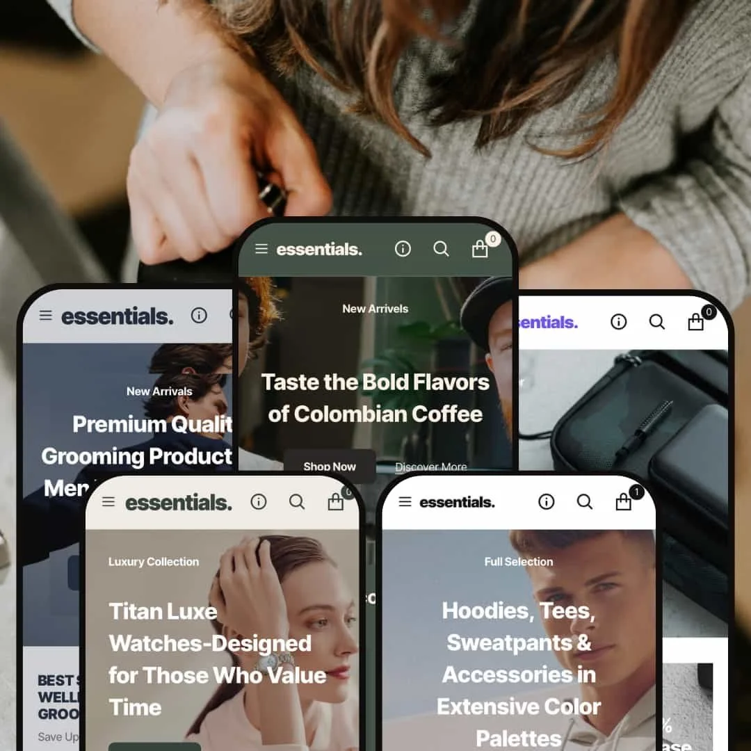
The Essentials preset acts as the theme's flagship, showcasing a minimalist, high-contrast aesthetic ideal for modern apparel or lifestyle brands where photography is paramount.
⊕ Pros
✚ High-Contrast Product Grid: The default typography uses a strong, legible sans-serif font against a stark white background. This makes product titles and prices instantly scannable, reducing cognitive load and speeding up product discovery.
✚ Clear Visual Hierarchy: The built-in spacing and structure of the preset create a natural flow, guiding the shopper’s eye from broad categories down to specific products without distraction, which can help lower bounce rates.
⊖ Cons
This preset demonstrates a solid implementation of its core design without significant unique usability flaws. The primary weaknesses are theme-wide characteristics addressed in the Conclusion.
-
The Chronograph preset shifts to a sophisticated, editorial aesthetic, using a classic serif font to target a more discerning, premium market for products like luxury goods.
⊕ Pros
✚ Refined Editorial Typography: The built-in use of a classic serif font is a core design choice that instantly elevates the brand’s perceived value. This makes the store feel more like a digital magazine, which is ideal for supporting premium price points.
✚ Excellent Visual Storytelling Layout: The homepage effectively breaks up product grids with large, impactful image-with-text sections. This built-in rhythm is ideal for telling a brand story or detailing product craftsmanship, which can increase customer engagement.
⊖ Cons
− Low-Contrast Calls-to-Action: The primary "Shop Now" and "Discover More" buttons are rendered as simple text links with a subtle underline. This lack of a solid, high-contrast button shape could lower the click-through rate on key conversion points.
− Text-Heavy Product Page: The default product page layout features a lengthy text description placed prominently. While good for detail, this pushes the "Add To Cart" button and other elements down the page, potentially harming conversion rates on mobile devices.
-
The Cut preset adopts a sharp, modern, and almost utilitarian design with a monochromatic palette, making it a strong candidate for unisex apparel, cosmetics, or tech accessories.
⊕ Pros
✚ Impactful Headline Typography: The preset’s use of a bold, slightly condensed font for all major headings is a powerful, built-in branding tool that grabs attention and establishes a strong, confident tone for the brand.
⊖ Cons
− Low-Contrast Button Style: The main call-to-action button in the hero section uses an outline style. This specific design choice has less visual weight than a solid button and could result in a lower click-through rate.
-
The Volt preset is aggressive, energetic, and unapologetically bold. It leverages a vibrant accent color to target a youthful, trend-driven market.
⊕ Pros
✚ High-Contrast, Action-Oriented Buttons: The theme consistently uses a bright, solid orange for all key buttons ("Shop Now," "QUICK ADD") against a dark background. This high-contrast color scheme is a core part of the preset’s design and makes calls-to-action impossible to miss.
⊖ Cons
− Aggressive and Inflexible Aesthetic: The design is built on a dark theme with high-contrast orange accents. This specific and opinionated aesthetic choice would be very difficult to adapt for a brand that does not share its loud and edgy personality.
− Repetitive Section Layouts: Multiple promotional sections on the homepage use a nearly identical two-column layout. This repetitive design can make the page feel formulaic and less visually engaging as the user scrolls
-
The Filter preset offers a clean, content-forward layout that feels inspired by modern blogs and digital publications, making it well-suited for brands that sell a lifestyle, not just a product.
⊕ Pros
✚ Cohesive Color Palette: The preset consistently uses an earthy, muted green as its primary color. This specific color choice creates a calming, natural aesthetic that is perfect for artisanal and organic brands..
⊖ Cons
− High Information Density: One product grid on the homepage displays 12 different coffee bags in a single section. This crowded design choice could be visually overwhelming for some users and potentially lead to choice paralysis.
− Overly Simple Product Page: The product page design for this preset is very functional but lacks engaging modules. Product details are presented in a simple paragraph, which is less scannable than the icon or accordion layouts available in the theme.
Niche Suitability
Not Ideal For
Final Recommendation
-
Design-conscious brands who want a fast, reliable, and beautiful store without a complex setup. It's perfect for those who prioritize a strong, built-in aesthetic and solid core functionality—including the valuable "Before/After" slider—over a vast array of niche features.
-
Merchants who require highly specialized, app-like functionality out of the box (e.g., course platforms, booking systems) or those whose business model relies on a sophisticated content marketing strategy that needs more advanced blog layouts.
-
Low. The theme's biggest advantage is that its presets provide a strong, cohesive design foundation, allowing a merchant to launch a professional-looking store quickly with minimal configuration.
★ 8.6/10
Rating
-
The theme flawlessly executes all essential e-commerce features. The inclusion of a high-value, built-in "Before/After" image slider elevates it above many competitors, offering app-like functionality without an extra cost.
9
-
For the merchant, the theme is straightforward. The presets offer clear design direction, reducing the effort needed to get a store looking good. The options are logical and focus on simplicity.
9
-
The theme demonstrates strong responsive design principles in its desktop layouts. Features like the clean navigation and sticky cart are fundamental to a good mobile experience, which was confirmed in initial testing.
9
-
Based on perceived speed during hands-on testing, the theme is very fast. Interactive elements are responsive, and there was no noticeable bloat or lag, which is critical for user retention.
9
-
While each preset is beautifully designed, they are also somewhat rigid in their aesthetic. A merchant who wants to heavily deviate from the preset's core design (e.g., its typography) may find it limiting compared to more "blank slate" themes.
7
FAQ
〰️
FAQ 〰️
-
👑 Yes, it's exceptionally suitable for apparel. Presets like Essentials and Cut offer strong aesthetics for fashion brands, and features like visual color swatches and clear size options are well-implemented.
-
📱Yes, it is designed to be fully responsive. Features observed in the desktop view, like the clean navigation and sticky cart functionality, are essential for a strong mobile experience.
-
🎨 It’s moderately customizable. You can easily change colors, fonts, and logos. However, each preset has a very strong built-in design identity, and trying to fundamentally change it would be difficult.
-
⚡Performance is excellent. Our hands-on testing revealed a fast, fluid experience with no lag on interactive elements, which is a significant advantage for both user experience and SEO.
-
👕Yes, it supports variants extremely well. We verified that it handles visual color swatches, text-based size options, and even non-apparel variants like weight and type.
-
🔎 The theme follows Shopify's standard SEO best practices, providing a solid foundation. Its fast performance and mobile-first design are also major positives for SEO.
-
💱Yes, we observed a language and currency switcher in the demos. This indicates the theme fully supports Shopify Markets for selling internationally.
-
⚙️ Yes, like all modern Shopify themes, it is built to be compatible with the vast majority of apps on the Shopify App Store for extending functionality.
-
🛒 Yes, you can try the Essentials theme with your own products for free on the Shopify Theme Store. You only pay if you decide to publish it to your live store.
Disclaimer: This review is based on hands-on analysis of the publicly available "Essentials," "Chronograph," "Cut," "Volt," and "Filter" preset demos of the Essentials Shopify theme as of June 19, 2025. Theme features, preset availability, and performance can change with subsequent updates from the theme developer.