
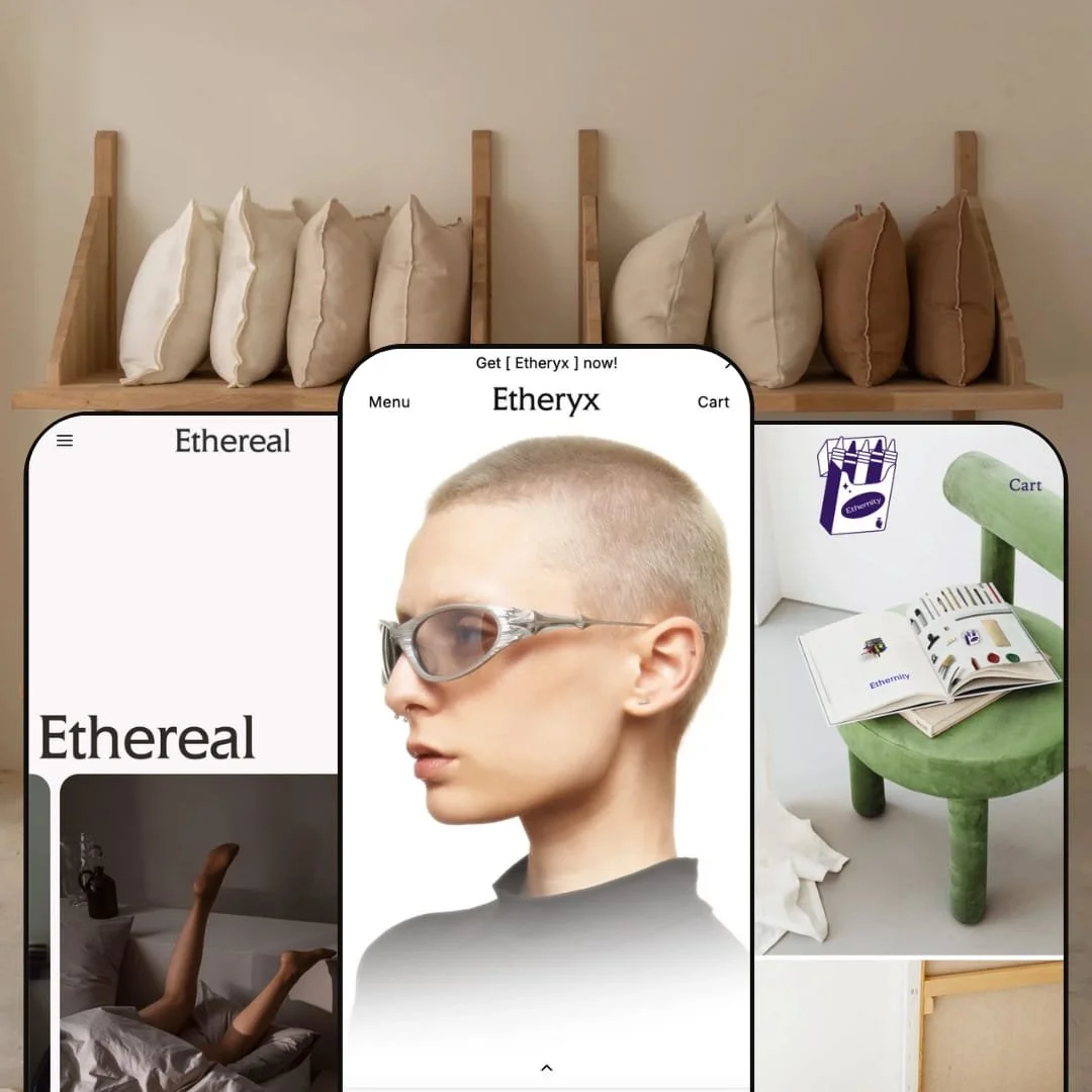
Etheryx is a versatile Shopify theme built for merchants who value strong visual storytelling and quick shopping workflows. Throughout the theme, you’ll see a refined typography hierarchy, generous white space and purposeful imagery. Every preset shares a multi‑level navigation, a sliding side cart with progress bars and discount code field, and product pages with variant selectors and quantity controls. These features streamline shopping, while the design elements help merchants tell brand stories.
Pros.
〰️
Pros. 〰️
✚ Flexible presets, consistent core
flexible preset options that maintain core functionality while offering distinct aesthetic approaches.
In practice, the demos show noticeably different moods across Default, Ethereal and Ethernity without changing the underlying shopping structure. That gives merchants room to pick an aesthetic direction while keeping familiar pathways for navigation, product selection, and cart flow.
✚ Structured mega menus and multi‑level navigation
Etheryx’s navigation is built to handle depth without feeling overwhelming, using a structured approach that supports scanning. When a catalogue is organised into many sub‑collections, that structure reduces the “where do I start?” problem and helps shoppers move with intent. For merchants, it’s a clean way to present breadth without forcing visitors through long collection pages first.
✚ Cart drawer that keeps checkout close
Adding an item triggers a sliding side cart that stays on the current page while surfacing key checkout utilities. In the demos, this drawer includes elements like progress bars tied to incentives, a discount code field, note fields, and clear checkout buttons. That combination keeps the purchase moment nearby and can encourage shoppers to complete checkout without losing their place.
✚ Variant‑aware quick add shown in the Default preset
In the Default demo, product cards use a quick add pattern that distinguishes between single‑SKU items and products with multiple variants. For multi‑variant items, shoppers can choose a size and add to cart from the collection context instead of detouring into the product page. That setup supports faster “browse, decide, add” behaviour when the catalogue is built around variants.
✚ Clean product pages with intuitive selectors
Across the demos, product pages keep purchase controls straightforward, with clear variant selectors and quantity controls. The structure focuses attention on the product media and the decision points that matter at checkout. For shoppers, it reduces guesswork during selection, especially when products come in multiple options.
✚ Storytelling framework that stays design‑forward
Etheryx consistently leans on refined typography, generous white space and purposeful imagery as part of its default presentation style. That gives merchants a strong starting point for brand storytelling without needing to build an editorial layout from scratch. The end result feels intentional, especially for categories where visuals do most of the selling.
Cons.
〰️
Cons. 〰️
🚫 Search behaviour is inconsistent across the demos
Search presentation is polished in the Default demo, but the behaviour is not consistent in Ethereal and Ethernity. In testing, Ethereal’s overlay dismissed without returning results when a query was submitted, and Ethernity’s search link did not reliably trigger an overlay or results. Because search can be central to discovery on larger catalogues, this is a workflow worth verifying early.
🚫 The cart drawer can introduce an extra compliance step
In the Ethernity demo, checkout is gated by agreeing to terms before proceeding. That can be helpful for stores that need explicit acknowledgement, but it does add a step at the point where shoppers expect a clean handoff to checkout. Merchants should consider whether that friction matches their category and buyer expectations.
-
The Default preset is tailored for fashion boutiques that want a combination of editorial imagery and efficient shopping. The home page mixes full‑width hero banners with product sliders and collection call‑outs, creating multiple entry points for browsing.
What works in this preset
The first thing Default communicates is energy. Between the bold fashion photography and the punchier calls to action, the demo reads like a modern boutique that expects shoppers to browse quickly and react to strong visuals. That framing matters because the preset leans on mood and momentum more than slow, spec‑heavy merchandising.
Default’s homepage structure supports that browsing rhythm. Full‑width hero banners lead, then the layout transitions into product sliders and collection call‑outs rather than forcing a single path. This “many doors” approach makes it easy for a visitor to jump into a category, scroll into a carousel, or follow a curated collection highlight. It feels intentionally built for quick discovery, not just a single hero and a long scroll.
Even small styling choices reinforce the high‑energy positioning. Pastel headings soften the fashion‑forward imagery without making the page feel subdued, and the carousel moments add a sense of movement to the presentation. The overall effect is a boutique storefront that stays visually expressive while still giving shoppers multiple ways to enter the catalogue.
Where it stumbles
Default’s identity is clearly fashion‑led and editorial, which can be a mismatch for technical products. If your catalogue relies on dense specifications, comparisons, or shoppers who want to evaluate multiple items with a lot of detail before committing, this preset’s mood‑first presentation may feel less aligned with how those customers shop.
-
Ethereal reimagines the theme for homeware and lifestyle merchants. Neutral colours, generous margins and still‑life product photography establish a calm, aspirational mood.
What works in this preset
Ethereal’s biggest asset is restraint. The demo leans into neutral tones, wide spacing, and still‑life imagery that gives products room to breathe. That choice fits homeware well because shoppers often want to imagine items in a space, not just evaluate them as isolated SKUs. The result is a slower, calmer storefront presence that prioritises atmosphere.
The preset also uses trust cues as part of the visual language. Large lifestyle images of kitchens and soft furnishings set the cosy tone, then a row of badges highlights promises like free shipping, sign‑up discounts and secure checkout. In this context, those badges read less like an interruption and more like a designed reassurance layer. It’s a straightforward way to reduce hesitation while keeping the page visually composed.
Ethereal’s demo navigation is staged in a way that matches the category. Groupings like Bedding and Throws, Cushions, Curtains, and Kitchen make it easy to understand the store’s shape at a glance. That content structure reinforces the “browse by room and texture” feeling rather than pushing a product‑list mindset.
The About page staging also supports the preset’s tone. Instead of treating brand story as an afterthought, the demo’s origin narrative is presented with text and imagery that feels consistent with the rest of the site. For merchants selling lifestyle goods, this kind of story placement can matter because trust is often built through context, not just price.
Where it stumbles
Ethereal’s collection browsing is very image‑led, and key details like product names and prices are revealed through interaction rather than sitting plainly on the grid. That keeps the layout quiet and premium‑feeling, but it also adds a small step to basic scanning. For shoppers who want to compare items quickly by name and price, the experience can feel slower than it needs to be.
-
Ethernity adapts Etheryx for a stationery and creative‑goods brand. It uses minimalist layouts, generous margins and paper‑texture accents, giving the site a boutique bookshop feel.
What works in this preset
Ethernity’s strength is its editorial tone. Minimalist composition and generous spacing keep pages feeling like a curated catalogue rather than a busy storefront. The paper‑texture motif and understated type choices reinforce that “bookshop” identity without needing loud graphic elements. For creative goods, that kind of quiet confidence often reads as premium.
The homepage staging leans into merchandising like a magazine spread. A split hero with images of an open magazine establishes the concept immediately, and the Bestsellers section below arranges items like wax seals, markers and compasses into a clean 2×4 grid. That grid presentation makes the assortment feel intentional and collected, not just stocked. It suits products that sell through curation and craft.
Ethernity’s store‑locator content is also notable within the demo. The Our Stores page lists physical locations in Seoul, Tokyo and Osaka with addresses and hours, and the page is anchored by a bold type treatment that fits the brand identity. For merchants with retail presence, this kind of staging supports the idea that the brand exists beyond the screen. It also reinforces trust by making the business feel tangible.
Where it stumbles
Like Ethereal, Ethernity’s collection browsing relies on interaction to surface basic product information such as names and prices. That supports the clean, editorial look, but it can slow down shoppers who want to compare multiple items quickly. For high‑volume shopping patterns, the grid’s minimalism can become a point of friction rather than a benefit.
Niche Suitability
Not Ideal For
-
Merchants who want a design‑forward theme that can adapt to fashion, homeware or stationery with minimal configuration. It suits brands that use imagery and storytelling to sell and are comfortable shaping content to match a curated presentation.
-
Stores that rely on consistently strong on‑site search behaviour as a primary shopping path, or teams that want every key discovery tool to feel identical across presets out of the box. Merchants with extremely large catalogues or technical products may also prefer themes that are purpose‑built for spec‑heavy comparison shopping.
-
Medium — while presets offer polished designs, merchants should verify search behaviour early and tailor the demo content into their own brand story. Incentive messaging in the cart drawer and any trust‑badge promises also need real store settings behind them to stay meaningful.
Final Recommendation
★ 8.0/10
Rating
-
Mega menus, a feature‑rich cart drawer, and the Default demo’s variant‑aware quick add stand out. Search behaviour varies across demos, which holds the score back.
8
-
Navigation and cart interactions are intuitive once shoppers engage with them. The main caution is that some demo interactions hide key details until interaction, and search requires an early sanity check.
8
-
Core flows like navigation and the cart drawer are clear in the demos, and the browsing layouts stay clean. Some presets prioritise minimal, interaction‑revealed details, so merchants should confirm that discovery cues feel obvious on touch.
7
-
Pages loaded smoothly during testing, and animations like the cart drawer and mega menu felt fluid. There were no major lags during the demo pass.
8
-
Three distinct presets cater to fashion, homeware and stationery retailers, and the theme demonstrates strong section‑based flexibility for customisation.
9
FAQ
〰️
FAQ 〰️
-
👑 Yes. The Default preset was tested with apparel products and pairs high‑impact hero sections with a collection browsing experience that supports quick selection.
-
📱Key interactions like opening navigation and adding to cart into the drawer behaved smoothly in this demo testing. Some demo elements reveal details through interaction rather than showing everything upfront, so it’s worth checking how those cues feel on touch for your audience.
-
🎨 Yes. Each preset demonstrates different colour palettes and typography, such as Ethereal’s neutral tones and Ethernity’s paper‑inspired aesthetic. The demos make it clear that branding can be tailored in the theme editor.
-
⚡ Interactive elements like the cart drawer and mega menu animate smoothly. We didn’t experience any noticeable lag during testing.
-
👕 Product pages display variant selectors clearly, and the Default preset’s quick add flow supports choosing a size before adding to cart. This keeps variant selection straightforward in the buying flow.
-
🔎 Etheryx leans on Shopify’s built‑in SEO workflow rather than adding a separate SEO toolset inside the theme. You’ll still manage search titles and descriptions through Shopify, with the theme focusing on clean presentation rather than extra SEO widgets.
-
💱 Yes. Use Shopify Markets to sell in multiple currencies and languages, then enable the storefront selectors you want as part of your localisation setup. The theme is designed to work within Shopify’s standard localisation approach.
-
⚙️ Etheryx follows Shopify conventions, so apps that extend functionality such as upsells or reviews are generally expected to integrate in a typical Shopify setup. As always, it’s smart to test your must‑have apps during a trial configuration pass.
-
🛒 You can explore the live demos linked in this review and use Shopify’s theme trial period to customise Etheryx before committing. That trial window is the best time to confirm search behaviour and align the presets with your catalogue.
This review is based on hands‑on testing of the publicly available preset demos of the Etheryx Shopify theme as of 13 December 2025. Theme features, preset availability and performance can change with subsequent updates from the theme developer.