
The Exhibit Shopify theme is a visually-driven platform tailored for brands that prioritize aesthetics and storytelling. With four distinct presets, it provides a sophisticated canvas for art galleries, photographers, design boutiques, and premium furniture makers. Its core design philosophy revolves around clean lines, editorial layouts, and large-scale imagery, putting the product and the creator front and center. The initial impression across all presets is one of refined elegance, using ample white space and strong typography to guide the visitor's eye toward collection galleries and featured products.
Pros.
〰️
Pros. 〰️
✚ Exceptional Visual Storytelling: Across all presets, the theme excels at integrating large, beautiful images and editorial content sections. This allows merchants to build a compelling brand narrative, not just a product list, which enhances brand perception and can support a higher average order value (AOV).
✚ Focus on the Creator/Designer: The theme consistently provides layouts and specific page sections to highlight the artist, designer, or maker behind the products. This is a powerful advantage for brands built on provenance and craftsmanship, which streamlines navigation and can directly lower bounce rates.
✚ Flexible and Sophisticated Layouts: From masonry grids to clean, spacious showcases, the theme offers a range of sophisticated homepage layouts that can be adapted to different types of curated inventories, making key information highly accessible.
✚ Built-in Support for Varied Business Models: With features supporting art provenance details (Exhibit), personal portfolios (Exposure), and even service inquiries (Curate) , the theme is more versatile than a standard e-commerce template.
✚ Polished Mobile-First Experience: The theme demonstrates a consistently strong and considered mobile design across all presets . The layouts are not merely responsive; they are intentionally designed for smaller screens, ensuring that the high-end aesthetic translates perfectly and navigation remains intuitive, which is critical for capturing sales from the majority of online shoppers.
Cons.
〰️
Cons. 〰️
− The Minimalist Trap: The theme's biggest strength is also its biggest risk. Its reliance on stunning photography and well-written copy means it demands significant creative effort from the merchant. Without professional-grade assets, the clean, minimalist designs can easily look empty, unfinished, and unprofessional, which may detract from the site's professional appearance and damage customer trust.
− Standard Feature Implementation: The theme does a great job of styling standard Shopify features (like text-based filters) to match its aesthetic, but it doesn't appear to add advanced functionality to them (e.g., color swatch filters, AJAX filtering). This may require apps for stores needing more powerful discovery tools, creating user friction that could negatively impact mobile conversion rates.
− Passive Calls-to-Action: In pursuit of a refined look, the CTAs across all presets are visually subtle. They are well-designed but lack the aggressive color contrast or sizing that drives high-conversion, which can be a problem for brands that aren't already established.
-
The Exhibit preset is clearly staged for a traditional art gallery or a fine art marketplace, focusing on curation and artist discovery.
⊕ Pros
✚ Detailed Art Information Fields: The product page includes dedicated sections for Artist, Nationality, Year, and Style. This is a crucial feature for art retailers, allowing them to provide essential provenance and context directly on the purchase page.
✚ Content-Driven Curation: The homepage effectively blends commerce with content by featuring sections like "International Exhibitions" and "Publications" alongside product galleries. This builds brand authority and tells a richer story than a simple product grid.
✚ Multiple Discovery Paths: It gives customers several ways to browse, including "Shop collection" , "Shop by style" (e.g., Abstract, Asian Art, Landscape) , and carousels for the latest works. This structured navigation is ideal for stores with diverse inventories.
✚ Prominent "As Seen In" Section: Featuring logos from publications like VOGUE and MONOCLE builds immediate social proof and trust with potential buyers.
⊖ Cons
− Visually Demanding Layout: The design relies heavily on text overlays on images. If a merchant's photography isn't composed with these text areas in mind, key parts of the image could be obscured.
− Basic Product Grid: The "Latest in..." carousels show a fairly simple product grid with just the image, title, and a gallery counter (e.g., "1/8"). This lacks more engaging elements like price or quick-add buttons on the homepage.
− Potentially Static Feel: The homepage is built with many distinct, self-contained blocks. While clean, it may feel less dynamic than presets with more integrated or animated elements.
-
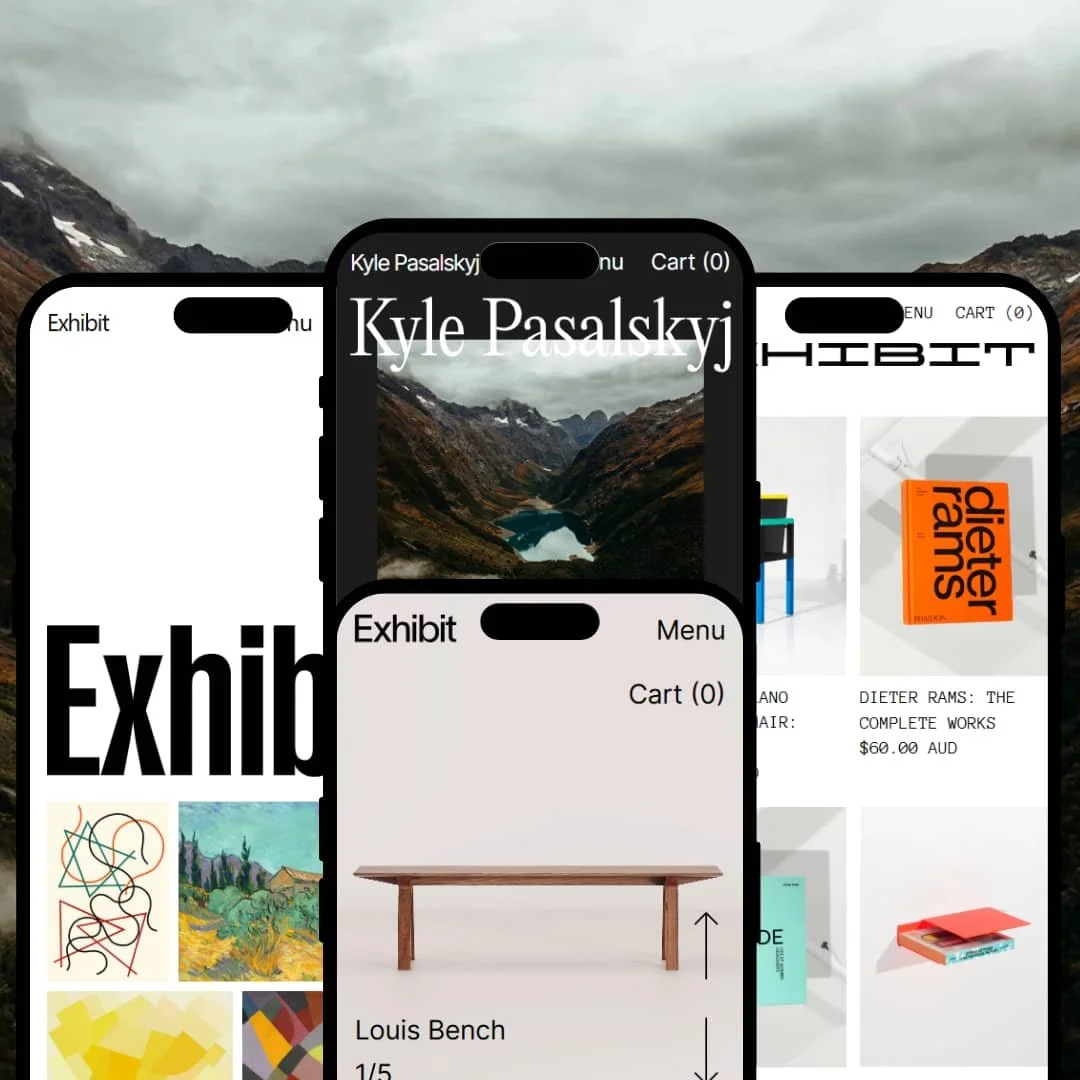
The Exposure preset is perfectly tailored for a solo creator, such as a photographer or artist, who is building a personal brand around their work.
⊕ Pros
✚ Strong Personal Branding: The design puts the creator's name, Kyle Pasalskyj, front and center in the hero and footer. The homepage is structured around a detailed "Profile" and biography section, making the theme excellent for building a brand around an individual.
✚ Integrated Blog Content: The "From the blog" section is cleanly integrated into the homepage flow, allowing creators to easily share stories behind their work, like "A Straight Shot to Wanaka".
✚ Clear Portfolio-to-Print Funnel: The user journey is straightforward: learn about the photographer , see their latest work, and click to buy a print. It avoids the complexity of multi-category stores.
✚ Product Page Simplicity: The product page for "Lake Tekapo" is uncluttered, focusing on a large image and straightforward options for Size and Frame. This removes friction from the buying process for a single-purpose product.
⊖ Cons
− Limited Scalability for Collections: The simple, linear layout is not well-suited for a store with many different product types or collections, as it lacks the categorical navigation of other presets.
− Generic "Featured In" Section: While it includes a "Featured in" section, its placement below the main biography could feel buried compared to a more prominent position at the top of the page.
− Over-reliance on Off-site Links: The demo content relies on external links for the creator's full portfolio and business, which could drive traffic away from the primary goal of selling prints on the site itself.
-
The Curate preset is designed for a modern design boutique or concept store, selling a mix of objects, books, and high-end furniture with a distinct, avant-garde aesthetic.
⊕ Pros
✚ Service & Rental Integration: The "Studio Rental" section with a clear "ENQUIRE" call-to-action is a standout feature. It shows the theme can support service-based offerings alongside physical products.
✚ Dynamic Homepage Grid: The homepage features a dense, masonry-style grid that showcases products of different sizes and types, from books to lamps. This creates a visually interesting, editorial feel.
✚ Strong Categorical Focus: The theme prominently displays collections for Books, Objects, Rugs, Seating, and more, making it easy for customers to navigate a varied inventory.
✚ Detailed Product Information: The product page for the "TATÚ TABLE LAMP" includes its design history, designer, and specifications, reinforcing the value of curated, high-design items.
⊖ Cons
− Visually Busy Hero: The initial grid of products can feel cluttered and may overwhelm a first-time visitor, lacking a single, clear focal point to start their journey.
− Unconventional Price Display: Prices are displayed in various font sizes and positions within the homepage grid, which is stylistically bold but could be confusing for some shoppers.
− "Read More" for Key Details: On the product page, crucial information like light intensity is hidden behind a "READ MORE" link. This extra click could cause some users to miss important details.
-
The Display preset embodies minimalism, crafted for high-end furniture brands or designer workshops that let the product's quality and form speak for itself.
⊕ Pros
✚ Product as Hero: The design uses clean, expansive layouts that give individual furniture pieces like the "Louis Bench" ample breathing room, making the product the star of the show.
✚ Clear Sale and Status Badges: The theme effectively uses "On Sale" and "Sold Out" badges on collection grids. This is a clear and effective visual cue for shoppers Browse collections.
✚ Effective Use of White Space: The entire preset leverages generous white space on both the homepage and product pages, which enhances the feeling of luxury and focuses attention on product details and craftsmanship.
✚ Clean Variant Selection: The product page offers clean, button-style selectors for variants like Size and Timber, providing a seamless user experience without clutter.
⊖ Cons
− Requires Flawless Photography: The minimalist aesthetic is unforgiving. It absolutely requires professional, high-resolution photography with clean backgrounds to look premium; otherwise, it will appear plain or unfinished.
− Potentially Low Information Density: The focus on minimalism means that less information is presented above the fold. Customers may need to scroll significantly to find details, which could be a drawback for those wanting quick answers.
− Understated Calls-to-Action: While elegant, the CTAs don't aggressively stand out. This fits the high-end brand feel but might not be optimal for stores focused on maximizing conversion rates.
Niche Suitability
Not Ideal For
Final Recommendation
-
This theme is perfect for art galleries, photographers, design studios, bespoke furniture makers, and high-end fashion or lifestyle brands who have a strong visual identity and professional assets ready to go.
-
Dropshippers, budget-focused brands, stores with low-quality product photos, and anyone needing a "quick and easy" setup should avoid this theme. Its strength is in its aesthetic, which requires significant merchant effort to maintain.
-
High – This theme is a powerful tool for the right user, but it demands high-quality content, thoughtful curation, and a strong design sense to unlock its full potential.
★ 8.0/10
Rating
-
Excellent for visual storytelling and creator-focused content. It presents Shopify's standard features, including filtering, in a clean, usable way. However, it lacks built-in, advanced conversion or filtering tools seen in other themes.
7
-
For its target audience (design-savvy merchants), the sections and options are logical and focused on achieving a specific aesthetic.
8
-
The mobile layouts presented in the demos are consistently clean, readable, and touch-friendly, successfully translating the high-end feel to small screens.
8
-
Based on hands-on testing of the demos, interactive elements are responsive and pages load with a fluid, snappy feel, which is critical for maintaining a premium user experience.
9
-
The four presets demonstrate significant range within a specific niche. While it's highly flexible for creating a refined, minimalist look, it's not designed to be an all-purpose theme.
8
FAQ
〰️
FAQ 〰️
-
👑 Absolutely. The Exhibit and Exposure presets are specifically designed for selling art and photography, with features for displaying artist details and building a portfolio.
-
📱Yes, our testing shows that all presets offer a polished, responsive, and highly usable experience on mobile devices.
-
🎨 The theme is highly focused on a specific minimalist and editorial aesthetic. It's excellent for brands that fit this style, but less flexible for those wanting a loud, vibrant, or dense design.
-
⚡Based on hands-on testing, the theme feels fast and responsive. Interactive elements like menus and product carousels operate smoothly without noticeable lag.
-
👕Yes, the demos show clean, text-based buttons for selecting variants like size, frame, timber, and color. The presentation is minimalist and effective.
-
🔎 The theme follows Shopify's standard SEO practices. Its blog and content features provide good opportunities for on-page SEO.
-
💱Yes, like all modern Shopify themes, it is built to be compatible with Shopify Markets for multi-language and multi-currency selling.
-
⚙️ Yes, the theme is compatible with apps from the Shopify App Store. Merchants can add functionality like advanced reviews or marketing pop-ups as needed.
-
🛒 Yes, you can preview the theme on your own store with your own products for free. You only pay if you decide to publish it. Live demos for all four presets are also available.
Disclaimer: This review is based on hands-on testing of the publicly available "Exhibit," "Exposure," "Curate," and "Display" preset demos of the Exhibit Shopify theme as of July 6, 2025. Theme features, preset availability, and performance can change with subsequent updates from the theme developer.