
Expanse is a premium Shopify theme aimed at stores with larger catalogues and higher average order values. Across its demos it leans into fast shopping: shoppers can choose variants, add to cart, and see cross-sell suggestions without leaving the page. Every preset uses bold hero imagery and editorial-style merchandising to frame products in context. Countdown banners, testimonial sliders, and urgency messaging are all designed to encourage an immediate purchase rather than casual browsing. Underneath those visuals, the theme maintains a consistent cart drawer checkout path, variant-aware add flows, structured product pages with accordions, and trust badges like free shipping and returns.
Pros.
〰️
Pros. 〰️
✚ Flexible presets, consistent core
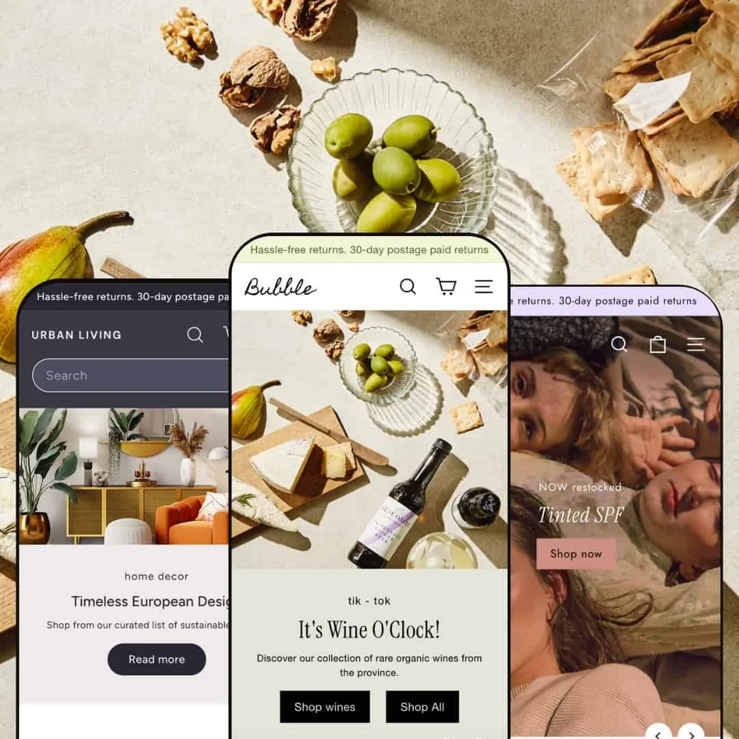
flexible preset options that maintain core functionality while offering distinct aesthetic approaches. Default feels like an interior design studio, Spritz feels like a tasting room mid-party, and Revive feels like a boutique facial bar. Underneath those different moods, the shopping mechanics stay aligned so the shopper doesn’t have to relearn the cart, the add flow, or the product page each time.
✚ Fast add-to-cart and upsell flow
Across demos, shoppers can add an item straight from a product card or a focused quick-shop modal. If a product has variants, the modal asks for size, colour, or flavour before it confirms the add. The moment something is added, a slide-in cart drawer appears with quantity controls, a running subtotal, and “Goes great with…” suggestions. That encourages multi-item baskets without forcing a full cart page reload.
✚ Visual merchandising that sells full looks
Expanse stages complete scenes instead of isolated SKUs. A living room with planters, a skincare routine laid out next to a model’s face, or a board of drinks and snacks all appear as finished vignettes. Shoppers can pull the pieces they like from those scenes. The message is simple: if you like the vibe, you can take the whole vibe home.
✚ Promotion and urgency tools
The theme ships with urgency cues like countdown strips for giveaways or holiday sales. These timers surface hours, minutes, and seconds, and they sit in high-visibility areas such as the hero or a promotional banner. That kind of built-in urgency normally requires an extra app, but here it’s already woven into the storytelling layer.
✚ Guided discovery for large catalogues
Expanse assumes you carry more than three products. Shoppers get obvious entry points — search placed directly in navigation, visual category buttons like Wine or Spirits, and curated bestseller or “New Arrivals” groupings. Collection and results pages stay structured with clear layout controls, so it’s easier to browse deep catalogues without feeling lost.
✚ Trust elements on product pages
Product pages reinforce confidence using compact icon rows that promise things like free shipping, free returns, or carbon neutrality. Some demos also surface pickup availability at a nearby store. Instead of burying reassurance in FAQ text, Expanse pins it next to the price and add-to-cart button, where hesitation usually lives.
Cons.
〰️
Cons. 〰️
− Heavy hero imagery can slow first paint
Large, high-resolution lifestyle banners are central to how Expanse sells mood. The cost is weight. On slower devices or weaker connections, those opening visuals can delay the first meaningful paint, and impatient visitors may bounce before the page fully settles. Merchants should compress hero assets before launch.
− Search consistency between presets
Spritz handles “no results” gracefully by suggesting categories and fan favourites. Default leans into seasonal promos instead of clearly saying “nothing found,” and Revive never truly admits “no results” at all — it just shows a generic grid. That inconsistency can confuse shoppers who expect honest feedback from search.
− Setup complexity and content workload
The theme gives you a lot: staged scenes, promo timers, testimonial sliders, pickup messaging, category buttons, and more. Getting all of that to feel intentional (not noisy) takes effort. Merchants who rush may accidentally ship clutter instead of clarity.
-
What works in this preset
The Default preset targets home and décor brands. Its dark header and muted neutrals feel upscale and slightly industrial, which matches furniture and interior accessories. The overall tone is slower, warmer, and more editorial than a typical catalogue grid. It looks like an interiors magazine rather than a storefront, which helps higher-ticket items feel intentional and styled instead of transactional.
This mood supports a more considered type of purchase. The preset feels curated rather than loud, and it frames furniture as “pieces for your space,” not interchangeable products on a shelf. That’s an important psychological difference for higher-value items like chairs, planters, and lighting.
Where it stumbles
The header styling could create contrast issues. The combination of a dark background and softer gray text looks elegant, but some text elements may not meet strict accessibility contrast targets for all users. On lower-brightness screens, navigation text can start to feel muted and less legible, and that might slow scanning.
-
What works in this preset
Revive is aimed at skincare and cosmetics. The visual language is soft pastels, clean serif headlines, and close-up skin photography. It feels like a boutique facial studio brought online, not a mass retailer. That tone immediately supports a “treat yourself” price point and positions products as part of a ritual.
The homepage is built as a sequence of confidence builders. There’s a bestsellers strip, curated category icons (“Serums,” “Face Mists,” and similar regimen-based groupings), and a testimonial slider with star ratings and customer quotes. Beauty is trust-heavy, and social proof right on the landing canvas reduces hesitation before someone even scrolls to ingredients. It’s a deliberate, calming presentation that says “this has worked for real people,” instead of shouting discounts.
Where it stumbles
Outside of a polished “Our story” page, long-form education is light. The demo doesn’t surface tutorials, ingredient breakdowns, or skincare routines beyond product cards and short blurbs. High-intent shoppers may still convert, but routine-seekers and ingredient-focused buyers could want more narrative support than they get out of the box.
-
What works in this preset
Spritz is built for food, drink, and “party in a bottle” energy. The hero imagery shows boards of charcuterie, fizzing cocktails, and playful taglines that read more like banter than corporate messaging. The palette is bright and appetising rather than neutral. It immediately signals “taste this now,” which is ideal for wine clubs, bottle shops, and craft beverage startups that want to feel lively instead of formal.
Email capture is handled in a very commercial way. The preset surfaces a tasteful discount pop-up (for example, 10% off in exchange for an email) right inside the browsing flow. That means the merchant can start building a list from first contact without bolting on a separate newsletter app or third-party popup. It is clearly conversion-minded and fits the “buy something fun tonight” tone.
Where it stumbles
The same discount pop-up that fuels list growth can interrupt the first few seconds of exploration. If it appears too aggressively, a new visitor might close it on instinct and mentally tune out future offers. Merchants will need to tune timing and frequency instead of leaving default timing unedited.
Spritz likes energy. Between giveaway messaging, “new arrivals,” seasonal callouts, and promo copy, the homepage can crowd the eye. Without careful pruning, important messages risk getting buried under equally loud messages, which can make the first scroll feel busy rather than guided.
Long menus and deep category trees can get heavy. The preset’s top navigation tries to expose many product types and sub-types at once. If a shop already has a wide assortment — wine, mixers, glassware, snacks — it can edge toward clutter, and curation becomes a real design job.
Some hero slides layer light text over bright photography. On certain backgrounds, readability drops. It looks fun and celebratory, but merchants should double-check headline contrast on mobile before going live.
Content depth is not its focus. Spritz, as demonstrated, doesn’t lean on recipes, pairing guides, or long-form “Our Story” content. Brands that rely on education or winemaker storytelling may need to build those pages manually.
Niche Suitability
Not Ideal For
-
Expanse shines for stores with real breadth. Furniture and décor shops, wineries and gourmet markets, and boutique skincare brands all get layouts that feel tailored to their space while reusing the same conversion backbone. If your goal is to raise average order value by nudging “add one more thing,” Expanse is built for you.
-
Ultra-minimal brands with one flagship product may feel drowned in modules. Expanse assumes storytelling, bundles, pairings, and a sense of curation. If you just want one hero SKU on a stark landing page with instant checkout and almost no distractions, a leaner theme is a better fit.
-
Medium —Expect to spend time art-directing hero imagery, curating cross-sell pairings, tuning pop-up timing, and pruning the homepage so it doesn’t shout in five voices at once. None of that requires custom code, but it does require taste and deliberate setup.
Final Recommendation
Rating
★ 8.2/10
-
Comprehensive feature set (quick add, quick shop, cart drawer, countdown timers, scene-style merchandising) with few omissions.
9
-
Sections are configurable in Shopify’s theme editor; the sheer number of blocks demands thoughtful organisation.
8
-
Layouts adapt cleanly to phones and tablets, and the slide-in cart drawer and variant-aware add flow remain usable.
8
-
The rich hero photography adds weight at first load; once loaded, interactions are smooth.
7
-
Multiple presets, strong visual identities, and modular sections make it adaptable to different verticals.
9
FAQ
〰️
FAQ 〰️
-
👑 Yes. The Spritz preset demonstrates how mocktail and wine merchants can use vibrant banners, countdown promotions and recipe content to create an immersive store
-
📱Yes. Pages reflow for smaller screens, and core interactions like quick-shop, add-to-cart, and the cart drawer remain available without forcing a full cart page reload.
-
🎨 Colours, fonts, hero imagery, promotional banners, testimonial sections, and urgency timers can all be edited in Shopify’s theme editor. You can rearrange or hide sections like “Shop the look,” swap photography, and change messaging without touching code.
-
⚡ Interactive elements such as the quick-shop modal and cart drawer respond smoothly in testing. The only performance caution is that large hero images (especially in the Default and Revive demos) can slow the very first paint, so merchants should optimise media.
-
It tries. After adding an item, the slide-in cart drawer surfaces quantity controls and “Goes great with…” suggestions immediately. That encourages add-on purchases in the same session instead of waiting for post-purchase upsells.
-
💱 Expanse uses Shopify’s native internationalisation. If your store is configured for multiple languages or currencies, the theme will surface those selectors so shoppers can browse and purchase in the options you’ve enabled.
-
⚙️ Because it follows Shopify’s section and product standards, it should cooperate with most mainstream Shopify apps. During testing, adding items via the theme’s own quick-add flow didn’t conflict with the cart drawer experience.
-
🛒 You can preview Expanse in your own Shopify store before paying. The Theme Store listing exposes live demos for each preset, and you’re allowed to install and test the theme in an unpublished state prior to purchase.
This review is based on hands-on testing of the publicly available Default, Revive, and Spritz preset demos of the Expanse Shopify theme as of 28 October 2025. Theme features, preset availability, and performance may change with future updates from the developer.