
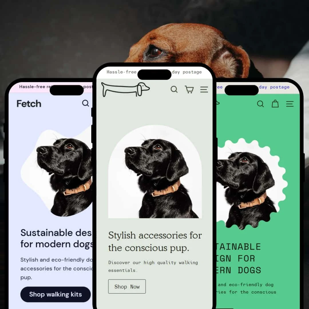
Fetch targets sustainable pet-product brands with three distinct aesthetics wrapped around one functional backbone. Across demos you’ll see consistent building blocks—predictive search, quick-add/quick-view, filterable collections, collapsible product tabs—presented with different visual treatments. The result is a theme that lets merchants pick an aesthetic without giving up core merchandising mechanics.
Pros.
〰️
Pros. 〰️
✚ Flexible merchandising modules
Across presets, Fetch ships with modern merchandising building blocks—quick-add and quick-view modals, countdown banners, testimonial sliders, lookbooks with hotspots, and a multi-column mega-menu. Merchants can assemble rich pages without hunting for extra apps, which shortens setup and preserves visual cohesion.
✚ Comprehensive product discovery
Predictive search, multi-level navigation, and robust filtering make finding items straightforward. Flicker’s in-context search overlay keeps the page visible while you type, which helps orientation during exploratory sessions.
✚ Thoughtful product pages
Collapsible accordions for shipping, care, and inquiries keep dense information tidy. Cross-sell blocks such as “Pairs well with” surface complementary items at the right moment, quietly increasing average order value.
✚ Consistent cart experience
All demos route to a full cart page with quantity steppers, order notes, and recommendations. While the absence of a slide-out drawer breaks the flow, the cart template itself feels trustworthy and complete.
Cons.
〰️
Cons. 〰️
− Interrupted shopping rhythm
Sending users to a dedicated cart page after add-to-cart introduces friction—especially on mobile—by pulling them out of the collection. A drawer would reduce context switching and speed up small baskets.
− Discovery inconsistencies by preset
Quick-view and filter depth differ across demos; Hush in particular keeps things sparse and hides details behind full-screen media. Merchants should choose a preset with eyes open, or plan to restage discovery tools to match their catalogue.
-
A neutral palette, generous white space, and lifestyle photography create a clean, magazine-style shopfront. The first screen pairs a full-width product image with a direct Shop Now call-to-action, keeping focus on the assortment rather than decoration.
What works in this preset
The restrained colour system and editorial spacing make product shots feel premium. Shoppers scan quickly, while the layout leaves room for brand storytelling.
Typography and image scale are balanced: headers guide the eye; product cards sit in breathable grids that don’t overwhelm. It’s a safe canvas for brands that value clarity over flash.
Where it stumbles
We didn’t find any cons for this preset.
-
Hush softens the experience with muted sage tones and oversized photography. The header reduces to a single Shop Now entry, and product pages often open into immersive, full-screen galleries.
What works in this preset
The photo-first framing builds a serene, boutique vibe. Large, gently toned images let textures and materials shine, which suits slower, story-led shopping.
Simplified top-level navigation keeps the chrome out of the way on small catalogues. With fewer header choices, visitors head straight to products.
Where it stumbles
The full-screen gallery can hide price, options, and add-to-cart behind a small close control. Some shoppers will miss that cue and assume details aren’t available.
-
Flicker turns up the volume: bright backgrounds, playful shapes, and ticker elements deliver an unapologetically energetic storefront. The header mixes a mega-menu with direct links to content pages for a lively, media-rich feel.
What works in this preset
High-contrast colour and large CTAs command attention. It’s easy to build a memorable first impression that nudges visitors to explore.
The bold framing pairs well with discovery features; the shop feels like a playground where browsing is the point, not just the path to checkout.
Where it stumbles
Visual motion and saturated hues can overpower subtle brands. If assets aren’t carefully curated, the page risks feeling busy rather than intentional.
Niche Suitability
Not Ideal For
-
Brands selling accessories, pet goods, and lifestyle products that want strong imagery plus built-in discovery and cross-sell tools. The three aesthetics—neutral (Main), calm (Hush), and bold (Flicker)—cover a wide range of identities without sacrificing core features.
-
Merchants prioritising ultra-fast, stay-in-context checkout or running single-product stores may prefer a theme with a slide-out mini-cart and less visual motion. Super-subtle luxury brands might find Flicker too busy and Hush too concealed for their shoppers.
-
Medium — You’ll configure imagery, promos, and cross-sells, and you may add an app to achieve a drawer-style cart.
Final Recommendation
★ 7.8/10
Rating
-
Strong set of merchandising modules; the lack of a slide-out cart and varying quick-view availability hold it back slightly.
8
-
Navigation is straightforward; Hush’s concealed product details and cart redirects add minor hurdles.
7
-
Responsive layouts and tap-friendly modals work well; full-page cart interrupts flow more on mobile than desktop.
8
-
Smooth transitions and fast modals; heavy imagery in Hush can slow first paint.
8
-
Three distinct aesthetics with switchable sections—easy to tailor look and feel.
8
FAQ
〰️
FAQ 〰️
-
👑 Yes. Layouts and imagery modules are geared toward accessories and lifestyle products; they translate well to pet-care, fashion, or eco-friendly shops.
-
📱Modals and accordions are touch-friendly; the full-page cart interrupts flow more than a drawer would. Staging aside, the shopping journey remains usable end-to-end.
-
🎨 Colour, typography, and section choices can be adjusted in the editor, and each preset starts from a distinct visual baseline.
-
⚡ Overall load times are good, and UI transitions feel smooth; image-heavy staging (notably in Hush) can slow the first paint.
-
👕 Yes. Variant selection appears on product pages, within quick-add, and in quick-view, so shoppers can choose size or colour before adding to cart.
-
🔎 The theme doesn’t add specialised SEO widgets; it also doesn’t get in the way of standard optimisation workflows.
-
💱 The demo headers/footers don’t display a language or currency switcher; if you need them, plan for staging that accommodates those controls.
-
⚙️ Countdown banners, testimonial sliders, and cross-sell blocks slot cleanly into pages and feel native to the design system.
-
🛒 Yes—live demos for all three presets are linked above, so you can evaluate look and staging in context.
This review is based on hands-on testing of the “Main” (modern), “Hush” (calm), and “Flicker” (bold) demos as of 15 September 2025. Theme features and presets may change with future updates.