
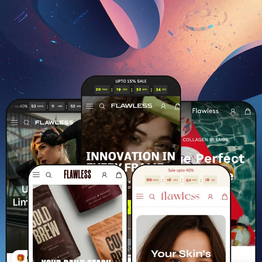
Most theme demos are really about selling you the theme. Flawless spends its five demos trying to sell you smart sunglasses, collagen sachets, vitamin C serum, oversized hoodies, and cold brew instead. It's an Online Store 2.0 theme from Ascend Themes built around a dense library of conversion sections, and the demos lean on them hard. At $300, the question isn't whether it has enough merchandising tools — it's whether your brand wants this much sell in its layout.
A coordinated merchandising kit, not a section grab-bag
The conversion sections work as a set: a competitor-comparison table, a before/after slider, image-hotspot shoppable banners, countdown timers, a press-coverage band, claim badges, and an "add all to cart" bundle row that all share one visual language. It hangs together. Deployed in sequence, they let you build an argument down the page instead of just listing products. For a conversion-focused DTC brand with a tight catalog and a story to tell, that breadth is the main reason to pay premium money here.
Five presets that actually commit to different verticals
Buy once and you get smart eyewear, wellness powders, skincare, apparel, and coffee, each staged as a believable store rather than a recolor of one homepage. Each holds up. Persona leans outfit-and-lookbook, Heal leans education-and-bundle, Chill leans calm-and-claims. For an agency or a multi-brand operator launching across categories, one license stretches across jobs that would otherwise mean separate buys.
A product page built to actually close apparel sales
On a variant-heavy product the page pulls real weight: a color-plus-size picker, a size-guide modal with a measurement table, a fit-feedback strip, product-care and shipping tabs, a stock counter, and a complete-the-look row. Clothing needs exactly this. It's a lot, but it's the right lot for garments. For an apparel or footwear merchant carrying real size ranges and return-sensitive buyers, this is the template that earns the tier.
Header staging with genuine merchandising depth
The mega menu does more than list links. Across presets it stacks structured columns, featured-product tiles with live prices, and promotional banner images inside a single dropdown. For a multi-category catalog where shoppers arrive by browsing rather than search, a header that surfaces products and promos on hover meaningfully shortens the path from landing to cart.
The default vibe is hard-sell, not quiet luxury
Urgency is wired into the demos: countdown timers, sale marquees, percentage-off badges, "only 10 left" counters, and discount popups stack up fast. For a mid-market or impulse-buy brand that's fuel. For a luxury or heritage label built on restraint, it's the wrong instinct, and stripping it back to something calm means switching off section after section. The demo sells hard because that is what it is for. A premium label may spend its first week turning the volume down.
No subscription surfacing for the consumable presets
Two of the five demos, collagen and coffee, are classic reorder businesses, but the product pages are staged for one-time purchase. There's no subscribe-and-save UI in the template, so a subscription-driven consumables brand will need a separate subscription app plus the integration work to wire its widget into the product page. The theme leaves room for it. It doesn't do it for you.
Built for hand-merchandised catalogs, not big ones
The whole design rewards manual curation: featured-product tiles, hand-picked shoppable galleries, "add all to cart" rows, story sections tuned page by page. On a twenty-to-fifty SKU catalog that's a strength. On a five-hundred-plus SKU store, that same hand-built approach turns into ongoing merchandising labor, and the standard collection grids do less of the storytelling the homepage sections do. The theme scales down beautifully. It scales up with effort.
What it takes to launch
Expect a multi-day pass to swap demo branding for your own across all five preset surfaces, rewrite hero, popup, and section copy, replace the demo imagery with real product and lifestyle photography, configure currency and locale defaults, and populate the metafields behind the comparison tables and benefit grids before launch.
-
What works in this preset
The eyewear demo is the busiest of the five, and it's the best showcase of what the section library can actually do. A "how we stack up against the competition" comparison block sits a few scrolls below a before/after lens slider, an image-hotspot shoppable banner, and an advanced-features grid walking through calls, music, and voice memos. I clicked through expecting filler. There's a real merchandising argument being built here, section by section.
The mega menu carries three structured columns (features, style, purpose) alongside two promo banner tiles and a featured-glasses list with live prices, the kind of header depth the other presets dial back. It's the deepest navigation staging in the set. A shopper browsing by face shape or use case has somewhere to go from the first hover.
Where it stumbles
The advanced-features section, staged here around calls, music, and Siri, reads as product copy for one very specific kind of smart glasses rather than a reusable layout. The section itself is theme-wide, but its staging is so tied to wearable tech that a non-tech eyewear merchant would gut most of it before launch. It works as a demo. It travels poorly as a template.
-
What works in this preset
Wellness brands live or die on education, and Heal stages for exactly that. A "what is collagen" explainer sits mid-page, a benefit matrix maps skin, hair, nails, joints, and gut across the range, and a before/after slider handles the visual proof. I read the explainer block twice. It isn't filler.
Bundles get their own real estate, with a dedicated bundle section and an "add all to cart" row that drops a full routine into the drawer in one tap. That's the whole pitch. For a consumable where the goal is a daily stack, that single button does a lot of quiet work.
-
What works in this preset
Routine is the most photographic of the set, leaning on tall model shots and a soft pastel palette. The brand-comparison matrix returns, this time pitting the store against two stand-in rivals on cruelty-free, transparency, and sensitive-skin claims. It's the clearest single use of that section anywhere in the demos.
Product cards run a clean discount treatment, with percentage-off flags and struck-through pricing handled at the card level rather than as an afterthought in the settings. The look is clean. Across a twenty-or-so SKU beauty catalog that reads as curated rather than cluttered, though the same density on a five-hundred-SKU store would feel very different.
-
What works in this preset
Persona is where the product page earns its keep. A dual-axis variant picker pairs color swatches with size buttons, a size-guide modal opens a full measurement table, and a fit-feedback strip lets shoppers report whether an item ran small or large. That's apparel merchandising done properly.
Separate Women and Men mega-menu trees keep a mixed catalog navigable, and a style-spotlight section plus a lookbook give outfit-led browsing room to breathe. I went looking for the complete-the-look pattern and found it twice, once on the homepage and again under the product. The repetition is on purpose. For cross-shopping apparel buyers, that's the point.
-
What works in this preset
Chill is the newest preset, added in the spring 2026 update, and it's the most relaxed of the five. A scrolling "sip better, feel better" marquee runs above a single calm hero, and unit pricing per 100ml sits right on the product cards. The voice stays consistent top to bottom.
An "in the press" band and a trio of claim badges (organic, no artificial flavor, no sugar) handle credibility, while a shoppable "brew crew favorites" gallery turns lifestyle shots into a buyable grid. Not every store needs the full arsenal. For a beverage brand selling on routine and vibe, the lighter section count genuinely suits it.
One section vocabulary, five convincing accents
Read all five demos back to back and the achievement isn't any single section, it's that the same kit bends into five different brand voices without looking like a reskin. Eyewear reads technical, beauty reads editorial, coffee reads casual. That range from one codebase is the theme's real signature, and it's the strongest argument for buying it over a single-vertical specialist.
Active, current maintenance
The theme is on version 11, and the newest preset landed in the spring 2026 update rather than at launch. A developer still shipping fresh presets and gallery redesigns two years in is a meaningful signal at this price. The roadmap is clearly still moving.
Homepages do the selling; interior pages thin out
The demos pour their energy into the homepage and the product page, where the section library shines. Collection and category pages, by contrast, fall back to fairly standard grids across all five presets, so the storytelling that makes the homepage compelling mostly stops at the listing pages. The drop-off is consistent. Shoppers who navigate by collection see a plainer store than the homepage promises.
An Online Store 2.0 core under newer paint
Under the styling, this is an Online Store 2.0 theme rather than one built on the newer Theme Blocks generation. For most merchants that's invisible and fine. But buyers specifically wanting AI-assisted block generation or the deepest nested-block editing won't find it here, and at the premium tier in 2026 some shoppers will be cross-checking for exactly that.
★ 7.8/10
Rating
-
The conversion-section library is unusually deep, and the apparel product page carries real variant, size-guide, and fit-feedback tooling.
9
-
Richness cuts both ways; the more sections a preset ships, the more configuration and copy work stands between install and launch.
6
-
Mobile menus use a stacked drawer pattern and the section layouts reflow to single-column cleanly.
8
-
Image-heavy demos with marquees and video lean toward weight, though lazy-loading and webp delivery keep the homepages reasonable.
7
-
The same section set convincingly produces five distinct vertical aesthetics, the clearest evidence of how far the styling bends.
9
Frequently Asked Questions
-
Match the vertical: Persona for apparel, Heal or Chill for consumables, Routine for beauty, Flawless for tech-forward eyewear. The section set is shared, so you're choosing a starting staging, not a different feature set.
-
It runs on product metafields, so you'll populate the comparison data per product before it displays correctly. Budget time for that data entry rather than expecting it to fill itself.
-
It can, but you'll be switching off urgency badges, countdowns, and sale marquees to get there. The defaults assume an active-promotion store.
-
Functionally yes, but the design rewards hand-curated merchandising, so a very large catalog leans harder on the standard collection grids than on the showcase sections.
-
The demo lifestyle shots are placeholders; plan to replace them with your own product and lifestyle photography before going live.
-
It's on version 11 as of spring 2026, with the Chill preset added in that recent update, so it's actively maintained rather than parked.
This review is based on hands-on testing of the publicly available preset demos of the Flawless Shopify theme as of June 3 2026. Theme features, preset availability, and performance can change with subsequent updates from the theme developer.