
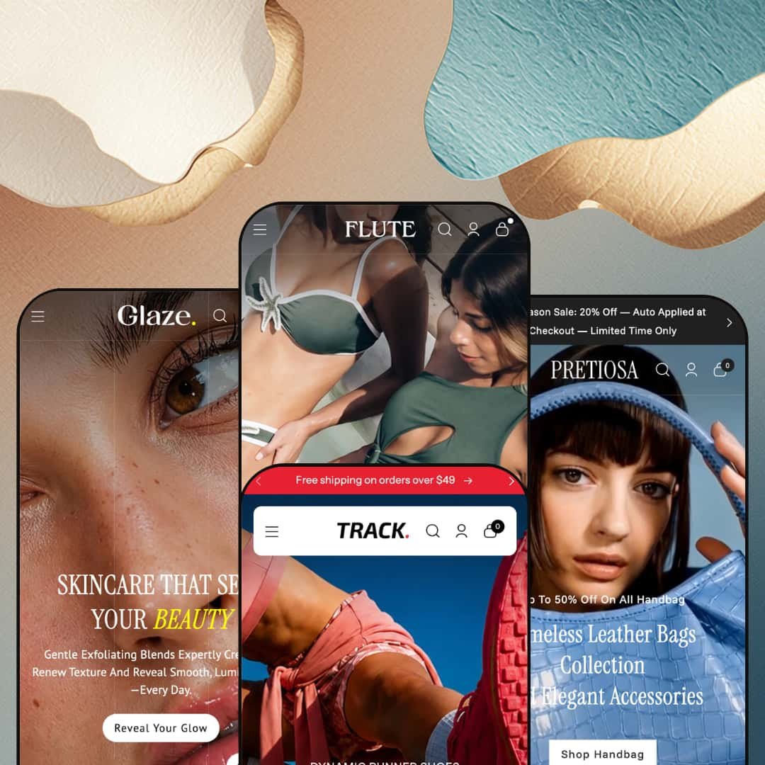
Most themes that stretch across four retail verticals end up generic in all of them. Flute, Webibazaar's $230 Online Store 2.0 theme, makes the opposite bet: one dense merchandising toolkit restaged four ways, for swimwear, footwear, handbags, and beauty. The four demos aren't short on capability; they're stuffed with conversion sections. The real question is whether that maximalism fits how you want to sell.
A navigation menu that behaves like a second storefront
Flute's mega menu isn't a list of links. Across the presets it carries featured product tiles, collection imagery, and blog cards inside the dropdown itself, so the header doubles as a discovery surface rather than just a way to jump between pages. For multi-category catalogs such as apparel or footwear stores with dozens of subcategories and cross-shopping buyers, that depth is the difference between a menu people use and one they ignore.
A cart drawer built to lift order value
Adding an item opens a slide-out cart that does more than confirm the add. It stacks a cross-sell rail ("Add additional item" with product cards), a free-shipping progress bar, and a sticky checkout button into one surface, so the moment of highest intent also becomes a prompt to add more. The timing is the point. For impulse-friendly, mid-market catalogs chasing a higher average basket, that's working real estate rather than decoration.
Visual discovery that rewards browsers
What happens when a shopper doesn't know the product name, only the look they're after? Flute answers with two recurring discovery patterns: a colorway navigator that maps shades to collections, and tagged lookbook imagery that turns an editorial photo into shoppable hotspots. Both reward wandering. For visual-first verticals like swimwear and footwear, where buyers shop by mood and palette before they shop by SKU, those surfaces turn browsing into baskets.
Four production-grade verticals from one license
Buy Flute once and you get four fully art-directed storefronts: swim, footwear, bags, and beauty, each with its own demo catalog, imagery, and copy voice. That's unusual value. The range matters for operators who haven't locked their final direction, or who run more than one brand from a single back office. A multi-brand seller or an agency building several mid-market stores gets four starting points for the price of one.
Loud by default
Out of the box, Flute sells hard. The demos lean on urgency: a countdown band, auto-applied "Midseason Sale" messaging, flash-sale marquees, stacked promo bars. When I tried to picture a full-price, quietly premium label here, I kept mentally deleting blocks, because softening that discount-forward tone means stripping the promotional sections a curated, small-catalog brand (think under 30 SKUs, considered purchases) would never run in the first place.
Social proof is staged, not collected
The testimonial sections look like reviews, but they're theme content you write yourself: a name, a role, a quote, sometimes a star number you type in. It isn't a review system. The theme doesn't collect or verify customer reviews, so product star-ratings and review widgets still come from an app like Judge.me, Loox, or Yotpo. Beauty and considered-purchase brands that live on social proof should budget for that app rather than assume the demo's praise wall is functional.
A fashion-and-beauty toolkit, not a universal one
Every preset shares the same DNA: visual, impulse-friendly, lifestyle goods. The merchandising vocabulary (lookbooks, colorway navigators, kit bundles, fragrance and serum sets) is tuned to swimwear, sneakers, bags, and skincare, and there's no demo or pattern aimed at spec-driven categories. An electronics, furniture, or B2B merchant whose buyers compare specifications and read long-form detail gets the frame but not the fit.
What it takes to launch
Plan a couple of focused days per store: rewriting hero, slideshow, and banner copy in your own voice; re-staging the mega menu around your real collections; populating product imagery and metafields; and configuring currency, language, and shipping-threshold settings before launch. The demos arrive richly populated, so expect to remove or re-skin sections as much as fill them.
-
What works in this preset
The navigation does real work. Open SHOP and you get silhouette-level subcategories (triangle, halter, plunge, high-leg) sitting next to a rail of collection tiles like Beachwear Edit and Blush Rush; NEW IN opens the same way into bras, sleepwear, and bodysuits. For a swim-and-intimates range that fragments into dozens of fits, that header turns a sprawling catalog into something a shopper can actually walk through.
Then the homepage keeps going. A dual-headline slideshow gives way to a quick-add product carousel, a countdown band, a tagged lookbook, a wall of testimonial cards, and an Instagram strip, all before the footer arrives. It's a long, browse-led scroll built for impulse-friendly swim shopping rather than quick in-and-out buying.
The search overlay is a nice touch. I clicked the icon and it surfaced curated quick-search chips (Bikini, Swimsuit, Beachwear, One-Piece) above tabbed results that split products from collections, blogs, and pages. Shoppers who arrive knowing the word for what they want get to it fast.
Where it stumbles
Of the four, this is the most editorial preset, and it still can't sit still. The discovery rails, countdown, and testimonial wall all jockey for attention high on the page, which suits a trend-driven swim label but works against a quiet, lookbook-first luxury positioning. Getting there means deleting sections, not nudging them.
-
What works in this preset
Track is where the engine flexes hardest. I noticed the "Everyday Running Shoes" carousel runs video inside the product cards, and the grid is dense with badges (New, Hot, Trend, percent-off) and quick-add buttons. It reads like a sneaker site mid-drop.
The header earns its keep too. A live countdown sits in the announcement bar above rotating shipping messages, and the SHOP dropdown folds "Top Picks For You" product tiles and "From The Blog" cards in beside the category imagery. Organized by use-case (running, training, trekking, casual), it gives a deep catalog a clear spine.
Lower down, a tabbed collection slider lets shoppers flip between Everyday Sneakers, Jogging Kicks, and Sport Essentials without leaving the section, and a trio of editorial banners routes to the right use-case. Browse paths are everywhere. That suits a catalog people shop by activity rather than by name.
-
What works in this preset
The first thing you notice is two menus where others give you one. SHOP and MINI BAGS each open into their own subcategory columns plus a "Handpicked For You" product rail, which fits a bag range that splits into category types (tote, crossbody, bucket, hobo, sling) and a separate curated mini line. It keeps two merchandising stories from colliding.
It also stages itself as accessible, not aspirational. The announcement bar stacks two offers (an auto-applied seasonal discount and a gift-with-purchase), a relaxed marquee repeats "Hang Out In Style," and demo prices sit in the $31–48 band. It's a high-street bag shop.
-
What works in this preset
Glaze is built for regimen shopping. Three menus (Skin Essentials, Explore, Promos) sort the catalog by concern (face, body, hair and scalp) and by kit, and a "Radiance Report" blog rail tucks editorial right into the dropdown. A routine-led beauty brand will recognize its own logic here.
The product mix leans on bundles. Starter kits and hydration sets sit alongside single serums and washes in the $21–35 range, nudging shoppers toward the kind of multi-item discovery that beauty routines invite. For a brand selling steps rather than one hero SKU, that emphasis lands.
Conversion logic that lives in the theme
Read the four demos together and the same thing keeps showing up: the selling tools are built in, not bolted on. Navigation, cart, discovery rails, urgency modules, and social-proof layouts ship inside Flute, which means the working app stack is lighter than the long feature list first suggests. For a merchant who'd rather not assemble and pay for half a dozen plugins to reach a polished result, that consolidation is the theme's quiet advantage.
It holds its art direction across very different stores
The harder trick Flute pulls off is tonal: the swim demo feels like a swim brand, the sneaker demo feels mid-drop, the beauty demo feels like a regimen line. That's art direction doing its job, not one palette swapped four times. Buyers weighing whether a single theme can credibly carry their specific category can see the answer modeled four ways.
One structural personality underneath
When I scrolled all four demos back to back, the sameness surfaced: the same menu pattern, the same cart, the same lookbook-and-testimonial rhythm, restaged with new photography. It's efficient, and most merchants only ever deploy one preset, so they won't feel it. But anyone hoping the four presets represent four genuinely different layout systems will find one well-dressed skeleton in four outfits.
A short track record
Flute is young and lightly reviewed: 100% positive, but across only nine ratings, with roughly eight months on the Theme Store. There's nothing negative in that record; there simply isn't much of it yet. Buyers who weigh established review counts heavily have a thinner signal to read than they'd get from a long-tenured theme.
★ 7.6/10
Rating
-
The native conversion and merchandising set is broad for the price: cross-sell cart, free-shipping bar, countdown, swatch filters, quick view, stock counters, lookbooks. Little of it depends on apps.
8
-
Editing is familiar Online Store 2.0 section work, but the demos arrive densely populated, so there's a lot to rearrange or remove before a store feels like your own.
7
-
Dedicated mobile hero and lookbook assets and a stacking mega-menu pattern handle phones well; the long, section-heavy pages still ask for plenty of scrolling.
8
-
Pages use WebP imagery and lazy-loaded media, though the high section count and autoplay video on some presets add weight worth watching.
7
-
Four distinct presets and a deep shared section library give a lot to start from, even if the underlying layout grammar stays consistent across them.
8
Frequently Asked Questions
-
The mega menu, swatch filters, and use-case collection sliders are built for many subcategories; a 10-SKU store would leave most of that navigation empty. It rewards depth.
-
That's just its idle state with no sale scheduled. Point it at a real end date and it counts down; the demo simply isn't counting toward anything.
-
You can strip it down, but you'd be working against its intent. Flute is built for catalog merchandising with deep navigation, not a single-hero-product layout.
-
Some presets, Track especially, use background and in-card video. You can swap those for images to cut page weight without losing the layout.
-
In the header and footer. The selectors are the theme's UI; the actual conversion and translation run on Shopify Markets, which you configure in admin.
-
Not really. You deploy one preset, but the section library is shared, so you can borrow blocks from the other three as you build.
This review is based on hands-on testing of the publicly available preset demos of the Flute Shopify theme as of June 25 2026. Theme features, preset availability, and performance can change with subsequent updates from the theme developer.