
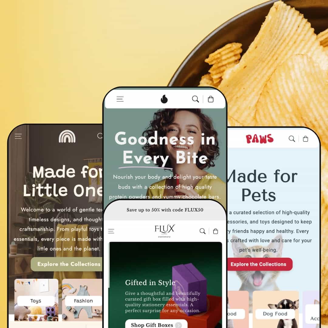
Flux positions itself as a versatile Shopify theme that can cover food, stationery, kids’ products and pets within one codebase. Across presets the first impression is clean and inviting: a large hero or category grid anchors the top of the page and a clear type hierarchy guides visitors toward products instead of burying them in text. Colour direction changes by style, with soft pastel tones in the Default demo, saturated greens in Scribbly, playful pastels in Tinki and light blues in Paws, while all of them keep generous white space. The navigation bar stays visible as shoppers move down the page, so search, cart and the main menu are always within reach and the site feels cohesive even as layouts change dramatically between presets.
Pros.
〰️
Pros. 〰️
✚ Flexible presets, consistent core
Flux offers flexible preset options that maintain core functionality while offering distinct aesthetic approaches. Each of the four demos targets a different vertical — from health food and stationery to kids’ products and pets — yet they all share the same underlying navigation, product presentation and checkout flows. That consistency means a merchant can switch presets or mix ideas between them without relearning how the theme behaves.
✚ Quick actions and cart drawer
Across presets, product cards support quick actions such as quick view and inline add, and adding items leads into a cart drawer rather than a separate page. Shoppers can inspect product details in a modal, adjust quantities and see updated totals without losing their place in a collection or content block. This pattern keeps the experience feeling fast and reduces the number of full page loads between browsing and checkout.
✚ Merchandising and recommendations
Flux consistently surfaces cross‑sell suggestions near cart elements and at the bottom of product pages, sometimes alongside “recently viewed” items. These blocks are woven into the layout rather than tacked on, so recommendations feel like part of the shopping journey. Merchants can lean on these zones to increase average order value without resorting to intrusive pop‑ups or complex upsell apps.
✚ Content‑rich informational pages
The theme includes templates and staging for About pages, team overviews, timelines, events, journal entries, FAQs and contact forms, and these appear in different combinations across presets. Because those templates borrow the same visual language as the storefront, shoppers moving from products to story content do not feel like they have left the main site. For merchants with a strong brand narrative or community component, this makes it easier to tell that story alongside the catalog.
✚ Sticky navigation and purchase flows
Sticky headers and, on many product pages, sticky add‑to‑cart bars keep key actions on screen as shoppers scroll. When combined with clear typography and structured product information, this reduces the friction of finding the cart or buy button after reading long descriptions or FAQs. The result is a theme that quietly keeps the next step visible, which is particularly useful for mobile visitors and longer forms of content.
Cons.
〰️
Cons. 〰️
🚫 Cross‑sell links can disrupt the flow
In multiple demos, some cross‑sell plus buttons near the cart lead to external or sign‑in pages rather than adding items silently. Those detours break the otherwise smooth cart drawer pattern and can confuse shoppers who expect a simple quantity change or confirmation. Merchants will need to review and, if necessary, adjust how these cross‑sell blocks are wired so they behave consistently.
🚫 Feedback on quick‑add actions is sometimes subtle
Quick‑add controls on product cards add items to the cart without always opening the drawer or providing strong visual feedback. While the cart icon count does update, it is easy for a distracted shopper to miss this small change, especially on busy grids or long scrolling pages. Stores that rely heavily on rapid multi‑item basket building may want to test whether this pattern feels clear enough for their audience.
🚫 Small performance hiccups on interactive elements
During testing, certain interactive components such as the first quick‑view modal or mega‑menu hover occasionally took longer to appear than the rest of the page. The delays were not severe, but they were still noticeable during regular browsing. For shoppers, that can translate into a brief moment of uncertainty about whether a click or hover has registered.
-
The Default preset frames Flux as a contemporary health‑food store with strong product photography and nutrition‑centric messaging. It leans on soft colours and clean typography so the imagery of powders, snacks and prepared food feels fresh rather than cluttered. The overall effect is calm and “better for you,” which fits the wellness niche the demo is staged around.
What works in this preset
The Default style uses its hero area and first few sections to set a clear “healthy convenience” story. Products are grouped into tight, visually consistent grids and banners that echo the same colour family, so shoppers moving from hero to product cards never get jolted by a radically different look. That kind of visual continuity helps merchants who sell multiple formats of the same product category, like powders, snacks and gift cards, present everything as one brand rather than a patchwork.
Copy and imagery are coordinated in a way that feels very specific to this preset. Section headings, background colours and icon choices lean heavily into the “fuel” metaphor, so even generic blocks like feature rows feel on‑theme for nutrition and energy. A store that already has strong packaging can drop assets into this structure and get a coherent brand impression without much layout surgery.
Further down the page the Default preset alternates product grids with more editorial content and promotional callouts, while staying inside the same restrained palette. That pacing makes it easier to weave storytelling and merchandising together; a merchant can talk about how their product works, then immediately surface a small, relevant set of items without dropping into a different layout mode. It feels designed for brands that want education and commerce sitting very close together.
Where it stumbles
Most of the rough edges observed on this preset are shared with the rest of the theme rather than coming from Default’s styling choices. The colour system and composition themselves do not introduce any obvious, style‑specific usability issues, so merchants mainly need to be aware of the theme‑wide behaviors discussed in the conclusion.
-
Flux Paper (Scribbly) reimagines the theme as a stationery and gifting shop, anchored by an ink‑friendly dark‑green hero and a lot of paper texture in the visuals. The home page quickly leans into cards, planners and gift boxes, so the entire experience feels tactile even though it is entirely digital. Typography and colour in this preset push the impression of a design‑literate brand without becoming fussy.
What works in this preset
The hero and top‑of‑page content in Scribbly do a good job of signalling that this is a store about paper, printing and thoughtful objects. Rich but muted greens and off‑whites give product shots a gallery‑style backdrop, which flatters greeting cards and planners because small design details remain legible. That aesthetic choice makes the whole layout feel like an extension of the product rather than a generic frame bolted on later.
Product cards in this preset also feel tailored to stationery. The way titles, prices and decorative elements align gives each card the rhythm of a mini cover rather than a basic list entry. When shoppers scan a grid of cards, they get a sense of the brand’s overarching style even before reading individual titles, which is helpful for merchants selling lots of similar SKUs with modest price differences.
The About and supporting pages keep the same editorial direction, with founder stories, team images and service highlights composed in clear blocks that mirror how a studio or small press might structure its portfolio. That consistency between catalog and content pages makes the store feel less like a commodity marketplace and more like a studio that just happens to have a checkout.
Where it stumbles
On collection grids in this preset, shoppers move into quick view or full product pages before adding items. For a gifting or stationery store where customers might buy multiple low‑priced items in one session, merchants can decide whether that pattern fits how they expect people to build a basket or whether they prefer to emphasise add‑to‑cart affordances more directly from the grid.
-
The Tinki preset repackages Flux as a children’s world, full of soft pastels and playful illustrations. The layout leans into “little explorers” language and visuals so parents immediately understand this store is about kids’ clothes, toys and room decor rather than general lifestyle. The aesthetic is deliberately gentle to align with baby and toddler products.
What works in this preset
From the hero banner through to the first product rail, Tinki maintains a child‑friendly tone using rounded shapes, bright but soft colours and generous spacing. The hierarchy keeps product photography front and centre while still allowing enough room for short, reassuring bits of copy, so parents can quickly skim what makes a product special without wading through heavy text. It feels like a visual extension of modern kids’ brands that design for both young children and their caregivers.
Category blocks and mid‑page highlight sections are staged to look like curated “worlds” rather than raw lists. Clothing, toys and furniture each get their own visual treatment that still ties back to the overall palette, which helps merchants tell stories around outfits, playtime or room setups rather than just listing every SKU. That staging can make it easier to run seasonal edits, like back‑to‑school or holiday sets, without completely rebuilding the page.
The tone of the preset is also cohesive across non‑product content. Testimonials, reassurance messages and secondary banners all use a friendly, conversational voice that matches the visual design. This alignment is helpful for small teams that may not have separate copywriting and design resources, because the demo itself offers a clear model for how to talk about kids’ products in a way that matches the layout.
Where it stumbles
The very specific palette and child‑focused staging that make this preset strong for kids’ products also narrow its usefulness outside that niche. Brands in adjacent categories, like maternity wear or general lifestyle, might find the colours and iconography too whimsical or youthful, which means they would spend additional effort toning the design down to fit a broader audience.
-
The Paws preset is Flux’s take on a pet‑focused store, with bright blues, warm accent colours and plenty of imagery of cats and dogs. The layout combines merchandising with a strong sense of community by weaving stories, offers and brand elements into a single long page. It feels like a friendly neighbourhood pet shop translated into an online experience.
What works in this preset
The homepage composition in Paws leans heavily on expressive photography of animals, which immediately grounds the store in its category. Category blocks for dogs, cats and other segments are staged with clear labels and imagery that matches the type of product shown, so visitors quickly know where to go even if they land mid‑page. This visual clarity can be especially helpful for new customers who are browsing without a specific item in mind.
Paws uses a mix of promotional areas and story‑driven content to create a sense of “club feel.” Sections highlighting top offers, favourite picks of the week and behind‑the‑scenes glimpses of “Paws Founders” or similar messaging make the site feel more like an ongoing relationship than a one‑off transaction. For brands that run frequent campaigns or want to build loyalty, that kind of framing can help keep the homepage fresh without disturbing overall structure.
The supporting pages in this preset — including the team, timeline, journal, FAQ and contact — carry the same light, approachable tone as the homepage. Timelines and event‑style content blocks let a merchant showcase milestones or local happenings, while the FAQ and contact forms reduce friction for visitors who have practical questions. That breadth of content templates makes this preset a strong fit for community‑minded pet businesses.
Where it stumbles
The demo’s contact page ships with a map pinned to a specific city, which works for the staged brand but will not match every merchant out of the box. While this is easy to reconfigure, it does mean that a new store owner needs to remember to adjust or remove that visual so customers are not misled about the physical location.
Niche Suitability
Not Ideal For
-
Flux is best suited to merchants who want a single theme capable of covering several product types, but who still care deeply about visual coherence and modern interaction patterns. Health‑focused food brands, stationery and gift shops, kids’ stores and pet retailers can all find a preset that gives them a strong starting point without needing a second theme.
-
Merchants who require very aggressive, app‑like collection interactions or highly experimental layouts might feel constrained by Flux’s more measured approach. If your store depends on extremely specialised product configurators or unusual browsing patterns, a more niche theme or a custom build may be a better fit.
-
Medium — the presets are well staged, so a merchant can get something presentable by swapping in their own assets and copy, but fine‑tuning quick‑add behaviour, cross‑sell logic and some content templates will still take deliberate configuration and testing.
Final Recommendation
★ 8.2/10
Rating
8
8
9
7
9
-
Covers standard capabilities along with quick view, cart drawer and cross‑sell features that appear consistently across the demos.
-
The mega‑menu, sticky elements and clear typography make navigation straightforward, though occasional delays in quick view or menu loading can interrupt the otherwise smooth experience.
-
Across presets, sticky buttons and simplified menus keep primary actions reachable on smaller screens, and the layouts adapt cleanly to narrow viewports.
-
Most pages load promptly, but some interactive components such as the first mega‑menu hover or modal open a little slower than the rest of the interface.
-
Four distinct presets offer varied aesthetics while maintaining a consistent structural approach, so merchants can change visual direction without relearning their theme.
FAQ
〰️
FAQ 〰️
-
👑 Yes. The Default preset is staged around health‑food and supplements, Scribbly is styled for stationery and gifting, Tinki is tuned for children’s products, and Paws focuses on pet supplies. These presets give merchants in those niches a clear visual and content model right out of the box.
-
📱In testing, all presets adapted cleanly to smaller screens, with stacked layouts, sticky headers and persistent cart access helping keep key actions visible. Quick view modals and cart drawers remained usable without crowding the viewport.
-
🎨 Each preset demonstrates a different way to combine colour schemes, typography and imagery, and those elements are configurable through theme settings. Merchants can adjust palettes and fonts while reusing the same underlying sections, and unique pages like About, events and journal posts can be restyled to match.
-
⚡ General page loads felt snappy, and browsing between collections and products did not introduce noticeable delays. The only slow spots were occasional pauses when first opening quick view modals or mega‑menus, which are worth testing on your own catalog size and app stack.
-
👕 Across presets, product pages show variant choices such as colours or sizes using clear selectors, often supported by sticky purchase bars. This makes it easier for shoppers to confirm which variant they are buying even after scrolling through long descriptions or related content.
-
🔎 Flux relies on Shopify’s standard SEO features while providing clean, readable markup and well‑structured headings on content pages like About, journal and events. The demos show meaningful titles and copy in these sections, which can be adapted to match a merchant’s keyword strategy.
-
💱 Language and currency behaviour on the storefront is handled by Shopify itself rather than by theme‑specific logic. Selectors and translations are controlled through Shopify settings and apps, and the demos show they can be surfaced in the header or footer without clashing with the overall layout.
-
⚙️ Because Flux follows standard Shopify patterns, most apps that rely on product forms, cart updates or content blocks should integrate cleanly. As with any theme, merchants should test key apps, especially those that alter the cart or checkout flow, to make sure they play nicely with the drawer and quick‑view behaviours.
-
🛒 Yes. Shopify’s theme store allows merchants to preview Flux on a store before purchasing, and the publicly available demos for Default, Scribbly, Tinki and Paws give a good sense of how the theme behaves with different content types.
This review is based on hands-on testing of the publicly available Default, Scribbly, Tinki and Paws demos of the Flux Shopify theme as of 2025-12-02. Theme features, style availability and performance can change with subsequent updates.