
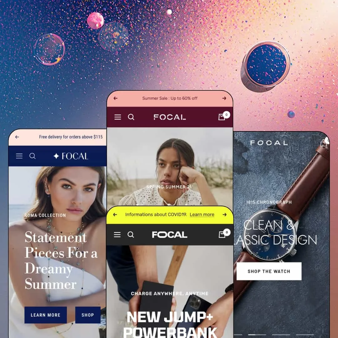
Most tech-accessory storefronts look like spec sheets. Focal's lead demo looks like a photography portfolio that happens to sell cables, and that single design decision explains almost everything else about this $320 theme from Maestrooo. It runs on Online Store 2.0, ships four presets that stretch from iPhone cases to Danish watches to Monaco silver jewelry, and has been in the Theme Store since November 2016 with its thirteenth major version landing in March 2026. A ten-year-old theme either earns its keep or shows its age, and Focal does a bit of both.
Mega menus built as merchandising surfaces
Focal's mega menu supports multi-column link groups with headed sub-columns plus a row of promo tiles per panel, each tile carrying an image, a title, and a one-line tagline. That means the menu can sell, not just route. For electronics or multi-category merchants with 200+ SKUs and three or more top-level departments, that promo row replaces a homepage banner slot with something shoppers see on every page.
The announcement bar that turns into a campaign panel
Short version: it expands. The announcement bar accepts a "Learn more" trigger that opens an inline panel with image, heading, body copy, and a button, and closes again without a page load or a popup overlay. For single-brand merchants running one seasonal campaign at a time, it's a way to put a second hero on every page without pushing the actual hero down.
Product page information blocks that scale with the catalog
Apparel and jewelry merchants with considered-purchase buyers and 50 to 500 SKUs get the most out of this one. The product template carries a tab group, stackable text blocks with their own headings, a help popover, a size-chart modal, SKU and inventory-state display, a variant colorway switcher section, and a cross-sell row, and every piece can be reordered or removed per template in the editor. A merchant can run a spare buy box for cables and a long-form one for a flagship product from the same theme without custom code.
Collection pages that do more than list
Dawn's collection page is a banner, a filter bar, and a grid. Focal adds a sub-collection navigation row with image tiles, lets you drop promo tiles into the product grid itself, and appends a second curated product row below the grid. For catalog-driven merchants with 500+ SKUs organized by compatibility or sub-category, that trio turns a collection page into a department page with its own merchandising, which is the main thing the free baseline can't do.
One-tap add never reaches the card for multi-variant catalogs
Single-variant products get a "+ Add to cart" button on the card. Anything with a second axis gets "Quick view" instead, and the add happens inside the modal. For apparel, footwear, or jewelry merchants where every SKU carries a size and a color, that means the grid never closes a sale on its own, and every purchase routes through either a modal or the product page. On a 300-SKU catalog that's a speed bump shoppers hit on every single card. That's a design choice, but it's a costly one.
Online Store 2.0 architecture at a 2026 price
Focal runs on Online Store 2.0 with blocks nested roughly two levels deep. It does the job well. But at $320 in August 2026, a merchant is also weighing it against Theme Blocks themes that allow deeper nesting and AI block generation, and Focal's March 2026 release notes point to account-component and metafield work rather than an architecture jump. For agencies or holding-company operators standardizing on one theme across several storefronts for the next three years, that matters more than any single feature.
Five-language interface strings and no further
The theme ships pre-translated UI strings for English, French, Italian, German, and Spanish. Product data is always the merchant's job via Shopify Markets, but button labels, form text, and cart copy are theme work, and a merchant selling into Dutch, Nordic, or Polish markets with a 200+ SKU catalog will be translating those strings by hand or through an app before launch. That's a real gap for a theme whose own demo footers list currencies for every country on earth.
No gifting or urgency layer beyond a stock counter
Across all four demos I saw an order note in the cart drawer and an "In stock" line on product pages, and that's the extent of the conversion pressure. No countdown staging, no free-shipping progress bar in the drawer, no gift wrap or gift message block. For gift-led jewelry or beauty merchants with repeat-buyer audiences, those are the levers that move average order value, and here they're all app installs.
What it takes to launch
Expect a multi-day pass across hero image pairs (desktop and mobile crops for every banner), announcement-panel copy, mega menu promo tiles, size-chart and tab content, collaboration landing pages, navigation cleanup, and About and FAQ narrative before any of the four presets is ready to carry a real brand.
-
What works in this preset
The first thing I clicked was the announcement bar, and it opened. Instead of a one-line ticker, the bar expands into a full panel with an image, a paragraph about the Heritage Collection, and a Shop button, then collapses back out of the way. For a brand running one hero campaign at a time, that turns the least-loved strip on the page into a second hero slot that doesn't cost vertical space.
Navigation is where the electronics positioning gets serious. The mega menu splits into "Shop by Category" and "Shop by Device," and the device panel fans out across iPhone, MacBook, iPad, and AirPods sub-columns with nineteen compatibility collections, each panel closing on a promo tile with its own tagline. Depth like this is exactly what a case-and-cable catalog needs. It lets a shopper land on "iPad Pro 11 inch" in two moves without ever touching a filter.
On the product side, the AirPods case page reads like a mini landing page. Below the buy box you get a "Need help?" popover with support hours, Description and Tech Specs tabs, stacked Shipping, Warranty, and Secure Payment blocks, a "Why We Designed This" story section, a three-tile colorway switcher that deep-links to each variant, and a press row with a pull quote. That's a lot of architecture for a $29.99 silicone case, and it would carry a $299 speaker just as well.
Where it stumbles
Electronics buyers compare. The Carbon demo stages nineteen device collections and a Tech Specs tab, but nothing on the product page or collection page lines two products up side by side, so a shopper weighing the Drop XL charger against the Watch Edition has to hold both pages in their head. For a theme whose Theme Store tagline is "standout tech imagery," the gap between image-led and data-led electronics merchandising is visible here.
-
What works in this preset
Walk through the Ivory homepage as a shopper and the rhythm is obvious: big campaign image, Women and Men buttons, a product grid with tabs, a shop-the-look image with two hotspots, then a sustainability panel. Nothing fights for attention. The burgundy palette and the slow pacing read as a Scandinavian mid-market label rather than a fast-fashion outlet.
The dress page I spent time on carries an eighteen-combination variant matrix across three colors and six sizes, and the size picker sits next to a "Size chart" link that opens a modal with two full EU/UK conversion tables for tops and bottoms. Below that, a "Complete the look" row pairs the dress with a cardigan and jeans. This is the apparel product page in its most complete demo form.
I went looking for how the theme treats sale merchandising and found it baked into the card grammar. Cards in the Essentials grid render "Save 50%" badges, strike-through regular prices, "1 color available" counts, "New!" labels, and "Sold out" states, all in one grid, without looking cluttered. For a label running seasonal markdowns across a 100 to 300 SKU catalog, that card density does a lot of quiet selling.
Where it stumbles
Ivory stages a two-gender apparel brand with a full size run and then puts a Women's-only size chart behind every product I opened, including menswear. The data lives in a page-level block rather than a per-product or per-collection one in the demo, which means a merchant with distinct men's and women's fit tables has conditional-logic work ahead before the chart stops lying to half the catalog.
-
What works in this preset
Nobody expects a watch store to sell the year 1815. Quartz does, through a tabbed "Back in time" section where each watch face gets its own tab, image, and origin story about chronographs and self-winding patents, and the same tabbed image-with-text mechanic shows up again as the brand's "A dream came true" story lower down. It's the strongest piece of storytelling kit in the whole preset family.
Variant handling gets its real test here. The featured 1969 model on the homepage runs two case sizes against seventeen straps, twenty-seven combinations in total, and the picker renders both axes as clean pill groups with the full variant list wired underneath so nothing gets orphaned. The homepage featured-product section carries that entire gallery and picker above the fold, so a shopper can configure and add without ever opening the product page.
The "Personalize your watch" section is a nice touch of vertical thinking. Two image tiles route to a face-color collection and a strap collection, framing the strap catalog as customization rather than accessories, which is how a watch brand with 20 to 80 core references and a long strap tail actually wants to merchandise.
-
What works in this preset
Sapphire is the only preset that drops the search icon from the header. Navy, gold accents, and a four-column "Chic, Fun, Fashion" category grid do the browsing instead, and the mega menu leans on a "Shop By Color" column (White Silver, Yellow Silver, Pink Silver) alongside type. For a jewelry brand with under 200 SKUs, color-first navigation mirrors how people actually shop metal.
The ring page shows the theme's inventory and identity cues at their most useful. A SKU line sits directly under the review count, the ring size picker runs 48 through 60 as pills, and the price renders in euros with a comma decimal because the demo is localized to France. Small things, but a fine-jewelry buyer notices when a site looks like it knows what it's selling.
This preset also stages the video section, a campaign still for the Enchaînée line with a play overlay, and a brand-history timeline with year tabs from 1982 to 2022. Editorial weight like that suits a considered-purchase jewelry brand better than a grid of products ever would. The Instagram-style eight-tile gallery below it fills the social-proof slot without needing an app feed.
Where it stumbles
Jewelry at €276 to €666 is gift territory, and Sapphire stages none of the gifting mechanics a gift-heavy brand leans on: no gift-wrap option, no gift message field on the product page, no "ships by" date cue. The cart drawer carries an order note, which a merchant can repurpose for engraving or messages, but that's a workaround, not a feature.
Four verticals, one section grammar
Reading all four demos back to back, the same components reappear in the same roles: slideshow, tabbed featured collection, shop-the-look hotspots, featured product with full gallery, press row, tabbed timeline, blog, image newsletter. A merchant who learns Focal on the electronics preset can rebuild it as a jewelry store without relearning the editor, which is a bigger practical win than any of the presets individually.
Demos built on real catalogs
Every preset borrows an actual brand's products and photography, with the attribution in the footer. That means the variant matrices, sale pricing, sold-out states, and collection depth you see are real-world data shapes, not placeholder lorem. It's the most honest preview of how a theme behaves with messy inventory that I've come across in this price range.
Image-first discipline all the way down
Focal never lets text carry a section that imagery could. Hero slides, announcement panels, timeline tabs, collection tiles, and newsletter blocks all lead with a full-bleed photograph, and the theme's mobile treatment expects a dedicated portrait crop for each. For brands with a photography budget, that discipline produces storefronts that look art-directed by default.
Presets differ in palette, not in structure
The four homepages follow the same section order with different colors, fonts, and photos. Buying Focal for the Sapphire look buys you a navy-and-gold skin over the Carbon skeleton. Merchants hoping a preset choice would give them a different information architecture will find themselves rebuilding the homepage anyway.
Two images per banner is the price of admission
The desktop-plus-mobile crop convention runs through every hero, announcement panel, and shop-the-look section in every preset. It's why Focal looks so good on a phone, but it also means a brand without a photographer on retainer ends up with stretched or awkwardly cropped imagery on one device or the other. The theme assumes you can feed it.
Storytelling without data
The timeline tabs, press rows, and collaboration pages are all hand-written rich text. Nothing I found across the four presets pulls product attributes from metafields into a structured section, so the editorial layer and the catalog layer never really talk to each other. For merchants who need spec-driven content at scale, that's a ceiling.
Rating
★ 7.4/10
-
Mega menu promo tiles, expandable announcement panel, promo tiles inside collection grids, and a deep product-page block library; gifting and urgency tooling is thin.
8
-
The section grammar repeats across presets so the learning curve is short, but every banner wants two image crops and the product template has many blocks to configure.
7
-
Dedicated mobile image variants on every hero and shop-the-look section, a drawer menu that stacks the full mega menu depth, and sticky add-to-cart on product pages.
8
-
Homepages run long with featured-product galleries of fifteen to twenty-eight images loaded inline; image lazy-loading keeps it workable but these are heavy pages by design.
7
-
Color, typography, and section-level image control are generous, yet all four presets share one homepage skeleton, so structural variety comes from the merchant, not the theme.
7
Frequently Asked Questions
-
No. The "2 reviews" links on product pages anchor to a reviews pocket designed for a review app; Focal provides the integration slot, and a merchant needs an app like Judge.me or Shopify's own reviews to populate it.
-
Yes. The bar renders Previous and Next controls, and the Carbon demo pairs a rotating message with the expandable panel, so multiple campaigns can cycle without stacking bars.
-
The Quartz demo runs a watch with twenty-seven size-and-strap combinations as two pill groups with the full variant list wired underneath. Options render as text pills by default rather than image swatches for strap materials.
-
Version 13.0.0 moved the header login button to Shopify's managed account component for Shop-based quick login and added brand metafield support for social links that fall back automatically when theme settings are empty.
-
Yes. The slide-out cart drawer includes an "Add order note" toggle with a save action in every preset, which is the only free-text capture point on the purchase path.
-
The Theme Store listing flags quantity pricing and combined listings as Plus-tier supported features, so B2B volume tiers and sibling-product consolidation render natively on Plus stores without template edits.
This review is based on hands-on testing of the publicly available preset demos of the Focal Shopify theme as of August 21 2026. Theme features, preset availability, and performance can change with subsequent updates from the theme developer.