
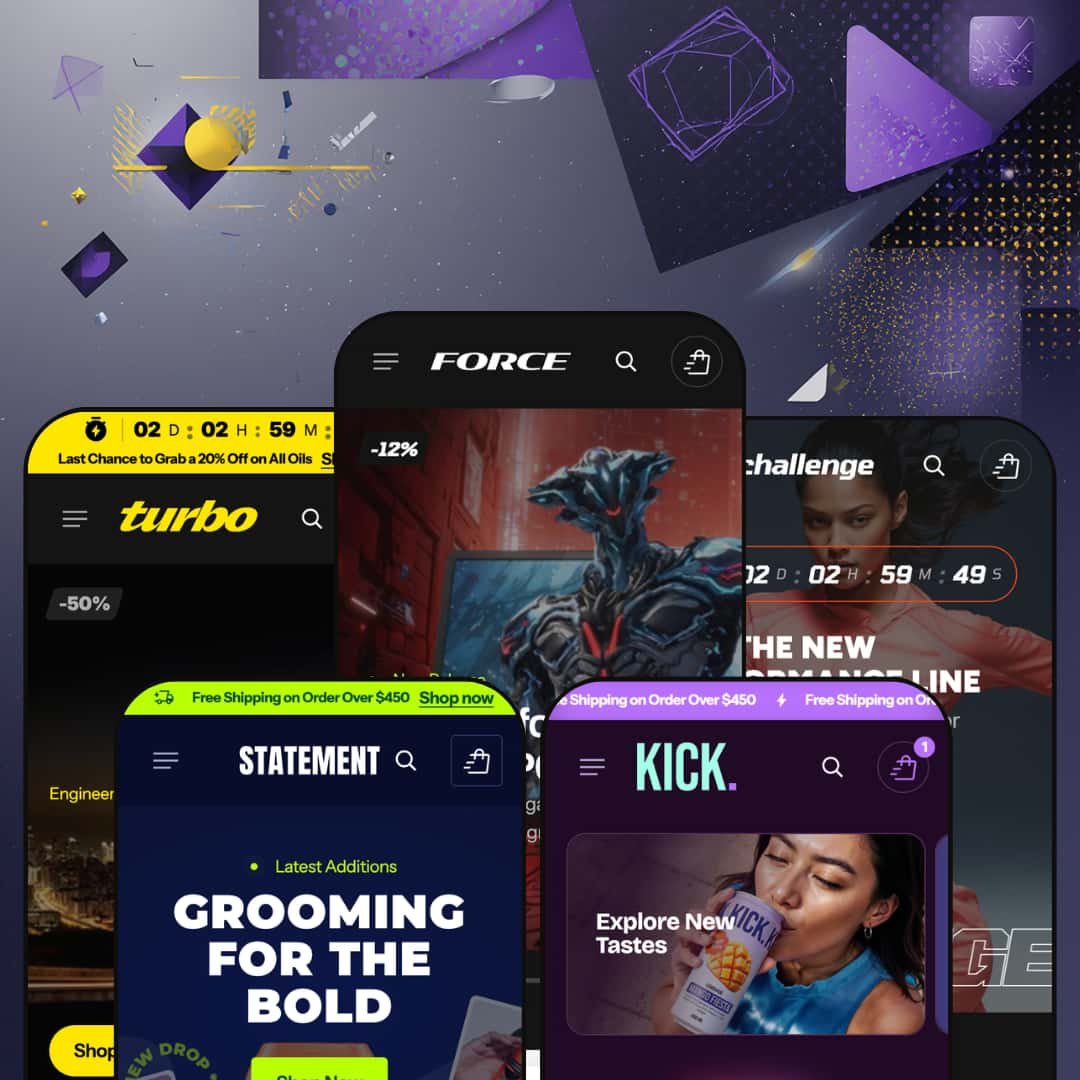
Most $380 Shopify themes play it safe. Force doesn't. It ships with 21+ built-in sections, a mega menu that doubles as a merchandising surface, and five presets that stretch from jet-black gaming stores to warm-toned grooming brands. On paper, it's one of the most feature-dense themes on the Shopify Theme Store. The catch? It launched in January 2026 with zero merchant reviews and a developer most buyers haven't heard of yet. So the question isn't whether Force has enough features. It clearly does. The question is whether it delivers on that promise when you actually click through the demos, add products to cart, and stress-test the sections that look so good in screenshots. I spent time in all five presets to find out.
Pros.
〰️
Pros. 〰️
✚ Deep Section Library with Specialized Merchandising Blocks
Force ships with 21+ built-in sections, and they aren't filler. You'll find a Before/After image slider, Product Markers (hotspots), a Card Slider, a Description Grid, an Image Banner Collapsible variant, and multiple testimonial formats. That depth eliminates the need for several third-party apps merchants would otherwise install for comparison sliders, hotspot maps, or curated recommendation rows. Most competing themes in this price range offer 10 to 15 sections, so the breadth here is a genuine competitive advantage.
✚ Mega Menu with Promotional Images and Multi-Column Dropdowns
The mega menu supports promotional image cards, direct product links within dropdowns, and organized multi-column sub-categories. Across all five presets, it adapts to each niche cleanly, from gaming hardware categories in Force to gendered apparel navigation in Challenge. Those promotional cards embedded inside the menu turn navigation into a merchandising surface, which is especially useful for seasonal campaigns or hero product spotlights.
✚ Inline Variant Selection and Quick-Add from Homepage Grids
The Featured Product section renders full variant selectors (color swatches, dropdowns), quantity steppers, and Add to Cart buttons directly within homepage product rows. Shoppers can complete a purchase without ever visiting a dedicated product page, which cuts friction for repeat buyers and gift-seekers. I tested this across multi-variant products and it worked reliably every time.
✚ Product Card Specs Accordion and Expert Testimonial Section
Every product card in grids that use the Popular Products or Featured Items sections includes an expandable Specs accordion for surfacing key selling points (configurable per product by the merchant). The Expert Choice testimonial section pairs a curated product row with an "editor" avatar, name, and title, building purchase confidence through attributed expertise. Both features add merchandising depth that goes beyond standard product-card patterns.
✚ Image Rollover and Quick View Across Product Grids
Product cards display a secondary image on hover, giving shoppers a second angle without clicking through to the product page. Quick View opens a modal with product images, variant selectors, and an Add to Cart button. Both features tested consistently across presets and product types, including simple and multi-variant items.
✚ Versatile Preset Range Across Five Distinct Industries
Five presets spanning gaming electronics, sportswear, men's grooming, beverages, and automotive care prove the theme engine handles dark and light palettes, dense and minimal layouts, and technical and lifestyle positioning equally well. Core functionality, including mega menu, Quick View, image rollover, and the full section library, remains consistent across all five. Each preset's staging choices create genuinely distinct shopper-facing identities without sacrificing the underlying toolkit.
Cons.
〰️
Cons. 〰️
🚫 No Track Record at a Premium Price Point
Force launched at version 1.0.1 (January 2026) with zero merchant reviews on the Shopify Theme Store. At $380, that's a real ask. Competing themes at this price tier, like Focal, Concept, or Enterprise, carry dozens to hundreds of reviews and years of update history. Merchants adopting Force are essentially betting on the developer's 15-minute support promise without any community feedback to validate long-term reliability, bug resolution, or update frequency. The theme's feature set is impressive, but early adopters should weigh that against the absence of proven real-world performance.
🚫 Heavy Content Investment to Match Demo Quality
Force's 21+ sections are a strength on paper, but every one of them needs custom content to look as polished as the demos. The Specs accordion requires unique copy for every product. The Before/After slider needs dedicated comparison photography. The Expert Choice section needs editorial headshots, titles, and curated product picks. The blog runs two distinct layout formats that both need written content. And the numbered Top 10 grid only works if you've actually curated a ranked selection. Without that investment, a 12-section homepage full of placeholder text and repeated products looks hollow rather than impressive. Merchants should budget meaningful content-creation time before launch, not just theme configuration.
-
Gaming electronics, jet-black backgrounds, and vibrant accent colors. That's Force's opening pitch. The oversized industrial typography reinforces an aggressive, performance-driven identity, and the hero slideshow layers countdown timers alongside discount percentage badges directly over lifestyle imagery. Everything about this preset says "launch day."
What works in this preset
The homepage hero is a full-bleed slideshow that stacks promotional overlays on top of wide-angle product shots. You'll see a discount percentage badge, a "New Release" tag, and a CTA button all competing for attention inside the same frame. It's dense and information-rich, which is exactly what works in the gaming vertical where product launches and limited drops drive buying decisions.
Scroll past the hero and you'll hit a numbered "Top 10 Items of the Month" grid. Large rank numbers (1, 2, 3 and so on) sit alongside each product card, paired with an editorial intro ("Only the best made the list") that contextualizes the curation. The visual weight of those numbers draws the eye down the page naturally, giving shoppers a shortcut to flagship products without forcing them to browse collections.
Two scrolling marquee tickers break up the homepage, one mid-page and one near the footer. The mid-page version uses geometric separator icons between repeated brand-name text, creating a visual rhythm that prevents section fatigue. The near-footer marquee reinforces branding with the "FORCE" name. Together they bookend the product-heavy middle of the page and keep the scroll from feeling monotonous.
Collection categories are laid out in an asymmetric grid that mixes one large tile with smaller supporting tiles. Each category carries a short descriptive tagline ("High-performance systems for every playstyle" under Gaming PCs, for example). That mix of tile sizes and added copy gives the grid a curated, editorial feel rather than the usual equal-width thumbnail wall.
A "Score Big with Hot Deals" section sits mid-homepage, pairing a countdown timer with a horizontally scrollable product slider. It's positioned to intercept shoppers who've already browsed the Top 10, creating a self-contained urgency module further down the page flow.
What really caught my eye was the "Essentials to Get Started" section. It renders full variant selectors, product descriptions, and Add to Cart buttons directly inside a homepage product row. Each card includes color swatches, dropdown selectors, and a quantity stepper, so shoppers can complete a purchase without ever visiting a dedicated product page. For repeat buyers or gift-seekers who already know what they want, that's a meaningful friction reduction.
Where it stumbles
Several countdown timers across the hero slideshow and the sale section display zeroed-out values (00:00:00:00). Merchants set their own dates after install, but the default appearance looks like an expired promotion. It's a presentation issue rather than a functional flaw, yet it undercuts the urgency the section is designed to create.
Every product card's Specs accordion shows identical placeholder text ("High-Fidelity Sound," "Comfort-Fit Design"), even on mice and chairs where those descriptions make no sense. The accordion itself is a strong feature, but the copy-paste demo content obscures its per-product customization potential and makes the grid feel templated on first impression.
The homepage packs roughly 12 distinct sections into a single scroll: hero slideshow, Top 10 grid, sale countdown, Before/After slider, Featured Items, Expert Choice, blog, FAQ, and multiple collection grids. That density works for large catalogs, but merchants with fewer than 15 to 20 products could easily end up with a page that feels padded rather than packed.
-
Challenge shifts the energy entirely. Gone are the jet-black backgrounds; in their place, a lighter palette lets clean activewear photography drive the layout. Navigation splits into gendered categories (Women, Men) plus Accessories and Sale, which is exactly how shoppers in this vertical expect to browse.
What works in this preset
Top-level navigation organizes products into Women, Men, Accessories, and Sale, with each dropdown listing specific products by name. The gendered split channels shoppers straight to their section and reduces browse time. It's a staging decision that mirrors how established sportswear brands structure their sites, and it immediately signals a focused apparel identity.
Sale has its own top-level navigation slot rather than being buried in the footer. For apparel businesses where end-of-season markdowns drive significant volume, that elevated placement gives clearance items the same visibility as core categories. It's a small staging choice that could meaningfully affect click-through.
The blog section stages sport-specific content in both the standard and overlay layouts. The overlay variant layers the post title and metadata directly over a hero image, which gives individual posts a more editorial, magazine-like feel. If you're an activewear brand that publishes training guides or product drops, that layout adds real polish to your content marketing.
Product cards here are clean and image-forward. Color swatches appear inline on multi-variant products, and secondary images swap in on hover to give shoppers a second angle without clicking through. The card styling is restrained on purpose: it lets the activewear photography do the selling rather than competing with it.
Where it stumbles
The demo catalog is shallow, with only three to four products under the Women and Men dropdowns. You can't see how the grid handles pagination, infinite scroll, or a larger inventory. The preset looks great with a small lineup, but it doesn't fully demonstrate the theme's capacity for scale.
-
Statement is the quietest preset in the lineup, and that's deliberate. Warm neutral tones, minimal navigation (just Body, Face, and Hair), and generous whitespace create a premium, editorial atmosphere. The product catalog is intentionally tight, and the design favors texture and packaging over visual density.
What works in this preset
A small detail worth noting: the announcement bar pairs a custom shipping-truck icon with the "Free Shipping on Orders Over $450" message. That icon breaks up what would otherwise be a plain text strip, improving scannability and lending a polish to the top of the page that most announcement bars lack.
Navigation boils down to three categories: Body, Face, and Hair. For single-brand personal care lines with a curated product range, that simplicity reinforces a premium positioning where less feels intentional rather than limiting. There's no category sprawl, no decision fatigue, just three clear entry points.
The color palette here moves entirely away from the Force preset's gaming energy. Warm, muted tones sit against clean backgrounds, and the product photography emphasizes texture and packaging. It's proof that the same theme engine powering a jet-black gaming store can handle luxury and lifestyle staging without looking out of place.
Both blog layouts (standard and overlay) stage grooming-specific editorial content. The overlay layout is particularly effective, layering post titles over atmospheric product photography. Articles with headlines like "Why a Good Day Starts with a Great Deodorant" show that the blog system supports long-form content marketing just as well in the personal care space as it does in the gaming vertical.
Here's something that stood out: the mega menu's promo cards link to individual products rather than collections. For brands with hero SKUs they want to spotlight, a signature body spray or flagship face wash, this product-level linking turns the navigation itself into a merchandising surface.
Where it stumbles
The hero section opens with an image-led layout, but the CTA buttons sit at a lower visual weight compared to the Force preset's bold overlaid CTAs. The subtler button treatment fits the premium grooming tone, but merchants whose priority is immediate click-through rather than brand immersion may need to bump up button sizing or contrast after install.
-
Kick is the fun one. Bright, saturated product imagery and a playful scrolling announcement bar project energy and approachability from the first pixel. The overall feel is youthful and brand-forward, with a navigation structure built for a small, category-specific product line rather than a sprawling catalog.
What works in this preset
The announcement bar uses a continuous marquee effect with bolt icons repeated between each instance of the "Free Shipping" message. That scrolling motion and repeated icon pattern create a ticker-tape energy that matches the brand's fizzy identity. It's noticeably more dynamic than the static announcement bars used in the other presets.
A direct "Catalog" link sits in the main navigation alongside categorized collection links (Kombucha, Lemonades, Sets, Shots). That one-click "view all" path is practical for stores with small-to-medium inventories where a single browse page works better than deep category drilling.
Contact is promoted to the main navigation bar rather than being tucked into the footer. For DTC beverage brands where customer questions about ingredients, subscriptions, or wholesale orders are common, that surface-level placement reduces friction and signals accessibility. It's a staging choice that makes the store feel approachable.
The collection structure uses four tightly defined categories. Even with only a handful of items per collection, the navigation and grid layouts maintain visual balance. The theme scales down gracefully for niche product lines, which is something not every section-heavy theme can pull off.
Blog content stages beverage-specific posts about kombucha culture and summer drinks. Both the standard and overlay post layouts are in play, demonstrating that the blog system supports brand storytelling in the food-and-drink vertical just as effectively as it handles gaming or grooming content.
Where it stumbles
Despite a relatively small catalog, the homepage still deploys multiple product sections. Some of the same products show up in different grids, which creates a sense of repetition as you scroll. Merchants with a similarly sized inventory would need to trim sections or diversify their product photography to avoid the page feeling padded.
-
Turbo is the most product-navigation-forward preset in the lineup. Dark, rugged tones with bold yellow and orange accents set the industrial mood, and each category dropdown lists specific products by name rather than linking to broad collection pages. It's built for stores where customers know exactly what they're looking for.
What works in this preset
The announcement bar stages a live countdown timer tied to a promotional message ("Last Chance to Grab 20% Off on All Oils"). Turbo is the only preset that places a countdown directly in the announcement bar, making urgency messaging persistent and visible on every page rather than confined to a single homepage section.
Each navigation category dropdown lists specific products by name: "XShine Protect," "Rustonix," "Crystall Glass." For B2B or technical stores where customers search by product name or part number, this approach is far more useful than generic category links. It effectively turns the menu into a quick-access product directory.
Unlike the other presets, Turbo's main navigation focuses entirely on product categories (Protective Coats, Lubricants, Cleaning Agents, Motor Oils) rather than showcasing the theme's section library through a "Features" dropdown. This is a more realistic staging decision, one that mirrors how an actual merchant would configure the navigation for a real store.
Blog content stages automotive care posts with how-to titles about detailing technique and product maintenance. The layouts serve technical, instructional marketing just as effectively as the lifestyle content seen in the other presets.
One thing worth flagging: the Features menu includes a "Collection List" section that doesn't appear in the other presets' menus. This suggests the developer is actively expanding the section library, and Turbo's staging exposes the newest additions.
Where it stumbles
Like the Force preset's homepage timers, the countdown in the announcement bar displays zeroed-out values (00:00:00:00). Because the announcement bar appears on every page, the expired-promotion look is more persistent here than in a homepage-only context. Merchants will need to configure a real end date immediately after install.
Each category dropdown lists four to five individual products. On narrower laptop screens, these product-dense dropdowns could feel cramped or require internal scrolling. Merchants with large catalogs would need to be selective about which items surface in the dropdown versus the full collection page.
Niche Suitability
Not Ideal For
Final Recommendation
-
Force is best suited for merchants selling electronics, sporting goods, automotive care, personal care, or beverages who want a section-rich theme with strong visual merchandising tools. It rewards stores with 20 to 200+ SKUs that can fill the homepage's many content blocks with distinct products and who are willing to invest time configuring spec text, countdown dates, and section order.
-
Stores with fewer than 10 products, minimalist brands that prefer whitespace-heavy layouts, or merchants who want an out-of-the-box experience with minimal configuration should consider simpler alternatives. Force is a powerful but opinionated theme that looks best when merchants actively shape it to their catalog.
-
Medium-High. The 21+ section library is powerful, but matching demo quality requires substantial content creation: unique spec copy per product, curated editorial sections, comparison photography for the Before/After slider, and deliberate homepage trimming to avoid repetition.
★ 8.2/10
Rating
-
Exceptionally deep section library with 21+ blocks including Before/After, Product Markers, and numbered ranking grids. Quick View, swatches, and image rollover all function reliably. Shopify's standard filtering is presented cleanly.
9
-
The theme editor exposes a large number of settings, which is powerful but can overwhelm first-time Shopify merchants. Homepage sections need trimming for smaller stores.
7
-
Layouts reflow appropriately, and the mega menu collapses into a mobile drawer. Touch targets on product cards and Quick View buttons are adequately sized.
8
-
Pages load quickly and transitions feel smooth. The dual marquee tickers and slideshow hero don't introduce noticeable jank. Image-heavy sections rely on Shopify's CDN for optimized delivery.
8
-
Five presets spanning five distinct industries prove the theme engine can handle dark and light palettes, dense and minimal layouts, and technical and lifestyle positioning.
9
FAQ
〰️
FAQ 〰️
-
👑 It's one of the best options in this price range for that niche. The Force preset stages a gaming electronics store with a numbered product ranking grid, spec accordions on every card, and a Before/After graphics comparison slider. If you sell gear with detailed specifications, these sections eliminate the need for third-party apps.
-
📱Yes. Across all five presets, layouts reflow into single-column stacks on smaller screens. The mega menu collapses into a hamburger drawer, and product grids adjust their column count. Touch targets on Quick View buttons and variant swatches tested fine during exploration of the Force and Challenge presets.
-
🎨 Highly customizable. The five presets span jet-black gaming aesthetics (Force), clean sportswear layouts (Challenge), warm grooming tones (Statement), bright beverage palettes (Kick), and rugged automotive styling (Turbo). The theme editor exposes granular control over colors, typography, section order, and layout density. Typography is fully self-serve through Shopify's font system.
-
⚡ It's snappy. Hero slideshows, product grids, and the Before/After slider load without perceivable lag. Marquee tickers scroll smoothly, and Quick View modals open instantly on click. No significant rendering delays appeared during testing across all five presets.
-
👕 It does. The Force preset's Featured Items section renders color swatches and dropdown selectors directly in the homepage grid, with inline Add to Cart. On product pages, variants display as selectable options. Multi-variant products in the Challenge preset (like sneakers with color and size options) handled variant switching without issue.
-
🔎 The theme supports Shopify's standard SEO infrastructure: editable title tags, meta descriptions, alt text on images, breadcrumb navigation, and clean URL structures. Breadcrumbs appeared across product and collection pages in all presets. Blog posts support both standard and overlay layouts for content marketing.
-
💱 Like all paid Shopify themes, Force ships with standard EU translation locale files (English, French, German, Italian, and Spanish) for theme UI strings such as button labels, cart text, and form fields. The theme includes styled language and currency selector widgets in both the header and footer. Which languages and currencies actually display in your store is controlled entirely through Shopify Markets and the Translate & Adapt app, not the theme itself.
-
⚙️ The theme is built on Shopify's standard section architecture, so app blocks and embed slots work as expected. The slide-out cart, product pages, and checkout flow all follow standard Shopify patterns. No compatibility issues were encountered during testing.
-
🛒 Yes. Shopify allows you to install and customize any theme before publishing. You only pay the $380 when you go live. All five presets (Force, Challenge, Statement, Kick, and Turbo) are available as live demos on the Shopify Theme Store for hands-on exploration before purchase.
This review is based on hands-on testing of the publicly available preset demos of the Force Shopify theme as of March 2025. Theme features, preset availability, and performance can change with subsequent updates from the theme developer.