
The Forge Shopify theme is a premium e-commerce option aimed at product-focused businesses that want sophisticated visual merchandising with minimal setup friction. Priced at $180 USD and developed by We are Underground LLC, it leans into “optimized for conversions” through thoughtfully composed sections and a smooth, modern cart flow. Across all three presets you get a consistent core: a slide-out cart that preserves shopping momentum, enhanced search, broad variant support, and polished, mobile-ready layouts. In first-impression testing, typography hierarchies read cleanly and color systems steer attention toward primary actions, while each preset’s hero composition is deliberately staged to hook interest within seconds.
Pros.
〰️
Pros. 〰️
✚ Variant handling that adapts to complex catalogs
Across demos, variant selection and pricing felt clear—whether it’s metals for jewelry, size runs for apparel, or bottle volumes. The theme communicates ranges and options without overwhelming the shopper, which reduces friction on higher-consideration items.
✚ Professional slide-out cart that keeps momentum
The cart drawer is a consistent pattern and is used to present add-ons or trending picks without shunting users to a separate page. That continuity keeps attention on the product path and shortens the distance from interest to checkout.
✚ Enhanced discovery via clean search and signposting
Search and navigation cues surface the right destinations with minimal effort. Because typographic hierarchy and labeling are disciplined, users can hop categories or products quickly and stay oriented throughout.
✚ Promotional tooling that doesn’t shout
Badges, rotating announcement bars, and time-based elements (as seen in Iridium) are available to create urgency and context. When configured thoughtfully, they guide decisions without cheapening the brand voice.
✚ Preset depth that speeds up setup
You get distinct starting points for jewelry, fashion, and beverages while the underlying mechanics remain consistent. That balance lets teams launch quickly, then iterate without relearning the theme’s foundations.
Cons.
〰️
Cons. 〰️
− Editorial depth varies across demos
Some product templates (notably in Titanium) rely on single images, and related-item modules aren’t always present. When those pieces are thin, cross-selling and tactile evaluation suffer until merchants expand content.
− Potential fragility under certain flows
We observed an instance of cart contents clearing during navigation in the Iridium demo. Even if isolated, it’s a reminder to regression-test the cart and drawer behavior after updates or app installs.
− Performance trade-offs with richer canvases
The theme feels smooth in use, but like most premium themes, heavy media and layered sections can tax budgets on slower devices. A structured media plan and post-launch audits will help maintain perceived speed.
-
Aimed squarely at luxury jewelry and customizable pieces, the Default preset frames product pages and editorial blocks as a high-gloss showcase. The overall feel is refined and restrained, relying on scale, contrast, and copy to underline value rather than clutter the canvas with novelty elements.
What works in this preset
The split-layout hero sets the tone immediately. On one side, oversized product photography anchors the composition; on the other, succinct lines like “Create yours” and “Timeless Necklaces” provide a persuasive micro-narrative. The balance between imagery and copy is careful, so the call to explore feels guided rather than forced. As an entry point, it’s effective at signaling customizability and premium positioning right away.
Typography choices carry that premium signal throughout. A clean serif pairing and generous whitespace create calm pacing, so details feel deliberate instead of dense. Headings are large enough to scan without sacrificing elegance, and paragraph text remains readable even when content blocks stack on smaller screens. The upscale voice stays intact from hero down through product storytelling.
Catalog and product templates in this demo are composed to support high-value items. Category labels and collection context make it obvious where a shopper is and what’s adjacent. On product pages, descriptive text and brand information are given clear lanes, so specifications and selling points don’t fight for attention. The net effect is a composed journey that treats every click like a premium touchpoint.
-
Titanium speaks to premium fashion with a minimalist lens. It emphasizes clarity over flourish—clean product cards, tidy information density, and obvious wayfinding—so collections and seasonal drops take center stage without visual noise.
What works in this preset
Navigation is straightforward and fast to parse. A horizontal menu breaks categories into intuitive buckets—Coats, Dresses, Jackets, Pants, Skirts—reducing cognitive load as shoppers jump between departments. Because the labels match how people shop, it’s easy to arrive at the right slice of the catalog within one or two clicks.
The product card layout keeps information density disciplined. Price, title, and key cues are arranged so browsing feels quick rather than scattershot, which supports the preset’s minimalist stance without hiding essentials. That restraint helps shoppers compare items without visual fatigue.
Social links are handled cleanly and include modern channels like TikTok alongside the usual platforms. This acknowledges where fashion audiences spend time without pulling attention away from the shop experience itself. The result is a storefront that stays focused while still offering off-site touchpoints.
Where it stumbles
Related-items blocks are conspicuously absent on product pages in this preset. Without adjacent recommendations, natural cross-sell paths are weaker, so shoppers rely on back navigation or the main menu to continue browsing. For fashion, where outfitting and “complete the look” moments drive AOV, that’s a missed opportunity in the demo.
Some product pages lean on a single image. Without alternate angles or detail shots, tactile qualities are harder to evaluate, which risks hesitation on higher-ticket apparel. The overall minimalist stance stays elegant, but a touch more image depth would better support purchase confidence.
The homepage keeps content to a simple banner-led approach. While it maintains the clean aesthetic, it leaves editorial storytelling and seasonal curation underdeveloped in the demo. For brands with robust campaigns, more varied blocks on the landing canvas would help transfer that narrative into the storefront.
-
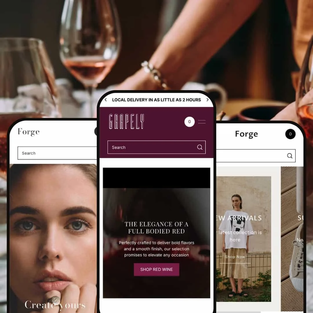
Iridium is cut for premium beverages and leans into authority cues and a moody, high-end palette. It favors presentation choices that convey scarcity and credibility—classic conversion levers for wine and spirits.
What works in this preset
Trust elements are surfaced directly on product pages. References such as “500+ 5 star Trustpilot Reviews” and visible star ratings appear near the point of decision, reinforcing credibility without forcing a detour. That placement helps premium SKUs feel appropriately justified.
The darker, restrained color palette suits luxury positioning. It frames bottle photography and label details without glare, so the merchandise remains the star while the interface recedes. For collections built on heritage and rarity, the tone supports the story being told.
Homepage copy and staging keep attention on featured items rather than chasing novelty. Blocks are composed to feel deliberate, giving each highlight room to breathe while maintaining a sense of exclusivity. It’s a measured rhythm that aligns with premium beverage merchandising.
Niche Suitability
Not Ideal For
-
Product-focused brands that value polished staging and want industry-specific starting points without sacrificing a consistent, reliable core.
-
Merchants who need turnkey compliance flows or who expect every demo to ship with exhaustive content patterns out of the box will likely want additional configuration or a different starting point.
-
Low — Presets provide sensible defaults that look “finished” with minimal inputs. You’ll still want to expand imagery, enable cross-sell modules where needed, and validate third-party app interactions.
Final Recommendation
★ 8.2/10
Rating
-
Strong commerce fundamentals with reliable variant handling, a cohesive cart experience, and dependable search. Standard collection organization is presented cleanly. Minor deductions for the demo-observed cart quirk and limited on-card interactions.
8
-
Three industry-specific presets shorten setup. The editor’s section list stays intelligible even as layouts expand, so ongoing updates feel manageable.
9
-
Layouts reflow cleanly, tap targets are sensible, and the cart drawer behaves as expected on smaller screens in our tests. Nothing in the core interactions breaks the cadence of mobile browsing.
9
-
Day-to-day navigation is smooth, and interactive elements respond quickly. A comprehensive PageSpeed pass would quantify trade-offs, but rich canvases will still warrant media discipline.
7
-
Presets cover distinct aesthetics, and color/typography levers go far before custom code is necessary. Truly bespoke layouts may still need developer support.
8
FAQ
〰️
FAQ 〰️
-
👑 Yes. The Default preset is staged for luxury jewelry and customizable pieces, with hero composition and typography that support premium positioning.
-
📱In testing, interactions felt consistent across presets, with touch-friendly navigation and a cart drawer that stays usable on small screens.
-
🎨 Very. You have 20+ sections and three distinct starting points; color systems and type choices are easily tuned in the editor without code.
-
⚡ General navigation and transitions were smooth in hands-on tests. A fuller audit is still advisable if you plan heavy media or complex landing pages.
-
👕 Yes. Jewelry metals, apparel sizing, and bottle volumes were all expressed cleanly in the demos, with pricing and options made clear.
-
🔎 Standard Shopify SEO controls are presented cleanly, with sensible heading hierarchy and tidy URLs observed through navigation.
-
💱 Languages: EU translations (EN, FR, IT, DE, ES) are included as documented. Currencies: multi-currency display is managed by Shopify Markets at checkout; the theme surfaces what Shopify provides.
-
⚙️ The theme follows standard Shopify architecture, so typical apps should integrate normally; evaluate case-by-case for specialized tooling.
-
🛒 Yes, all three presets (Default, Titanium, Iridium) have fully functional demos available for comprehensive testing before purchase, allowing complete evaluation of features and user experience.
This review is based on hands-on testing of the publicly available “Default,” “Titanium,” and “Iridium” preset demos of the Forge Shopify theme as of October 11 2025. Theme features, preset availability, and performance can change with subsequent updates from the theme developer.