
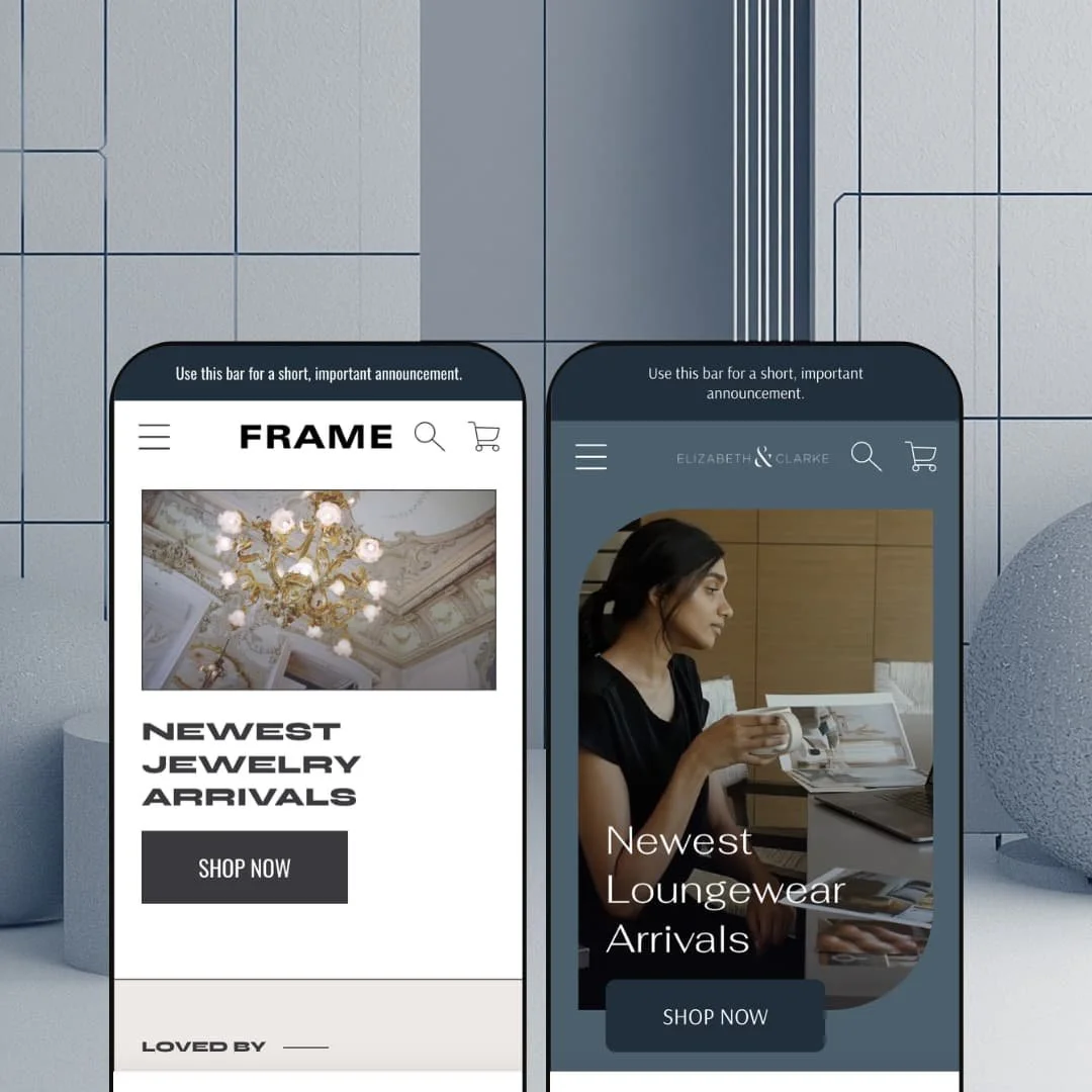
You're selling clothes online, and your product page has to answer the one question a photo can't: how will this fit? Frame, a $160 Online Store 2.0 theme from Archer Commerce, is built around answering it, with fit scales, sheerness ratings, and care iconography wired directly into the product template. Two presets ship with the purchase, one staged as a single-brand loungewear label and one as a multi-brand luxury boutique. I spent time in both demos to see whether a budget-tier price tag hides budget-tier corners.
A product page that answers fit questions before support has to
Frame wires an apparel answer sheet directly into the product template: a fit scale running from fitted to oversized, a sheerness rating, care iconography, a fabric callout, and multi-column size-chart tables, all sitting beneath the buy box as one coordinated set fed by product data the merchant controls. Shoppers stop guessing between sizes. For apparel brands whose buyers make considered purchases and return what disappoints, this set does pre-sale support work that otherwise lands in the inbox.
Collection discovery gets a real presentation layer
Shopify supplies the filter data; Frame decides how it reads, and it reads well. Collections run a persistent sidebar with collapsible groups for availability, price range, product type, brand, color, fabric, material, and size, plus a control for pulling additional filters in, nine sort orders, and view-more loading that spares shoppers pagination clicks. Merchants carrying a hundred-plus SKUs with cross-shop-heavy buyers get browsing architecture that holds its shape as the catalog grows.
Native video runs through the section library
Motion is a first-class citizen here, not an embed. Hero sections, media-with-text blocks, slideshows, and product galleries all accept hosted video, so a brand can carry film through the whole shopping path from landing page to product detail without bolting on a page-builder app. Single-brand labels at mid-market or luxury price points, where drape and movement sell the garment, will get the most out of this.
Interface translations for five EU languages ship in the box
Merchants selling into French, German, Italian, or Spanish-speaking markets start with the theme's interface already translated: button labels, cart strings, and form copy come pre-localized in five languages, so the theme-side half of a European launch is finished before setup begins. Product content still runs through Shopify's own market tooling, as it does everywhere. For mid-market apparel sellers with catalogs in the dozens to low hundreds, that's days of fiddly string work removed.
The merchandising vocabulary is apparel-only
Every merchandising surface in this theme speaks fabric. The product panels rate fit and sheerness, the size charts measure bust and waist, and both presets stage soft goods from hero to footer, so a seller of electronics, furniture, or other spec-sheet products inherits vocabulary that has to be dismantled before it stops reading wrong. Spec-driven catalogs with considered-purchase buyers should treat this as a different theme's job.
The featured-collection section stops at four products
The homepage featured-collection grid caps at four items. When a merchant raised this publicly, the developer's recommended fix was duplicating the section and zeroing the spacing between the copies so that two instances masquerade as one longer grid. That's a patch, not a layout option. Stores with catalogs past a hundred SKUs and restock-driven merchandising calendars will feel this cap weekly, because the homepage is exactly where those rotations live.
The cart layer undersells the conversion pitch
Frame markets itself on conversion, and the cart doesn't fully back the claim. In-cart recommendations and a free-shipping progress meter are both absent from the published feature set, which stops at cart notes, pickup availability, a slide-out drawer, and a sticky cart button. For impulse-led stores at budget-to-mid price points, the drawer is where the extra item gets added. Here it's a checkout hallway.
What it takes to launch
Expect a multi-day pass covering storewide copy, contact and brand-naming details, metafield population for the product-page panels across the catalog, mega menu re-staging, homepage media re-linking, and cross-preset copy cleanup before either demo reads as your store.
-
What works in this preset
Scrolling the Frame demo, reassurance arrives before any product does. A press logo strip sits under the hero, benefit icon trios follow ("Easy Care", "Pockets", "4-Way Stretch"), a shipping-returns-exchanges band appears mid-page, and rotating customer quotes close things out near the footer. None of it shouts. Taken together, the staging demonstrates just how much trust-building this preset can layer into one homepage without leaning on a single third-party review or social-proof app install.
Four collection tiles labeled Work from Home, The Big Interview, Date Night, and Weekend Casual sit mid-page under a Featured Shops heading. That's occasion-based merchandising rather than category merchandising, and it's a smarter default than it looks: the same forty tops can be resold several ways by context instead of by product type. Loungewear, workwear, and gifting stores all shop this pattern well.
I clicked into The Andie to stress-test variant handling. Six colors across six sizes render as clean button groups, thirty-six combinations in total, and the gallery behind them holds roughly two dozen images labeled by colorway, so the thumbnail rail reads as a navigable set instead of an image dump. Breadcrumbs sit above the title. For a demo backed by hundred-product collections, the product page held its structure at full load.
Where it stumbles
The preset tells its story before it shows its shelf. Product grids surface far down the page, after several video-led story sections and two embedded social feeds, and a shopper who arrives ready to buy has to travel for it. For an evergreen single-brand label selling considered pieces, that pacing fits; merchants running flash drops or restock events on this preset will want the section order inverted on day one.
-
What works in this preset
Madison asks a question the first demo never does: what if the store isn't the brand? The navigation is the answer. Every mega menu panel splits into Women's, Men's, and Designer columns, letting shoppers enter the catalog by category or by label, and a promotional new-arrivals tile sits inside the panel itself, so campaign routing happens without ever leaving the menu.
The homepage reads like a magazine that takes payment. Headline-led features ("Why a Coin Necklace Is the New Cult Jewel", "Airport Style: Dress for Travel") alternate with shoppable collection links, and a three-post blog grid anchors the lower page, pulling article teasers with dates and excerpts straight into the commerce flow. Content is doing the selling here. The section library clearly expects it to.
Product cards on Madison carry real metadata density. Vendor names print above titles, New badges flag recency, color counts and swatch dots show variant breadth at grid level, and sale pricing renders with the original struck through. For multi-brand assortments, that card density is the difference between a grid shoppers scan and a grid they have to click through item by item.
Where it stumbles
This architecture eats content. The magazine cadence only works if someone writes the magazine: features, blog posts, campaign imagery, refreshed seasonal headlines. A two-person boutique without a content habit will watch these sections go stale within a quarter, and stale editorial in a luxury staging reads worse than no editorial at all.
One section library, two retail personas
Read side by side, the presets prove the same architecture can hold two different retail identities: a single-brand storyteller and a multi-brand editorial boutique, separated by navigation logic and staging rather than by code. Choosing a preset here is choosing a posture, not a feature set. That's a useful property in a theme this cheap, because the second identity is already paid for if the business model shifts.
Editorial and commerce interleave by default
Across both demos, story sections and selling sections alternate instead of living in separate zones, with blog teasers pulled into homepage flow and collection links embedded inside feature copy. The theme treats content as a merchandising surface rather than a sidebar. Merchants who publish will find the architecture already shaped for it.
Two storefronts for one budget-tier purchase
Both presets come with the single $160 license, and nothing in either demo reads like it was rationed to hit that list price. The value case is self-contained: one purchase, two staged launch directions, the full section library behind both.
Two presets, one storytelling rhythm
Reading both homepages back to back, the sequence repeats: hero media, press logos, alternating media-with-text features, quote rotation, newsletter. The skins differ sharply; the underlying rhythm barely does. Merchants buying the second preset expecting structural variety will find styling variety instead.
A small public evidence base
Frame launched in December 2022 and now sits at version 7.0.0, but its public review count stands at eight, running 88% positive. Nothing in that data raises a flag; there simply isn't much of it. Buyers who weight peer volume heavily should know the sample is small before treating the percentage as settled.
Rating
★ 7.2/10
-
The apparel panel set and collection discovery presentation reach past the price point; the advertised cart toolkit is short for a theme sold on conversion.
7
-
Online Store 2.0 sections throughout, a searchable documentation portal, and demo staging that maps cleanly onto what a merchant actually swaps out.
8
-
Drawer-style mobile navigation, sticky cart access, and responsive galleries; video-heavy homepage builds will need mobile-conscious media choices.
7
-
Product and collection pages run lean; the demo homepages stack native video and social embeds, so restraint in section selection matters.
7
-
Two staged directions from one section library that mixes commerce and editorial freely, all of it tuned toward soft goods.
7
Frequently Asked Questions
-
Yes. The Madison staging demonstrates vendor names displayed on product pages and brand-level collection routing, so a curated multi-label boutique works without customization.
-
Version 7.0.0 shipped in June 2025 with a file-structure revision for Shopify's Theme Store redesign requirements, roughly two and a half years after the December 2022 launch.
-
The theme surfaces Shopify's in-store pickup availability within the cart and checkout flow; the pickup logic itself runs on the platform, with the theme handling how it's displayed.
-
Yes, quick view ships in the marketing feature set, and product cards support a second-image rollover for showing an alternate angle on hover.
-
Archer Commerce runs a searchable documentation portal and email support, and the developer answers public Theme Store reviews, typically within a day of posting.
-
Lookbook sections ship in the merchandising library alongside image galleries and zoom, and the marketing set includes a stock counter, product badges, promo banners, and in-menu promos.
This review is based on hands-on testing of the publicly available preset demos of the Frame Shopify theme as of July 2026. Theme features, preset availability, and performance can change with subsequent updates from the theme developer.