
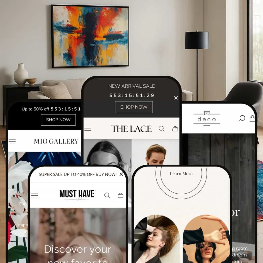
The Gain theme presents five distinct presets that target different niches without sacrificing Shopify’s core functionality. Across all demos the theme offers a mega‑menu, variant‑aware product cards, slide‑out search or cart drawers, quick view modals, and multi‑step hero sliders. These features are configurable through Shopify’s theme editor, so they aren’t unique to any one preset. Below you’ll find detailed observations from real testing that reveal how each preset stages those capabilities for specific audiences.
Pros.
〰️
Pros. 〰️
✚ Versatile Mega‑Menu & Navigation – Every preset uses a robust mega‑menu that exposes multiple categories and product. This helps merchants organise large inventories and shortens the shopper’s path to product pages.
✚ Quick‑View & Slide‑Out Cart Ecosystem – The theme pairs hover‑activated quick‑view modals with a polished slide‑out cart. Quick‑view modals allow variant selection and quantity adjustment without page, while the cart drawer features cross‑sell items, free‑shipping progress and gift‑wrap. Together they streamline purchasing and keep customers on the product grid.
✚ Rich Merchandising Sections – Across presets, the theme offers lookbooks with hotspots, FAQ, testimonial sliders, and story call‑outs. These sections are modular, letting merchants build narrative‑driven pages and showcase products in context.
✚ Elegantly Styled Variants & Swatches – Product cards display colour swatches, and product pages provide variant pickers, size guide links and stock indicators. The consistent styling gives customers confidence when selecting options and reduces returns.
✚ Predictive search drawer – Clicking the search icon slides a panel from the right where queries show product names, prices, articles and pages instantly. This helps customers find items quickly without leaving their current context.
✚ Full‑screen image zoom (Desktop‑Only) – Product pages include a zoom icon; clicking it launches a full‑screen gallery with navigation arrows. The seamless transitions make product inspection intuitive for shoppers.
✚ Rich product page extras – Variants are displayed with swatches and size options; there’s a mandatory comment box and consent checkbox before the Add‑to‑Cart button activates. Optional features such as an Ask a Question link, “Pairs well with” slider and a cross‑sell recommendations grid keep customers engaged.
✚ Clean filter panel – On collection pages, the “Filters and sort” button slides out a panel with availability, colour, size and price filters. Colour swatches display counts and are spaced widely for easier.
✚ Support for non‑product content – The “Projects” menu links to a blog‑style page where each article includes imagery, share icons and cross‑links to other posts. This supports storytelling and content marketing.
✚ Rich footer content – The footer offers detailed brand messaging, quick links, contact information and language/currency switchers. Social icons make it easy for customers to connect via Instagram, Facebook and others.
Cons.
〰️
Cons. 〰️
− Search Accessibility – While all presets include a predictive search drawergain-demo2-store.myshopify.com, the search icons in Sable and Maison are small or low‑contrast. This inconsistent visibility can frustrate shoppers accustomed to quickly finding products.
− Reliance on High‑Quality Imagery – Many sections (lookbooks, hero sliders, editorial callouts) require professional photos. Without strong visuals merchants may struggle to replicate the demos’ premium feel, risking a lacklustre presentation.
− Inconsistent Interaction Patterns – Quick‑view triggers vary across presets: some require hover then click, others just click; and the add‑to‑cart behaviour ranges from auto‑opening the cart to simply updating the iconutd-theme-2.myshopify.com. These differences could confuse customers who browse multiple presets or stores.
− Overlapping Pop‑ups & Busy Headers – The theme includes countdown bars, announcement bars, newsletter pop‑ups and optional consent/notes forms. When all enabled simultaneously, they clutter the viewport, especially on mobile, and can impede progression to products.
-
The Default preset mixes lifestyle photography with understated typography to create a polished boutique feel. It’s clearly designed for apparel or accessories brands that want an elegant store without strong colours.
Pros
We didn’t find any pros for this preset.
Cons
Inconsistent quick‑view behaviour – Hovering product cards shows a “quick view” icon, but clicking sometimes navigates to the product page instead of opening a modal. This inconsistency can confuse shoppers expecting a modal.
Required comment/consent fields – Add‑to‑Cart is disabled until a comment is entered and a checkbox is ticked on the product page. Without clear explanation, customers might think the button is broken.
Crowded header on narrow screens – At certain widths the announcement bar, language/currency switchers and account/search icons overlap slightly, creating a cramped look.
-
Lace embraces high‑fashion styling with bold photography, dramatic typography and interactive storytelling. It’s aimed at luxury apparel or couture shops that want to highlight collections and editorial content.
Pros
Accordion‑style collection list – A “Popular Collections” block collapses categories into a vertical list; clicking each reveals a curated product list in the adjacent panel. This design surfaces depth without overwhelming the page.
Cons
Quick‑view overlay occasionally unresponsive – The double‑arrow icon next to the quick‑view eye sometimes appears but does nothing. Shoppers may wonder if another feature is broken.
Filter close button small on mobile (Mobile‑Only) – On narrow screens the filter panel’s close icon is tiny, making it easy to mis‑tap and accidentally select a filter.
-
Mio leans into modern aesthetics with artistic photography, monospaced typography and interactive product storytelling. The layout suits creative brands offering bespoke or artisanal goods.
Pros
We didn’t find any pros for this preset.
Cons
Quick‑view doesn’t auto‑open cart – After adding to cart from a quick‑view, the cart count updates but the drawer doesn’t open. Shoppers might not realise their item was added.
FAQ accordion icons misaligned on mobile (Mobile‑Only) – The FAQ block’s plus/minus icons sometimes overlap text on small screens, reducing readability.
Navigation slightly hidden – The header uses low‑contrast colours and small fonts; first‑time visitors may overlook the “Projects” or “Theme Features” links.
-
Sable reimagines Gain for trend‑driven retailers. Its clean lines, minimal colour palette and strong typography make it suitable for contemporary fashion or lifestyle brands.
Pros
We didn’t find any pros for this preset.
Cons
Small search icon – The search button in the header is small and low‑contrast, making it easy to miss. This reduces the visibility of search and may slow down product discovery.
Product cards sometimes show duplicate icons – On hover, two separate quick‑view icons appear; one is functional and the other seems decorative. This duplication could confuse shoppers.
Inconsistent hero navigation – The split hero uses a small arrow to jump directly to a collection page rather than sliding to another banner. Shoppers may expect it to cycle like other presets.
-
Maison tailors Gain for high‑end furniture retailers. It uses dark backgrounds, serif typography and organic shapes to project sophistication and highlight craftsmanship.
Pros
Multi‑slide hero with editorial layouts – The hero offers three curated slides with contrasting backgrounds and elliptical image masks. Each slide contains a clear headline and supporting copy, guiding the shopper into the store narrative.
Tab‑bed product carousel – The “Customer Favorites & Limited‑Time Deals” block lets users switch between “On sale” and “Best sellers” without reloading the page. Product cards include colour swatches and a subtle quick‑view .
Massive collection grid with pagination – The collections page displays dozens of categories with compelling photography and names like “Benches,” “Cabinets,” and “Dining Chairs.” Pagination at the bottom keeps loading times manageable.
Video showcase and story sections – A video player embedded in a curved frame showcases craftsmanship. An “About” block near the footer tells the brand story and includes design consultation and shipping benefits.
Niche Suitability
Not Ideal For
-
Gain suits merchants seeking a premium, narrative‑driven Shopify store without custom coding. Fashion brands, jewellery designers, home decor artisans and high‑end furniture retailers will benefit from its editorial layouts, rich media sections and smooth quick‑view/cart experience.
-
Stores with massive catalogues, discount‑driven businesses or merchants who rely heavily on search functionality may find Gain less efficient. Subtle search icons in some presets, inconsistent quick‑view patterns, and heavy dependence on visuals could slow high‑volume shoppers.
-
While Gain offers many built‑in sections and style controls, merchants must invest time in uploading high‑quality imagery and configuring pop‑ups, lookbooks and quick‑view settings to avoid a cluttered or inconsistent experience.
Final Recommendation
★ 7.6/10
Rating
-
Gain implements standard Shopify features—mega‑menus, variant selectors, filters, quick‑view, and a polished cart. It supports filtering via Shopify’s Search & Discovery app and presents them cleanly. Some presets hide search behind subtle icons, which hurts discoverability.
8
-
Most interactions are intuitive: mega‑menus open smoothly, quick‑view modals are easy to use, and the slide‑out cart is consistent. However, required comment fields and small search icons add friction.
7
-
Mobile layouts are responsive and maintain typography hierarchy. Hotspot targets and filter close buttons can be small on touch screens, and some pop‑ups overlap vital content.
7
-
Animations feel smooth and pages load quickly despite large images and videos. Quick‑view and cart drawers open without lag. The video section in Maison may add loading time, but overall performance is solid.
8
-
Merchants can choose from five distinct aesthetics and a wide range of sections (lookbooks, FAQs, testimonials, story callouts). The reliance on high‑quality visuals means results vary depending on content; still, the theme editor offers many layout and colour options.
8
FAQ
〰️
FAQ 〰️
-
👑 Yes. Each preset targets a different niche: Default suits boutique apparel, Lace fits luxury fashion, Mio targets artisanal goods, Sable caters to trendy clothing, and Maison is designed for premium furniture.
-
📱The layouts respond well to mobile screens. Navigation drawers, quick‑view modals and carts work smoothly, though some icons (filter close, FAQ toggles) are small on phones and pop‑ups can obstruct content.
-
🎨 Gain offers extensive section blocks (lookbooks, sliders, FAQs, story callouts) and supports custom colours and typography via Shopify’s editor. Merchants can upload custom fonts and adjust styling without code.
-
⚡ Despite rich imagery and videos, page transitions, quick‑view modals and cart drawers feel responsive. Only the Maison video section adds slight load time.
-
👕 Yes. Variant swatches appear on product cards and within quick‑view and product pages. Quantity steppers, stock indicators and size guide links improve usability.
-
🔎 The theme uses semantic HTML, adjustable meta tags and clean URLs. It doesn’t offer built‑in SEO apps but integrates smoothly with Shopify’s SEO settings.
-
💱 All presets include language and currency switchers. Merchants can enable Shopify Markets to customise the options; the presence and styling of the switcher remain consistent across presets.
-
⚙️ Although the demos don’t showcase specific app integrations, Gain uses standard Shopify section architecture. You can add Search & Discovery filters, reviews and other app blocks without conflicts.
-
🛒 Yes. The developer provides live demos for each preset and merchants can install the theme on a development store to test configuration before purchase.
This review is based on hands‑on testing of the publicly available Default, Lace, Mio, Sable and Maison preset demos of the Gain Shopify theme as of 26 Aug 2025. Theme features, preset availability, and performance can change with subsequent updates from the theme developer.