
Galleria is a premium Shopify template aimed at boutiques, lifestyle brands, and specialist retailers. Across the demos we explored, the theme pairs strong photography with clear typography and simple, intuitive navigation. A consistent slide-out cart, generous product imagery, and tidy page structure keep the shopper focused.
Pros.
〰️
Pros. 〰️
✚ Polished cart experience
The slide-out cart appears quickly after adding an item and includes quantity controls, remove actions, a notes field, and a prominent checkout path. Keeping edits in place reduces friction and helps shoppers maintain context as they refine their basket.
✚ Variant-savvy product pages
Product detail pages handle swatches and buttons smoothly and update images and state without confusion. Vertical galleries, clear stock messaging, and tidy accordions for details make it easier to evaluate options before committing.
✚ Refined media and gallery behavior
Large hero sections and image-forward layouts let products breathe. Secondary images on hover and natural zoom affordances reward curiosity, which helps material-driven categories and lifestyle goods.
✚ Editorial and support content built-ins
Blog/Journal templates and FAQ accordion patterns give merchants room to answer questions and tell stories without custom development. That connection between inspiration and purchase supports content-led merchandising.
✚ Flexible presets, consistent core
Style can change (palette, tone, typography) while navigation, cart behavior, and product mechanics remain familiar. This consistency shortens the learning curve for returning shoppers who browse multiple campaigns or seasonal refreshes.
Cons.
〰️
Cons. 〰️
− No quick-add on collection grids
Shoppers must click through to product pages to add items. Power users building larger baskets may feel a beat slower compared with grid-level add patterns.
− High dependency on strong photography
Galleria’s layouts assume compelling imagery. If assets are inconsistent or low quality, pages can feel flat and may fail to convey value.
− Advanced SEO features require custom work
Beyond Shopify’s standard SEO controls, richer schema patterns or specialized FAQ/article markups typically need custom code or an app. Teams expecting those out of the box should plan accordingly.
− Product-card micro-interactions may need tailoring
If your brand depends on more complex hover states or alternative card behaviors, plan to configure or customize those patterns rather than rely on default demo staging.
-
A clean, neutral palette and generous white space create a calm storefront that lets product photography shine. The landing hero fills the viewport with a single product or lifestyle scene supported by a direct call to action. Navigation is straightforward and points to shopping categories and editorial content.
What works in this preset
The visual language feels restrained and premium. Neutral tones, ample spacing, and a confident type stack direct attention to product stories rather than decorative UI. This suits brands that rely on imagery to convey quality.
The Lookbook page leans into lifestyle storytelling. Full-width slides and curated highlight sections connect products to context, making it easy to move from inspiration to a product detail page without breaking the flow.
Typography is pragmatic rather than flashy. Clear headings and sensible body copy keep longer descriptions readable. That helps when SKUs require more than a couple of bullet points to explain materials or use cases.
-
Drape applies a warmer color palette and slightly different typography while keeping the same underlying mechanics as Default. It reads softer on first load and shifts the mood without changing how shoppers move through the store.
What works in this preset
Palette and type choices add warmth and a touch of softness. This shift suits textiles and soft goods where surface feel and color play a bigger role in the buying decision.
-
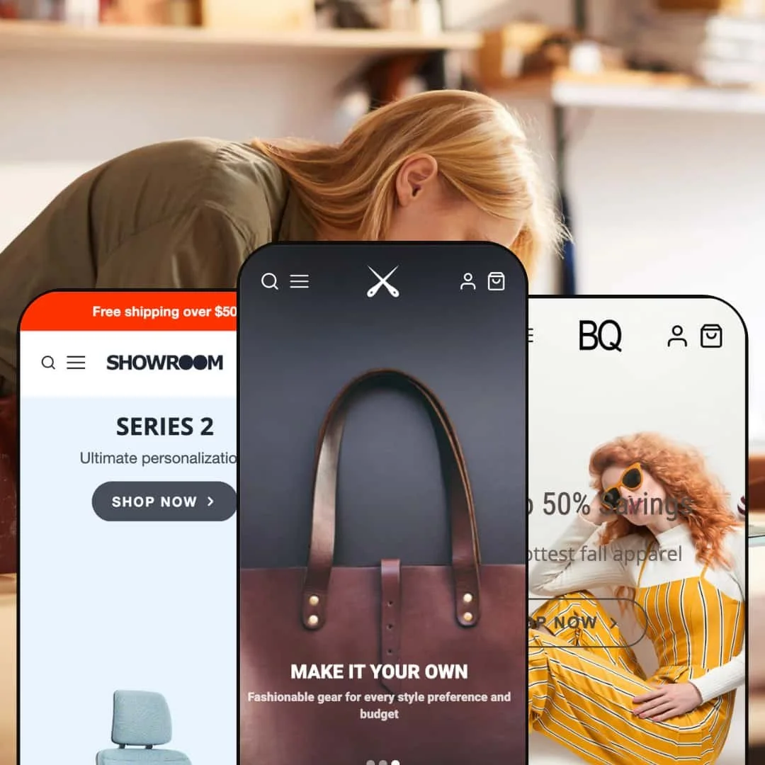
Showroom pivots Galleria toward furniture and home goods with bolder color accents and category-oriented staging. The hero elevates a signature piece, while the rest of the layout stays minimal and product-first.
What works in this preset
Bolder color accents and crisp type help larger product photography land with impact. The mood fits modern interiors and office goods where shape, material, and proportion sell the item.
The hero composition showcases a single piece with a clear “Explore” pathway. That simple framing encourages category browsing without clutter.
Minimal, consistent product presentation keeps focus on dimensions, finishes, and imagery. It feels catalog-like in the best way: quiet UI that defers to the product.
Niche Suitability
Not Ideal For
-
Medium to large catalogs that want strong visual merchandising, clear wayfinding, and a quick cart flow. It suits brands that mix lifestyle content with product discovery.
-
Shops that require highly experimental product-card interactions by default, or an ultra-minimal single-page funnel, may prefer a theme built expressly for those patterns.
-
Medium. Dialing in navigation, staging media blocks, and tailoring product-card behavior takes a bit of setup. Day-to-day operations remain straightforward once configured.
Final Recommendation
★ 8.0/10
Rating
-
Major needs are covered: clear multi-level navigation, fast cart drawer, variant-aware product pages, and rich visual sections including lookbook and video.
8
-
The editor is intuitive after a brief orientation. Blocks, palettes, and section order are easy to adjust, and the default layouts provide sensible starting points.
8
-
Menus collapse predictably, product grids remain touch-friendly, and the cart drawer is easy to access and dismiss on small screens. No mobile-specific issues observed.
8
-
Home, collection, and product templates loaded briskly in repeated sessions. Drawers, accordions, and media transitions felt immediate.
7
-
Preset variety covers modern, editorial, and minimal looks. You can reorder multimedia blocks, set palettes, and manage fonts to reach a distinct brand expression.
9
FAQ
〰️
FAQ 〰️
-
👑 Yes. The Default preset’s lookbook and content blocks are well suited to premium bags or apparel, with wide heroes and curated sections that support brand storytelling.
-
📱Demos adapt gracefully to small screens. Navigation collapses neatly, product galleries swipe smoothly, and the cart drawer is easy to dismiss.
-
🎨 Yes. The theme allows custom colors, typography, and section arrangements through Shopify’s editor. In testing we adjusted color swatches and banner text without code.
-
⚡ In our hands-on tests, pages loaded quickly and interactive elements, including the cart drawer, responded immediately.
-
👕 Yes. Variant selectors appear as swatches or buttons and update images and state cleanly. Items with no variants present a fixed price with a direct add-to-cart path.
-
🔎 Shopify’s native SEO settings—titles, descriptions, and alt text—are available in the admin. The theme does not impose restrictions that would block optimization.
-
💱 Use Shopify Markets to enable languages and currencies in your store; the theme does not block this and selectors can be surfaced when configured.
-
⚙️ Standard Shopify apps are supported. In testing, a wishlist plugin integrated without layout issues.
-
🛒 Yes. You can preview the developer’s live demos and install the theme in a trial state inside your Shopify store before purchasing.
This review is based on hands-on testing of the publicly available “Default,” “Drape,” and “Showroom” preset demos of the Galleria Shopify theme as of 4 November 2025. Theme features, preset availability, and performance may change with future updates from the developer.