
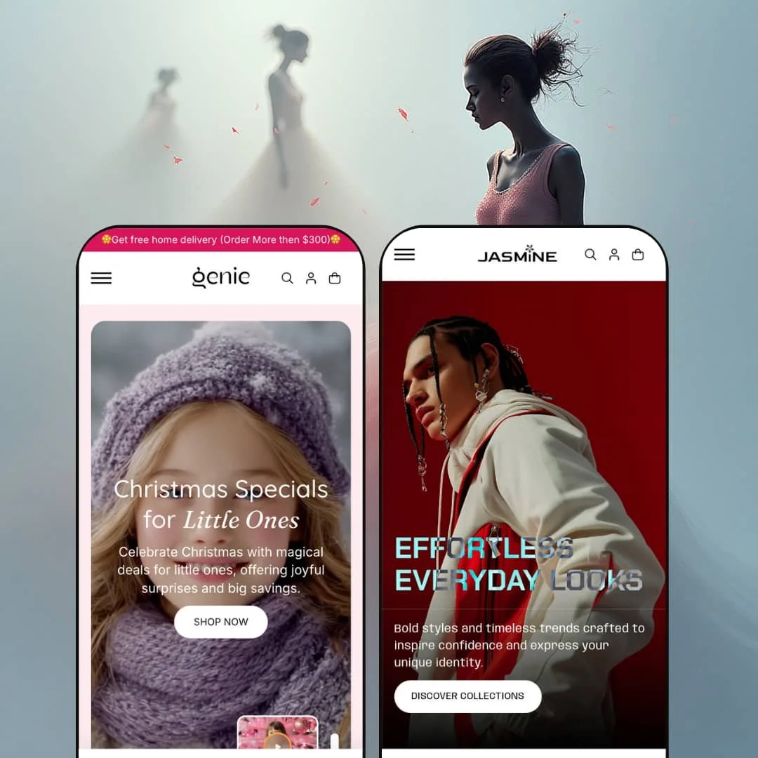
Genie is presented through two very different storefront moods: Default, which is staged for kids’ products, and Jasmine, which is staged for fashion and lifestyle. The key thing to understand is that the demos mainly show how each preset surfaces the theme’s tools, not what the theme is “limited to.” In practice, the two presets feel like two merchandising playbooks built on the same foundation, with a different emphasis on pacing, imagery, and how aggressively the page pushes you toward a click.
Pros.
〰️
Pros. 〰️
✚ Flexible presets, consistent core
flexible preset options that maintain core functionality while offering distinct aesthetic approaches. In practical terms, that means you can keep the same underlying shopping flow while choosing a storefront vibe that fits your category. Default leans playful and promo-forward, while Jasmine leans editorial and curated, yet the shopping journey remains familiar.
✚ Fast paths to purchase without forcing a layout change
The demos repeatedly use quick, in-context shopping patterns rather than pushing every interaction into a full page hop. When a shopper wants to act immediately, the flow supports that behavior while still keeping product detail accessible. For merchants, that can reduce friction during “I already know what I want” moments.
✚ Cart experience that stays in the shopper’s momentum
Adding items routes you into a cart drawer experience that keeps shoppers in the browsing context rather than dumping them into a separate dead-end step. The Default demo goes further by framing the cart around a free-shipping progress goal, which creates a simple incentive to add one more item. That kind of momentum-preserving cart pattern is especially helpful for stores relying on add-ons or bundles.
✚ Merchandising and trust blocks designed to be staged in multiple ways
Across the demos you see recurring section types used for urgency, reassurance, and brand-building, including timed promo framing, FAQs, testimonial-style content, blog modules, and newsletter discount messaging. The important part is how flexible the staging can be: Default uses these blocks to create a guided funnel, while Jasmine uses them to support a magazine-like journey. Either way, the structure gives merchants multiple conversion levers without relying on one single section to do all the work.
✚ Visual storytelling modules that fit both playful and editorial brands
The Jasmine demo showcases story-first modules such as a video section, “Styled by Fashion Insiders,” and a Before/After slider that encourages comparison. Default, meanwhile, stages more playful interaction like image hotspots that reveal practical details. The shared advantage is that the theme supports storytelling beyond “image plus button,” and that can increase engagement when the product benefits from context.
Cons.
〰️
Cons. 〰️
🚫 Small, subtle UI targets can hide valuable interactions
Both demos lean toward understated iconography for secondary actions, including tiny triggers on product cards, compact header icons, and small interactive hotspots. That design choice looks clean, but it can reduce discoverability for shoppers who don’t naturally explore UI details. In real stores, it puts more pressure on merchants to ensure key actions are visually obvious enough for their audience.
🚫 Text-on-image readability depends heavily on the image choices
In both presets, important messaging is often layered directly on top of photography. That can look premium, but it also means legibility varies with the image you choose. If you reuse the same hero approach, you’ll want to be deliberate so the call-to-action remains easy to read at a glance.
🚫 Content-rich pages can become long and image-heavy
The section variety is a strength, but the Default demo shows the trade-off: stacking many blocks creates a longer scroll and a heavier “visual load.” That can be fine for storytelling, yet it may slow decision-making for shoppers who want quick category access. The theme doesn’t force you to build long pages, but the demos illustrate how easy it is to overbuild if you aren’t selective.
-
Default is staged for a kid-friendly storefront, with bright colour, cheerful typography, and a “family shopping” vibe throughout. It feels built for stores where the shopper wants quick reassurance (timed promos, trust blocks, familiar sections) and fast scanning rather than slow editorial browsing.
What works in this preset
The above-the-fold experience is staged as a rotating hero with a clear “Shop Now” style call-to-action, and the demo adds a video-style overlay prompt. Mechanically, that gives first-time visitors two obvious paths: jump into shopping, or pause for a richer brand moment. The impact is immediate because you don’t have to hunt for the first “next step.”
The demo also leans heavily into age-segmented promotional messaging. Instead of one generic sale block, the offer framing is broken down by audience, which makes the promo content feel more relevant and easier to self-select. In day-to-day use, that staging can reduce the “where do I start?” feeling that happens on busy kids’ stores.
Default’s staging includes interactive hotspots on imagery that reveal extra detail like pickup availability. The mechanic is simple (tap or click to reveal information), but it adds a slightly app-like feel to the merchandising. For shoppers, the benefit is that you can learn something meaningful without being forced into a full page change.
The overall section rhythm is intentionally dense. This demo stacks multiple blocks that mix product merchandising with reassurance-style content (for example, things like FAQs, testimonials, blog teasers, and cross-sell style sections such as “Smart Sets”). That structure makes the homepage feel like a guided funnel rather than a minimal catalog front door, which can be a conversion-positive choice in this specific niche.
Where it stumbles
In this demo staging, the homepage becomes a long scroll because so many sections are stacked one after another. The mechanics are not confusing, but the pace can feel heavy, especially for shoppers who just want to get to a collection and compare items. If you keep this exact “section-rich” approach, it’s worth being intentional about what earns its place above the fold.
The imagery hotspots are a good idea, but the demo’s hotspot targets are small. That makes discovery less reliable, since shoppers often miss tiny UI targets unless they’re already in “explore mode.” It’s not a deal-breaker, but it does mean this preset’s staging benefits from slightly more obvious prompts.
-
Jasmine is staged as a fashion-forward, editorial storefront. The typography hierarchy is sharper, the imagery is treated like the main selling tool, and the page reads more like a lookbook that happens to be shoppable.
What works in this preset
The top of the homepage is staged with a striking hero and a clean navigation presentation, including obvious routes like Home, Collections, Catalog, About, News, and Contact. Mechanically, the layout feels restrained, which helps the photography carry the story. The shopper impact is that the brand reads as premium before you’ve even scrolled.
Jasmine’s demo is also structured as a curated narrative. It flows from the hero (“Effortless Everyday Looks”) into sections that feel like editorial chapters, including “From Runway to Real Life,” a featured collection slider, a “Watch the Trend” video module, and a “Styled by Fashion Insiders” showcase. This is less “promo stacking” and more “guided discovery,” which suits fashion browsing behavior well.
The on-sale area (“Find Your New Favourite on Sale”) surfaces product cards in a clean way, with secondary actions kept subtle. In this demo staging, the quick-view trigger is present but not loud, and it’s treated as an optional layer rather than the headline interaction. That makes the grid feel calmer, though it does put more responsibility on the shopper to notice the extra action.
A standout staging choice here is the Before/After slider section. Mechanically, it encourages comparison in a way that feels natural for fashion, since styling is part of the product value. The net effect is that the page can sell “how it wears” instead of just “what it is,” without requiring the shopper to bounce around multiple pages.
The Jasmine demo product page is also staged like a modern fashion PDP. It pairs a gallery that includes zoom controls with clear variant swatches, quantity controls, and direct purchase actions near the top. Then it extends the experience with a “Make a Pair” cross-sell carousel, followed by a long vertical text motif that keeps the brand voice present even deep on the page.
Where it stumbles
In this demo staging, key secondary actions can be easy to miss because the quick-view trigger is intentionally subtle. That’s consistent with the editorial look, but it can reduce interaction for shoppers who don’t instinctively hover or explore card-level UI.
There’s also a navigation clarity issue on smaller layouts in the demo: the collapsed menu presentation can show truncated labels (for example, “Hom…”). Mechanically, that still works, but it can create a small confidence hit for shoppers who rely on the menu to orient themselves quickly.
Niche Suitability
Not Ideal For
Final Recommendation
★ 7.0/10
Rating
-
Comprehensive modules: quick‑view, cart drawer, countdown timers, carousels and pickup checks. Basic Shopify filtering only; no advanced filtering tools.
7
-
Theme editor provides numerous sections and blocks; however, hover‑only interactions require careful setup and user instruction.
7
-
Layouts adapt well and carousels swipe smoothly; hover‑dependent features need visible alternatives for touch devices.
7
-
Animations and sliders are fluid, but long pages with many images could slow initial load on weak connections.
7
-
Both presets showcase different moods; merchants can customise colours, typography and section order extensively.
7
FAQ
〰️
FAQ 〰️
-
👑 Yes, especially if you want promo framing and trust content integrated into the shopping path. The Default demo is staged around a kid-friendly palette and age-segmented merchandising, which suits that audience well.
-
📱The layouts are designed to adapt cleanly as the screen gets smaller, and the demos keep the shopping journey straightforward. Where you’ll want to pay attention is tap comfort, since some actions are presented as compact icons in the demo styling.
-
🎨 The two presets already demonstrate how far the look can shift through palette, typography hierarchy, and section rhythm. Default reads playful and promo-led, while Jasmine reads editorial and fashion-led, without changing the core shopping journey.
-
⚡ Interactions in the demos feel smooth, including modal-style shopping steps and drawer behavior. The main practical constraint is how many image-heavy sections you choose to stack, since that can affect how “light” the page feels.
-
👕 Yes, the demo flows present variants as swatches or selectors in the shopping journey, and the purchase actions stay close to those selections. On the Jasmine product page, the variant choices sit alongside quantity and direct purchase actions, which keeps decision-making tight.
-
🔎 The theme doesn’t ask you to learn a special SEO system inside the design itself. You’ll still manage the usual store SEO basics through Shopify, while the theme focuses on clean presentation and content structure.
-
💱 Yes. Localization is controlled through your Shopify store settings, and the theme’s job is to display those choices in the storefront. The demos include language and currency selection UI, which aligns with that setup.
-
⚙️ In general, you can still use the usual Shopify app ecosystem for reviews, subscriptions, and similar add-ons, since those live on top of your theme. What matters most is how you want the app UI to appear within the theme’s styling and spacing.
-
🛒 Yes. You can explore the Default and Jasmine demos directly, and that’s the best way to judge whether the staging matches your brand. It also helps you spot which interactions you want to emphasize more than the demo does.
This review is based on hands-on testing of the publicly available preset demos of the Genie Shopify theme as of December 28, 2025. Theme features, preset availability, and performance can change with subsequent updates from the theme developer.