
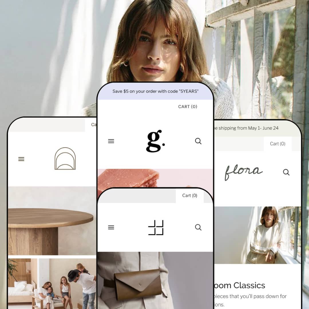
Grid’s name hints at its hallmark: a flexible grid layout that puts imagery first. This versatile Shopify theme prioritises visual storytelling through mosaic heroes, second‑image hover effects and generous white space. During testing, the theme consistently surfaced universal features such as mega menus for deep catalogues, predictive search, mini cart pop‑overs and robust variant selectors. The first impression on every preset combines strong typography with bold imagery, gently guiding shoppers toward curated collections and product pages.
Pros.
〰️
Pros. 〰️
✚ Flexible presets, consistent core
flexible preset options that maintain core functionality while offering distinct aesthetic approaches. The style shifts from bright and airy to dark and dramatic without losing the underlying shopping mechanics or navigation patterns. That consistency lets teams experiment with look and feel while preserving a reliable buying flow.
✚ Visual grid that tells stories
Grid’s image‑first system presents multiple narratives without clutter. Mosaic heroes and editorial sections can highlight several destinations at once, and alternate‑image hovers offer quick product glimpses without leaving the page. Shoppers get a magazine‑like browse that encourages exploration while keeping products front and centre.
✚ Navigation built for depth
Large catalogues benefit from robust mega menus and predictive search that surface destinations quickly. The shop stays feelable even when the category tree gets complex, so users find their way with fewer detours.
✚ Variant‑aware product pages
Selectors update price and availability as options change and avoid dead‑end combinations. Badges and sale pricing remain clear as selections change, so shoppers understand status and discounts at a glance.
✚ Cart access without losing place
A compact mini cart pop‑over exposes line items and quantity controls in context. Shoppers can check the running tally or move to checkout without breaking the flow of discovery.
✚ Editorial building blocks
Narrative sections—about pages, journal slices, lifestyle vignettes—slot easily between product blocks. Brands can express ethos and craft while maintaining a steady rhythm through the page.
Cons.
〰️
Cons. 〰️
🚫 Pacing that favours PDP‑first journeys
Across presets, the browsing rhythm nudges shoppers to product pages for full context rather than pushing rapid, grid‑level transactions. High‑volume or flash‑sale operations that rely on one‑click carting from cards may feel slowed.
🚫 Effort needed to hit the sweet spot
Grid exposes many configuration levers. Unlocking the best balance of hero composition, navigation prominence and card behaviour takes deliberate setup and testing.
🚫 Card dynamism varies by style
Some presets strike a quieter tone on collection cards. That cohesion looks polished, but it can place more of the persuasion on product pages in assortments where quick contrasts drive decisions.
-
Bright (the default) uses a clean, modern palette with lots of white space. The landing composition gives beauty and personal care brands an upbeat, magazine‑like start to the journey.
What works in this preset
The header composition sets an energetic tone while keeping copy concise. It feels editorial yet product‑led, which suits brands that launch frequent, tightly curated drops. As a shopper moves down the page, the cadence stays light and breathable, letting photography do most of the persuasion.
Promotional placements sit comfortably near the top and echo the page’s visual rhythm rather than fighting it. As the scroll continues, typography maintains a steady, legible tempo that keeps sections clear without adding clutter. The card presentation stays restrained so imagery and section headlines carry most of the work.
Where it stumbles
If a brand wants one story to dominate above the fold, this preset’s default balance may feel less single‑minded. Teams that lean on a singular seasonal statement could prefer a more linear hero treatment.
-
Flora softens the presentation with pastels, editorial hero slides and neat, evenly spaced grids. The look aligns with fashion and lifestyle labels that prefer a gentle, modern tempo.
What works in this preset
The full‑width hero slider frames campaigns like short editorial spreads. Transitions feel smooth rather than flashy, so seasonal messages can breathe. This pairs well with photography that emphasises drape, texture and movement.
Below the fold, Flora’s tidy grid carries the same calm. Cards sit in well‑spaced rows with quiet text treatments that keep attention on silhouettes and details. The overall pacing encourages considered browsing that still feels current.
Flora also leans into brand narrative. Supporting sections sit naturally beside compact product rows, so a lookbook or journal excerpt can share space with a grid without visual friction. Fashion labels can weave tone and product in the same scroll.
Where it stumbles
On some collection views, key details stay hidden until hover. The minimalist surface is elegant, but deal‑seekers who skim for quick comparisons may need extra interactions before deciding.
-
Knoll adopts neutral tones and structured layouts that evoke a refined furniture showroom. It’s a poised, architectural take that favours clarity, scale and restraint.
What works in this preset
The grid lands with showroom precision. Large imagery blocks present materials and proportions cleanly, which helps buyers imagine pieces in real rooms. Copy is spare and well placed, so attention stays on form.
Pacing remains measured from top to bottom. Sections follow a calm order that keeps long pages organised rather than dense. The presentation suits retailers who sell considered, higher‑ticket items.
Knoll’s typographic system adds to the disciplined tone. Headlines guide the eye without stealing focus from photography, and the neutral palette keeps everything cohesive. The result is calm confidence.
Where it stumbles
No notable preset‑specific issues surfaced beyond taste. The restraint that makes Knoll elegant can feel quiet to brands chasing a louder, trend‑driven mood.
-
Ember runs dark and dramatic with full‑screen slides and bold type. It’s a cinematic option for accessories and lifestyle brands that trade on mystique and margin.
What works in this preset
The hero makes an entrance. Full‑bleed visuals and stripped‑back copy create a runway‑like stage for a single story, then hand off to product rows without a jolt. It feels premium and deliberate.
Ember’s typography carries weight. Headlines are assertive, body text is crisp and spacing stays generous enough that the dark palette never reads heavy. It’s a strong canvas for moody art direction.
Where it stumbles
The demo skewed heavily toward sold‑out items. That staging choice makes it harder to test cart flows and can distract from the otherwise sleek path to purchase; it’s not a theme limitation, but it does colour first impressions.
Niche Suitability
Not Ideal For
-
Visual brands in fashion, beauty, home décor or accessories that value curated imagery and cohesive storytelling. If photography and art direction are core assets, Grid turns them into a clear, shoppable narrative.
-
High‑throughput retailers and flash‑sale players who depend on the fastest possible grid‑to‑cart flow. A template built explicitly for bulk, rapid add behaviour will better match those priorities.
-
Medium — There’s ample control over layout, typography and content blocks, but real polish comes from thoughtful configuration and testing. Expect to budget time for dialling in hero strategy, navigation structure and product card presentation.
Final Recommendation
★ 7.8/10
Rating
-
Grid covers the essentials: mega menu, predictive search, variant selectors and cross‑sell, exposed through flexible sections and settings.
8
-
The editor is straightforward, though discovering the right combination of section options takes a short learning curve.
8
-
Key interactions translate cleanly to taps; the editorial pace can feel slower for rapid multi‑item purchases.
7
-
Pages load briskly with lazy‑loaded media and minimal layout shift; animations and transitions remain fluid across presets.
8
-
Multiple presets, configurable typography and colour options, plus a wide section catalogue allow a bespoke look; card behaviour varies by style and setup.
8
FAQ
〰️
FAQ 〰️
-
👑 Yes. The Default and Flora presets lean into clean or pastel palettes with image‑led cards and strong variant support, and both accommodate brand stories through dedicated narrative sections.
-
📱Yes. Key interactions translate cleanly to taps, and predictive search remains usable without fuss.
-
🎨 Highly. You can adjust colour palettes, typography, section order and imagery without code, and the mega menu plus homepage grid give plenty of room to reflect brand identity.
-
⚡ Performance was smooth in testing, with quick page loads, lazy‑loaded images and responsive animations. Even complex hero sliders didn’t introduce distracting jank.
-
👕 Yes. Product selectors update price and availability dynamically and avoid unavailable combinations. In grids and galleries, alternate images can appear on hover when enabled.
-
🔎 Grid follows Shopify’s SEO best practices with sensible heading hierarchies and fast rendering. Meta titles and descriptions are handled through Shopify’s built‑in tools.
-
💱 Yes. It works with Shopify’s Markets and translation settings, and the theme is compatible with those configurations.
-
⚙️ Yes. Grid works with common review, loyalty, subscription and bundling apps found in the Shopify App Store. Some design tuning may be needed to keep visuals consistent.
-
🛒 Yes. You can explore live demos for all presets on the developer’s site and install the theme via the Shopify Theme Store with an unlimited trial on unpublished stores.
This review is based on hands‑on testing of the publicly available “Default”, “Flora”, “Knoll” and “Ember” preset demos of the Grid Shopify theme as of 14 November 2025. Theme features, preset availability and performance can change with subsequent updates from the theme developer.