
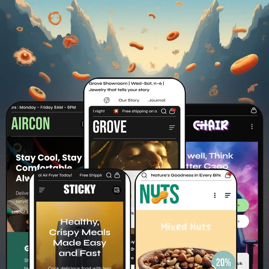
Grove is a versatile Shopify theme offering an impressive range of layouts tailored for very different product niches, from jewellery and home appliances to service businesses, gaming‑inspired products and speciality food. Across its presets, the theme aims for a polished shopping experience built around strong navigation presentation, quick product discovery, and cart momentum rather than a purely decorative front end.
Pros.
〰️
Pros. 〰️
✚ Flexible presets, consistent core
Grove offers five distinct presets covering fashion, electronics, services, gaming and food. Each preset employs unique typography, colour schemes and section arrangements while sharing a consistent foundation of sections and shopping patterns. For merchants, that means you can start from a niche‑aligned visual system without feeling like you are buying five completely different themes.
✚ Storytelling sections that encourage browsing
The theme’s section library is built to support narrative merchandising, not just product grids. Features like image hotspots, before/after sliders, testimonial carousels and social‑style galleries give merchants multiple ways to add context and credibility. For shoppers, this creates a learn‑and‑explore experience that can increase time on site and help justify higher prices.
✚ Feature‑rich product and cart interactions
Across the demos, Grove leans into fast shopping loops. Quick‑view modals and quick add patterns let shoppers act without constantly bouncing between pages, while cart drawers can surface free‑shipping progress bars, coupon prompts and order notes in the same flow. The search overlay with instant suggestions adds another fast path, letting shoppers jump to products and categories while typing. Done well, these interactions keep momentum high and reduce the sense of friction at checkout.
✚ Product pages built for detailed selling
Grove’s product pages are staged as long‑form sales pages rather than minimal templates. Variant swatches, quantity controls, pickup availability and accordion‑based information blocks help merchants present depth without overwhelming the layout. Cross‑sell areas and complementary product blocks also encourage shoppers to build a larger cart while they are still engaged.
✚ Lead generation support for service businesses
The Aircon demo shows that Grove can be staged for bookings and quotes, not only for physical products. Lead forms, service benefit cards and pricing tables provide a service‑first structure that still leaves room to sell related items. This makes the theme more flexible for hybrid businesses that want both appointments and e‑commerce revenue.
✚ Smooth performance in demo testing
In hands‑on testing, the demos loaded quickly and interactive sections such as sliders, accordions and carousels felt responsive. Even heavier media moments did not create noticeable lag in the browsing flow. For merchants, that baseline smoothness reduces the risk that a feature‑rich layout will feel sluggish.
Cons.
〰️
Cons. 〰️
🚫 Cart flow and confirmation can vary by context
In testing, some add‑to‑cart interactions opened a cart drawer immediately, while other paths redirected to a cart page. In a few product grids, add‑to‑cart feedback was subtle enough that shoppers could miss the confirmation without checking the cart icon. Merchants should choose a cart behaviour intentionally and test it across home, collection and product contexts so the experience feels consistent.
🚫 Placeholder content needs manual cleanup
Several demos included leftover placeholder messaging such as “Add important info here,” plus faint taglines that feel unfinished near the bottom of pages. These are easy to fix, but they can undermine trust if they slip into a live store. Anyone launching on Grove should treat placeholder cleanup as a required pre‑launch step.
🚫 Some micro‑interactions need polish
A few interface details can feel more delicate than they should. Small product‑card icon targets, dense small‑screen menus, and overlays that are easy to dismiss accidentally can all create moment‑to‑moment friction, even when the overall design is strong. The theme is capable, but merchants should do a careful pass on tap targets and overlay behaviour to match the premium look.
🚫 Strong preset styling increases adaptation work
Each preset is heavily tailored to its niche, from neon gaming visuals to earthy grocery merchandising. Repurposing a preset for a different industry can be done, but it usually requires significant editing of images, icons, colour choices and section messaging. The upside is that you get a purposeful starting point, but it is not a one‑click make‑it‑anything design.
-
The Default preset targets jewellery or fashion boutiques, leaning on elegant typography, soft colour accents and generous white space. The demo is staged around high‑end moissanite jewellery and accessories, so the experience feels calm, premium and very photo‑led. It is a classic editorial take on Grove’s overall design approach.
What works in this preset
The visual pacing is the biggest win. The combination of airy spacing and delicate typography makes product photography feel more expensive, and it gives the home page a boutique‑showroom rhythm. That same restraint also helps feature sections land without feeling like hard sales blocks. If you sell small, high‑margin items, the quiet presentation keeps attention on detail.
In this preset demo, navigation is presented as a visual mega menu with image links under “Shop.” Categories and featured items are surfaced in a structured layout that feels curated rather than purely utilitarian. For shoppers, it shortens the path from browsing to a specific collection because the menu itself does some merchandising. For merchants, it signals a store with multiple lines, not a single hero product.
In this preset demo, product cards surface quick actions through small iconography rather than large buttons. An eye icon is used to stage a quick‑view interaction, and the modal opens after a short hover delay, which makes the browsing flow feel deliberate and high‑end on desktop. The same staging supports faster add‑to‑cart moments without forcing constant page changes. It is a “browse first, commit second” pattern that fits jewellery shopping well.
In this preset demo, storytelling is staged directly into the home page. A lifestyle image is paired with clickable hotspots that point shoppers to featured items, which makes cross‑selling feel visual instead of pushy. The demo also uses a vertical before/after slider to create an interactive moment that breaks up the scroll and invites a closer look. Together, these sections make the page feel like a lookbook rather than a simple product grid.
In this preset demo, direct purchasing is still available when the shopper is ready. The demo includes a Featured Product section that places variant pickers, quantity controls and an add‑to‑cart button on the home page itself. That keeps higher‑intent shoppers moving without requiring them to hunt for the product page. It also lets merchants spotlight a hero item without sacrificing the broader editorial vibe.
Where it stumbles
Some click targets feel tighter than they need to be. In this demo staging, the quick‑view eye icon and the small add‑to‑cart icon on product cards can lead to mis‑clicks when shoppers aim for the modal. The overall look is refined, but refining the tap and click comfort would make it feel more confident.
During testing, the cart badge occasionally reset after multiple adds when returning to the home page. It reads like a demo‑session glitch rather than a consistent behaviour, but it is still the kind of thing that can shake trust if it happens for real shoppers. Merchants should run a full add‑to‑cart loop before launching to confirm the behaviour is stable.
The mobile presentation of the large menu can feel dense. In this demo staging, the multi‑column navigation collapses down into an accordion‑style list on smaller screens. It remains usable, but it is easier for the menu to feel crowded when many categories are present. If you plan to keep a deep category tree, the mobile menu deserves a careful review.
-
The Sticky preset is staged for kitchen appliances with a bold, high‑contrast aesthetic. Thick typography, bright product shots and oversized icons make the demo feel energetic and feature‑forward. It is designed to sell a hero product quickly and to justify the purchase through visual explanation.
What works in this preset
The overall hierarchy is clear and assertive. Large type and bright imagery make it obvious what the product is and why it matters, which helps when you are selling functional hardware instead of emotional goods. The neon‑accented styling also keeps the page from looking like a generic appliance site. It feels intentionally branded, even in demo form.
In this preset demo, the home page pushes a direct purchase path through a full product card for the SmartCrisp Digital Air Fryer. Swatches, a quantity selector, and both add‑to‑cart and buy‑now buttons are placed right on the landing experience. That staging reduces friction for shoppers who already know what they want. It also makes the home page feel like a selling page, not just an introduction.
In this preset demo, the section rhythm is built around feature education. The demo stacks full‑width panels that explain benefits such as non‑stick cleaning, rapid air circulation and preset cooking modes, using images and short, skimmable copy blocks to keep the information moving. This works well for a considered purchase where shoppers need justification before they commit. It also reduces the burden on the product page to do all the explaining.
Upsells are staged as part of the product story rather than an afterthought. In this preset demo, the product page presents a complementary product area that behaves like a mini bundle builder, encouraging shoppers to add extras without leaving the flow. The layout frames add‑ons as “complete the setup” choices rather than random recommendations. For merchants, it is a persuasive default merchandising pattern for accessories.
In this preset demo, social proof stays close to the buying moment. A mosaic‑style image grid at the bottom of the product page invites shoppers to follow on Instagram, which adds lifestyle texture to an otherwise spec‑heavy page. It’s a small touch, but it helps the brand feel active and modern. For high‑ticket appliances, that kind of credibility can matter.
Where it stumbles
In this demo staging, the integrated home‑page product card is more transactional than exploratory. It does not emphasise additional imagery or a deeper preview moment, so shoppers who want to compare angles or read more will still end up moving down into the longer product narrative. That is not inherently bad, but it shifts the page into a buy‑now‑or‑scroll choice early.
The overall template is feature‑heavy by default. The abundance of explanatory sections is perfect for appliances, but it can overwhelm merchants selling straightforward goods who do not have rich benefits to explain. A minimalist store could still use the styling, yet it would likely require trimming sections and rewriting copy so the page does not feel overbuilt. The demo is a strong starting point, but it assumes you have something to say.
The header presentation can feel busy on small screens. In this demo staging, the sticky header stacks multiple utilities such as announcements, search, currency, account and cart into a tight space. Navigation remains functional, but it can consume valuable vertical room at the top of the viewport. Merchants should test their own announcement and icon choices to keep the header from dominating the page.
-
Aircon transforms Grove into a service‑oriented website for HVAC or home services, with lead generation staged as the primary goal. The demo replaces the usual retail rhythm with booking prompts, service cards and pricing tables that feel closer to a local services landing page. It is the clearest example of Grove being used beyond pure product retail.
What works in this preset
The hero is built to capture demand immediately. In this preset demo, the first screen pairs a clear headline with a lead form asking for name, service type, phone and email. That framing turns the home page into a conversion point rather than a brochure. For service businesses, it means fewer steps between interest and contact.
In this preset demo, trust building is staged in quick, scannable blocks. A four‑card benefits section highlights points such as “No Hidden Cost,” “GST Absorbed,” “Same Day Booking,” and “Customer Care,” each paired with an icon and a short explanation. The structure is familiar, but it works because it addresses common objections without requiring deep reading. It also makes the page feel organised and professional.
In this preset demo, pricing is presented in a way that supports decision‑making. The “Pricing Plan” section lists different air‑con brands and unit counts with visible prices and “Book now” calls‑to‑action. That can reduce back‑and‑forth for service quotes and help shoppers self‑select a package. In demo staging, the presence of brand logos also adds legitimacy.
In this preset demo, testimonials and promotional messaging are integrated as part of the service pitch. Customer quotes and a promotional banner, such as a maintenance discount, add reassurance and urgency without changing the overall structure of the page. This is especially useful for services where trust is the conversion barrier. The demo treats social proof as a core section, not a footer afterthought.
Even with its service focus, the preset still stages space for physical products. At the bottom of the home page, the demo includes a product grid of air coolers with quick‑view icons and add‑to‑cart controls. That hybrid approach fits businesses that book services but also sell accessories or consumables. It is a practical bridge between lead generation and retail revenue.
Where it stumbles
The hybrid positioning can cut both ways. Because the demo mixes service booking and product selling, visitors might not immediately understand whether they are meant to book a service, buy hardware, or do both. Merchants need to make an intentional choice about which path is primary and adjust content accordingly. Otherwise the experience can feel like two sites stitched together.
Navigation is staged in a very simple way. In this preset demo, the top menu lists only a few pages, which keeps the header uncluttered but also limits how much structure is shown up front. A service business with many sub‑services, resources or documentation may need to build out a deeper information architecture. The demo does not prevent that, it just does not spotlight it.
The search overlay behaviour can be easy to dismiss accidentally. In this demo staging, suggestions can vanish if the page scrolls, which makes the interaction feel fragile. A more pinned or persistent results area would reduce accidental exits. It is a small detail, but it matters when shoppers are trying to find something quickly.
Some imagery also feels generic. Several sections rely on stock photos that do not clearly communicate HVAC work, which can weaken trust for local services. Merchants will want to replace these assets with real team, job site or equipment photography. The structure is solid, but the visuals need specificity.
-
Chair showcases gaming and office chairs with a neon, gaming‑centric design. Dark backgrounds, neon gradients and holographic typography create an energetic tone aimed at tech‑savvy shoppers. The demo feels like a product launch page more than a traditional furniture catalogue.
What works in this preset
The aesthetic is the main differentiator. Dark surfaces and neon accents make the product feel performance‑oriented, and the typography reinforces a gaming brand mood rather than an office supply vibe. This style choice helps even basic product grids feel more dramatic. If your audience expects tech energy, the preset delivers it.
The hero composition is also strong. In this preset demo, the home page opens with a smoke‑filled image and clear calls‑to‑action for pre‑orders, then overlays a floating product card that reinforces price and product focus. That layered layout feels intentional and modern, not like a standard template header. It is built to push action quickly.
In this preset demo, feature education is staged with supportive visuals. Sections highlight ergonomic elements like dynamic lumbar support, flexible backrests and adjustable seats, and the demo uses graphics to illustrate body support rather than relying only on text. That makes the product benefits easier to grasp at a glance. It also reduces the wall‑of‑specs problem that chair stores often face.
In this preset demo, long‑form details are kept organised through multiple accordions. Sections like Product Features, Specifications, Shipping & Returns and Assembly Guide are collapsible, so the page stays readable while still carrying depth. Shoppers can skim and expand only what they care about. For merchants, it’s a clean way to hold complex information without creating clutter.
In this preset demo, social proof is placed mid‑page where it can actually influence decisions. A testimonial slider with star rating sits inside the product narrative, not buried at the bottom. This placement makes the review content feel like part of the product story. It also gives nervous buyers a reassurance moment before they reach the purchase area.
Media handling matches the premium positioning. In this demo staging, clicking a product image opens a full‑screen zoom overlay with navigation arrows, making close inspection feel intentional. The dark, high‑contrast footer continues the theme with contact details, hours, address and numerous social links. Together, these elements keep the experience coherent from top to bottom.
Where it stumbles
In this preset demo, collection pages are staged with straightforward add‑to‑cart calls and do not emphasise a quick‑view trigger. That can be fine for decisive shoppers, but it nudges detail‑oriented buyers into the product page more often. If your audience expects preview first, you may want to adjust how discovery is presented.
Some merchandising text can be easy to miss. In the cross‑sell slider, category labels appear but full product names may not show until hover, which introduces a small information gap. The design keeps the slider clean, yet it asks shoppers to interact to see key details. For high‑consideration purchases, visible names can reduce uncertainty.
The dark canvas raises your asset requirements. Lighter or low‑contrast product photos can look washed out against the background, which undermines the intended premium feel. Merchants will likely need to prepare high‑contrast imagery and consistent lighting. The preset looks great when assets are strong, but it is less forgiving when they are not.
The cart overlay behaviour can also create friction. In testing on this demo, the cart drawer sometimes overlapped bottom sections and could be difficult to close on small screens, which risks hiding important footer links. This is the kind of interaction detail shoppers blame on the store, even if it is a configuration quirk. A quick small‑screen pass is essential before publishing.
-
The Nuts preset is staged for online grocery and speciality food, using earthy colours, clean typography and appetising photography to signal freshness. Instead of leaning on heavy animation, the demo builds a long home page made of distinct category rows, call‑outs and promotional panels. It feels like a guided aisle‑by‑aisle shop rather than a single curated collection.
What works in this preset
The tone is grounded and food‑first. Earthy colour choices and simple type keep the page feeling clean, while product imagery does most of the persuasion. The demo communicates nutrition and freshness without trying to look luxury or high‑tech. That clarity helps shoppers understand what kind of store they are in within seconds.
Category discovery is staged right at the top. In this preset demo, the sticky header is filled with category links such as Brazil Nuts, Mixed Nuts, Salted & Baked, Chocolate and Dry Fruits, and the hero reinforces this with three large collection tiles. Discount badges on the hero tiles help shoppers notice promotions immediately. The result is a home page that behaves like a category directory.
In this preset demo, product cards are designed for fast scanning. Cards show price, compare‑at price, in‑stock labels and large add‑to‑cart buttons, which keeps decision‑making simple. The clean card design makes it easy to compare items across rows without visual fatigue. For grocery‑style shopping, that clarity is a real advantage.
In this preset demo, the home page structure is intentionally long, but it is also structured. Each themed row begins with a left‑hand promotional tile, such as “Crunchy Nut Treats,” “Salted Delights,” “Choco Bliss,” or “Roasted Goodness,” followed by a run of product cards. This rhythm makes the page feel like separate aisles, and it helps shoppers orient themselves as they scroll. It is a strong approach for stores with many sub‑categories that still want a curated feel.
A mid‑page call‑out adds a clear hero moment. The “Pure Crunch, Pure Nutrition” section highlights Premium Roasted Whole Almonds with a full product card, including size options, quantity controls and both add‑to‑cart and buy‑it‑now buttons. That gives the home page a direct‑purchase focal point without breaking the category‑row pattern. It also lets merchants spotlight a best seller in a more story‑led way than a standard grid.
In this preset demo, supporting content blocks reinforce trust and repeat the brand message. The demo uses a four‑column health benefits grid with statements like “Naturally Grown Goodness” and “Freshness You Can Taste,” plus flash‑deal and cross‑sell sliders to keep shoppers browsing. Between rows, colourful promotional banners such as “New Arrivals” create visual resets and seasonal emphasis. The About and Contact pages lean into credibility with physical addresses in New York, London and Dubai, plus email and phone details, and a multi‑column footer that repeats links and a subscription field.
Where it stumbles
In this preset demo, product cards are staged clean and do not spotlight a quick‑view trigger. That keeps the grid uncluttered, but it also means detail‑hungry shoppers will click into product pages more often. For grocery‑style browsing, an extra click can slow the rhythm. Merchants should consider whether their audience prefers speed or depth on the grid.
Some transitions feel a little imperfect. In testing on this demo, opening the cart drawer dimmed the page and caused a small amount of layout shifting underneath. It is minor, but it can make the site feel less solid than the design suggests. If your brand is premium, those micro‑movements are worth smoothing out.
The page length is also a trade‑off. Because the home page stitches together many separate rows and banners, visitors may need to scroll extensively to reach the footer. Shoppers looking for a specific item might prefer a more condensed path to the categories they care about. The structure works, but merchants should watch analytics to ensure scroll depth is not dropping conversions.
Niche Suitability
Not Ideal For
Final Recommendation
-
Merchants who want a highly customisable theme with multiple niche‑specific starting points and strong storytelling sections. Brands with products that benefit from education, cross‑selling and long‑form detail will get the most value from Grove’s section library and product page depth.
-
Stores that want a minimal, stripped‑down storefront with very little editorial content may find the presets more structured than necessary. Merchants who cannot allocate time to replace placeholder content and to adapt the preset styling to their own brand assets may be better served by a simpler, more neutral theme.
-
Medium — Grove provides many built‑in sections and strong preset starting points, but merchants should plan time to replace placeholder content and tailor imagery, icons and copy to match their niche. The cart behaviour and quick‑shopping interactions also deserve a full end‑to‑end test before launch so the experience stays consistent.
★ 7.8/10
Rating
-
Wide range of built‑in elements such as quick view, sliders, hotspots and accordions, plus a cart experience that supports fast adds and upsell‑style merchandising in the demos.
8
-
The theme editor provides many sections and global settings, but merchants must remove placeholder content and decide on cart behaviour. Variants and settings are straightforward once learned.
7
-
Across presets, sections and navigation patterns condense cleanly and the cart drawer stays usable on smaller screens in the demos. Some headers feel crowded and product‑card icons can be small, so spacing and tap targets should be reviewed.
8
-
All presets loaded quickly in testing, with smooth transitions. Heavy media moments did not create noticeable lag.
8
-
With five different presets, Grove can suit many industries. Section padding, colours and typography are adjustable, but each preset has a strong aesthetic that may require substantial editing for other niches.
8
FAQ
〰️
FAQ 〰️
-
👑 Yes. The Default preset’s staging uses elegant typography, generous white space, and a visually merchandised navigation style that fits jewellery and boutique fashion.
-
📱Across presets, sections stack smoothly on smaller screens and the cart drawer stays usable in the demos. Some headers can feel crowded and product‑card icons can run small, but overall the experience remained mobile‑friendly in testing.
-
🎨 The theme supports changing fonts, colours, section order and imagery. Presets provide strong starting points and merchants can swap visuals and text easily, although changing the inherent mood of a preset usually takes more work.
-
⚡ Pages loaded quickly and interactive elements such as accordions, sliders and quick‑view modals responded without lag in testing. The only noticeable delay was occasional add‑to‑cart feedback from some grids, where confirmation could take a moment.
-
👕 Yes. Product pages include variant swatches, size selectors and quantity steppers, and quick‑view modals reflect available options. In the demos, quick view typically showed one variant type at a time, so complex products may still require the full product page
-
🔎 The theme includes SEO‑friendly headings, meta fields and structured blog and FAQ layouts. More advanced SEO work, such as deep structured data editing, still relies on Shopify’s platform settings or apps.
-
💱 Yes, the demos show language and currency switchers in the header in several presets, but merchants still need to enable and configure Shopify Markets or an appropriate setup to make multi‑language and multi‑currency selling work end to end.
-
⚙️ App compatibility depends on the app, but Grove behaved like a normal Shopify theme in testing. Contact forms, the search overlay and newsletter sign‑up sections worked cleanly, and merchants should still verify any critical app stack before launch.
-
🛒 On Shopify, themes can be previewed in your store before purchase. The public Grove demos show the theme’s features in action, but a paid theme is required to publish a live storefront.
This review is based on hands‑on testing of the publicly available preset demos of the Grove Shopify theme as of 3 January 2026. Theme features, preset availability and performance can change with subsequent updates from the developer.