
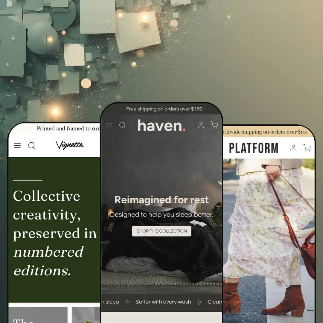
Haven is a premium Shopify theme designed for brands that rely on evocative photography and straightforward purchasing flows. Across the Default, Vignette, and Platform presets, the theme keeps a restrained design language with generous whitespace, oversized imagery, and clear typography. During testing, the core interaction patterns stayed consistent across demos, while the presets mainly changed the palette, hero treatment, and editorial staging.
Pros.
〰️
Pros. 〰️
✚ Flexible presets, consistent core
Across the Default, Vignette, and Platform demos, Haven keeps the same underlying interaction patterns while shifting the mood through palette, typography, and hero staging. That makes it easier to pick a starting aesthetic without gambling on entirely different shopping behavior. For merchants, it also means you can refresh the look without rebuilding the customer journey from scratch.
✚ Photography-led sections that support storytelling
Haven is built to put imagery first, and the demos show how far that can go beyond a simple hero banner. Sections like image hotspots, before/after comparisons, full‑bleed editorial blocks, and embedded video are used to explain benefits and build desire. When the content is strong, the theme’s minimal framing keeps the spotlight on the product narrative.
✚ Smooth browse-to-cart flow for curated shopping
In testing, core conversion touchpoints stayed consistent: product cards support quick-view style modals for option selection, and complex items can route shoppers to the full product page when needed. A slide‑out cart drawer reinforces momentum with quantity controls, a free‑shipping progress bar, and product suggestions, so shoppers can adjust without losing their place. Predictive-style search suggestions further shorten the path when shoppers prefer to navigate by keyword.
✚ Product pages keep key details in view
Haven’s product pages prioritize clarity while maintaining a gallery-like media experience. Information stays anchored as shoppers scroll through imagery, and variants can be selected through swatches. Collapsible accordions keep descriptions, materials, and care instructions organized, which helps detail-driven customers stay focused instead of wading through long blocks of text.
✚ Built-in cross-sells and content blocks reduce app pressure
Cross-selling is treated as a native part of the shopping flow rather than an afterthought. The demos show “You may also like” style carousels and recommended grids appearing on product pages and even within the cart experience. A Journal-style blog section also supports content-led merchandising, so brands that publish regularly can keep that channel visible without redesigning the homepage.
Cons.
〰️
Cons. 〰️
🚫 No instant add-to-cart for single-SKU items
Haven prioritizes option-aware buying over one-tap speed. Even simpler items in the demos typically flow through a quick-view step or a full product page before the add-to-cart action is completed. That can be a sensible guardrail for variants, but it adds friction for shoppers who want immediate checkout from a collection view.
🚫 Heavy visuals can be a trade-off on slower connections
The presets earn their premium feel through large imagery, slideshows, and occasional video. The demos felt smooth in testing, yet the same visual richness can translate into heavier pages for visitors on slower networks. If performance is a primary constraint, the theme’s aesthetic direction may require more careful media choices.
🚫 Some touch interactions may feel finicky
A few modules rely on dragging rather than tapping. The before/after comparison in particular uses a narrow handle, and drag-based widgets can be less precise on touch screens. These interactions still communicate their message, but they may not be as effortless as a simple tap-through experience.
-
Default is staged for home and lifestyle brands, especially bedding and other soft goods. Pale backgrounds and calming typography create a restful mood, and the home page blends promotional blocks with education‑forward storytelling. The demo’s structure focuses on guiding shoppers from a single hero image into a sequence of product highlights and material-focused context.
What works in this preset
The most distinctive choice in this demo is the calm, sleep-forward presentation. Muted tones, generous whitespace, and oversized photography keep attention on the textiles rather than on interface decoration. The hero photograph of neatly made sheets, paired with a direct call to “Shop the collection,” sets expectations quickly and avoids competing visual noise.
Below the hero, this demo adds movement without breaking the quiet tone. A scrolling ticker cycles through short value propositions, so the page feels active while still reading as minimal. Because the palette stays understated, the messaging sits in support of the imagery instead of overpowering it.
Product discovery is staged as a small, curated introduction rather than a dense grid. A four‑product block presents sheet sets with clear imagery, colour swatches, and sale badges, which reinforces the idea that shoppers are browsing a considered range. In this demo, product cards tuck actions behind hover‑revealed icons, and the bag versus plus treatment helps signal whether a quick selection is likely to be simple or more involved.
The educational rhythm is where Default feels most “preset-specific.” The demo leans on an image hotspot scene set in a bedroom, then follows with a draggable before/after comparison, material callouts, embedded video, and a Journal-style blog section with images and excerpts. That sequencing turns the homepage into a guided explainer, which suits products where reassurance and material detail drive confidence.
Where it stumbles
In this demo staging, the before/after comparison relies on a slim drag handle. That can make the interaction feel a bit finicky, especially for shoppers who prefer quick, low-effort gestures. The section still communicates the point clearly, but it may reward patient users more than hurried ones.
-
Vignette reframes Haven as a gallery-like experience geared toward art prints, posters, and decor. Earthy greens and serif typography push the mood toward boutique and curated, while the underlying layout remains minimal and image-driven. The demo reads like an exhibition walkthrough, with storytelling sections that build context before asking for the sale.
What works in this preset
This demo’s strongest move is how it treats whitespace and type as part of the product. Generous margins and calm hierarchy make prints feel like exhibits rather than inventory, which can help justify premium positioning. The result is an experience that feels intentionally paced and editorial in tone.
Vignette also leans into “in-room” imagination. Large interior scenes are staged with subtle white hotspot circles, and in this demo the reveal behavior is understated so the photography stays in control. When the notes appear, they act more like gallery labels than sales callouts, reinforcing the collectible framing.
Navigation is presented as part of the curatorial experience. In this demo, the “Collections” entry expands into a two‑column mega-menu that mixes category links with imagery and artist names, so browsing feels guided rather than purely utilitarian. That menu treatment reinforces the idea that the catalogue is organized by taste and authorship.
Storytelling is given prime real estate throughout the page. Artist spotlights include large photos and short biographies, and “From vision to edition” style sections explain framing options and edition process. Product highlight blocks use full‑bleed imagery with overlay text, which keeps the call-to-action present without turning the page into a grid.
Where it stumbles
The same large-format presentation that makes Vignette feel premium can also make it feel heavy. This demo uses big hero areas and art-focused slideshows, and that kind of image density may be more noticeable for visitors on slower connections. It is a deliberate trade-off, but it still affects how quickly the shop feels “ready.”
The editorial focus can also delay the catalogue moment. Long narrative sections and artist features push product listings further down the page, which means shoppers often need extra scrolling before they reach browsing mode. For audiences who arrive already knowing what they want, the pacing may feel slower than necessary.
-
Platform applies Haven’s minimal framework to footwear and accessories with a fashion-forward tone. Neutral colours, sharper typography, and lifestyle photography create a modern boutique feel, and the page is staged to look like a campaign landing page. The demo foregrounds motion, trust messaging, and cross-category browsing rather than slow, educational build-up.
What works in this preset
The first impression here is intentionally retail and contemporary. The demo opens with an autoplaying hero slider built around seasonal shoe campaigns, which makes the storefront feel active and time-sensitive. That campaign treatment can be useful when the product story changes by season and the hero needs to rotate quickly.
Platform also gives cross-category browsing a prominent role. A horizontal “Shop Handbags” slider sits near the top of the page and presents products with names and prices, inviting shoppers to move between shoes and accessories without hunting for separate entry points. Because it is staged as a dedicated band, it reads as a merchandising priority rather than a secondary suggestion.
In this demo, product selection is framed around quick sizing decisions. Product cards surface a bag icon on hover that opens a quick-view style modal with shoe sizes, price, and an add-to-cart button, so the interaction feels closer to a boutique checkout counter than a catalogue drill-down. It is a small staging choice, but it reinforces that fit is the key decision.
Brand persuasion is handled through repeated lifestyle sections. Blocks such as “Style That Speaks,” “Trends You’ll Love,” and “Crafted with Care” pair full‑bleed imagery with persuasive copy, and a short looping video demonstrates the product in use. Near the footer, icon-based assurances around personalized service, effortless returns, secure checkout, and worldwide delivery work as trust signals without requiring long paragraphs.
Where it stumbles
This demo sometimes repeats itself. Several homepage sections land on similar layouts and similar reassurance copy, which can make the middle of the page feel redundant. The message is consistent, but the rhythm can blur when too many blocks feel interchangeable.
The autoplaying hero slider is also opinionated. In this demo it cycles without visible controls to pause or skip, which may frustrate shoppers who prefer to browse at their own pace. The visual energy is strong, but it assumes visitors want motion.
Finally, the horizontal “Shop Handbags” slider can hide inventory in plain sight. Because it relies on sideways scrolling, some items may get less exposure if shoppers do not notice the arrows. The section is useful for merchandising, yet it asks shoppers to recognize the interaction pattern immediately.
Niche Suitability
Not Ideal For
Final Recommendation
-
Haven is best for brands selling home goods, art prints, fashion, or lifestyle products where photography and editorial context are central to conversion. If your merchandising relies on mood, process, and in-situ storytelling, the theme’s section library gives you a strong foundation.
-
High-volume retailers that need catalogue density as the primary experience may find Haven’s story-first pacing too deliberate. It may also be a mismatch for budget stores where heavy visuals can slow down the buying process, or for merchants who want bolder, more saturated design styles.
-
Medium — Haven offers many configurable sections and a consistent core structure across presets. To get the polished look shown in the demos, you will still need thoughtful content planning and strong imagery.
★ 7.0/10
Rating
-
Robust modules like quick view, image hotspots, a before/after slider, cross-sell sections, and a slide-out cart make the theme feature-rich without leaning on apps. The main trade-offs are the extra step before add-to-cart and the reliance on media-heavy presentation.
6
-
Sticky navigation, predictive-style search, and clear quick-view modals keep browsing straightforward once the sections are in place. The theme’s editorial approach asks merchants to curate content carefully, and shoppers may take an extra step before carting items.
7
-
Desktop testing suggests generous spacing and large controls that should translate well to touch. Interactive elements like quick view and carousels are designed for tap-based browsing, though drag-based widgets such as the before/after comparison may feel less precise.
8
-
Pages felt smooth and interactive components responded promptly in testing. At the same time, the heavy use of large images and video can slow down load times for visitors on slower connections.
7
-
The theme offers many customizable sections and interchangeable layouts, and the presets demonstrate distinct aesthetics ranging from serene to gallery-like to fashion boutique. Merchants can tailor colours, typography, and content blocks without coding.
7
FAQ
〰️
FAQ 〰️
-
👑 If you sell visually driven products like bedding, art prints, shoes, or accessories, Haven’s emphasis on imagery and storytelling can showcase them effectively. The demos are built around mood, process, and lifestyle context, which suits brands that win with presentation. Stores with complex technical specifications or very large catalogues may prefer a more catalogue-first shopping experience.
-
📱Testing was desktop-focused, but the layouts use generous spacing that keeps images, buttons, and navigation easy to reach on smaller screens. Interactive elements like quick view and carousels are built for touch-based browsing. Drag-based widgets, such as the before/after slider, may still feel less precise than tap-driven sections.
-
🎨 Yes. The theme editor allows you to adjust colours, fonts, section order, and content blocks. Each preset demonstrates a distinct style, so you can start from the closest match and then refine it. The overall system is designed to keep the structure familiar even as the aesthetic changes.
-
⚡ During testing, pages loaded smoothly and interactions like search, quick view, and the cart drawer responded promptly. The trade-off is that the presets lean heavily on large images and video. Optimising media files remains important if you expect a significant portion of visitors on slower connections.
-
👕 It supports swatch selectors for colours and sizes, and quick-view modals let customers choose options without leaving the collection context. In the demos, items requiring more complex selection routes shoppers to the full product page. This reduces accidental carting when the selection step is more involved.
-
🔎 Haven does not replace the on-page SEO work you need to do in Shopify. Its main contribution in the demos is a clean, content-forward layout paired with fast interactions, which supports readable pages for shoppers and crawlers. Because the presets lean on large imagery and video, keeping media lightweight helps protect the performance foundation that SEO benefits from.
-
💱 Yes. Haven relies on Shopify’s native language and currency features, so localization is configured through Shopify Markets and your store settings rather than being tied to a specific preset. In practice, that means your language and currency setup can stay consistent even if you change presets.
-
⚙️ Haven’s modular sections are designed to accept compatible app blocks, so you can embed additional functionality without editing code. In most cases, integration work is about placement and styling rather than rebuilding templates. If you already depend on a few key apps, the section-based structure makes them easier to slot into the layout.
-
🛒 Yes. You can explore the official demos for the Default, Vignette, and Platform presets to see the staging choices in context. Like other paid Shopify themes, you can also install the theme in your store as a trial before publishing, which lets you test your content and configuration without committing immediately.
This review is based on hands‑on testing of the publicly available preset demos of the Haven Shopify theme as of 6 January 2026. Theme features, preset availability and performance may change with subsequent updates from the theme developer.