
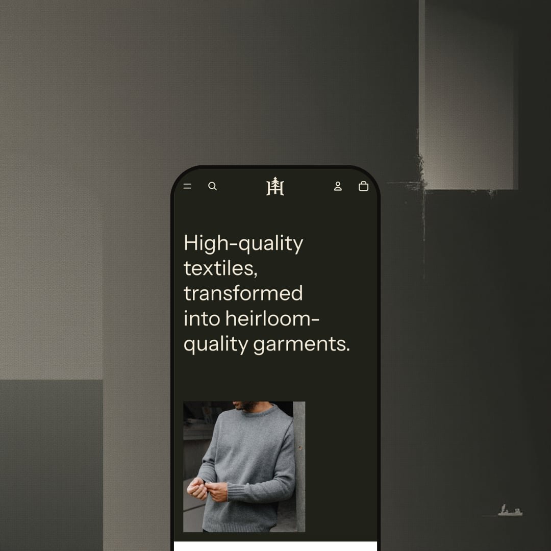
Heritage is a free theme by Shopify that leans hard into an elevated, story-first storefront style. The demo’s look is built around dark, earthy colour choices, bold typography, and generous full-bleed photography, so the first impression is much more “editorial brand” than “catalog grid.” In practice, the homepage rhythm moves from atmospheric hero imagery into product browsing moments and promotional call-outs, then finishes with a footer that pushes shoppers into support and brand-story pages. If you’re selling apparel, accessories, or lifestyle goods where visuals and trust-building content matter, Heritage is designed to make that path feel intentional rather than noisy.
Pros.
〰️
Pros. 〰️
✚ Quick-add and quick-view flow that keeps momentum
The theme’s quick-shop path is built around a modal that surfaces key purchase controls without forcing a full page change. In testing, that flow included variant selection elements alongside add-to-cart and buy-now actions, which helps shoppers stay in browsing mode while still purchasing decisively. The practical impact is fewer “back button” moments during discovery.
✚ Slide-out cart that supports edits mid-browse
Heritage uses a slide-out cart experience that keeps the shopper on the current page while they review what they’ve added. The cart presentation supports common adjustments like quantity changes and includes a discount code field, so customers can correct or refine an order without breaking their browsing session. That reduces friction on mobile-like “single flow” shopping patterns, even when viewed on desktop.
✚ Navigation built for discovery with a mega-menu presentation
Category navigation is handled via a larger, overlay-style menu presentation that exposes sub-collections and uses strong visual call-outs. Mechanically, this makes category depth feel easier to explore than a narrow dropdown. For brands with multiple product groupings, it can increase discovery without forcing a shopper into repeated backtracking.
✚ Predictive search overlay with a clear no-results state
Search is staged as an overlay experience that produces immediate results and suggestions instead of sending shoppers to a dead-end page. In testing, the no-results state was still readable and clear, which matters because it prevents a “broken site” feeling when a shopper searches with the wrong term. That kind of clarity is small, but it protects intent-heavy shoppers.
✚ Built-in storytelling and support page structure
Heritage includes the structural bones for brand-story and support content, including About-style pages, fit/care guidance, FAQ-style content, and a blog feed with long-form posts. The benefit is that a merchant doesn’t need to bolt on a complicated system just to publish foundational trust content. It’s a straightforward way to make a storefront feel established rather than purely transactional.
Cons.
〰️
Cons. 〰️
🚫 Merchandising cues are understated in the demo staging
The demo keeps product-card UI deliberately clean, and faster purchase cues are not heavily emphasized while browsing grids. That looks premium, but it can slow down shoppers who expect an obvious, front-and-center purchase path during scanning. If your audience responds best to overt conversion prompts, you’ll likely adjust how prominently those cues are presented.
🚫 Image-led layouts can feel slow if media isn’t optimised
The demo’s visual identity relies on large photography and full-bleed sections, which can make initial loading feel heavier. This is less about the theme “being slow” and more about the cost of staging the storefront this way. If a merchant adopts the same approach, image optimisation becomes a priority task.
🚫 Content templates skew minimalist
The FAQ and blog-style pages in the demo favour simple, text-forward presentation over highly interactive layouts. For some brands that matches the calm, editorial tone; for others it may feel like the starting point rather than the finished system. If your support content needs to be extremely scannable, you may want a more structured presentation.
-
This demo is staged for upscale apparel and accessories, with a subdued palette and high-contrast typography that keeps the focus on photography and product detail. The overall presentation feels calm and considered, prioritising mood and readability over aggressive “buy now” prompts.
What works in this preset
The strongest preset-specific win is the visual hierarchy. The dark background treatment and large photography blocks make product imagery feel high-end, while text elements stay restrained enough that key headings and prices don’t compete for attention. That “quiet confidence” nudges the shopper to browse and explore instead of rushing.
This preset also leans into an editorial pacing on the storefront pages. Instead of reading like one continuous product wall, the layout is staged to alternate between story-driven imagery and shopping moments. For brands that sell with positioning, materials, or provenance, that rhythm helps carry the narrative without needing constant pop-ups or heavy-handed prompts.
Another clear exposure choice is how the demo keeps product-card UI clean until interaction. In this staging, purchase cues are intentionally subtle, so shoppers mostly see image, name, and price first. That keeps the grid uncluttered and fits brands that want photography to do most of the selling.
Navigation is presented with a wide, overlay-style mega-menu treatment in this demo. It reads more like a lookbook directory than a utility dropdown, especially because it’s paired with strong imagery. For shoppers, it makes category discovery feel like part of the brand experience instead of a separate “site function.”
The footer staging also helps the store feel complete by routing shoppers into support and brand-story content (including the blog-style “Field notes” area). In this demo, those pages are presented in a clean, content-first way, reinforcing the brand’s positioning without extra visual noise.
Where it stumbles
In this demo staging, the commitment to large, image-led sections can create a heavier feel on first load if a merchant mirrors the approach with unoptimised media. The aesthetic works, but image compression and sensible media handling become part of the build.
Because interaction cues on product cards are staged to stay minimal, quick-shop affordances are not emphasized. That’s a deliberate look choice, but for some audiences it can mean fewer shoppers notice the faster purchase path unless they naturally hover and explore. If your customers expect more explicit “add” prompts while browsing, you’d likely tune how prominent those cues are.
The content templates in this demo are also presented in a very minimalist way. The FAQ appears as straightforward text content rather than a collapsible, highly skimmable layout, and the blog posts read as clean long-form articles without visible interactive extras. That fits the editorial vibe, but it may feel like a starting point for brands that want more structured help content.
Niche Suitability
-
Heritage is ideal for merchants who want a story-first storefront with a calm, premium-feeling presentation, especially in apparel, accessories, and lifestyle categories where photography and brand context matter.
Not Ideal For
-
It’s not ideal for stores that depend on a highly utilitarian shopping experience or a storefront that constantly pushes explicit conversion cues. If your merchandising strategy relies on loud prompts and dense comparison behaviour, Heritage’s restrained staging may need more tuning than you want for a fast launch.
Final Recommendation
-
Heritage is best for merchants who want a story-first storefront with a calm, high-end presentation, especially for apparel, accessories, and lifestyle goods where photography and brand context are central to conversion
-
If your store depends on a highly utilitarian shopping experience or you need loud, constant conversion cues, Heritage’s restrained staging may feel too quiet without additional tuning.
-
Medium — You’ll likely spend time optimising imagery to keep the storefront feeling fast while maintaining the demo’s visual impact. Depending on your audience, you may also rebalance how prominent purchase cues appear during grid browsing.
★ 7.2/10
Rating
-
Strong quick-shop flow, slide-out cart, mega-menu navigation, and a polished search overlay. The included content structures cover the essentials without feeling cluttered.
6
-
The browsing and shopping flow is straightforward, and key actions stay close to the shopper’s current context. The cart drawer close behaviour is the main usability snag observed.
8
-
The theme leans on overlay-based interactions (search, quick shop, cart), which typically translate well to smaller screens. Media weight is the main factor that could affect the experience if not handled carefully.
8
-
Interactions felt responsive, but the image-first staging can make initial loading feel heavier. Good media discipline will matter for maintaining snappiness.
8
-
The structure supports both selling and storytelling, and the demo’s rhythm is adaptable. The visual style is opinionated, so changing the mood completely may take more work than with a neutral theme.
6
FAQ
〰️
FAQ 〰️
-
👑 Yes, the demo is clearly staged for apparel, with product browsing built around large imagery and variant-driven purchase moments. The overall layout prioritises presentation and discovery over a dense catalog feel.
-
📱The core interactions tested rely on overlays (search and quick shop style behaviours), which generally stay usable even when screen space is tight. The biggest mobile risk is the same as desktop: heavy media choices can make pages feel weighty if not optimised.
-
🎨 From the shopper-facing side, the theme presentation is consistent and cohesive, but the demo is clearly leaning into a specific dark, editorial mood. If you want a completely different aesthetic direction, plan to spend time reworking the visual system rather than assuming a single toggle will do it.
-
⚡ Interactive elements responded cleanly during testing, but the site’s presentation leans heavily on large photography. If your storefront uses similar media density, optimising images will be key to keeping the experience snappy.
-
👕 Yes, the tested quick-shop and product-purchase flow exposed variant selection controls as part of the buying process. That matters for apparel, where size and colour decisions need to happen before adding to cart.
-
🔎 Nothing in the storefront experience suggests a theme-specific SEO dashboard; the practical workflow is the usual Shopify approach of managing SEO in the admin. What the theme does influence is how cleanly content pages and product layouts present information to shoppers.
-
💱 This is handled through Shopify Markets configuration rather than something unique to the theme itself. If you enable languages and currencies in Shopify, the storefront reflects those settings.
-
⚙️ You can add apps in the standard Shopify way, and the demo doesn’t show unusual constraints that would imply incompatibility. In practical terms, you’ll treat apps as optional layers on top of the theme’s built-in shopping and content structure.
-
🛒 Yes, the theme is demonstrated publicly, which makes it easy to test the shopper flow before you invest time in setup. The Heritage demo is the most reliable way to judge whether the aesthetic and browsing rhythm match your brand
This review is based on hands-on testing of the publicly available preset demos of the Heritage Shopify theme as of 26 December 2025. Theme features, preset availability, and performance can change with subsequent updates from the theme developer.