
In a crowded market of single-focus themes, Fame enters as a versatile contender, offering a single, robust toolkit that can be staged in remarkably different ways. Our testing explored its four personalities: a cinematic fashion editorial, an app-inspired boutique, a high-energy fitness store, and a polished jewelry showroom.
Pros.
〰️
Pros. 〰️
✚ Flexible presets, consistent core
flexible preset options that maintain core functionality while offering distinct aesthetic approaches. Even within the Default demo, Horizon keeps its shopping mechanics consistent from browsing to buying, so the interface feels cohesive as shoppers move through the store. That consistency reduces friction for repeat interactions like selecting variants, adding items, and reviewing the cart. In the demo, the header stays fixed while scrolling, and a floating back‑to‑top arrow appears on longer pages, which keeps basic navigation within reach.
Variant-ready quick add that keeps browsing momentum
From product cards, quick add opens a modal that includes product imagery, swatches and size options, quantity controls, and both Add to cart and Shop Pay buttons. The modal loads quickly and lets shoppers choose variants without leaving the listing view, which is especially useful when comparing multiple items. For apparel stores where size and colour choices are frequent, this keeps browsing moving while still supporting considered selection.
A slide-out cart built for in-context edits
The cart icon opens a side drawer with thumbnails, variant details, quantity controls, and a discount code field. Express checkout buttons for Shop Pay and Google Pay are present, so shoppers can move toward checkout without a full-page detour. Because quantity changes and removals happen inside the drawer, customers can fix mistakes without losing their place in the catalogue.
Search that helps recovery when queries fail
Search opens as an overlay and provides instant suggestions, which keeps discovery feeling lightweight rather than disruptive. When a query returns no matching products, the demo shows a clear message that encourages different keywords and surfaces alternative products instead of leaving shoppers stuck. That combination supports both confident shoppers who know what they want and browsers who are still exploring.
Product pages that support confident variant selection
On product detail pages, Horizon pairs an image gallery with zoom alongside clear swatches for colour and size, plus a straightforward quantity selector. Add to cart and “Buy with Shop” sit within the same decision area, so shoppers can either keep building a cart or move to checkout quickly. The “You may also like” cross‑sell module extends browsing with a slider and arrow controls, and it follows the same quick‑add logic used elsewhere.
Smooth interactions in real use
In hands‑on testing, pages loaded swiftly and modals appeared without noticeable delay, which helps the experience feel polished rather than heavy. The cart drawer and search overlay behave smoothly, and even image‑heavy pages stayed responsive while browsing. For a theme built around photography and whitespace, that steadiness matters because it protects the “calm” aesthetic from feeling sluggish.
Cons.
〰️
Cons. 〰️
🚫 Add-to-cart confirmation can feel too quiet
When adding a multi‑variant item through the modal, the item is added silently and only the cart counter updates. Shoppers have to open the cart drawer manually to confirm what happened, which adds an extra step and can create momentary doubt. This occurred consistently during testing, so it is worth factoring into UX expectations.
🚫 Direct-add behavior can lead to accidental quantity jumps
Single‑variant products add straight to the cart without a confirmation step, which is fast but also easy to mis‑click. In the cross‑sell slider, repeated clicks on the Add button increased quantity without clear feedback until checking the cart counter. For some shoppers, that increases the risk of adding more than intended.
🚫 Navigation depth may not suit complex menu structures
The demo is built around a single‑level navigation approach, which keeps the header clean but limits how much hierarchy you can surface up front. Businesses that need multiple menu tiers or complex mega menus may find the structure too shallow for large catalogues. If navigation is a primary conversion lever for your store, this is a practical constraint to weigh early.
-
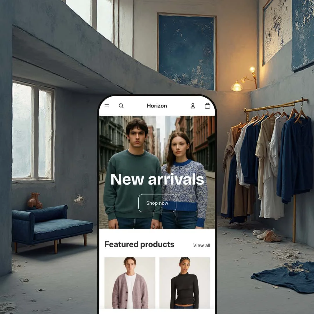
The Default preset positions Horizon as a versatile clothing store template with a minimal, contemporary feel. Its clean layout and restrained colour palette work well for modern fashion, while the presentation stays neutral enough to suit other catalogue‑driven shops that prefer a quieter storefront.
What works in this preset
The overall visual tone is calm and product‑first. Generous spacing, understated typography, and a muted palette give photography room to breathe, so the page reads more like a clean lookbook than a crowded sales layout. That restraint can make contemporary apparel and lifestyle products feel more premium, especially when the catalogue is already well photographed.
The hero treatment is deliberately single‑minded. A full‑width image carries overlay text and one primary button, which pushes shoppers toward the catalogue without competing calls‑to‑action. For merchants who want a clear “enter the store” moment instead of a homepage packed with promotions, this structure is simple to maintain and stays consistent over time.
Product discovery in the Default preset stays spacious and legible. Cards are evenly spaced with names and prices presented without visual clutter, which makes scanning a new‑arrivals grid feel relaxed rather than cramped. The result is a catalogue view that supports slower browsing and easy comparison across items.
The header styling follows the same minimal logic. Navigation and utility links are kept compact, so the top of the page does not compete with product imagery and the hero area remains the dominant visual. This helps the preset feel cohesive, because the interface consistently steps back and lets the merchandise lead.
Where it stumbles
The same restraint that makes the Default preset feel modern can also make it feel too quiet. Stores that rely on highly visual storytelling or heavier editorial layouts may find the presentation too product‑focused, because the aesthetic prioritizes clean merchandising over layered narrative. If your brand needs the homepage to do a lot of explaining, you may end up pushing against the preset’s simplicity.
Brand maximalists may also hit a ceiling sooner. The minimal design is purposeful, but in this preset it can read as constrained if your identity depends on bold typography, dense patterning, or highly customized visual systems. The cleaner the template, the more your photography and copy have to carry the brand voice on their own.
Niche Suitability
-
Fashion and lifestyle boutiques, accessory shops, and other merchants with curated catalogues who want a minimal presentation that keeps attention on the product. The Default preset works best when your assortment is selective and you want browsing to feel calm and uncluttered.
Not Ideal For
-
Brands that depend on heavy editorial storytelling or a more expressive, highly branded storefront aesthetic. If your merchandising depends on dense campaign content, the Default preset’s restrained layout may feel like it is always pulling you back toward “just the products.”
-
Horizon is best for merchants who want a modern, uncluttered look paired with a polished browsing‑to‑cart flow. Fashion, lifestyle, and accessory shops with curated catalogues will get the most value, especially when variant selection is a frequent part of shopping.
-
If your storefront depends on deep navigation structures or a more editorial, story‑led layout, Horizon may feel too restrained. Highly branded stores that need louder typographic identity and denser page composition should consider themes designed for heavier narrative content.
-
Medium — There is a learning curve to configuring sections and variant options in the editor. Ongoing maintenance does not require advanced coding, but you should plan time to tune the setup to your catalogue.
Final Recommendation
★ 6.6/10
Rating
-
Covers key storefront mechanics with polished implementations like quick add, a slide‑out cart, and an overlay search experience. The lack of a mega menu and the quiet add‑to‑cart feedback keep it from a higher score.
5
-
Browsing feels straightforward thanks to the clean grid presentation and the persistent header behaviour. The main friction comes from moments where add‑to‑cart actions are silent, which can push shoppers to verify via the cart counter or cart drawer.
7
-
Swatches and the slide‑out cart translate well to touch, and no mobile‑only issues were observed during testing. The overall interaction model remains easy to follow on smaller screens.
8
-
Swatches and the slide‑out cart translate well to touch, and no mobile‑only issues were observed during testing. The overall interaction model remains easy to follow on smaller screens.
8
-
Colours, typography, section order, and variant display are adjustable in the editor, which gives merchants room to align the theme with their brand. The minimal foundation is intentional, but it may feel constrained for stores that want a louder, more heavily branded storefront.
5
FAQ
〰️
FAQ 〰️
-
👑 Yes. The Default preset’s new arrivals grid, size swatches, and cross‑sell section are tailored to fashion merchandising and handle multiple size and colour variants elegantly.
-
📱The demo adapts seamlessly to mobile screens. Navigation stays accessible via a sticky header, and the slide‑out cart and search overlay work well on touch devices.
-
🎨 You can change colours, typography, and section layouts without touching code. For example, the newsletter block on the home page and the cross‑sell slider can be repositioned or hidden.
-
⚡ During testing, pages and modals loaded quickly, and the cart drawer appeared instantly after clicking the icon. The minimal design helps maintain good performance.
-
👕 Yes. Multi‑variant items launch a modal with swatches and size buttons, while single‑variant products add directly to the cart. This dual behaviour was observed on both the home and product pages.
-
🔎 The theme includes structured headings and customizable meta fields. In the demo, blog post pages use semantic headings and display a clear publication date.
-
💱 Yes, via Shopify settings. The demo does not display language or currency selectors, but Horizon supports Shopify’s translation and currency features, which merchants can enable through Shopify.
-
⚙️ Yes. Horizon uses Shopify’s standard architecture, so popular apps, such as reviews, loyalty programmes, or chat widgets, can be added via the Shopify App Store.
-
🛒 Shopify themes offer free trials through the Theme Store. You can customize Horizon in your store and only pay when you publish it.
This review is based on hands‑on testing of the publicly available preset demo of the Horizon Shopify theme as of 14 December 2025. Theme features, preset availability, and performance can change with subsequent updates from the theme developer.