
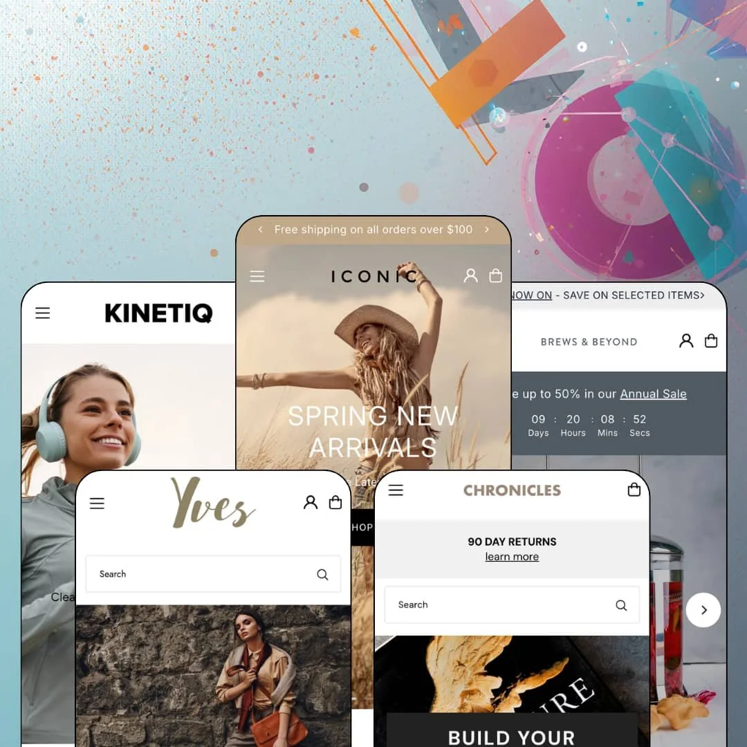
A theme that first went on sale in 2016 shouldn't still be gaining presets ten years later. Icon picked up a fifth one this summer, a sports-nutrition storefront that looks nothing like the fashion demo it launched with, and We Are Underground is still shipping updates against a codebase older than Shopify's section editor. At $250 it runs on Online Store 2.0 architecture, not the newer Theme Blocks generation. So the real question is whether ten years of accumulated merchandising beats a fresher foundation.
Variant quick-add on product cards, theme-wide
Size buttons render directly on product cards in collection grids, carousels, and recommendation rows, so a shopper picks a size and adds to cart without opening the product. That cuts one click from every repeat purchase. For apparel or footwear merchants with 50 to 500 SKUs whose customers already know their size, and for restock-driven stores where speed of re-order matters more than discovery, this is the single feature that most changes conversion math.
A homepage buy module with stock and pickup context
Merchants who sell one hero product at a time, whether a seasonal kitchen gadget or a limited drop, get a featured-product section that renders a live variant picker, quantity stepper, sale badge, and stock counter on the homepage, with the in-store pickup availability component available alongside it. It turns the homepage into a landing page. Single-brand stores running flash drops or retail-plus-online operations with a physical counter will use this section weekly.
Cross-sell baked into the product page
Why pay for an upsell app before you've tested what the theme already does? Icon's product template stacks an Often Purchased With row under the description, a Recommended item inside the buy column with its own add-to-cart, and a You May Also Like grid further down, and all three draw from collections or recommendations the merchant controls. Three surfaces, one template. For housewares, beauty, or accessory merchants with 100 to 500 SKUs and cross-shop-heavy buyers, that's attach-rate tooling without the monthly subscription.
A promo kit that covers the calendar
Countdown sections, scrolling announcement bars, promo tiles, promo popups, and product badges ship as theme sections rather than as separate apps, and the demos deploy them as annual-sale timers, free-delivery tiles, and mailing popups. Flash-sale merchants and seasonal brands, especially mid-market apparel and gift stores that run four to six campaigns a year, can restage the whole storefront from the editor without touching a line of code.
Social proof is decoration
Every demo closes with an Our Customers Say carousel: four short quotes, a first name, a city. None of them connects to an order, a product, or a rating because Icon renders testimonials as text blocks and leaves actual reviews to Judge.me, Loox, or whichever app the merchant installs. The quotes are set dressing. Beauty and supplement brands with impulse buyers who scan for star ratings before they trust a new store will need that app on day one, which adds setup and a subscription the theme's price doesn't cover.
No sticky add-to-cart on long product pages
The buy column stays pinned on desktop while the description scrolls, but once a shopper is past the benefit bands, the FAQ accordion, and three cross-sell rows, there's no floating bar to bring the button back on mobile. That's a real gap for consumables. Subscription-driven CPG and supplement brands whose mobile shoppers read ingredients before buying will see drop-off at the bottom of exactly the pages that do the most persuading.
Online Store 2.0 at a 2026 price
Icon's architecture is solid OS 2.0: sections everywhere, app blocks, JSON templates. It is not the Theme Blocks generation, so nested blocks stop at two levels and the editor experience matches what Dawn gives away for free rather than what Shopify's newest paid themes layer on top. Wholesale-enabled or multi-brand operations with 500+ SKUs who expect to rebuild page structure frequently should weigh whether a $250 theme on last-generation foundations will still feel current after the next Shopify editor update.
What it takes to launch
Expect a multi-day pass across translation-string cleanup, currency and shipping-threshold alignment, product-copy replacement where descriptions repeat, colorway consolidation into variants, and expired-campaign re-staging before any of the five presets is launch-ready.
-
What works in this preset
You land on a fashion store stocked by Runway Scout, and the first thing I noticed was how much selling happens before you reach a product page. The hero slideshow hands off to a Trending Now row, then a two-up collection split, then a Newest Arrivals carousel, and each card in those carousels shows its size options inline so a shopper can pick an S, M, or L from the homepage itself. Sizing is right there. That density only works because the photography carries it, since every tile in this demo leans on full-bleed editorial shots of the garments rather than on copy.
Product pages here read like a boutique's fitting-room notes. Under the size picker there's a fit scale running from slim through regular to oversized, a size-and-fit guide link, and a details block that spells out model height and measurements alongside the fabric composition, which gives merchants who sell garments with forgiving fits a ready template for the copy. The tabs below hold delivery and returns. A row headed Often Purchased With slides in three complementary pieces with quick-view triggers, and a four-card You May Also Like grid repeats the inline size pickers from the homepage.
The collection template is where this preset's catalog logic shows. A filter sidebar exposes availability, a price range, color with counts per swatch, size, and product type, with nine sort orders above the grid, and a Recently Viewed strip at the bottom tracks what you've already opened. Twenty-six products. That's small, but the filter counts make the catalog feel navigable at ten times that size.
-
What works in this preset
Dolce is a bookshop. Specifically it's staged with Taschen's art-book catalog, priced in pounds, and the homepage opens on a row of four promo tiles (free delivery, sale, 90-day returns, email signup) before a category band titled Build Your Collection stacks Fashion, Film, Pop Culture, and Comics as image tiles. I spent time scrolling through it and the editorial rhythm holds: a Best Selling Art Books trio with Buy Now buttons, a New In Comics grid, a full-width feature for The Fight with a two-line blurb, then Featured Art, Perfect Gifts, and a blog excerpt row. Nothing shouts. It reads like a publisher's seasonal catalog, which is exactly what a bookseller wants from a homepage.
The product page keeps that restraint. A single title, a price, a quantity stepper, a Buy It Now button, and a long-form description; no variant picker appears because the books are staged without format options, and the Recently Viewed plus Recommendations sections below give the page its only cross-sell. For merchants selling editions, prints, or one-SKU collectibles, the template demonstrates how quiet the buy box can get.
Where it stumbles
Books usually come in formats. Hardcover, paperback, limited edition, signed, and the demo stages none of them, so a bookseller evaluating Dolce never sees how the variant picker behaves on the one product type the preset is built around.
-
What works in this preset
Is a $5,300 dress a good test of a theme? Yves says yes, and stages a luxury closet of dresses, totes, and designer eyewear with four-figure prices and numeric sizes (2, 4, 6) that show on the cards as quick-add buttons just like the S/M/L sizes do in the fashion preset. The eyewear section pitches Fendi, Gucci, and Tom Ford by name in its intro copy and then lines up six sunglasses at $390 to $435 in a single row with a View All Eyewear link, which is a clean pattern for a boutique that mixes house-label garments with third-party accessories.
Physical retail gets a section of its own here. A New Store Now Open block carries a Prince Street address and a Come And See Us call to action, and on product pages the pickup-availability component sits under the buy box, which matters for a preset that's clearly staged for a brand with a Manhattan storefront. I went looking for the product copy and found it generic: a limited-edition paragraph plus a four-bullet details list that repeats across items, so the demo shows the template, not the voice.
Where it stumbles
The totes arrive as three listings. Grey Tote, Pink Tote, Tan Tote, each at $1,970, each its own product instead of one product with a color picker, and that choice hides the swatch rendering the theme advertises while tripling the catalog rows a merchant would have to manage. For a luxury preset where colorway is the purchase decision, staging color as separate products reads against the positioning.
-
What works in this preset
Louis sells Bodum, and it opens with a countdown. Save Up To 50% In Our Annual Sale sits above a four-way collection split (Coffee, Tea, Kitchen, electrics), and then a Shop The Look section and a homepage buy module take over the middle of the page. The buy module is the standout: a Chambord French press at $49.99 struck from $55 with a Sale badge, an Only 1 Left stock line, a Buy It Now button, and a truncated description with a Read More link, all without leaving the homepage.
Product pages push cross-selling further than the other four demos. The Bistro kettle's buy box carries color and capacity pickers, the same Only 1 Left counter, and then a Recommended block inside the buy column that shows a bread box with its own color picker and its own Buy It Now button, so two items can go to cart from one page. Tabs for details, shipping, and returns follow. This kept bugging me in a good way, because a second purchase decision inside the first one is a template choice here, not an afterthought a merchant has to build.
Where it stumbles
Five listings called Bistro Electric Burr Coffee Grinder or Bistro Electric Coffee Grinder share a carousel with prices from $19.99 to $119.99 and no visible differentiator on the card. A shopper can't tell the $44.99 one from the $119.99 one without opening each, and for a housewares preset aimed at considered purchases that's a staging choice that works against its own catalog.
-
What works in this preset
The newest preset is the only one that moves. Vivienne stages Kinetiq, a sports-nutrition brand, and its homepage opens on a hero slideshow, drops into a full-width background-video section, and later runs a video-with-products block that pairs footage with shoppable cards, which gives the page a motion layer none of the other four demos attempt. Every product card carries a From £1.99 price because gels, drinks, and gummies are staged with pack-size variants, and a Single/6/30 picker on the product page makes the multi-pack logic legible at a glance.
I sat up at the FAQ accordion. It sits on the homepage between product carousels and answers questions a first-time gel buyer would ask, like whether the products suit runners and cyclists, and the product page adds a Nutrition Information tab next to Details and Shipping plus a three-column benefit band (stomach friendly, 100% natural, clean energy). Short. Clear. Built for a category where ingredients sell the product.
Where it stumbles
The announcement bar reads Subscriptions Now Available, and nothing on the product page delivers one. There's no subscribe-and-save toggle, no frequency picker, because subscriptions are app territory on Shopify and the theme can only leave room for them. Promising them in the demo's first line sets up an expectation the template can't meet on its own.
One section library, five genuinely different storefronts
Fashion, art books, luxury eyewear, Bodum kitchenware, and sports nutrition all run on the same carousels, image-with-text blocks, and product sections, and none of the five homepages looks like a recolor of another. The preset family proves the sections bend further than the feature list suggests. A merchant who buys Icon for one vertical and later pivots isn't starting over.
A retail-aware layer running through every preset
Store-announcement blocks with addresses, pickup-availability components on product pages, and stock counters that read Only 1 Left show up across presets, not as one demo's gimmick. That's the footprint of a theme built by people who've watched merchants run a counter and a cart at the same time.
Ten years of maintenance with no sign of abandonment
A mid-2026 release that adds a preset and fixes money formatting, on a theme first sold in 2016, says more about the developer's commitment than any feature bullet. Buyers inherit a product that has already survived every Shopify platform shift since Sections came out.
The homepages share a skeleton
Read all five demos back to back and the same grammar appears every time: hero, collection split, carousel, image-with-text, carousel, testimonials, popup. The visual range is wide, the structural range is narrow, and a merchant wanting a homepage that breaks the carousel rhythm will be fighting the template rather than using it.
Content hunger across every vertical
Every preset leans on photography and video to fill full-bleed sections, and the demos borrow catalogs from Runway Scout, Taschen, and Bodum to do it. A new brand without a shoot budget will see the same sections look thin. The theme assumes assets that many first-year stores don't yet own.
Rating
★ 7.0/10
-
Card-level variant quick-add, homepage buy module, in-column cross-sell, and a full promo section set cover most merchandising needs; reviews and subscriptions still need apps.
7
-
Sections are consistent across presets and the editor mapping is predictable, but the number of promo and cross-sell slots means more configuration decisions than a leaner theme asks of a first-time merchant.
7
-
Slide-out navigation and card quick-add translate cleanly to small screens; the missing floating add-to-cart on long product pages costs it a point.
7
-
Homepages run carousel-heavy, with the Vivienne preset adding background video, so page weight depends on how many sections a merchant keeps; the templates themselves are lean.
7
-
Five distinct verticals from one section library demonstrate real range; the repeated homepage skeleton limits how far a merchant can stray from the carousel-driven layout.
7
Frequently Asked Questions
-
Yes. Size buttons render directly on cards in collection grids and carousels, and a shopper can add a specific size to cart from the listing; color swatches on cards depend on how the merchant sets up variants.
-
Yves stages a store-announcement block with a street address and a pickup-availability component on product pages, and the same components are available to any preset.
-
Louis demonstrates a countdown section at the top of the homepage tied to an annual sale, and the section can be placed on any page template through the editor.
-
Vivienne stages gels and gummies with Single, 6, and 30 pack sizes as variants, and product cards show a From price when variants differ.
-
Yes. The Vivienne product template carries a Nutrition Information tab alongside Details and Shipping, and the Theme Store lists ingredients and nutritional information as a theme-wide section.
-
Dolce stages single-format books with just a price, quantity stepper, and Buy It Now button, so the buy box collapses cleanly when there's nothing to choose.
-
The theme ships interface translations for English, French, Italian, German, and Spanish; product data and localization still run through Shopify Markets.
This review is based on hands-on testing of the publicly available preset demos of the Icon Shopify theme as of August 2026. Theme features, preset availability, and performance can change with subsequent updates from the theme developer.