
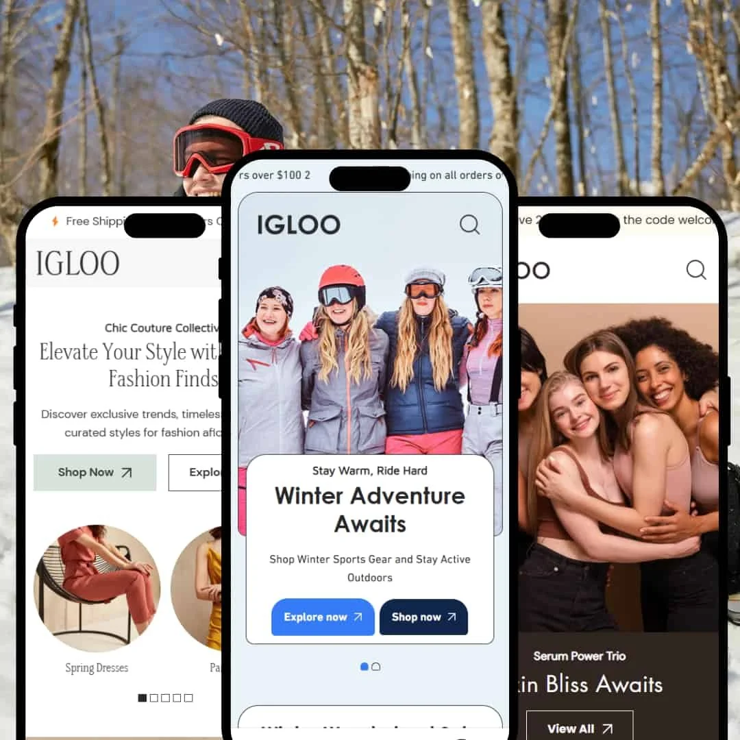
The Igloo Shopify theme is a premium, visually-driven framework designed for brands that rely on strong imagery and an elevated aesthetic. Through its three distinct presets—the rugged Cool, chic Clean, and polished Glow—it offers a versatile foundation that can be adapted to various industries. Our in-depth testing, refined by new evidence, reveals a theme with a powerful and feature-rich core, though its greatest strengths require deliberate merchant configuration.
Pros.
〰️
Pros. 〰️
✚ Well-Integrated Quick View: Across all presets, a "+" icon on product grids opens a quick-view modal. Each modal is uniquely styled to match its preset's aesthetic. This is a crucial feature that reduces clicks and streamlines the Browse process, directly improving user experience and supporting conversions.
✚ Excellent Mobile Experience: All presets feature a persistent sticky navigation bar at the bottom of the screen on mobile view, providing constant, easy access to the menu and cart, which is a major usability win that can lower bounce rates on mobile devices.
✚ Excellent Predictive Search: The theme-wide search functionality is a standout. It provides a fast, visually rich predictive dropdown with product images and prices, and gracefully handles "no results" by suggesting other products. This creates a superior user experience that can reduce frustration and lower site abandonment rates.
✚ Flexible and Marketable Mega Menus: The mega menu functionality is powerful, allowing for the inclusion of not just links but also featured products and promotional images. This transforms standard navigation into a valuable marketing tool, which enhances product discovery and can directly lift AOV.
✚ High-End Design Foundation: Across all presets, Igloo maintains excellent typographic hierarchy, generous use of space, and smooth animations. This creates a cohesive, premium feel that supports higher price points and strengthens brand credibility.
✚ Built-in Conversion Tools: Igloo includes a native Before & After slider, a sticky add-to-cart bar, and accordion tabs for product pages. These are app-level features that can directly boost conversions and trust, saving merchants subscription fees and reducing site complexity.
Cons.
〰️
Cons. 〰️
− The Hidden Features Dilemma: The theme's biggest weakness is a potential trust gap created by its demo staging. Its official Shopify feature list advertises a "Sticky cart"—a powerful, conversion-driving product page bar. However, this feature is completely disabled in all live demos. A merchant could easily buy the theme without ever knowing one of its key advertised features exists, placing an unfair burden on them to discover and enable it.
− The "Bring Your Own-Strategy" Flaw: The theme’s biggest weakness is its inconsistent demo staging. Key conversion-driving features like Before & After slider are only shown in one preset. This creates a significant risk that a merchant might choose the theme without realizing its best features are available but need to be manually discovered and configured, leading to a sub-optimal site build.
-
The Cool preset makes a bold first impression, utilizing a rugged, high-impact design that’s perfectly calibrated for outdoor gear, action sports, and adventure-focused brands.
⊕ Pros
✚ Informative Collection Hovers (Desktop-Only): On collection pages, hovering over a product image expands the tile to show available color and size swatches directly. This unique interaction allows shoppers to check availability without a single click, which can reduce friction and shorten the path to purchase.
✚ Structured, Grid-Based Layout: The preset’s foundation is a clean, block-based grid that creates a highly organized and masculine feel. This structure makes content easy to scan, a major benefit for stores showcasing technical products where clarity is key.
✚ Clear Visual Category Navigation: The "Shop By Category" section uses large, clear images for different product types, making it highly intuitive for users to navigate to the section that interests them most.
⊖ Cons
− Lack of Visual Hierarchy: The demo homepage presents multiple "View all" and "Shop now" sections that are visually identical. This makes it difficult for users to discern the most important promotion, which could negatively impact the performance of key campaigns.
− Generic Customer Review Styling: The customer review section is a simple, text-based block that lacks the visual impact of review sections in other presets. It fails to draw the eye or effectively leverage social proof.
− Understated Footer: The footer is a simple, dark bar at the very bottom of the page, lacking the substantial, multi-column layout typically used for encouraging further site exploration.
-
The Clean preset embodies a minimalist and elegant aesthetic, making it an ideal choice for high-fashion, apparel, and boutique stores where premium product photography is the main focus.
⊕ Pros
✚ Elegant Asymmetrical Layouts: The preset masterfully uses overlapping sections and asymmetrical image grids. This creates a modern, editorial feel that elevates the brand and makes the site look like a custom build.
✚ Refined Typography Hierarchy: The expert balance of serif and sans-serif fonts creates a sophisticated and clear visual flow. This guides the user’s eye naturally through the content, which can help increase time on page.
✚ Focus on Large-Scale Imagery: The entire preset is architected to showcase large, impactful photography. Product grids and promotional banners provide ample space for high-resolution images, essential for apparel brands where visual appeal drives sales.
⊖ Cons
− Lacks Informative Hover Cues: Unlike the Cool preset, collection page items are static on hover. While a quick-view +icon exists, the absence of a motion-based hover effect makes product discovery slightly less dynamic.
− Low-Contrast Hero CTA: The main homepage hero banner features call-to-action buttons with a subtle outline style that can be easily missed against a busy background, potentially reducing click-through rates.
− Overly Subtle Sale Indicators: On-sale items on collection grids are marked with a very small, low-contrast tag. While this maintains the minimal aesthetic, it fails to create urgency and may cause shoppers to overlook discounted products.
-
The Glow preset is meticulously tailored for the beauty, skincare, and wellness industries, combining a clean aesthetic with powerful features designed to educate consumers and demonstrate product effectiveness.
⊕ Pros
✚ Prominent Trust-Building Design: The demo effectively uses sections for customer testimonials with photos and displays clear icons for benefits like "Cruelty-Free Certification" and "Secure payment", all of which help alleviate customer concerns.
✚ Unique "Before & After" Staging: This is the only preset that demonstrates the theme's powerful "Before & After" image slider, a critical tool for any brand needing to visually prove its product's effectiveness.
⊖ Cons
− Generic Upsell Section: The "You may also like" section for recommended products is a simple horizontal slider with small images and no pricing visible, a low-impact design that requires extra clicks to be useful.
− Underwhelming Blog Section: The homepage blog post section is a simple two-column layout that feels like an afterthought compared to the rest of the polished design.
− Minimalist Footer: The footer is very basic and lacks the detailed sitemap and rich content areas seen in other premium themes, representing a missed opportunity for SEO and user navigation.
Niche Suitability
Not Ideal For
Final Recommendation
-
Merchants with strong brand aesthetics and high-quality photography who want to build an elevated, content-rich shopping experience. It's particularly well-suited for lifestyle brands, fashion boutiques, and skincare companies that can leverage the editorial layouts and built-in features.
-
Merchants who want a simple "what you see is what you get" experience. The fact that key features are documented but not demonstrated means this theme is best for those willing to dig into the settings and build their store deliberately.
-
Medium. While the foundation is solid, making Igloo look as good as the demos requires thoughtful configuration. To achieve a premium result, merchants must invest time in sourcing high-quality imagery and be prepared to explore the theme editor to find and enable its most powerful (and sometimes hidden) features.
★ 8.4/10
Rating
-
The theme includes high-value features like a Quick View modal, Before/After slider, and accordion tabs across all presets. It loses a point for not demonstrating its advertised "Sticky Cart" feature in any live demo, which could confuse buyers.
9
-
For shoppers, the navigation and quick view are intuitive. For merchants, the theme's power is hidden in settings that aren't all enabled by default, requiring a learning curve to discover and implement its best features effectively.
7
-
The mobile experience is excellent. A consistent sticky navigation bar at the bottom of the screen offers easy access to the menu and cart. Pages are fluid and the quick-view modals are well-optimized for small screens.
9
-
Based on hands-on testing of the demos, the theme feels fast and responsive. Interactive elements like the search bar and quick-view modals load instantly without any noticeable lag, contributing to a smooth and professional user experience.
9
-
Between the three distinct presets and powerful section-based design, the theme offers significant flexibility. However, it is best suited for image-heavy brands and may be challenging for those without strong visual assets.
8
FAQ
〰️
FAQ 〰️
-
👑 Yes, the "Clean" preset, with its focus on large imagery and elegant, editorial layouts, is exceptionally well-suited for high-fashion and apparel brands.
-
📱Yes, it provides an excellent mobile experience. Our testing confirmed a sticky navigation bar at the bottom of the screen on all presets, which makes Browse and accessing the cart very easy on smaller devices.
-
🎨 It's highly customizable through Shopify's theme editor. You can change colors, fonts, and layouts, and features like the mega menu allow you to inject brand marketing directly into the navigation.
-
⚡Performance in the demos feels strong. Pages loaded quickly, and interactive elements like the quick-view modals were fluid and lag-free during testing.
-
👕Yes, it supports variants well. The demos showcase both clickable swatches for colors and pill-style buttons for sizes, which are more user-friendly than traditional dropdowns.
-
🔎 The theme follows Shopify's standard SEO best practices. Merchants can edit meta titles and descriptions for products, collections, and pages through the standard Shopify admin.
-
💱Yes, the demos show functional language and currency switchers, allowing merchants to use Shopify Markets to sell internationally.
-
⚙️ Yes, as a modern Shopify theme, it is built to be compatible with apps from the Shopify App Store. Its section-based structure should accommodate app blocks for reviews, cross-sells, and more.
-
🛒 Yes, you can try the theme with your own products for free on the Shopify Theme Store. You only pay if you decide to publish it to your live store.
Disclaimer: This review is based on hands-on testing of the publicly available "Cool", "Clean", and "Glow" preset demos of the Igloo Shopify theme as of June 22, 2025. Theme features, preset availability, and performance can change with subsequent updates from the theme developer.