
Impact is built for brands that want a bold storefront without giving up modern shopping mechanics. In hands‑on testing of the three demos, the theme consistently leaned into big imagery, editorial spacing, and browse‑first navigation that keeps shoppers moving through categories and product stories. The presets feel genuinely different at a glance, but the underlying shopping flow stays familiar: you can discover items from grids, choose options with swatches, and move through cart steps without the experience feeling stitched together.
Pros.
〰️
Pros. 〰️
✚ Flexible presets, consistent core
flexible preset options that maintain core functionality while offering distinct aesthetic approaches. In practice, the three demos feel like different storefronts, but the core shopping mechanics stay consistent so merchants are not trading usability for style. This helps if you want to change brand direction later without rebuilding the customer journey from scratch.
Shoppable storytelling sections
Impact supports rich story blocks that are designed to sit inside a commerce flow, not beside it. Across the demos, that includes large media sections, hotspot‑style product discovery moments, and narrative pacing that keeps visitors scrolling. The result is a theme that can sell on context and emotion while still keeping buying actions close at hand.
Variant‑aware quick shop and sticky purchase cues
A recurring pattern in the demos is fast shopping from grids combined with confident option selection through swatches and structured product templates. When the theme surfaces quick‑shop style interactions, it keeps the shopper in context and then confirms the add‑to‑cart action clearly. Sticky purchase cues on longer product pages reduce the “scroll fatigue” problem where the buy button disappears for minutes at a time.
Navigation built for browsing
Impact repeatedly stages navigation as a browsing experience, not a utility bar. Mega‑menu style layouts, category‑led entry points, and image‑driven navigation moments make it easier to move through a larger catalog without relying on a single search‑first behavior. For merchants with multiple collections, this can increase discovery and reduce bounce.
Comparison and spec‑friendly templates
For products that require justification, Impact supports structured information layouts. The Default demo highlights a comparison‑style approach and the product templates use organized sections that read like decision support rather than marketing fluff. This helps merchants selling product lines where the differences are subtle but important.
Cons.
〰️
Cons. 〰️
🚫 Shortcut discoverability can be subtle
Across the demos, some “fast path” shopping cues are visually quiet until the shopper hovers and explores. That makes the storefront feel clean, but it also means first‑time visitors may not notice quick‑buy shortcuts immediately. Merchants can mitigate this by staging clearer calls‑to‑action and avoiding overly dark imagery behind key interactive cues.
🚫 Content‑heavy layouts require curation
Impact shines when merchants have strong assets and a story to tell, but the presets are comfortable being long. If a store launches with thin content, the experience can feel stretched. Merchants should treat these demos as templates and remove sections that do not directly support discovery or purchase confidence.
🚫 Product‑first orientation
The demos are built around physical product selling and merchandising. If your business depends on memberships, bookings, or service scheduling, you should expect to add apps and do extra template work. Impact can still be a strong front end, but it is not staged as a service‑first theme in these demos.
🚫 Small header hit targets in some demos
Minimal headers look premium, but they can also create smaller click targets and icon clustering. In the Default demo, the search and account icons sit close together, which led to occasional mis‑clicks during hands‑on browsing. This is minor, but it’s worth checking if your audience includes less confident or older shoppers.
-
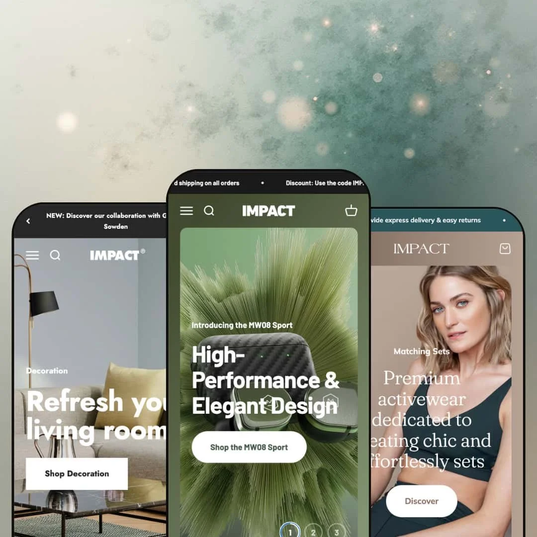
The Default demo is staged like a premium electronics storefront. Dark accents, product‑forward photography, and spec‑style storytelling make it feel suited to higher‑consideration purchases where shoppers want reassurance before they commit.
What works in this preset
In this demo, the header and top navigation are staged to encourage browsing. The “Shop” entry is presented as a large, image‑led navigation moment rather than a simple text dropdown. That presentation pushes visitors toward category exploration early, which fits the “premium tech” tone.
The homepage pacing is intentionally cinematic. Instead of racing into wall‑to‑wall product tiles, it mixes product feature storytelling with long visual sections, including a before/after‑style moment and a timeline‑like story block. The effect is that the brand story reads like product engineering rather than pure lifestyle inspiration.
Default also leans into comparison‑style shopping. The demo surfaces a dedicated comparison page and the product presentation includes structured, spec‑like information blocks, which helps answer “what’s the difference?” without forcing shoppers to open multiple tabs. If you sell multiple models that look similar at a glance, this kind of staging can reduce decision friction.
On product pages, the visual hierarchy stays focused on the purchase decision. You get strong media, but the demo keeps returning you to concrete details: swatches, technical callouts, and organized information sections. The sticky purchase cue (add‑to‑cart presence while scrolling) helps the page feel like a guided buying flow rather than a long article.
Where it stumbles
In this demo staging, some of the helpful shortcuts are visually understated. Quick‑buy style overlays and header icons sit on darker imagery, so a first‑time visitor can miss them until they pause and explore. That’s not a missing capability, but it does mean the “fast path” to cart is not immediately obvious.
The long‑form layout is a commitment. If your catalog is small, or if you don’t have strong media assets, the Default demo’s section density can start to feel like padding. Merchants who pick this direction should plan to trim sections and keep only the story blocks that genuinely support the sale.
-
Cocoon is staged as a home and interiors storefront with a calmer, softer feel. The palette is muted, the spacing is generous, and the demo spends more time on room scenes and design inspiration than on raw specs.
What works in this preset
Cocoon’s homepage is designed to be browsed like a magazine. The demo moves through lifestyle photography, image‑hotspot discovery moments, and a timeline‑style story slider that frames the brand as design‑led. This staging is ideal for merchants selling items that need context, like furniture, lighting, or decor.
The demo also uses navigation as a curated storefront moment. “Shop” is presented as a large menu experience with category groupings (Office, Decoration, Kitchen, Lighting, Books) alongside big promotional tiles, which makes browsing feel guided rather than overwhelming. Instead of asking shoppers to figure out where to start, the layout suggests a few obvious paths.
On the product template, Cocoon pushes the “design story” angle. The demo layers in elements like designer biography‑style content, longer descriptive sections, and visual lookbook moments that connect the item to a broader aesthetic. That’s the kind of presentation that can justify price and reduce return anxiety for home goods.
Cocoon also spends more of its page real estate on editorial pages. The demo includes long‑form “Theme Features” and “Designers” style pages with alternating image/text layouts, timeline sections, and cross‑linked navigation. If you plan to run content marketing, this preset’s staging makes that feel native rather than bolted on.
Where it stumbles
In this demo, the navigation is intentionally understated. The header typography is minimal and can feel small compared with the large imagery elsewhere, so quick wayfinding relies on the shopper noticing subtle menu cues.
Cocoon’s editorial rhythm can also bury the “shop now” moment if you don’t curate it. The preset works best when the merchant is comfortable editing, trimming, and rebalancing sections so the story supports the purchase rather than delaying it.
-
Balance is staged for activewear and fashion with a wellness‑forward tone. Airy typography, soft color choices, and lifestyle photography make the demo feel light and modern, with brand messaging woven into the shopping flow.
What works in this preset
The top of the Balance demo is built around a lookbook‑style invitation. The hero pushes a “View Lookbook” call‑to‑action, and supporting sections use large percentage‑style statements to frame sustainability and materials as part of the brand promise. This staging works well for apparel where values and feel are part of the purchase decision.
Product browsing in Balance looks intentionally clean. The grid gives each item breathing room, and the demo emphasizes color choice by showing swatches directly under product cards. For fashion stores, that presentation reduces unnecessary clicks because shoppers can visually confirm available tones before opening a product page.
The add‑to‑cart confirmation flow is presented clearly in this demo. After adding an item, the shopper sees an immediate success state with obvious next steps, which keeps momentum high and reduces uncertainty during the purchase flow. It’s a small detail, but it helps the demo feel confident and polished.
Balance also stages the cart as a dedicated page rather than a drawer. The cart view includes a free‑shipping progress cue, quantity controls, remove links, a shipping estimator, and an order note area, so it reads like a “review your order” step with plenty of room to sanity‑check sizes and colors. This is the kind of staging that can reduce last‑second mistakes for apparel orders.
The demo’s search results are also structured with clear grouping into product, page, and blog post tabs. That presentation makes the storefront feel more like a brand site with supporting content, not just a product grid.
Where it stumbles
Because this demo routes shoppers to a full cart page, the flow can feel slightly more step‑based than a drawer‑first experience. That’s a staging choice, not a limitation, but it does change the pacing: the shopper leaves the browsing context to confirm the order.
Balance’s minimal aesthetic also puts pressure on product photography. If your images aren’t strong, the whitespace and soft typography can make pages feel empty. Brands selling highly technical products may prefer a denser, more detail‑forward presentation like the Default demo.
Niche Suitability
Not Ideal For
Final Recommendation
-
Impact is best for merchants who want a brand‑led storefront and have enough media and product depth to justify editorial sections. Electronics, home, fashion, and lifestyle stores will get the most out of the theme’s storytelling and quick‑shopping patterns.
-
If you need a minimal storefront for a small catalog, or if your revenue model depends more on services than product merchandising, a lighter theme may be a better starting point.
-
Medium. The theme gives you a lot of section options, but the best results require curation. Plan time for trimming sections, choosing strong imagery, and aligning product templates with how your customers decide.
★ 7.8/10
Rating
-
Strong built‑in shopping patterns combined with rich media storytelling and structured product presentation. The demos are firmly product‑merchandising focused, so non‑product models typically need apps.
8
-
The presets are well staged, but there are many moving parts. Merchants will get the best outcome by actively editing sections rather than publishing the demos as‑is.
6
-
The layouts rely on large imagery and modal‑style interactions that are generally compatible with mobile shopping. Merchants should still preview mobile views in the theme editor to confirm spacing and icon clarity for their audience.
8
-
Despite the media‑heavy sections, page navigation and shopping interactions felt steady in hands‑on testing on desktop. The theme’s flow stays coherent even when pages are long.
8
-
The three presets cover noticeably different aesthetics, from tech‑forward to editorial home to airy fashion. That flexibility makes it easier to match Impact to a wide range of brands.
9
FAQ
〰️
FAQ 〰️
-
👑 If you sell products that benefit from storytelling and context, Impact is a strong fit. The Default demo is staged for premium electronics, Cocoon for home and interiors, and Balance for fashion and activewear.
-
📱The demos are built around big imagery and overlay‑style shopping interactions, which tends to translate well to smaller screens. Before launch, merchants should still preview mobile layouts and confirm icon spacing and readability.
-
🎨 The biggest branding lever is the preset choice, because each demo starts with a distinct mood. From there, the section‑based structure lets you emphasize lookbooks, product stories, or a more direct shopping layout depending on how you stage the homepage.
-
⚡ In hands‑on testing on desktop, the media‑rich pages remained usable and the shopping flow did not feel fragile. Even when pages were long, moving between browsing, product pages, and cart steps felt consistent.
-
👕 The demos repeatedly rely on swatches and structured product templates so shoppers can choose colors and sizes with less friction. Cocoon and Balance both stage option selection as part of the shopping flow rather than hiding it behind long dropdowns.
-
🔎 It relies on standard Shopify SEO fields and clean page structure rather than adding a proprietary SEO panel. In the demos, blog‑style content is presented in a way that can support content marketing when paired with good metadata.
-
💱 Yes. The demos show currency selection in the header, and Shopify Markets can handle language and currency configuration behind the scenes. The theme presentation stays consistent when those controls are enabled.
-
⚙️ Yes. Impact follows Shopify’s standard theme structure, so common apps for reviews, upsells, and subscriptions should integrate normally. If you need memberships or booking flows, an app will be part of the plan because the demos are product‑first.
-
🛒 Yes. The three public demos (Default, Cocoon, Balance) are effectively a live sandbox you can click through to understand the shopping flow before purchase.
This review is based on hands‑on testing of the publicly available preset demos of the Impact Shopify theme. Theme features, preset availability, and performance can change with subsequent updates from the theme developer.