
Most paid Shopify themes at the $100 tier pick a lane and stay in it. Infinity tries to run two: a gadget store in one preset, an ATV and off-road shop in the other, and that choice shapes everything from the section library to the filter taxonomy. The result is an Online Store 2.0 theme with broader vertical reach than most entry-level paid options, and a Before/After slider plus Deal of the Day stack that competing $100 themes typically leave to apps.
A native Before/After slider that's actually wired in
Across both presets, the Before/After section runs as a native theme section, not an embedded app. The Infinity preset stages it on display imagery showing bezel-design differences; Mystic stages it on the Super Meteor 650 Comet Luggage Carrier showing the accessory installed vs not. Merchants typically install a $10-20/month app for this functionality on entry-level themes, so having it baked into a $100 theme is a real saving. For brands selling visible-transformation products (electronics with display upgrades, motorcycle accessories with installation impact, beauty before/after), this is the right merchandising spine.
Filter sidebar wired to product metafields, with image color swatches
The collection sidebar exposes more than tag-based filters. Image-based Color swatches (Black, Blue, Green, White rendered as actual swatches, not text), a Brand facet, custom-attribute facets like Display Size (32, 40, 55 inch options pulled from product metafields), and a price-range slider with min/max validation all sit in one panel. For electronics catalogs at 50-100 SKUs where buyers filter by technical attributes, that custom-attribute integration matters more than checkbox-based tag filters. Single-brand or photography-led catalogs won't need this depth, but technically-merchandised stores will use it from day one.
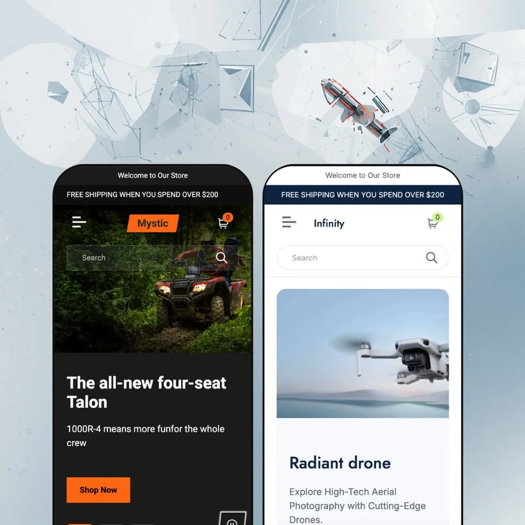
Two distinct vertical demos at the $100 tier
Most paid themes at this price ship one vertical and one aesthetic — usually fashion, beauty, or a generic boutique mood. Infinity goes the other way. One preset commits hard to gadgets and electronics, the other commits hard to ATV, off-road, and motorsport, and they share section bones while staging the verticals completely differently. The category grids, hero patterns, and product cards are reused, but the colors, copy, and demo content are genuinely separated. For merchants still exploring vertical fit before committing copy and assets, that's preview range you'd normally pay double for.
Demo polish doesn't ship clean
Both presets carry typos in headline demo positions, branding inconsistencies in filter sidebars, and social-link placeholders that point to Shopify's own accounts (facebook.com/shopify, instagram.com/shopify, x.com/shopify) across thirteen social platforms rather than the merchant's. None of these are bugs in the theme code, but they are problems the merchant inherits if they treat the demo as a starting layout. For merchants who plan to launch on a 1-2 week timeline by cloning the demo and swapping copy in stages, the cleanup audit has to come first, not last. The demo is the sales pitch. It should be airtight.
Single description block on product pages
Both presets ship the product page with one Description heading and one paragraph below it. The FOREMAN 4X4 description is a single short paragraph; the Radiant mini speaker is the same. There's no accordion split into Shipping, Specifications, Care, or FAQ tabs, which is the more typical pattern for electronics catalogs with spec sheets or motorsport products needing dimension and weight breakdowns. For brands selling technically-specified products that need to surface different content types without dumping everything into one paragraph, this constrains the PDP layout meaningfully. Lifestyle and apparel catalogs with short descriptions won't notice.
Filter taxonomy is duplicated and inconsistently spelled
The Infinity collection page sidebar shows two overlapping facet groups. Product type carries 16 facets including "Bluetooth speaker, Sounbar, Lense, Smart watch, Smart phone." More filters carries 19 facets including "Bluetooth speaker, Smart watch, Smart watches, Smartwatch, Speaker, Soundbar." Same items listed twice, with "Smart watch", "Smart watches", and "Smartwatch" each existing as separate facet values, and the word "Soundbar" appearing both as itself and as the typo "Sounbar". This isn't a theme bug; it's a metafield-and-tag setup problem in the demo, but it leaves merchants reverse-engineering which taxonomy field drives which facet. For catalogs over 50 SKUs where filter cleanliness matters, plan to consolidate the taxonomy before launch.
What it takes to launch
Rewrite the demo typos across hero copy and product descriptions (Blutoth, AVT, Sounbar, Lense, the duplicated facet labels), swap the placeholder shopify.com social links for the merchant's own handles across both presets, and consolidate the Product type and More filters facet groups into a single taxonomy with consistent spelling before opening either collection page to traffic.
-
What works in this preset
The category grid stacks two formats on one page. Ten collection tiles in the upper grid cover Smart Watches, Cases, Speakers, Tablets, Laptops, Earbuds, Smartphones, Accessories, Chargers, and Powerbanks. Below that, a second row surfaces five categories with starting prices (Folds from $1,199, Monitors from $1,499, Headphones from $169, Lenses from $29, Powerbanks from $25). For an electronics store with 50-100 SKUs across sub-categories, that's a reasonable way to make the homepage do navigation work without dumping everything into a single mega-menu.
Scroll past the category grid and the Deal of the Day card hits the homepage with a real conversion play. The Radiant mini speaker shows at $36 from $89, a 60% off badge, a countdown timer wired into the section, and a working Add to Cart that skips the product page detour. It's a small slot, but it does what the section is supposed to do.
The Before/After slider runs further down the page with a TV display demo: bezel on the "Before" side, bezel-less on the "After", staged through the same component that Mystic uses for accessory imagery. The fact that it's a native theme section, not an app integration, is the thing worth noting here. Sections like this usually arrive as a $10-15/month subscription on themes at this price.
Where it stumbles
The branding tells two stories. The theme is Infinity, the store name is Infinity, but every product carries the Radiant brand, and the filter sidebar lists Brand: Radiant (24) as a single-value facet. The third hero slide ships with a typo in the headline: "Experience Rich Audio Quality with Cutting-Edge Blutoth Headphones." For a paid theme with a January 2026 release version, this is the demo position where I'd expect the most polish, and it's where I found the least.
-
What works in this preset
Mystic commits hard to its vertical. Three full-bleed terrain heroes ("The all-new four-seat Talon", "The Beast on the Mud", "Ride in Style"), a Performance Accessories overlay banner mid-page, and a Best Selling grid running three ATV variants with sale percentages (Mystic RINCON at $9,599 from $9,999, FOREMAN 4X4 at $12,599 from $12,999, RANCHER at $10,599 from $10,999). The aesthetic doesn't blink.
I clicked through the FOREMAN 4X4 variant swatches (Blue, Orange, Violet, rendered as image-based color swatches in the sidebar) and the gallery loaded all nine product angles in one swap, three colors across three angles each (front, diagonal, back). For a budget theme, image-based swatches with this level of asset density is genuine merchandising work, not a checkbox swatch picker that some entry-level themes pass off as variant rendering.
The product-link mini-grid at the bottom of the homepage shows three accessories (Mystic GT3 Backpack at $329, Mystic Sport helmet at $269, Mystic Dial Dim Lighting at $679) with thumbnail images and clean linking. It's a quieter pattern than the Best Selling carousel, useful as a cross-sell strip below the fold.
Where it stumbles
The same demo typo appears twice in critical positions. The Deal of the Day card on the homepage describes "the perfect AVT bike" and the FOREMAN 4X4 product description opens with the same string. I noticed because the category navigation correctly uses "ATVs". Two characters dropped in the most-read demo copy.
The category grid carries demo debris below the Backpacks tile: a "Top Box" card with no description and a "Collection title" placeholder card linking to a hash anchor. A merchant cloning the preset inherits these tiles unless they manually delete them in the editor.
Two-vertical preset strategy at budget pricing
Reading both presets together reveals the architectural bet: shared section library, opposite verticals. Infinity goes hard on gadgets, with ten category tiles, "Starting from" pricing strips, and electronics-led Best Selling grids. Mystic goes hard on ATV and off-road, with terrain heroes, Performance Accessories banners, and color-swatch ATV galleries. The same theme bones flex into two completely different commercial identities, which is rare at the $100 paid tier.
Native conversion stack across both presets
Both presets ship the same conversion architecture: Before/After slider, Deal of the Day card with countdown, "In stock, ready to ship" inventory display, image-driven Color swatches on cards and PDPs, sale-percentage badges on every discounted item, and a quick-view modal wired into product cards. None of this depends on app subscriptions. For deal-led and transformation-driven merchandising, the conversion architecture is already in place on day one.
The variant-image gallery actually carries weight
The Mystic FOREMAN 4X4 demo loads nine images across three color variants, with the gallery wired to the swatch selection so each color triggers a coordinated three-angle image set. Image-based swatches with this kind of asset density is a budget-tier capability that usually shows up only on Premium-tier themes. Single-axis variants (color only) get the most out of this configuration; multi-axis configurations (color × size × material) would need testing on the merchant's own product set.
Demo data hygiene is systematic, not isolated
The polish problems repeat across both presets in different forms, and the pattern matters more than any individual instance. The newsletter modal in both presets ships with "Subheading / Heading / Give your description here" as default copy. The footer social link block on both demos points to shopify.com handles across thirteen social platforms (Facebook, Instagram, X, Threads, TikTok, Pinterest, Tumblr, Snapchat, YouTube, Vimeo, Spotify, LinkedIn, Discord), all needing replacement. Compounded across the catalog, this is a multi-hour cleanup pass, not a quick fix.
Trust signal sits in the middle
The Theme Store shows 67% positive across 6 reviews, with two negative entries calling out customization friction. Specifically, slideshow overlays are global rather than per-slide, and slide timing isn't merchant-editable through the editor (both verified through the developer's own response on the Theme Store reviews page). One reviewer later updated from negative to positive after support intervention, which is worth weighing. The review base is too small to draw firm conclusions, but the pattern of customization-related complaints is relevant if your store will need styling beyond the default slideshow behavior.
Rating
★ 6.4/10
-
Native Before/After section, Deal of the Day countdown, image-based color swatches on cards and PDPs, metafield-driven filter facets, stock counter, in-store pickup support, and quick view. Solid feature density at the $100 tier.
7
-
Standard Online Store 2.0 editor with drag-and-drop sections. Merchant reviews flag specific friction on slideshow overlay configuration (global rather than per-slide) and slide timing controls, so heavier styling needs lean on CSS.
6
-
Responsive image width parameters, mobile-aware asset sizing, slide-out mobile menu pattern. The cart and search icons sit at thumb-reach positions in the header bar.
7
-
The Infinity homepage runs dense, with the ten-tile category grid, secondary pricing strip, deal card, two split banners, video block, before/after, Best Selling, and a smaller product strip stacked on one page. Webp images and width-parameter responsive sizing help, but the section count is heavy for a budget theme.
6
-
Two presets, decent section library covering mega menu, video, banner, before/after, deal card, and multi-grid categories. No lookbook, no editorial layouts, no specialized merchandising sections (outfit builder, comparison engine).
6
Frequently Asked Questions
-
The Before/After section runs as a homepage block in both presets, configured with two image slots (Before/After) and a description field. Infinity stages it on a TV display demo; Mystic stages it on the Super Meteor 650 Comet Luggage Carrier showing the accessory installed vs not. The section sits as a homepage component, not a per-PDP integration, so wiring it directly into a specific product page would need theme customization.
-
Single block. The product page renders the description under one Description heading with no accordion split. For catalogs needing spec sheets, dimensions, or care instructions surfaced separately, that content has to go either into the single description body or into a metafield-driven content block, which requires setup beyond the default configuration.
-
The Deal of the Day card is a single homepage section. It takes one configured product, one countdown end-date, and the discount badge logic. It isn't a per-product countdown that appears on every PDP; it's one conversion-driven slot the merchant configures and updates manually when the featured deal rotates.
-
The Color filter in the collection sidebar pulls from variant data and renders as image-based swatches (Black, Blue, Green, White visible in the Infinity demo with corresponding swatch image files). On product pages, the FOREMAN 4X4 demo uses the same image-swatch component for its three variants, with each swatch triggering an image-set swap. Both are wired to the variant model rather than configured as a separate metafield.
-
The section library is shared. Deal of the Day, Before/After, category grids, Best Selling, and the smaller product strips all appear in both presets with the same configuration options. The presets differ in section ordering, color palette, hero composition, demo copy, and product imagery, but the underlying component set is identical. Switching presets is a re-stage of the same blocks, not a different theme architecture.
-
Infinity ships pre-translated UI strings for English, French, Italian, German, and Spanish. That means button labels, form text, cart messaging, and other theme-interface strings come pre-rendered in those languages out of the box. Translating product titles, descriptions, and collection names is handled by Shopify Markets and the platform's translation layer, not by the theme.
This review is based on hands-on testing of the publicly available preset demos of the Infinity Shopify theme as of May 2026. Theme features, preset availability, and performance can change with subsequent updates from the theme developer.