
The Iris Shopify theme is a versatile toolkit designed for creators, artists, and modern brands. It packages three distinct presets—Aurelle, Iris, and Sonik—into a single theme, each with a unique aesthetic but sharing a powerful set of underlying features. This review is based on hands-on testing and a detailed analysis of the theme's demos, verified against visual evidence.
Pros.
〰️
Pros. 〰️
✚ Polished E-commerce Fundamentals: The theme excels at the core user experience. A smooth slide-out cart drawer, a consistent mega menu across all presets, and a persistent sticky add-to-cart bar work together to create a seamless and professional journey that reduces friction and builds customer trust.
✚ Engaging Interactive & Conversion Tools: Iris includes several built-in features that function like paid apps. A native Before/After image slider allows for compelling visual stories, while interactive "Shop the Look" hotspots turn editorial images into shoppable experiences. These are paired with a dynamic free shipping progress bar in the cart to boost Average Order Value (AOV).
✚ Purpose-Built for Modern Brands: The theme provides a robust set of configurable sections for events, lookbooks, service pages, and detailed feature callouts. This allows merchants to professionally frame and sell non-physical goods and build a brand around their content, supporting diverse, modern business models beyond simple retail.
Cons.
〰️
Cons. 〰️
− Strategic Weakness: The Minimalist Trap: The theme's greatest asset—its clean, professional design—is also its biggest risk. The layouts heavily rely on high-quality photography and strong branding. For a business without these assets, the minimalist canvas can look sparse and unfinished, which can damage customer trust.
− Passive Discovery of "Add to Cart": On collection pages, the "Add to Cart" button is often hidden until a user hovers over a product image. This adds an extra step to the purchase process and makes the primary call-to-action less visible, which could negatively impact the add-to-cart rate.
-
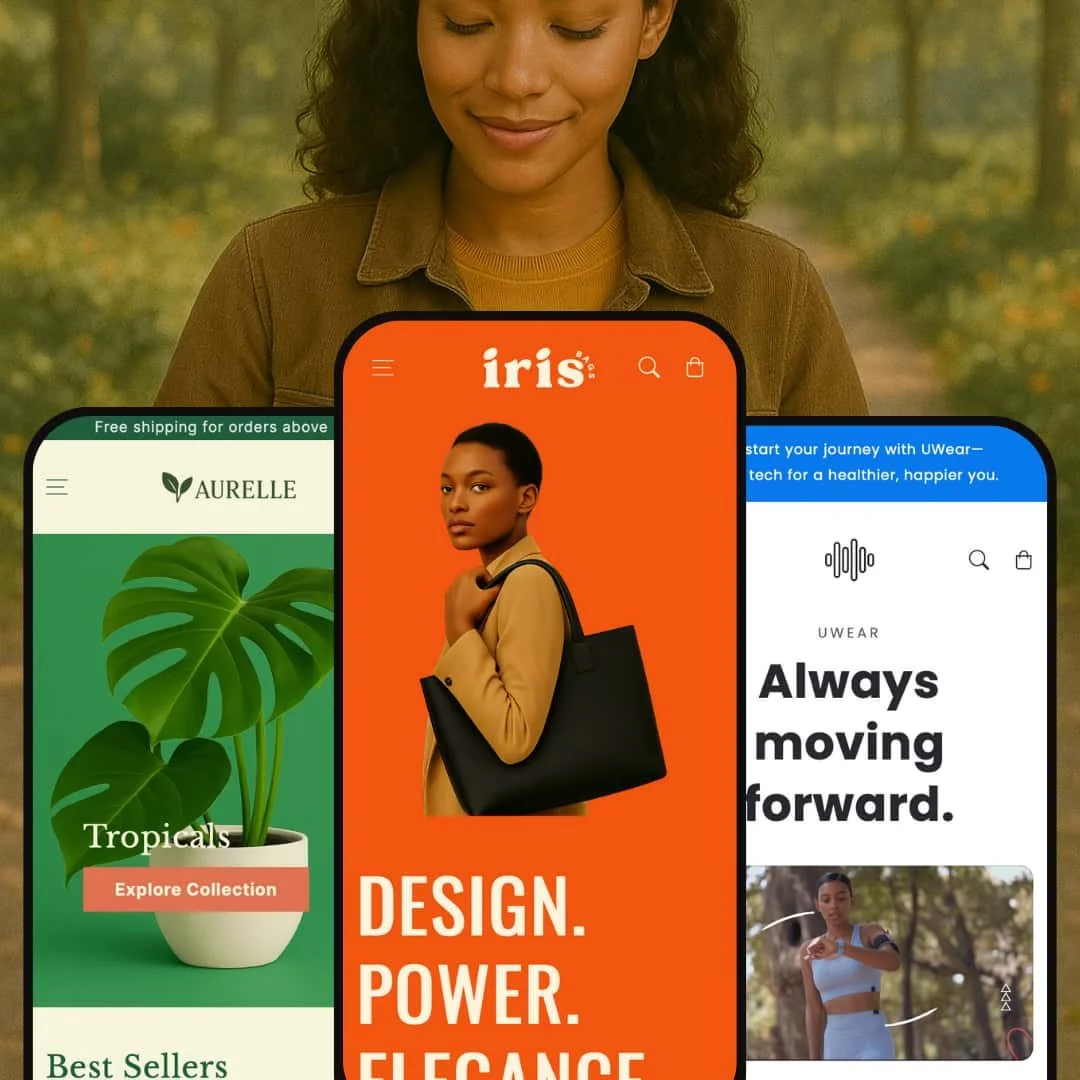
The "Iris" preset is a balanced and modern option, showcased as a sustainable handbag brand, with a strong emphasis on brand storytelling and interactive shopping.
⊕ Pros
✚ Interactive "Shop the Look" Hotspots: This preset features a standout module where numbered hotspots are placed on a lifestyle image, allowing customers to tap and explore specific products directly from a photo. This app-like feature is highly engaging and provides a direct path to purchase.
✚ Prominent Value Proposition Icons: The preset’s structure gives prime real estate to trust-building icons like "Fair Trade," "Recycled Materials," and "Vegan" in the header and scrolling marquees, centering the brand's mission.
✚ Bold, Confident Aesthetic: The combination of strong sans-serif typography ("DESIGN. POWER. ELEGANCE.") and vibrant color backgrounds gives this preset a unique, confident, and modern personality.
⊖ Cons
− Requires Strong Brand Identity: The design's use of bold color and clean lines acts as a powerful framework. However, it requires a merchant with a strong visual brand identity to truly shine and avoid looking generic.
-
Aurelle is positioned as a sophisticated, high-end preset, demonstrated as a boutique plant store, perfect for premium products or services.
⊕ Pros
✚ Elegant Service-Focused Layout: The theme excels at styling pages for service-based offerings. The layout expertly uses descriptive text sections and trust-building elements, elevating the perceived value of intangible products.
✚ Strong Editorial Typography: The design masterfully uses large, readable serif headings paired with clean body copy. This creates a distinct visual path that guides the eye, making content-heavy pages feel scannable and sophisticated.
✚ Trust-Building Icons on Product Page: The product page prominently features icons for "Natural," "Sustainable," and "First Class Delivery" directly below the main description, reinforcing brand values at a key decision-making moment.
⊖ Cons
− Potential for Low-Contrast Text: In the demo, some secondary text and labels use a light gray color that may not pass accessibility contrast standards, potentially creating readability issues for some users.
− Over-reliance on Professional Imagery: The minimalist, spacious design looks stunning with professional photography but could appear empty or unfinished for merchants with lower-quality or inconsistent visual assets.
-
Sonik is built for the modern tech or entertainment creator, demonstrated as a "UWear" brand for smartwatches and audio gear.
⊕ Pros
✚ Striking Dark Mode Design: The preset’s built-in dark background with vibrant text and imagery creates a bold, memorable look. This aesthetic is a powerful branding tool for entertainment, gaming, or tech brands wanting to stand out.
✚ Excellent Product Variant Swatches: The product page features large, clear, and clickable color swatches, allowing customers to easily visualize variants like "Orange," "Green," and "Purple" for the smartwatch. This provides a superior user experience for products with multiple options.
✚ Feature-Driven Layout: The homepage is structurally designed to showcase technology. It uses a grid to highlight key features like heart rate monitoring and battery life, and dedicated sections to explain app integration and product benefits.
⊖ Cons
− Extreme Niche Rigidity: The strong, dark aesthetic is a major pro for the right brand, but it's highly inflexible. A business outside the tech, music, art, or entertainment space would struggle to make this design feel authentic.
Niche Suitability
Not Ideal For
Final Recommendation
-
This theme is ideal for content-driven, modern brands and creators. This includes direct-to-consumer businesses, sustainable brands, tech startups, and artists who use strong visuals and storytelling to drive sales.
-
High-volume, large-inventory retailers or discount stores would likely find the spacious, editorial style inefficient. Brands that need dense product grids and a more traditional, utilitarian layout should look elsewhere.
-
Medium. While the theme is easy to configure, achieving the polished look of the demos requires a significant investment in professional photography and branding.
★ 9.0/10
Rating
-
The theme is packed with premium, built-in features that merchants often pay for via apps. With a consistent mega menu, slide-out cart, before/after slider, and conversion tools, it provides a complete and powerful toolkit out of the box.
10
-
For the merchant, the theme uses standard Shopify sections. For the customer, navigation is intuitive, and interactive elements are responsive and easy to understand.
9
-
The mobile experience is excellent. Menus are clean, touch targets are appropriately sized, and key features translate perfectly to smaller screens, ensuring a smooth shopping journey.
9
-
Based on hands-on testing, the theme feels fast and fluid. Interactive elements like the quick view modal and cart drawer open instantly without perceptible lag. Page transitions are smooth, contributing to a premium user experience.
9
-
While each preset is opinionated, the underlying feature set is so strong that with good branding, it can be adapted to many modern niches. The three distinct starting points offer more flexibility than a single-style theme.
8
FAQ
〰️
FAQ 〰️
-
👑 Yes, it's excellent for presenting services. Presets like Aurelle demonstrate layouts perfect for consultations and workshops, using Shopify's product system as the backend.
-
📱Yes, it provides a very strong and fluid mobile experience, with key features like the slide-out cart working seamlessly on smaller screens.
-
🎨 It's highly customizable within the aesthetic of each preset. You have full control over colors, typography, and sections, but it's best for brands that align with one of the three core styles.
-
⚡Performance feels excellent. Pages load quickly, and interactive elements like modals and drawers are instant and lag-free.
-
👕Yes. It supports variants excellently. The Sonik preset, for example, features large, clickable color swatches on its product page for a great user experience.
-
🔎 The theme supports all of Shopify’s native SEO features. Its clean structure and ability to showcase blog content prominently can also be beneficial for SEO.
-
💱Yes, a language and currency switcher was visible in the footer of the demos, indicating full support for Shopify Markets.
-
⚙️ Yes, it is built to be compatible with apps on the Shopify App Store, allowing you to extend its functionality.
-
🛒 Yes, you can add the theme to your store and try it for free with your own products. You only pay if you decide to publish it.
Disclaimer: This review is based on hands-on testing of the publicly available "Aurelle," "Iris," and "Sonik" preset demos of the Iris Shopify theme as of June 17, 2025. Theme features, preset availability, and performance can change with subsequent updates from the theme developer.