
Most Shopify themes are built for the shopper who buys one of something. Keystone is built for the buyer who orders forty units across six colorways and watches a running line total climb as they go. Brickspace Lab's Online Store 2.0 theme commits hard to wholesale and B2B, and each of its five presets reads like a different trade counter rather than a different lookbook. At this price the real question is whether that commitment earns more than a standard retail theme paired with a B2B app would.
A bulk-order grid that lives where the buyer already is
Keystone's defining move is letting a buyer order without leaving the page they're on. It is the whole pitch. Product cards across the presets carry quantity steppers, and heavier products expand inline to show every variant with its own stock count, unit price, quantity field, and live line total, which collapses what would otherwise be a slow product-page-by-product-page slog into a single screen. Catalog-heavy operations restocking the same SKUs every month feel the time saving most.
Wholesale pricing and onboarding handled at the storefront
What does a trade buyer see before they have an account? Pricing is a privilege here, not a default. Prices sit behind a "Login to view" state, and a wholesale signup asking for company details rather than just an email routes applicants into an account-application flow built into the storefront itself. The presets wire this in different ways, from an on-page login panel to a contractor application page, but the onboarding logic stays the same. For a distributor that approves trade accounts before exposing wholesale pricing, this keeps gatekeeping and sign-up inside the theme instead of bolted on elsewhere.
A cart drawer built to enforce wholesale rules
The cart is where Keystone's B2B intent gets strict. It applies rules, not just totals. The drawer enforces order minimums, blocking checkout and surfacing the shortfall when a basket sits below the threshold a wholesale program sets, and it carries an order-note field for PO numbers or delivery instructions. Operations running minimum-order policies on repeat trade accounts get that enforcement without a third-party add-on.
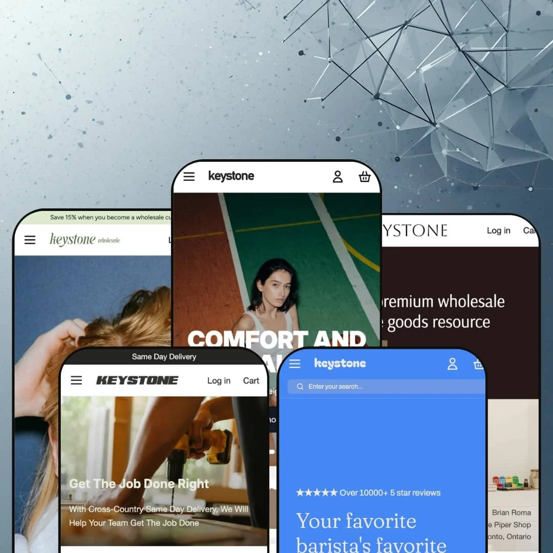
Five genuinely different verticals from one license
Buyers weighing this theme against narrower options should weigh what the preset range actually covers. One purchase, five trades. Keystone ships apparel, hardware, beauty, cafe-supply, and home-goods presets, and each is staged as a working store for its trade rather than a recolor of the one before it, down to its own navigation depth and merchandising rhythm. The hardware preset's mega menu goes several columns deep, a structure a parts distributor with hundreds of SKUs can grow into, while a business unsure which vertical it's really serving, or running more than one, gets room to move without buying again.
Built for wholesale, costly overhead for pure retail
Order minimums, login-gated pricing, the quick-order grid, the account-application flow: a merchant selling only direct-to-consumer switches most of it off and still pays the top-tier price for an engine they don't run. The features that make Keystone worth its number are the same ones a retail-only store has no use for. The fit gap is real for any brand without a wholesale side to its business.
Two headline B2B tools wait behind Shopify Plus
Two of the merchandising features Keystone leans on, quantity-break pricing and combined listings, carry a Shopify Plus tag. A wholesale merchant on a Basic or standard plan still gets the quick-order interface, the login gating, and the order-minimum logic, but the per-quantity volume pricing at the heart of wholesale selling stays locked until they upgrade their Shopify plan. Worth pricing in before you buy.
The layout temperament barely changes across the family
Across the five presets the layout instinct is grid, stepper, tile, repeat. That sells. But a brand whose buyers make considered, design-led purchasing decisions, a boutique home-goods label or a premium apparel line that trades partly on how it looks, won't find much room here for the visual storytelling that justifies sitting at the top of a wholesale price list.
What it takes to launch
Plan a multi-day build. Expect a full copy and imagery pass across hero blocks, category descriptions, FAQ entries, and blog posts; configuration of the B2B account gating, customer pricing visibility, and order-minimum rules; mega-menu re-staging for your own catalog depth; population of quantity-break and metafield data where you use it; and a localization pass over the five bundled European language strings. A link and content audit on every preset section you keep is worth budgeting for as well.
-
What works in this preset
I went looking for the usual hero banner, and the first thing the Knit homepage handed me was a product. The Matte Water Bottle sits near the top with its four colorways stacked as separate rows, each showing a live stock count (21, 42, 521, then 532), a per-unit price, a quantity field, and a line total that climbs as you key in numbers. For an apparel wholesaler whose buyers order mixed quantities per color, that one block does the work an order form would otherwise carry. That sets the tone.
The mega menu drops into image-backed columns for Tops, Bottoms, Outerwear, and Accessories, each with nested sub-links. A wholesale program banner sits above the header, and the footer splits into Customer Assistance, Wholesale, and About Us columns alongside a multi-location block listing Toronto, Halifax, and Vancouver store hours. The whole layout assumes a returning trade buyer who already knows the catalog.
I clicked through to the cart drawer to see how it behaves. It stacks an order-note field, a free-shipping progress bar, and a "Share your cart / Copy URL" control for sending a built basket to a colleague or back to yourself later. Several best-seller cards sit under a "Login to view" state, pricing held back until an account signs in.
-
What works in this preset
A hardware catalog lives or dies by navigation, and Kingpin treats the mega menu as the main event. It fans out across ten top-level groups (Tools, Fasteners, Garden, Electrical, Lighting, Flooring, Carpet, Tile, Plumbing, Lumber), each opening a column of specific sub-collections like Drills, Sanders, Threaded Rods, and Wall Tile. For a contractor hunting one fastener size, that depth is the difference between a sale and a bounce. Depth wins here.
Below the fold the homepage runs category bands (Fasteners, Tools, Lighting, Plumbing, Garden), each with a short descriptive line and a grid of sub-category tiles. A "Are you a contractor? Create an account to receive our wholesale pricing" block sits mid-page with an Apply Now path into a contractor application. Same-day-delivery messaging and a guides blog round it out.
Where it stumbles
The homepage is almost entirely navigation and category tiles. There's no real brand moment and nothing to hold a first-time visitor who isn't already a contractor with a list in hand. For the named vertical that's defensible, since trade buyers want the catalog rather than a story, but it does mean the preset offers little to turn a curious newcomer into a registered buyer beyond the apply-now prompt.
-
What works in this preset
"Save 15% when you become a wholesale customer" runs across the top, and Kindred wastes no time turning intent into an account. A Wholesale Login panel appears high on the homepage, and the signup form asks for a Company Name alongside the usual fields, quietly screening for trade buyers rather than retail browsers. The product cards underneath carry quantity steppers, so a returning buyer builds an order without opening a single product page. It's a B2B funnel, top to bottom.
I noticed the masks section leans on a looping background video instead of a static banner, which gives an otherwise utilitarian beauty catalog some motion. A "Shop By Collection" grid maps out Cleansers, Serums, Oils, Masks, and the rest with item counts, the same discovery pattern the other presets use, tuned here for a skincare range.
Where it stumbles
Leading with a login wall is a gamble. A first-time retail visitor lands on a sign-in panel before they've seen a price or a full product, and with much of the catalog set to "Login to view," the logged-out storefront can read as closed for business. It fits a pure-wholesale operation, though a brand selling both retail and trade from one storefront would want to rethink how much is gated up front.different sections don't have strong visual separation.
-
What works in this preset
Kettle opens with a star-rating line and a value-prop strip that scrolls a short loop of selling points (One-Stop Cafe Shop, Worldwide Flavours, Roasted in Canada, Compostable Supplies). The coffee cards use an inline "Load variants" control, so instead of leaving the homepage a buyer expands a card to reveal the product's size variants, priced from $27 to $275, and orders each directly. For a cafe restocking beans by the case, that keeps the whole order on one screen. Coffee sells by volume here.
A full product block for a Sugar Syrup sits inside the homepage, complete with description, options, an add-to-cart button, and a "Free Shipping on orders over $250" line. Further down, tea and syrup rows carry the same quantity steppers as the other presets. The wholesale signup here asks for a Phone number and Company name, a slightly heavier gate suited to accounts a sales rep will follow up with.
-
What works in this preset
Kaleidoscope is the upmarket one. The H1 calls it "the premium wholesale home goods resource," and the page carries a buyer quote from a Toronto shop owner, a trust band for Net 60 Payments, 24/7 Support, Free Shipping, and Easy Re-Order, plus a rotating best-sellers gallery. Pricing runs high and real here, with a console listed at $7,500 marked down from $8,000 under a Save 6% badge, sitting beside quantity steppers and Login-to-view cards.
A "Shop by Brand" directory gives each supplier its own card with location and designer credit (Sunburnt Glass, Field Studio, Cotton Duck, Taper), which suits a multi-brand distributor presenting a roster of makers. The Bed & Bath section goes editorial, with linen, muslin, percale, and waffle ranges each described in a sentence rather than dumped into a grid. The same "Load variants" expander from Kettle reappears on the plant-stick cards, the theme-wide control staged for a different catalog.
A vertical-agnostic B2B engine
The most telling thing about Keystone is that the same machinery re-skins cleanly from apparel to hardware to luxury home goods without any one vertical feeling like the real one and the rest like afterthoughts. That de-risks an unusual category bet. A merchant in a trade the big retail themes ignore can adopt it and trust the wholesale plumbing was built for them, not retrofitted.
An information architecture organized around the returning buyer
Read all five presets together and a single instinct surfaces: navigation, pricing visibility, and account flows all orient around a logged-in buyer placing a repeat order, not a stranger discovering the brand. Few themes are this consistent about who they're for. For an operation whose revenue comes from known accounts reordering on a cycle, that focus is the whole point.
The "five designs" promise is about catalogs, not aesthetics
The presets vary convincingly by vertical and color, but they share one layout temperament, so the range on offer is really range of catalog type rather than range of visual identity. A buyer drawn to Keystone for design variety specifically will find less daylight between the five than the pitch implies. The differentiation is in what each store sells, not in how it feels to browse.
The value is back-loaded behind the login
Keystone's best tools come alive after a buyer signs in, which leaves the logged-out storefront, the surface search engines crawl and first-time buyers judge, as the least-developed part of nearly every preset. The home pages lean on gating and quick-order utility rather than persuasion. A store that needs to win new accounts, not just serve existing ones, has to build that top-of-funnel layer itself.
★ 8.0/10
Rating
-
The B2B toolset is dense and genuinely useful: quick-order grids, login-gated pricing, order-minimum enforcement, account applications, and quantity-break support all ship in the box.
9
-
Day-to-day editing follows familiar Online Store 2.0 patterns, but standing up the wholesale pieces (gating, pricing visibility, minimums) is a real configuration project rather than a switch you flip.
7
-
Quantity steppers and the slide-out cart hold up on a phone and the mega menu collapses into a stacked drawer; the bulk grids get tighter on small screens but stay usable.
8
-
Image lazy-loading and webp assets keep pages reasonably lean, though the deepest mega menus and multi-section homepages add weight to the load.
8
-
Five vertical presets and a theme-wide section library give plenty of starting points, but the shared layout temperament means real visual differentiation takes custom work.
8
Frequently Asked Questions
-
Brickspace Lab, a Canadian developer based in Orillia, Ontario. The theme is on version 2.1.1 as of early 2026, with recent updates touching account settings, banner rendering, and cart-note handling.
-
Yes, but it's a setup decision rather than a default. The demos lean hard on "Login to view" gating, so you choose how much catalog and pricing stays visible to logged-out shoppers versus locked to approved accounts.
-
More than an email. Depending on the preset, the form asks for a company name and phone number, screening trade applicants before an account is approved.
-
Yes. The home-goods preset stages strike-through pricing with a percentage-saved badge on discounted items, so promotional markdowns render natively without an extra app.
-
The theme ships pre-translated interface strings for English, French, Italian, German, and Spanish. Translating your actual products and running multiple currencies still happens through Shopify's own localization, not the theme.
-
Each preset ships a working blog (supplier guides, how-tos, brand stories) plus contact and FAQ page templates, which suits distributors publishing buying guides for their trade customers.
This review is based on hands-on testing of the publicly available preset demos of the Keystone Shopify theme as of May 29 2026. Theme features, preset availability, and performance can change with subsequent updates from the theme developer.