
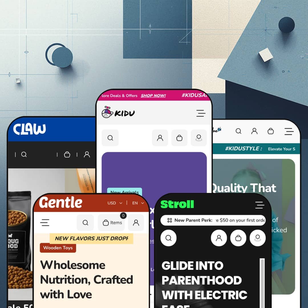
Most kids' themes pick one lane (toys, or apparel, or nursery gear) and build the whole demo around it. Kidu spreads five presets across five different retail worlds, and one of them sells dog food and cat shampoo rather than anything for children. It runs on Online Store 2.0 architecture, with a shared section library deep enough to restage as a toy shop, a baby-clothing boutique, a stroller showroom, a formula store, or a pet-supply outlet. That range is the whole pitch, and it's the part worth testing.
Five real verticals from one license
For a merchant who isn't locked to a single category, or an agency spinning up several family-retail stores, Kidu's headline value is range: it ships five presets that each commit to a different world, toys, baby apparel, nursery gear, infant nutrition and pet supplies. These aren't recolours of one layout; each restages the shared library into a believable store of its own. The breadth is genuine. A multi-brand operator or a founder still choosing a niche gets five running starts in a single purchase.
A consideration layer that's built in, not bolted on
A native product-comparison tool anchors the buying experience: shoppers add items to a "Compare Now" drawer from product cards and weigh them side by side, with an "Ask a Question" inquiry form and a product-level FAQ accordion backing it up on the page. For categories where buyers research before they commit, that turns the storefront into a decision aid rather than a catalogue. It comes standard. Nursery-gear and other considered-goods merchants with higher-ticket SKUs and research-minded buyers get this without an extra install.
Browsing by age, not by SKU
Every preset organises its catalogue by the shopper's age or stage, with bands tuned to each vertical: months for babies, years for kids, developmental stages for formula. For family retail that mirrors how parents actually search, by who they're buying for, which shortens the trip from landing to product. It matches how parents think. Baby, kids and gift-buying merchants whose range splits naturally by age get a browse model built around buyer intent.
The promotion machinery arrives assembled
Where Dawn hands you a clean baseline and leaves promotion to you, Kidu arrives with the conversion kit already wired: flash-sale blocks with countdown timers, stock counters, product and trust badges, a featured-product showcase, gift cards, and a store-locator with per-location pickup. For DTC merchants who run frequent promotions and omnichannel sellers who fulfil from physical shops, that's a coordinated merchandising kit rather than a parts bin. It sells from day one.
Breadth comes at the cost of depth
The flexibility cuts both ways. Because one library has to serve five worlds, each preset is a capable generalist rather than a specialist: a single-brand fashion boutique, for instance, gets clean product grids but no editorial lookbook or outfit-pairing section to sell the styling that apparel runs on. Merchants who want their category's signature merchandising built in will treat Kidu as a strong starting point and add the tailored pieces themselves. Range is the headline; vertical depth is the trade.
Consumable verticals are dressed for impulse, not refills
Two of the five demos sell consumables, formula and pet food, but the storefront merchandises them exactly like impulse toys. The flash-sale countdowns and low-stock pressure that suit a $23 plush sit awkwardly on products people rebuy on a schedule, and there's no repeat-order or subscription cue anywhere in the theme, so replenishment behaviour comes entirely from third-party apps. Subscription-driven nutrition or pet-supply merchants with repeat-buyers should plan on apps doing the work the theme doesn't. That's a real mismatch. If you sell refills, the shelf is set up like a toy aisle.
One aesthetic register: bright and busy
Kidu has a single tonal setting, and it's cheerful. Across every preset the look stays bright, rounded and promotion-loud, which is perfect for a toy shop and harder to live with if you're building a calm, premium, or minimalist brand. A luxury nursery label or an understated organic-baby line will spend real time muting colours, thinning sections and quietening the urgency cues to reach a restrained feel the demos never aim for. The theme dresses up better than it dresses down.
What it takes to launch
Plan for several days of real work. The demos run on licensed third-party products and brand names that have to be swapped wholesale for your own catalogue, on top of a full copy pass across heroes, testimonials, blog posts and product FAQs, age-band collection mapping for the browse navigation, market and currency configuration, and brand-name alignment through the header and footer. Budget three to five days before a chosen preset is genuinely yours.
-
What works in this preset
The flagship is the busiest of the five. Its Catalog menu opens into an image-led mega menu where category tiles run across the top, product columns sit beneath them, and two promotional banners anchor the right edge so the panel reads as a shopfront rather than a list of links. I clicked through expecting a plain dropdown and found a merchandising surface instead. For a store carrying plush, lights, masks, stickers and water bottles at once, that depth pays off.
Shoppers landing here get a path that keeps moving. A two-slide hero gives way to a top-collections row, an age-based browse strip, a flash-sale block with a live countdown, and a tabbed featured-collection panel, all before the page hands off to testimonials and a gift-card carousel. Each product card carries a colour swatch, a quick-add control, and a compare toggle that drops items into a side-by-side drawer. The pace rarely lets up.
One detail I didn't expect: a charity block on the product page. The Mushroom plush page pledges one percent of order value to a named cause, sitting just below an in-store-pickup widget that checks stock at each location. A size-chart modal, a stock counter, and an inquiry form round out the page. For a single-brand toy retailer with a storefront and a community angle, the page does real work. It rarely feels bare.
Where it stumbles
All that merchandising density has a downside. Between the flash sale, the "Snap Deal" menu item, and the sale mega menu, the demo fires several urgency cues at once, and they compete rather than compound. A first-time visitor meets three different "act now" prompts before scrolling past the hero. More is not always more.
-
What works in this preset
Strip the toy-store sprawl away and the same engine runs leaner. Dresser drops the image mega menu for tidy column dropdowns, fronts the page with apparel-specific browse strips, and segments everything by age band, from newborn (0-6M) up to boys and girls at 2T-7T. Sizing runs through the variant picker. For a baby-and-kids apparel boutique sorting a mid-size catalogue by age, the layout fits the question parents actually ask.
The reading experience here is calmer than the flagship. A featured blog sits mid-page with posts on layering and sustainable kids' style, giving the store an editorial beat between product rows that the toy preset never pauses for. Below it, a featured-collection tabset lets shoppers flip between bibs, socks, bodysuits and rompers without leaving the homepage. The tone steadies.
Where it stumbles
For a fashion vertical, the section library is conversion-first, not editorial-first. There's no built-in lookbook, outfit-pairing block, or shoppable-image section, so apparel merchants who sell through styling and "wear-it-with" context have to build that mood out of generic image and tab sections. The clothes get shown; they don't get styled. A boutique leaning on aspirational fashion storytelling will feel the gap.
-
What works in this preset
Stroll reaches up-market, and it changes posture to do it. The navigation goes flat and quiet, a "save $50 on your first order" bar greets new parents, and the homepage hands over to a full featured-product showcase: a five-image gallery, colour swatches, a stock counter reading "only 40 left," and an inquiry form, all for a $220 rotating car seat. I scrolled expecting product cards and met a near-complete product page sitting in the home view. Leading with one hero product suits higher-ticket gear.
Parents researching a big purchase get more than a buy button. A "baby registry" block invites them to build a gift list, video promo banners replace static images, and a "shop by age and stage" strip runs from newborn through preschool. The store-locator gets its richest staging here, with three named hubs and descriptive copy for each. It's built for browsing, not just buying.
Does the consideration tooling keep up with the price tags? Mostly. The compare drawer carries over, the inquiry form sits on the product page, and a product-level FAQ accordion answers the practical questions gear buyers tend to ask before committing. For a nursery retailer with considered-purchase buyers and a higher average order value, that's a reasonable decision layer out of the box.
Where it stumbles
The merchandising still behaves as if everything were an impulse buy. A $300 car seat is a researched, once-every-few-years decision, yet it sits under the same countdown timer and low-stock pressure the toy preset uses on a $23 plush. That urgency register can read as pushy on considered gear, where trust and detail close the sale. Calmer pacing would suit the cart better.
-
What works in this preset
Gentle takes the theme into consumables. Its "choose by age" tabset reorganises infant formula by stage, from 0-6 months through eighteen months and beyond, so a parent shops by their baby's age rather than by product name. Video sections are used most heavily here, including a four-tile video gallery mid-page. The age-first spine transfers well.
"New flavors just dropped," the announcement bar says, and the rest of the page keeps that warm, organic tone. Bestseller rows, a "meet the range" media block, and a gift-card carousel give the store a soft, gift-friendly feel that fits baby nutrition. Five social links anchor the footer. It reads gentle, as named.
-
What works in this preset
Here's the preset that proves the point: Claw is a pet store. Dog food, cat shampoo, bird feeders and chew toys fill collections built on the same sections as the toy flagship, down to the compare drawer and the flash-sale countdown. Weight and size variants (500g, 1000g) handle the way pet food actually sells. The bones are identical.
A pet shopper gets a familiar, friendly run down the page. Top-collection tiles split dog, cat, bird and fish food, a promo bar pushes "50% off, free shipping over $99," and a six-post blog covers pet-care topics with comments switched on. The "Join Our Pack" newsletter is a nice in-character touch. The costume holds.
Where it stumbles
The visual language stays cheerful where pet retail often wants reassurance. Bright promo banners and playful flash sales suit kids' toys, but categories like pet nutrition tend to sell on ingredient trust and authority, and the loud, upbeat register pulls the other way. A premium or vet-adjacent pet brand would spend effort toning the storefront down. The cheer is hard to switch off.
The shared library genuinely flexes
Read all five presets in a row and the achievement is plain: a pet store and an infant-formula store run on the same underlying sections as a toy shop, and none of them looks like a reskin of the others. That elasticity is rare, and it's the thing Kidu does better than its "five presets" headline suggests. The architecture, not the artwork, is the real product.
A natural fit for omnichannel family retailers
One profile keeps surfacing across the demos: a family or baby retailer with physical shops. The store-locator and the per-location in-store-pickup widget recur from the toy preset through the stroller and pet presets, which together point at a brick-and-mortar operator taking its catalogue online. It suits shops with shelves. Merchants in that exact position get more out of Kidu than the listing makes clear.
Its identity is borrowed, not its own
For all the competence, Kidu has no strong design viewpoint of its own; it becomes whatever vertical you pour in. Seen across all five presets at once, that's the cost of the flexibility: the theme is a chameleon, and a buyer shopping for a distinctive, opinionated look will notice the absence of a signature. You bring the personality; Kidu brings the plumbing.
One merchandising mode for very different purchases
The theme sells a $23 plush, a $300 car seat and a tub of formula with the same urgency-and-promotion playbook. It never modulates that approach to the buying psychology of each vertical, so the further a category sits from impulse, the more the merchant has to re-tune the storefront's pressure to fit. One gear fits none of them perfectly. A theme spanning this many purchase types would gain from more than one conversion setting.
★ 7.6/10
Rating
-
A deep conversion and decision set: native product comparison, in-store pickup, size charts, stock counters and a product-level FAQ, plus age-stage browse logic that works in every preset.
9
-
Online Store 2.0 sections are approachable, but the sheer breadth means heavy configuration, and restaging a preset to your own catalogue and copy is a multi-day job.
6
-
Responsive layouts, a slide-out cart, a sticky header and a clean mobile menu keep the feature-dense homepages navigable on a small screen.
8
-
Images lazy-load and the markup is tidy, though the busier presets stack many sections, sliders and video that add weight to the longer pages.
7
-
Five presets and one elastic section library give enormous reach across verticals; the trade is a consistently bright, playful register that's harder to push toward restraint.
8
Frequently Asked Questions
-
Yes. The Claw preset is a complete pet store, not a toy layout with pet photos, with its own collections for dog, cat, bird and fish food, weight-based variants, and pet-care blog content. You'd start from a fully realised pet storefront.
-
It's collection-driven. You create a collection for each age band and link it to the "shop by age" strip, so the setup is standard Shopify collection work rather than custom metafield wiring.
-
Yes, it's a theme section rather than a Stroll-only build. Any preset can place the same single-product showcase, with gallery, variant swatches, stock counter and inquiry form, on its homepage.
-
It's built into the theme. The "Compare Now" drawer and the compare toggle on product cards ship with Kidu, so you're not installing a third-party comparison app to get side-by-side viewing.
-
No. Those are licensed demonstration products that you replace entirely with your own catalogue; nothing in the demo data is yours to keep, which is part of why initial setup takes a few days.
-
Yes. The product page shows per-location pickup availability tied to your Shopify locations, and several presets include a multi-location store-locator with maps.
This review is based on hands-on testing of the publicly available preset demos of the Nexa Shopify theme as of May 2026. Theme features, preset availability, and performance can change with subsequent updates from the theme developer.