
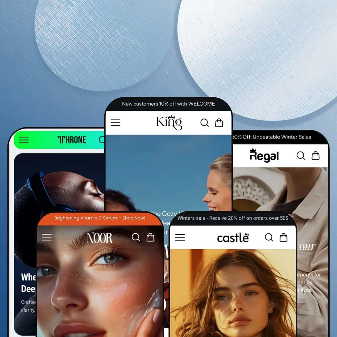
Five presets, five industries, one $500 price tag, and King is the rare Shopify theme that bets on breadth where most premium themes bet on depth. The Online Store 2.0 section library carries the same merchandising stack across luxury bags, watches, beauty, and electronics presets, all from one developer install. The question isn't capability; it's whether spreading across verticals at the Theme Store's pricing ceiling beats single-vertical specialists at $320 to $400.
Five-vertical preset coverage from one purchase
Five presets across five industries from one $500 install. King, Castle, Regal, Noor, and Throne pitch at general fashion, bags and accessories, premium watches, beauty, and electronics respectively, each with its own section rhythm and homepage staging. Premium themes at the $400+ tier typically ship two to four presets in the same vertical, or one preset with color variants. For multi-brand operators managing two or three Shopify stores, or merchants still narrowing their visual direction before committing, the breadth is meaningful: one theme install covers five experiments.
A 30+ section library that includes the merchandising-rich ones
A section library that delivers the merchandising-rich sections, not just the basics. The Shop the Look section runs as a native image-hotspot lookbook (where most themes treat hotspots as a paid add-on), the Before/After section ships as a comparison slider (typically an app subscription for beauty and home-improvement brands), and Multiboxes plus Marquee text with image cover editorial-style mid-page storytelling that catalogs leaning on visual narrative need. For brands selling categories where the buyer reads before they click (beauty, fashion, home goods, accessories), the library reduces the app-stack count from day one.
Cart layer treated as a sustained design choice
The cart layer is one of the better-equipped in King's section library. The theme ships both a slide-out cart drawer and a dedicated cart-page template, with cart notes, gift wrapping toggle, in-store pickup display, pre-order support, and a sticky mobile cart button wired in by default. For brands selling configurable orders (gift purchases, wholesale, BOPIS-enabled inventory), the cart-layer depth means fewer cart-related apps to install before launch.
Economical for agency operators and multi-brand owners
For agency operators and multi-brand owners specifically, King is one of the more economical Theme Store options. One $500 install gives an agency or a holding-company merchant five distinct production-ready visual directions to deploy across client stores or brand portfolios. Single-brand merchants will likely use only one preset and won't see the value the multi-store buyer sees.
Price at the Theme Store ceiling without a signature feature to anchor it
$500 buys the most expensive tier in the Theme Store, and King doesn't carry a signature feature that justifies the ceiling. The section library is rich and the cart layer is competent, but there's no outfit builder, no product configurator, no AI-driven search, no merchandising engine that distinguishes King at this price point. For merchants comparing King to themes at $320 to $400 with similar feature breadth, the extra $100 to $180 needs a clearer answer than the demo supplies. Budget-conscious buyers should look at vertical specialists in the $320 to $400 band first.
Vertical positioning without vertical merchandising depth
Each preset names a vertical, but none ships the vertical-specific merchandising tools the named buyer actually needs. The preset framing handles staging (color palette, section rhythm, hero photography), and the underlying metafield model and merchandising patterns stay general-purpose across all five presets. For merchants picking King because of its vertical positioning rather than its breadth, the absence of category-specific tooling is the gap to plan for. Most will end up either populating custom metafields manually or installing apps to fill what the preset name promised.
Support timezone narrow, documentation freshness uneven
Support hours run Monday to Friday 09:30 to 18:30 IST, which means European merchants get a half-day overlap window and North American merchants get a roughly two-hour overlap at the start of their working day. The developer support scope explicitly excludes design changes, new theme settings, and third-party app integration, which is standard for theme support but worth knowing before purchase. Theme documentation on the developer's GitBook was last updated roughly a year ago at the time of writing, despite the theme receiving its most recent version update in February 2026, so merchants implementing newer settings may need to rely on direct support tickets rather than self-serve docs.
Online Store 2.0 architecture at a Horizon-era price tag
King is built on Online Store 2.0 architecture rather than the newer Theme Blocks generation. For merchants who don't plan to use AI-block generation or deeply nested block compositions, OS 2.0 is still fully supported and works fine. Buyers paying the Theme Store's pricing ceiling in 2026 are increasingly comparing against Horizon-era themes that ship with up-to-eight-level block nesting and mobile-first architectures, and on that comparison King is one architecture generation behind.
What it takes to launch
Replace the preset demo copy across hero banners, FAQ entries, and collection descriptions, populate any vertical-specific metafields if you're staying inside Castle, Regal, Noor, or Throne's named industry, and trim the homepage section count (defaults are visually busy, and most stores will want to disable five to ten sections before launch).
-
What works in this preset
The King preset stages as the catch-all of the family, a multi-section homepage that opens with a slideshow hero and stacks featured collection, collection tabs, multiboxes, marquee text, and testimonials before the footer hits. For merchants who want maximum customization runway from day one, the section variety is the value: 30+ sections in the library, most of them visible on this preset's homepage so you can see what's available before deciding what to keep.
The mega menu architecture supports text-link columns, featured-product tiles, and promotional banner blocks in one navigation panel, useful for general fashion or lifestyle brands that want to merchandise inside navigation rather than just route shoppers through it. I noticed the announcement bar above the header supports message rotation, which most themes at this tier reserve for the top single-line slot.
The Categories section (a visual collection-tile grid with image overlays) and the Collections grid handle hierarchical catalog browsing without forcing merchants to install a third-party menu app. For brands with 5 to 15 collections and a mid-size catalog, this combination covers the navigation work most stores actually do.
Where it stumbles
King is also the preset where the "general-purpose" positioning works against it. With no specific industry tilt, the homepage reads as a section showcase rather than a designed experience, and the merchant has to make most of the staging decisions themselves. Competing premium themes ship pre-curated for the niche they target.
-
What works in this preset
Where King hedges, Castle commits. The bag-and-accessories framing shows up in the first hero panel: bold typographic overlay against full-bleed product photography, the kind of staging that fashion-accessory brands typically build with custom Liquid or page-builder apps. The Marquee text with image section adds the rotating brand-narrative strip that handbag and leather-goods catalogs lean on for storytelling between product blocks.
Where Castle earns its preset-specific positioning is the section rhythm. Styled Collections renders as a multi-column editorial grid rather than the standard four-tile pattern, and the Shop the Look section (the theme's image-hotspot lookbook) is staged here as central rather than as a footer-adjacent afterthought. For accessory brands selling bags, belts, and small leather goods where the visual hierarchy matters more than feature breadth, the magazine staging is closer to what merchants would otherwise commission from a custom developer.
Where it stumbles
The bag-and-accessories framing doesn't extend into the metafield model. There's no built-in surfacing for leather type, hardware finish, dimensions, or interior compartments, all of which are standard buyer questions on this category. Merchants on Castle will need to either configure metafield templates manually or accept that the product page describes bags with the same generic structure the Throne electronics preset uses.
-
What works in this preset
I scrolled through Regal looking for the watch-specific touches, and they show up where it matters. The Editorial Grid Layout section uses asymmetric tile sizes, which lets a premium watch catalog give flagship pieces visual weight without forcing every product into a uniform card. The Interactive Product Grid renders as a horizontal-scroll preview band rather than the standard sectioned grid, suiting the multi-collection structure that watch brands typically use (dress, dive, chronograph, vintage).
Regal's homepage opens with a Hero banner staged as a single-product editorial spread (one watch, full-bleed photography, restrained typography) before transitioning into a featured product section and the editorial grid. That sequence reads more like a digital lookbook than a standard ecommerce homepage. For watch brands selling at the $500 to $3,000 piece price point where the buyer needs to feel the brand before clicking add-to-cart, this is structurally the right approach.
The Combined Listing capability surfaces specifically in the Regal preset's feature list, which on Shopify Plus stores lets watch brands unify multiple model variations (case sizes, dial colors, strap materials) into a single product listing while preserving each variant's distinct page. That's the merchandising approach the watch vertical specifically needs and that most themes leave to manual workarounds.
Where it stumbles
Regal sells itself as the watch-vertical staging, but the demo doesn't go all the way. There's no movement-type or case-size metafield surfacing on the product page that I could verify from the theme's documentation, no comparison engine between models, and no native size-guide modal tuned for wrist measurements. The Editorial Grid is beautiful; the merchandising spine underneath it stays generic.
-
What works in this preset
Beauty is the vertical where Shopify already has a dozen specialized themes, so Noor has to fight for its place. The Quick-Buy Product Displays section runs as a streamlined card pattern (variant swatches visible from the listing, price exposed inline, add-to-cart inline rather than behind a click) which is the merchandising approach beauty catalogs lean on for repeat-buyer conversion. The Category-Rich Navigation pattern stages collections as visual entry points (skincare, makeup, fragrance, body) rather than text-only menu items.
What Noor borrows from the broader King architecture and applies well here is the Before/After section, the theme's image-comparison slider. For beauty brands selling skincare or cosmetic products where transformation imagery is part of the sales pitch, having a native comparison slider section saves merchants from installing a Before/After app or commissioning custom Liquid. The same section in the King preset feels generic; staged inside Noor's beauty framing, it lands as a category-specific tool.
Where it stumbles
The Noor preset has no built-in routine-builder, shade-matcher, or skin-type quiz, the merchandising tools beauty brands typically need to convert browsers into multi-product baskets. The Ingredients or nutritional information capability shows in the feature list, which suggests structured ingredient surfacing is possible, but the preset demo doesn't stage it conspicuously and the documentation doesn't walk through implementation. Beauty merchants will need to do the metafield work themselves.
-
What works in this preset
Throne's preview deck names electronics, mobile, and parts stores explicitly, and the preset's cart treatment is where the positioning shows. The Quick & Conversion-Ready cart drawer integrates a progress bar (typically configured for free-shipping thresholds), product-preview thumbnails, and an embedded countdown, the conversion stack that tech stores running flash sales and bundled accessories rely on. The combination of cart drawer plus cart page template (the theme ships both) gives merchants the choice between drawer-only or drawer-plus-page flow, which matters for catalogs where buyers research before checkout.
The Adaptive Page Templates positioning maps to the theme's section library: Multiboxes, Text with icons, Promotional bar, and Collection showcase sections give tech merchants the block vocabulary they need for spec-heavy product education. The Logo list section, often dismissed as a trust-badge filler, lands harder in tech where brand authorization (authorized reseller of X, Y, Z) is a genuine purchase trigger.
Where it stumbles
I went looking for a comparison-table section in Throne's library and didn't find one. The Product tabs capability handles accordion-style spec dumps, but for shoppers cross-checking battery life, processor speeds, or screen resolutions across three products at once, the merchant will need to either build a comparison page manually or install a comparison app. That's a real gap for the vertical the preset is named after.
One install, five experiments
What King uniquely offers in the Theme Store is the ability to test five different vertical positioning experiments from one purchase. Most premium themes commit a merchant to one visual direction; King lets the merchant try Noor's beauty staging this month, switch to Regal's watch-editorial direction next month, then settle on Castle for a long-term accessories build. That's a different kind of value than feature-richness. It's optionality.
Consistent section library across vertical staging
Reading all five presets together, the same 30+ section library appears with different content but the same structural blocks. A merchant who learns King's section system on one preset can switch to another without re-learning the editor. For agencies managing multiple King-themed clients, that's operational efficiency the single-preset alternatives don't offer.
Cart layer as a theme-wide architectural commitment
All five presets carry the same cart-layer depth: drawer plus page template, sticky mobile cart, gift wrapping, pre-order, in-store pickup. The cart treatment isn't a Throne-specific bonus; it's a theme-wide architectural commitment. For brands where cart-stage abandonment is the conversion bottleneck, the consistency across presets means the merchant can switch visual directions without re-engineering checkout flow.
Mid-page editorial sections as a default expectation
Multiboxes, Marquee text with image, Revealing text, and Image with text carousel show up across all five preset homepages with different content. The theme treats editorial-style mid-page storytelling as a default expectation, not an upsell. That pattern matters most for brands where the homepage needs to do more than route shoppers; it needs to brand them.
Breadth without depth in any single vertical
None of the five preset verticals gets the merchandising depth a vertical-specialist theme would ship. The presets vary staging, color palette, and section emphasis, but the underlying merchandising spine (variant pickers, metafield surfacing, comparison structures, category-specific tools) stays uniform. King is a multi-vertical theme; it's not a watch theme that also does beauty.
Price ceiling without a ceiling-tier moat
At $500, King competes in the most demanding tier in the Theme Store, and the demo doesn't supply a single feature that distinguishes it from $320 to $400 alternatives by capability rather than preset count. The breadth justifies the price for the right buyer. The feature set alone doesn't.
One architecture generation behind the current frontier
Online Store 2.0 is solid, mature architecture and works fine for merchants who don't need Horizon-era flexibility. Buyers paying the ceiling price in 2026 are increasingly weighing OS 2.0 themes against Horizon-generation alternatives with deeper block nesting and mobile-first architecture, and King hasn't yet made that transition.
★ 7.4/10
Rating
-
Strong section library, comprehensive conversion stack, cart depth, and multi-preset coverage. Loses points for no signature feature distinguishing it at the $500 price tier.
8
-
Standard Shopify editor with King's section library. The 30+ sections require curation effort, and the multi-preset structure means merchants need to commit early to one preset's section staging.
7
-
Mobile-specific assets present, sticky mobile cart wired in across presets, slide-out cart drawer optimized for thumb access. Standard mobile responsive architecture rather than Horizon-era mobile-first.
7
-
Image-heavy presets (especially Regal and Castle's editorial staging) carry significant homepage weight. OS 2.0 lazy-loading patterns are in place, but the default section count adds DOM weight that lean themes avoid.
7
-
Five preset baselines, 30+ sections, and comprehensive theme settings make swapping visual direction straightforward. Limited by OS 2.0's block nesting depth versus Horizon-era flexibility.
8
Frequently Asked Questions
-
If you'll only use one of the five presets, the per-preset value is roughly $100, which is competitive with budget themes but well below what single-vertical premium themes deliver in that vertical. King's economics favor multi-brand operators and agencies; single-store merchants should compare against $320 to $400 vertical specialists in their specific category.
-
Yes. The 30+ section library is theme-wide and not preset-locked, so a merchant on the Regal preset can add the Shop the Look section from Castle's staging or the Before/After slider from Noor's. The preset determines the default homepage composition; section availability stays consistent across all five.
-
The Store Locator section in King's library renders a Contact-with-map UI that can be wired to Shopify's locations data, so brands with physical retail (BOPIS-enabled or otherwise) can surface store finder functionality without installing a separate locator app. The implementation handles the standard single-store and multi-store cases without third-party tooling.
-
King ships both: a slide-out cart drawer for fast in-page conversion and a dedicated cart page template for catalogs where buyers want to review larger orders before checkout. Merchants can keep both or disable one in theme settings; most stores will run drawer-by-default with the cart page reserved for direct /cart navigation.
-
The Theme Store feature listing surfaces Combined Listing (Shopify Plus) and Lookbooks on the Regal and Noor preset pages specifically, though the underlying theme architecture supports them across all five. Merchants on Castle, Throne, or King will need to verify in the Shopify editor whether those sections appear in their available section list.
-
Support covers bug fixes and questions about theme settings and existing features. It explicitly does not cover design changes, third-party app integration, custom feature development, or modifications to theme structure. Merchants needing those services should plan for a separate Shopify expert engagement.
-
King ships pre-translated UI strings for English, French, Italian, German, and Spanish (button labels, form text, navigation labels). Language selection and currency switching for the storefront are handled by Shopify Markets at the platform level; the theme contributes the country/language selector UI and RTL CSS support. Product content translations remain a merchant responsibility through Shopify's translation interface or apps like Langify.
This review is based on hands-on testing of the publicly available preset demos of the King Shopify theme as of May 15 2026. Theme features, preset availability, and performance can change with subsequent updates from the theme developer.