
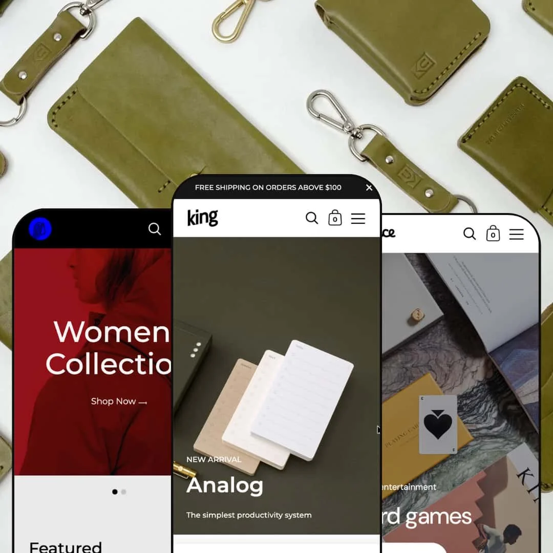
The Kingdom theme stands out for its vertically oriented, off‑canvas sidebar navigation and its editorial‑style layouts. Across all three presets you’ll see full‑bleed hero sliders with bullet navigation, enhanced search with predictive results, and adaptive grids that scale to different catalogue sizes. Some presets lean into a faster, add‑from‑grid flow; others take a slower, story‑driven journey. First impression: large hero panels and clean typography pull attention to featured products without overwhelming the shopper.
Pros.
〰️
Pros. 〰️
✚ Flexible presets, consistent core
flexible preset options that maintain core functionality while offering distinct aesthetic approaches. The through‑line is consistent: a vertical sidebar, predictable media behavior, and a clear editing model in the Shopify customizer. You can change tone—minimal, lookbook, or playful—without relearning the theme.
✚ Editorial storytelling toolkit
Kingdom leans into content. Long‑form product modules, mission‑style sections, and collage‑like panels let merchants explain materials, features, and brand values in situ. That built‑in structure helps answer objections and gives pages a publication feel.
✚ Predictive search with clear navigation
Enhanced search suggests results as you type, and the left‑aligned, off‑canvas sidebar keeps primary categories visible. Together they reduce hunt time and support quick pivots between collections.
✚ Adaptable layouts and strong hero treatments
Full‑bleed hero sliders anchor each preset while grids resize cleanly for small or mid‑sized catalogs. The typography is purposeful, so images lead without losing legibility.
✚ Mobile polish and brisk performance
On smaller screens the sidebar collapses cleanly, sliders remain swipeable, and there are no heavy animations. The result is a snappy feel that keeps taps and waits to a minimum.
✚ On‑page helpers and accelerators
Quick‑add overlays with a slide‑out cart keep shoppers on the page while they add multiple items. For products with options, a quick‑shop modal surfaces swatches or dropdowns alongside quantity controls and buy buttons. Star ratings sit beside product names on cards, providing instant social proof without clutter. A View size chart link opens a modal overlay with multiple tables so shoppers pick the right fit without leaving the page.
Cons.
〰️
Cons. 〰️
🚫 Vertical sidebar can squeeze the stage
The fixed, left‑hand navigation is central to Kingdom’s identity, yet on smaller desktops it narrows the main column. Wide, cinematic imagery loses some horizontal runway.
🚫 Easy to overbuild the home page
With heroes, grids, testimonials, mosaics, and mission blocks available, it’s tempting to stack them all. Without curation, pages grow long and shoppers work harder to reach products.
🚫 Cross‑sell is inconsistent across demos
Only the Default preset surfaces a related‑items carousel in testing; Queen and Prince ship lean. If you depend on recommendations, you’ll likely configure extra sections or add app blocks.
🚫 Social proof module depth
A single testimonial slider exists in the demos. Brands with extensive reviews or press will want additional blocks, custom sections, or an app to scale proof.
-
A calm, neutral palette and crisp typography give the Default preset a home‑goods feel. A left‑hand sidebar organizes categories such as Apparel, Gather, Workspace, and Books, with secondary links to the journal, FAQ, and contact pages. Rotating hero slides introduce a sequence of product grids and editorial sections that feel balanced between browsing and buying.
What works in this preset
Stylistically, the Default preset uses a restrained color system and tidy type scales to let product imagery lead. The visuals stay quiet so textures and finishes read clearly.
The page flows from a composed hero into well‑spaced grids and long‑form editorial sections that read like a magazine, making the experience feel purposeful rather than cluttered.
-
Queen reads like a fashion lookbook. Bold red and blue hero backgrounds, two‑column product grids, and generous white space prioritize imagery and copy over speed. A saturated blue footer with brand story, help links, and social icons underscores the editorial tilt.
What works in this preset
Two‑column collection grids with large tiles encourage slow, confident browsing. With minimal on‑hover distractions, the eye stays on fabric, drape, and silhouette.
Queen also includes a dedicated sizing‑charts page with comprehensive tables for simple, advanced, and extra‑large fits. The consolidated resource is handy for customer service and returns prevention.
The saturated blue footer carries brand voice down the page. Useful links, a short about, and social icons make it a functional endcap rather than an afterthought.
Where it stumbles
Product pages end after the description and sizing help, with no built‑in related items visible in the demo. The minimalist finish matches the lookbook vibe but gives up some cross‑sell opportunities.
-
Prince takes a playful approach for games and leisure products. The sidebar spotlights Board games, Outdoor game, and All games, while clean, light‑toned visuals keep things breezy. A materials feature near the bottom underscores craftsmanship.
What works in this preset
Category navigation is focused and clear. With board and outdoor games separated in the sidebar, shoppers jump between interests without drilling through long menus.
A materials feature grid near the bottom highlights attributes like lacquered wood, high‑quality plywood, and cotton packaging. For artisan or educational brands, this telegraphs quality and durability at a glance.
A compact Help page consolidates shipping and returns answers. It’s simple, but it removes the need for a separate app when a basic policy page is enough.
Where it stumbles
Product pages are sparse in the demo—description and buy buttons, with little else. It suits small catalogs, yet merchants with nuanced products may want tabs, comparison blocks, or on‑page cross‑sell to aid decision‑making.
Niche Suitability
Not Ideal For
-
Brands that want editorial storytelling wrapped around clear navigation. Home & decor labels, fashion boutiques with fit guidance, and playful hobby catalogs can all tune Kingdom to their tone without learning a new system.
-
Merchants who need aggressive on‑page merchandising—dense recommendation rails, comparison tables everywhere, or highly compact grids—may find Kingdom’s pacing deliberate. A more conversion‑first theme with broader built‑in merchandising widgets could be a better fit.
-
Medium — You’ll curate sections and imagery to avoid overlong pages, and you may add blocks for cross‑sell or richer proof. The editing model is consistent, so once you set a pattern, scaling new pages is straightforward.
Final Recommendation
★ 8.0/10
Rating
-
The Default preset offers quick‑add buttons, quick‑shop modals and a related‑products carousel. Queen and Prince lean minimal and omit these touches.
8
-
The vertical sidebar makes navigation intuitive, but long pages and the absence of quick‑add in some presets slow the flow. Merchants will invest time configuring sections.
7
-
Demos adapt well to smaller screens; the sidebar collapses into a compact menu, and sliders remain swipeable. No mobile‑only surprises surfaced.
8
-
Pages load quickly, and the quick‑add drawer in Default feels responsive. With few heavy animations, the theme stays brisk.
8
-
A wide array of section types—hero sliders, mosaics, testimonials, product grids, mission statements, newsletters—gives room to build distinct layouts. Color and font controls inside the editor extend flexibility.
9
FAQ
〰️
FAQ 〰️
-
👑 Yes. Its clean layouts and storytelling blocks make it versatile. Default suits home‑and‑decor, Queen fits apparel, and Prince complements games and leisure.
-
📱Absolutely. In testing, the sidebar collapsed into a compact menu and sliders responded to touch gestures. Product pages remained readable on small screens.
-
🎨 You can adjust colors, typography, and section order in the Shopify theme editor. Testimonials, mosaics, mission statements, and size‑chart modals offer branding options without custom code.
-
⚡ The theme feels snappy. The quick‑add drawer in Default loads quickly, and there was no noticeable lag when toggling overlays like size charts. Large images, not the theme, are the usual performance culprit.
-
👕 Yes. In Default, variant products trigger a quick‑shop modal with dropdowns or swatches. In Queen, variant selection lives on the product page alongside a size‑chart modal.
-
🔎 There’s no separate SEO panel, but the markup is clean. You can set meta titles, descriptions, and alt tags through Shopify’s built‑in SEO settings.
-
💱 Yes. Language and currency selectors appear in the footer of the demos, and Shopify’s multi‑currency features handle conversion.
-
⚙️ Yes. Built on Online Store 2.0, Kingdom supports app blocks and third‑party integrations for reviews, loyalty, and product options.
-
🛒 You can explore live demos for free on the Shopify Theme Store and test the theme in your own shop before purchasing. Shopify’s trial lets you configure and preview without immediate commitment.
This review is based on hands‑on testing of the publicly available “Default,” “Queen,” and “Prince” preset demos of the Kingdom Shopify theme as of 13 November 2025. Theme features, preset availability, and performance can change with subsequent updates from the theme developer.