
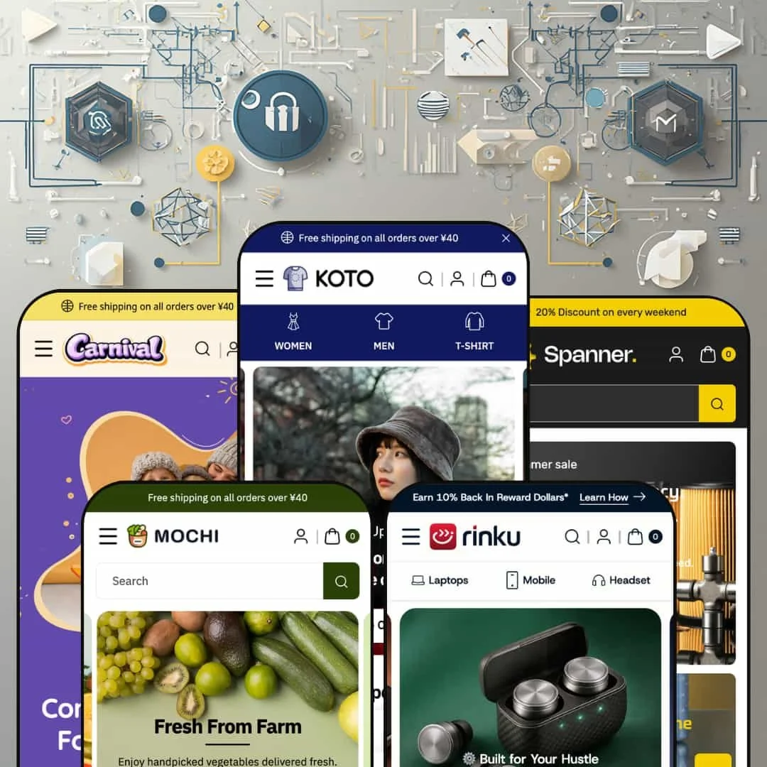
Five presets, five completely different verticals — that's the headline pitch of Koto. Clothing, electronics, supermarket food, automotive hardware, and kids' products, all running on the same Online Store 2.0 codebase. Most premium themes at this tier pick one industry and dig in; Koto stretches across five at $290. The question this review answers: does that breadth come at the cost of depth?
Five presets across five verticals at one price point
At $290, Koto ships five fully-styled presets covering clothing (Koto / Fancy), electronics (Rinku), supermarket grocery (Mochi), automotive hardware (Spanner), and kids' products (Carnival). Most Premium-tier themes ship one to three presets, and the multi-preset ones typically stay inside a single industry. Each Koto preset arrives with industry-appropriate catalog data, currency defaults (USD / JPY / INR), and mega menu naming conventions tuned to that vertical. For agencies pitching across niches and for multi-brand merchants prototyping different stores on the same codebase, this width is the value; single-vertical brands get the same architecture but won't use four of the five presets.
Mega menu depth above the price-tier baseline
Across all five preset demos, the mega menus carry more than the standard text-link columns: tabbed sub-panels (Rinku's Categories switches between five tabs, Mochi's Categories does the same), embedded featured-product tiles with prices and images (Koto, Carnival, Spanner), promo blocks with trust-signal lists (Koto and Carnival), Customer Service and Contact Us text columns (Mochi), and feature-bullet product cards (Spanner). Most premium themes top out at text columns plus one image banner, so the four-to-five content types per panel here is real depth. For merchants with large catalogs who want to merchandise inside navigation rather than route shoppers around it, this is structural room to work with; small-catalog brands won't fill the slots and should plan to disable layers.
PDP carries genuine merchandising weight without app dependencies
The product page (tested on the Animal Print Midi Dress in Koto) renders a six-image gallery with modal zoom, an embedded Size Guide table with Bust / Waist / Hip / Length measurements across five sizes, a feature-badge row (4-Way Stretch, Moisture Wicking, Quick-Drying, Recycled Content, Ridiculously Soft, Anti Wrinkle), a stock counter ("45 in stock"), social share buttons, and a "We Accept" payment badge row. The Rinku featured-product homepage section re-uses the same PDP block (variant picker, add to cart, feature bullets) inline as a homepage section. Merchants would normally assemble that surface from three or four apps, so having it native is meaningful for fashion, electronics, and any vertical where the PDP carries the conversion weight. For minimalist single-product DTC brands selling on lifestyle photography alone, this depth is more than the product needs.
Cart drawer built for upsell, not just checkout transit
For merchants who treat the cart as a second sales surface, the drawer ships with the right hooks: a configurable free-shipping progress bar (Koto sets the threshold at $1,000, Rinku at $50, easily reconfigurable per preset), an "Order special instructions" notes textarea, an Upsell Products section pulling from a merchant-defined collection, and hover-state product cards in the upsell strip. Equivalent post-add-to-cart conversion stacks usually arrive as third-party apps at $20-40 a month. For grocery (Mochi), hardware (Spanner), and electronics (Rinku) brands selling at mid-AOV with cross-sell potential, this is where the theme starts paying for itself; high-ticket single-item carts won't benefit.
Width is not depth — no preset is the best in its niche
Koto isn't a coherent design through-line stretched across five surfaces; it's five distinct visual treatments stitched onto a shared codebase. The Mochi supermarket aesthetic shares no visual vocabulary with the Spanner hardware preset or the Carnival kids preset. For merchants picking one preset and committing, that's fine. For merchants benchmarking against category-leaders — Pebble or Symmetry in clothing, Impulse in electronics, Empire in food and grocery — Koto's preset for that vertical won't beat the editorial-best in the niche. The pitch is breadth, not best-in-class depth, and editorial-first brands with a specific aesthetic in mind should compare against the single-vertical premium themes before committing.
Demo polish gaps are visible across multiple presets
Three different presets ship the placeholder phone "0123-456-789" and the email "demo@demo.com" in either the mega menu Customer Support block or the footer (Koto, Mochi, Carnival). The Koto preset shows "+91-XXXX-XXXX" inside the Sale mega menu Customer Support column. The Carnival and Koto announcement bars read "Free shipping on all orders over ¥40" while the default currency is USD. The Rinku Categories menu label renders as "Categories ==Sale==" with literal markdown emphasis markers leaking into visible text. These aren't staging choices; the markdown leak is a rendering bug and the rest is unfinished demo content. Merchants who skim the demo before buying will see the placeholder phone and assume the rest is similarly half-finished.
Default homepage density makes the setup work invisible until you start
The default Koto preset homepage stacks slideshow → seven-card promo grid → three category banners → product grid → eight-logo brand strip → trending products carousel → animated GIF testimonial marquee → newsletter, with similar density in Rinku and Carnival. Real merchants will trim heavily, which is a setup tax the demo conceals: what looks like an out-of-the-box-ready storefront is closer to a feature showcase that needs editing down. Small-catalog brands with fewer than 30 SKUs especially will find half the homepage sections empty of meaningful content unless they invest in producing it.
What it takes to launch
Strip the placeholder phone numbers ("0123-456-789", "+91-XXXX-XXXX") and demo emails (demo@demo.com) from the Customer Support mega menu blocks and footers across the Koto, Mochi, and Carnival presets, fix the "Categories ==Sale==" Liquid label bleed in Rinku, align the announcement bar text (¥40 default) with the preset's actual storefront currency, remove the image-source credit lines from product description bodies in the clothing preset, and trim the default homepage section stack to match the merchant's actual content production capacity.
-
What works in this preset
I clicked through the Fancy clothing preset and the mega menu lands first. The "Sale" panel runs three content types side by side: a "Top Deals In…" collection grid (Men, Women, Top Wear, Accessories, Skirts, Pants, Bags, Cap), a "Why choose us?" promo block with trust points ("100-Day Hassle-Free Returns", "Free Delivery on Orders Over $50", "Trusted by 50,000+ Customers"), and a Customer Support contact column. Most premium themes top out at text columns plus one image; getting promo blocks and contact columns inside the menu panel is layout room you'd usually need an app for.
"Layer Up in Style. Bold Prints. Easy Fits. Step into Winter. Match Sets for Everyday Comfort." Four slideshow slides, each routing to a distinct collection (jackets, tops, winter, men's co-ords), with copy that reads like a clothing brand actually wrote it rather than a placeholder. Below that, a seven-card "Limited-Time Specials" promo grid, three full-bleed category banners (Women's Wear / Winter Wear / Men's Wear), a brand-logo strip, then a Trending This Week product carousel. Editorial density appropriate for fashion brands with promo-heavy merchandising, though it's a lot to keep on the published homepage.
On the Animal Print Midi Dress page, the PDP renders a six-image gallery with modal zoom, a Size guide table embedded right inside the page (Bust / Waist / Hip / Length measurements across S through XXL), a feature-badge row (4-Way Stretch, Moisture Wicking, Quick-Drying, Recycled Content, Ridiculously Soft, Anti Wrinkle), a stock counter showing "45 in stock", social share buttons, and a six-payment-method trust badge strip. That's a working merchandising stack out of the box.
Where it stumbles
The announcement bar reads "Free shipping on all orders over ¥40" while the default currency is USD. The mega menu Customer Support column shows the placeholder phone "+91-XXXX-XXXX" and the footer carries "0123-456-789". Currency mismatch in the most visible piece of UI on the homepage plus two placeholder phone numbers is the wrong first impression for a $290 theme.
-
What works in this preset
The standout is the tabbed Categories mega menu — five tab labels (Mobile / Wireless / Computer Accessories / Gadgets / Laptop Accessories) sit inside a single panel and switch the visible collection grid as you move between them. Layered navigation at that depth is rare at $290; large-catalog electronics merchants get a real merchandising surface in the header instead of a long dropdown list.
Then there's the featured product section. The High Speed Productivity Laptop renders with full PDP UI inline on the homepage: five-image gallery, size variant picker (14.5 Inch / 15.5 Inch), quantity stepper, stock counter ("60 in stock"), three-bullet description, six-feature badge row (Fast Charging, Long Battery Life, Smart Protection, Compact & Stylish, Portable Design, Multi-Device Support), and an Add to cart button. Most themes treat featured product sections as a card and link out; here it's a complete shoppable block.
Color and size variant pickers also live inside the trending product carousel cards themselves — selecting Deep Bass Wireless Earbuds shows four color swatches and an Add to cart without navigating away. Combined with the "Hot sale 15% off 🔥" rotating ribbon and the inline video product section, the homepage carries more shoppable surface area than the clothing preset.
Where it stumbles
The Categories menu label renders as "Categories ==Sale==" with the literal markdown emphasis markers leaking into the visible menu text. That's a Liquid rendering bug, not a config choice, and it shouldn't exist at $290. Separately, the "Why Choose Rinku" benefit grid includes "GST Billing" as one of four pillars — India-specific tax terminology presented as a universal feature alongside generic items like free express delivery.
-
What works in this preset
Default currency in Mochi is Japanese Yen. Products price as ¥1,300, ¥2,000, ¥2,400 with thousand-separator formatting, and the country selector defaults to Japan. International merchants previewing a non-USD store can see how the theme actually renders three-digit-thousand prices without manually flipping the currency switcher.
A secondary navigation row sits above the primary header carrying FAQs, Sale, and News links, freeing the main nav for category mega menus. The Offers panel then runs three columns inside one mega menu: a "Shop By" collection grid (Dried Soup, Noodles, Grocery Galore, Weekend Treats, Seasonal Food, Bakery Products, Cooking Essentials, Beverages), a Customer Service text block (Easy Returns / Fast Delivery / Secure Payment / Contact Us), and a Contact Us block with phone and email.
Catalog naming reads like a real grocery store — Curry Sauce With Vegetable, House Foods Java Curry, Japan Soy Milk Wafer, Organic Soy Sauce, Delicious Red Bean Paste. The Highly Needs / Daily Use / Flour & Panko / Seafood category structure inside the mega menu is grocery-vertical-appropriate, not a clothing menu with grocery labels pasted on.
Where it stumbles
The Customer Support text shows "0123-456-789" as the phone and "demo@demo.com" as the email. The same placeholders appear in the footer. Grocery merchants going live with the Mochi preset need to scrub both before launch.
-
What works in this preset
Hardware doesn't usually merchandise like clothing, and the Suspension mega menu acknowledges that — the product cards inside the panel ship with sub-bullet feature lists ("Durable Steel" / "Easy Grip" under the Dual Open-End Wrench Set, "Multi-spoke Design" / "Smooth Ride" under the Multi-Spoke Wheel With Tire, "Enhanced Braking" / "Durable Build" under the Drilled Brake Rotor With Caliper). Spec-driven categories benefit from this; navigation becomes a comparison surface before the shopper even reaches the collection page.
Default currency is INR with Rs.-prefixed pricing. For India-based hardware merchants — and Webibazaar is based in Surat, Gujarat, so this is presumably the home-market preset — that's one less setup step. The Categories mega menu carries a four-tab structure (Core Components / Engine Essentials / Tool Set / Safety Equipment) and the Tires menu drops to a different pattern entirely: four text-link columns (Car Assets / Accessories / AutoCare / Powercore) with no images. Two distinct mega menu architectures inside one preset.
I noticed the Suspension panel also drops "Sold out" badges directly on the in-menu product cards, which is unusual — most themes hide inventory state until the PDP. For a parts merchant where stock turnover signals product popularity, surfacing sold-out states inside navigation is a small merchandising win.
Where it stumbles
Currency selector ships with two options only (INR and USD) where Koto and Carnival ship three and Rinku ships six. Hardware merchants selling across international markets will be adding currencies to the Markets config on day one, which isn't a theme problem but is a Spanner-specific staging gap.
-
What works in this preset
Carnival adds something the other four presets don't: age. The Nursery mega menu carries an Age Groups tab with collection tiles for 0-2 Years, 3-4 Years, 5-7 Years, 8-10 Years, and 10+ Years. Age-bracket navigation is the standard kid-vertical pattern and it's pre-wired here rather than left as a configuration task.
Footer social channels also expand to six — Facebook, Instagram, X, Snapchat, Pinterest, Vimeo — where the other presets ship four. Snapchat and Vimeo are vertical-aware additions for a kids store; the other presets don't bother. Three mega menus (Kids / Nursery / Specials / Offers) with playful naming ("Nursery", "Fun & Style", "Kids Favorites", "Featured Categories") read as written for the niche rather than relabeled from a fashion preset.
Product naming and catalog selection also lean into the vertical properly: Wooden Baby Learning Blocks, Bear Face Kids Sitting Stool, Junior Straw Drink Bottle, Organic Cotton Baby Bibs, Foldable Baby Bath Tub. Prices stay under $30, which is the kid-product band where the theme's discount-and-promo merchandising stack pays off.
Where it stumbles
The announcement bar carries the same "Free shipping on all orders over ¥40" mismatch as Koto (default currency is USD, threshold is yen), and the Offers mega menu Customer Support column repeats the "0123-456-789" / "demo@demo.com" placeholders from Mochi.
The width is the actual product
Five fully-styled presets across five unrelated verticals at $290 is uncommon. The clothing, electronics, supermarket, hardware, and kids presets aren't reskins of one design; each ships with vertical-appropriate currency defaults, catalog naming, mega menu structures, and social channel choices. For agencies pitching across niches, this is leverage other premium themes don't offer.
Mega menu and PDP architecture do real work
The mega menus across all five presets carry tabbed sub-panels, featured-product cards, promo blocks, and contact columns side by side — content density other themes ship as app dependencies. The PDP adds a stock counter, embedded size guide table, feature-badge row, and trust-badge strip natively. The cart drawer adds a free-shipping progress bar, upsell collection, and order notes field. Together these three surfaces give merchants merchandising room that usually costs $40-80 a month in app subscriptions.
Configurability over rigidity
The same theme handles a USD fashion store, a JPY supermarket, an INR hardware store, and a kids store with age-bracketed navigation without forking the codebase. The free-shipping cart threshold flips per preset (Koto's $1,000 vs Rinku's $50), social channels expand or contract per vertical (Carnival's six vs Spanner's four), and the mega menu architecture itself varies between tabbed, columnar, and featured-product patterns depending on which preset is loaded.
Demo polish is visible enough to be a brand risk
Placeholder phones, demo emails, currency mismatches in announcement bars, and a Liquid rendering artifact in a mega menu label are scattered across at least four of the five presets. Cleanup is mandatory before launch, but the deeper issue is that merchants demoing the theme to stakeholders will encounter these surfaces unfiltered.
Five presets is a width strategy, not a depth strategy
No single Koto preset is the editorial-best in its niche. The Koto clothing preset won't out-merchandise Pebble or Symmetry; the Rinku electronics preset doesn't match the depth of dedicated electronics themes; the Spanner hardware preset is solid but won't beat purpose-built automotive themes. The proposition is range across five verticals at one price, not category leadership in any one of them.
Setup tax is hidden in the default homepage
The default homepage section stack is dense enough that small-catalog brands or single-vertical merchants will be removing rather than adding sections before launch. The theme demo sells what the maximum configuration looks like; the typical-configuration storefront takes meaningful editing to get to.
★ 7.6/10
Rating
-
Mega menu depth, PDP merchandising stack, cart-drawer upsell hooks, and five vertical presets deliver capability above the $290 baseline.
8
-
Five presets means more configuration surface to learn before the right one is selected; default homepages need trimming.
7
-
Mobile menu uses a back-button stacking pattern across all presets, with thumb-zone-positioned cart and search icons; product cards keep tap targets generous.
8
-
Homepages run dense in the default config (multiple carousels, animated marquees, eight-image brand strips); image lazy-loading is wired in, but the section count will need trimming for fast LCP.
7
-
Five visual languages out of the box, configurable mega menus, swappable cart thresholds, and varied PDP layouts; ceiling held by the demo polish gaps rather than the underlying customization options.
8
Frequently Asked Questions
-
Start from whichever preset matches your primary vertical, then port section configurations across. The shared codebase means a clothing brand on Koto can copy the tabbed Categories mega menu pattern from Rinku, or borrow the Shop By Age structure from Carnival, without changing themes — the sections exist in the underlying theme, just configured differently per preset.
-
No. The threshold is a section setting that varies between presets out of the box (Koto ships at $1,000, Rinku at $50). Edit it directly in the cart drawer section settings in the theme customizer.
-
The "==Sale==" text is being entered into the menu label field as literal markdown rather than rendering as emphasis, which means it's a content fix in Shopify Admin → Online Store → Navigation. Edit the menu link label to remove the == markers and save. If the markers reappear after reapplying the Rinku preset, it's worth opening a ticket with Webibazaar.
-
Yes. The mega menu blocks (promo column, contact column, customer service column) are individual blocks that can be deleted from the menu section in the theme customizer. The Spanner preset already omits them, which is how that preset ships with a cleaner navigation surface than Koto or Carnival.
-
Both. The Rinku trending products carousel shows Color swatches and Size button groups on the same product card. The Animal Print Midi Dress PDP in Koto carries Size buttons; products with Color and Size will render both axes with swatches for color and button groups for size.
-
No. Quantity pricing and Combined listing both require Shopify Plus and are listed as Plus-only in the theme feature list. Merchants on Basic, Shopify, or Advanced plans get the rest of the theme's marketing, merchandising, and product discovery feature set without these two.
-
The Size Guide in the demo is a static measurement table (inches only) embedded in the product page. There's no built-in unit toggle. Merchants needing cm-inch switching for international shoppers will need to either maintain two tables or install a size-chart app with unit-conversion logic.
This review is based on hands-on testing of the publicly available preset demos of the Koto Shopify theme as of May 2026. Theme features, preset availability, and performance can change with subsequent updates from the theme developer.