
Loft is a Shopify theme for brands that sell with story as much as with product. Built by Pixel Union, it puts bold imagery up front and pairs it with simple building blocks—promo tiles, testimonials, short editorial sections—so your homepage reads like a clean, well-edited magazine. Hierarchy is clear, whitespace is intentional, and calls to action stay visible without feeling pushy.
We tested all three presets (Default for home & decor, Pounce for pet brands, Muse for fashion). The visuals and tone shift to match each niche, yet the underlying structure stays steady. You can tune color and type, rearrange sections to suit a campaign, and keep navigation consistent so shoppers never lose their place. If you want a store that feels curated, trustworthy, and easy to browse, Loft gives you the pieces to get there quickly.
Pros.
〰️
Pros. 〰️
✚ Visual storytelling, baked in
Loft’s homepages combine lifestyle photography, editorial blocks, testimonial moments, and promo tiles. The mix sells brand values alongside products and builds trust before the cart.
✚ Persistent, simple navigation
Clear menus and stable headers keep search, account, and cart access in easy reach during long scrolls. Shoppers act when ready without retracing steps.
✚ Campaigns that stay visible
Rotating messages and well-placed promotions keep offers present during exploration. Shoppers notice incentives while they browse rather than after the fact.
✚ Discovery and cross-sell moments
Curated recommendation areas and intentional merchandising nudge bigger baskets without derailing the session. It feels guided rather than purely algorithmic.
✚ Preset versatility with a consistent core
Three demos show wide aesthetic range—from calm furniture to playful pet to minimalist fashion—without losing structural consistency. That balance lets non-technical teams reach a polished look quickly.
Cons.
〰️
Cons. 〰️
− Story before densit
Layouts favor imagery and narrative, which reduces products per screen. Large assortments that bank on quick breadth exposure may need to raise density in key templates.
− Gentle call-to-action styling
In some presets, outline buttons and muted treatments fit the brand but under-signal priority actions. Promo-heavy stores may want stronger visual weight for primaries.
− Long lead-ins to the grid
Collection pages that open with large heroes add visual drama yet push products farther down. Task-driven visitors will feel that extra distance.
-
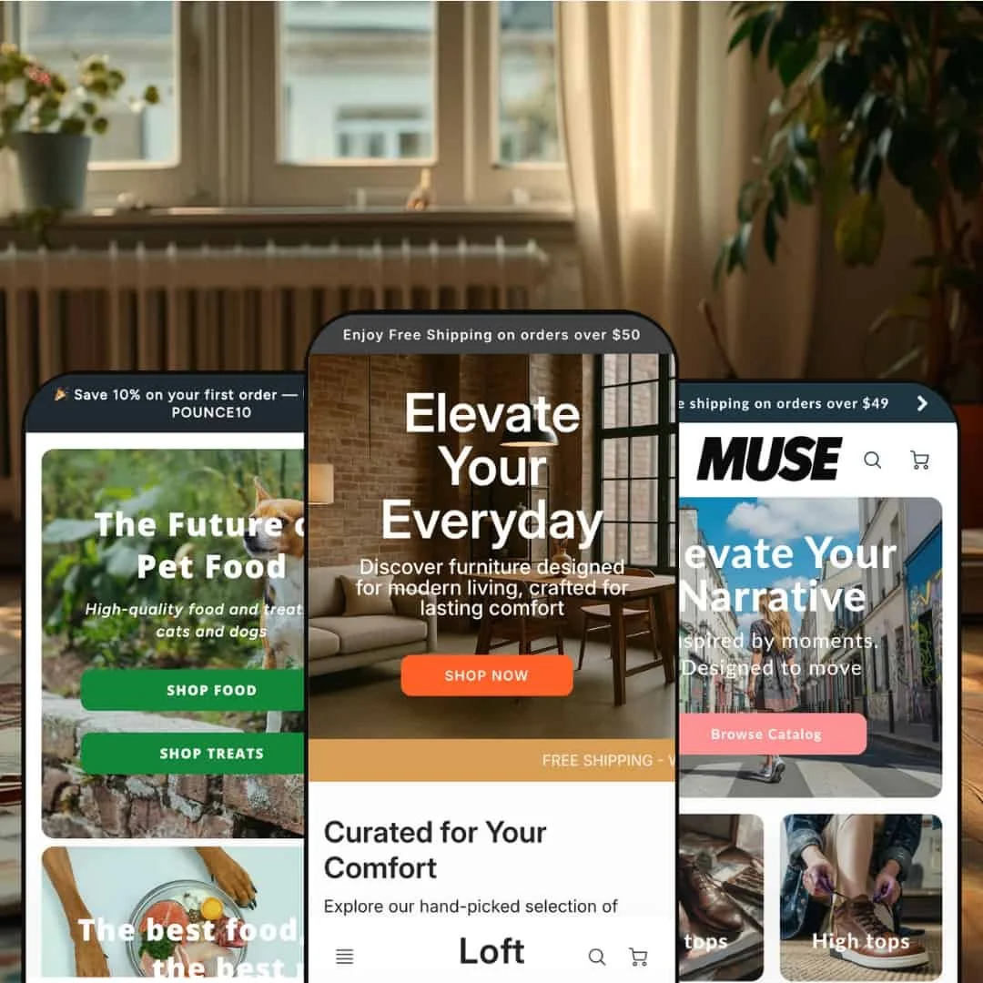
A warm orange accent palette and calm neutrals set an aspirational tone. The hero line “Elevate Your Everyday” sits over a minimalist living-space shot, presenting the brand as lifestyle-first rather than purely utilitarian.
What works in this preset
Rounded collection cards such as “Best Sellers”, “Desks”, and “Chairs” feel curated and easy to scan. Subtle shadows guide attention without clutter. The orange accents provide consistent emphasis for key actions and active states, which keeps the interface coherent.
Section spacing supports a calm reading rhythm. Imagery breathes, typography stays legible, and calls to action remain visible without overwhelming the layout. Taken together, the page reads like a well-edited catalog rather than a grid dump.
Visual tone remains cohesive from hero to footer. Accent color, corner radius, and card styling repeat throughout, so the design feels intentional. It suits furniture and decor brands that want polish without noise.
-
Pounce reimagines Loft for pet brands with playful green accents and high-energy photography. The hero pairs “SHOP FOOD” and “SHOP TREATS,” while colorful content cards stitch promos into lifestyle scenes.
What works in this preset
A mid-page promo card (“Save $10… USE CODE: DOGLOVER”) lands right where shoppers are browsing, so offers feel part of the story rather than an interruption. It’s a clean way to keep incentives visible during discovery.
Press credibility arrives via an “As Featured In” logo strip that reads quickly and adds reassurance. For new DTC brands, that nudge can reduce hesitation before first purchase.
A horizontal trust-badge scroller repeats key promises like ingredient quality and shipping thresholds as visitors move down the page. Alongside a themed newsletter invite and clear “from $…” price labeling on cards, the page communicates value and tone in one pass.
-
Muse adopts a minimalist fashion aesthetic with dark teal and navy accents, urban lifestyle photography, and gallery-like spacing. Navigation segments “Shop Casual” and “Shop Formal,” guiding intent from the header.
What works in this preset
Occasion-based navigation reduces effort. Shoppers who think in use cases find a path quickly without parsing deep category trees. It feels natural for fashion where context drives selection.
Testimonials arrive as full-width slides with names and locations. The specificity reads authentic and fits the editorial mood, which elevates perceived brand value. It pairs well with the restrained art direction.
Split-layout blocks (“Form in Motion”) place dark text panels beside clean product imagery for a magazine feel. Outline buttons preserve the quiet tone, while a pink “Customer Review” tile inside the grid keeps social proof active during browsing. A bold circular “Sold Out” badge signals scarcity clearly without shouting.
Where it stumbles
Outline-only buttons favor subtlety over urgency. Brands running time-boxed drops or heavy promotions may prefer stronger fills for primary actions.
The homepage’s generous spacing lowers product density, so shoppers will scroll more before seeing breadth.
Collection pages can open with a large hero, adding distance before the grid; it looks refined, though task-driven visitors may want products sooner.
Niche Suitability
Not Ideal For
-
Visual-first brands—in furniture, fashion, pet, and lifestyle—where editorial storytelling, promo visibility, testimonials, and brand credibility cues drive conversions as much as raw catalog breadth.
-
Retailers who prioritize hyper-dense product exposure, rapid grid scanning, and spec-driven comparison across very large assortments. Technical catalogs that rely on structured comparison tables may also want a different starting point.
-
Medium — Section-based controls make setup approachable, and presets provide a strong starting look. Standardizing emphasis or raising product density in key templates may call for apps or light developer work.
Final Recommendation
★ 7.4/10
Rating
-
Sticky headers, flexible section blocks, and intentional merchandising form a solid base. The demos emphasize editorial layout and gentler CTA styling over maximal product density; variant previews are handled inside product contexts rather than on cards.
7
-
The section-based editor is straightforward and the three presets offer clear design directions. Standardizing emphasis across presets or changing exposure patterns may require deeper configuration or small code edits.
8
-
Layouts stayed functional in testing with readable type and accessible actions. Image-forward pages can lengthen scrolls on small screens, so thoughtful section ordering helps.
7
-
Loads felt prompt and interactions responded smoothly during testing. Image-heavy sections benefit from optimized media and sensible lazy-loading.
7
-
The presets show strong range, and sections allow meaningful rearrangement and restyling. Larger density shifts or component emphasis changes can require deeper customization.
8
FAQ
〰️
FAQ 〰️
-
👑 Yes. The Default preset’s large lifestyle imagery, calm palette, and curated card styling suit furniture and decor. For very large assortments, consider increasing grid exposure in key templates.
-
📱Yes. In testing, home, collection, product, cart, search, and 404 pages remained usable with tappable actions and readable type. Ordering sections thoughtfully helps keep scrolls manageable.
-
🎨 Loft provides three distinct starting points plus section-based controls for colors, type, logos, and block order. Pounce’s playful voice shows how far presets can be tailored through copy and imagery.
-
⚡ Pages felt responsive during hands-on testing, including interactive elements such as navigation and carousels. Because layouts are image-forward, optimized media and sensible lazy-loading are advisable.
-
👕 Variant selection is handled cleanly on product pages and, where used, in modals. In the demos, shoppers discover options within those contexts rather than on collection cards.
-
🔎 Loft relies on Shopify’s built-in SEO framework. Error and search states are properly presented, and blog integration supports content marketing.
-
💱 The demos surface language and currency selectors in the interface. Actual options depend on your store’s configuration and plan.
-
⚙️ Standard app blocks integrate as expected. For deeper changes—like alternative review widgets or translation management—test in your store to ensure visual alignment.
-
🛒 Yes. You can try Loft from the Shopify Theme Store and test with your products before purchase. Public demos are available for each preset: Default, Pounce, and Muse.
This review is based on hands-on testing of the publicly available “Default”, “Pounce”, and “Muse” preset demos of the Loft Shopify theme as of November 6, 2025. Theme features, preset availability, and performance can change with subsequent updates from the theme developer.