
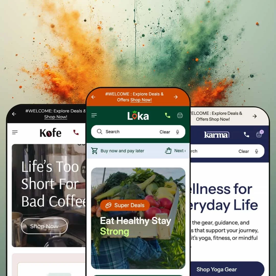
Loka is a visually rich Shopify theme built around interactive merchandising modules that are designed to keep shoppers browsing, comparing, and adding products without feeling like they’re constantly starting over on a new page. The three demos, Default, Kofe, and Karma, show the same underlying “engine” styled for different niches, which makes the theme feel adaptable without forcing a full redesign mindset.
Pros.
〰️
Pros. 〰️
✚ Flexible presets, consistent core
flexible preset options that maintain core functionality while offering distinct aesthetic approaches. In practice, the demos show three very different “front doors” to the same theme: grocery-friendly and playful, café-warm and curated, and wellness-bold and energetic. That’s useful when you want brand alignment without giving up the underlying shopping flow that makes the theme feel interactive.
✚ Category-first browsing through tabs and sliders
Loka repeatedly uses browsing patterns that keep shoppers moving laterally through products, such as multi-tab product groupings and product carousels. The mechanic is simple, but the impact is real: shoppers can explore more assortment without the constant “back button” feeling. For catalogs with lots of adjacent products, this supports discovery.
✚ Built-in bundling and promo urgency modules
Across the demos, Loka showcases a bundle-building concept and time-based promotional messaging. Bundling pushes shoppers toward multi-item carts, while countdown-style urgency framing supports limited-time offers. Together, those modules make the theme feel built for stores that run campaigns and want a more guided path to “add one more item.”
✚ Visual storytelling tools that go beyond static images
Loka includes interactive storytelling elements like before-and-after style comparisons and hotspot-style image callouts. These aren’t just decoration; they give you a way to demonstrate change, highlight details, or explain a product visually without writing a wall of text. That can be especially valuable for products where the benefit is easier to show than to describe.
✚ Integrated content sections for education and trust
The demos include storefront content areas that behave like a “journal” feed plus FAQ-style accordions. This supports brands that need to educate shoppers, answer objections, and build confidence over time. It also gives merchants a way to keep the storefront from feeling purely transactional.
✚ Add-to-cart flow that stays in context
In testing, single-SKU products could be added directly while multi-variant products used a “choose options then add” approach through a modal-style step. Cart interaction also emphasizes staying on-page through drawer or mini-cart behavior rather than forcing a hard jump away from browsing. Small touches like save-and-share style icons on product cards reinforce that the theme is designed for exploration, not just quick checkout.
Cons.
〰️
Cons. 〰️
🚫 Quick view is click-driven rather than hover-driven
Across the demos, product “quick view” behavior is initiated through clicking, typically via a choose-options path for variant products. If you’re used to hover previews for ultra-fast scanning, that extra click can feel like friction. It’s not broken, it’s just a specific interaction philosophy.
🚫 Search behaves like a dedicated flow, not live grid filtering
The hands-on experience leaned toward search as its own journey, where a query leads you into a results-style view rather than dynamically filtering a collection grid as you type. If your shoppers expect instant narrowing within the collection page itself, the experience may feel less direct. This is most noticeable when you’re trying to locate a product quickly inside a large catalog.
🚫 Long product names can wrap awkwardly in compact layouts
During testing, some longer product titles wrapped in a slightly awkward way on smaller screens in tighter featured-product areas. This is easy to mitigate, but it does mean you may need to shorten naming conventions or adjust text styling if your catalog relies on long descriptive titles. It’s more of a presentation constraint than a functional problem.
-
The Default preset is styled for broad retail, especially grocery and everyday lifestyle shops, with a light palette and a friendly, deal-forward feel. The most distinctive visual choice here is the playful, tag-shaped product-card style that makes the storefront read like a curated market rather than a high-fashion catalog.
What works in this preset
The tag-shaped product cards do a lot of heavy lifting for the overall tone. They visually reinforce the idea of “shop and save,” because they resemble price tags and promotional labels more than traditional product tiles. That’s a good match when your catalog is meant to be browsed casually and compared quickly.
The way the demo stages its assortment also fits the “modern grocery” intent. Category framing leans into everyday staples and deal language, which makes the storefront feel familiar if you’re selling food, pantry items, or routine-replenishment products. Even if you swapped the products, that “market aisle” vibe is baked into the way the visuals are presented.
Overall, this preset feels approachable and high-volume friendly in terms of first-time shopper psychology. It gives the impression that there’s always something worth clicking into, which is useful for stores that win through breadth, bundles, and frequent promotions rather than one hero product.
Where it stumbles
The same playful design cues that make the preset feel accessible can also make it feel less premium. If you’re selling luxury goods or trying to create an editorial, high-end mood, the tag-shaped card styling may work against that. You can still use the theme, but you’d likely spend time dialing the look away from “promo tag” and toward “gallery showcase.”
-
Kofe is positioned as a boutique coffee and specialty retail preset, with rich browns, creamy yellows, and an overall café-like warmth. The styling is intentionally cozy and product-forward, which suits brands selling beans, equipment, and related merchandise under one umbrella.
What works in this preset
The palette and typography choices immediately signal “coffee shop” rather than “general store.” Warm tones and artisanal-feeling type styling create a handcrafted mood that makes premium pricing feel more believable, even before you dive into any product detail. For niche brands, that kind of first-glance alignment matters because it reduces the mental jump between brand story and product value.
This preset also feels curated in how it frames the assortment. It’s easy to imagine the same structure supporting a roaster’s lineup, a café’s merchandise, and add-ons like bakery items, because the visual language doesn’t fight mixed product types. The vibe is consistent even when the catalog shifts between categories.
Kofe also leans into a “community and culture” tone rather than a purely transactional one. The overall presentation encourages the idea that shoppers are buying into a lifestyle, which fits well for brands that rely on repeat customers, gifting, and product discovery rather than one-time utility purchases.
Where it stumbles
If your store is extremely inventory-heavy and depends on deep category trees, Kofe’s boutique mood may feel like the wrong starting point. The aesthetic is built around curated browsing rather than a warehouse-style “scan and filter” mentality. You can still run a large catalog, but the staging is clearly optimized for a more edited product universe.
-
Karma is styled for wellness, fitness, and mindfulness brands, using a bold purple-and-green palette with rounded iconography and energetic typography. The look is airy, but it still feels active and promotional, which fits shops selling a mix of self-care, training, and wellness products.
What works in this preset
The most memorable part of Karma is its color and shape language. The bold palette and rounded visual elements give it a “studio energy” feel, which matches categories like yoga, fitness equipment, and supplements more naturally than a neutral retail template would. If your brand identity is already vibrant, this preset feels like a direct extension of that.
Karma’s visual tone also helps guide shoppers who may not arrive with a specific product in mind. The storefront reads like a wellness destination rather than a single-product landing page, which supports browsing across different sub-interests. That’s useful for stores that sell across routines, like training plus recovery plus self-care.
Even with the bright styling, the layout doesn’t feel cramped. The design keeps enough breathing room that it can carry promotional messaging without feeling chaotic. For wellness brands that run frequent offers, that balance is valuable.
Where it stumbles
Because the palette is so distinctive, Karma may require extra brand-tuning if you want a calm, minimalist wellness aesthetic. It’s easier to start bold and stay bold than it is to start bold and fully neutralize the mood. If “clinical” or “spa-minimal” is the goal, this preset’s default vibe may be a mismatch.
Niche Suitability
Not Ideal For
Final Recommendation
-
Loka is a strong fit for merchants who want interactive merchandising modules, guided browsing, and storefront storytelling baked into the theme experience. It matches stores that sell variety, run promotions, and benefit from showing shoppers more products per visit.
-
If you want a minimalist storefront where most of the experience is a simple grid and product pages, Loka may feel like more theme than you need. Shoppers and merchants who strongly prefer hover-based preview browsing may also want a theme that emphasizes that interaction pattern.
-
Medium. You get a lot of built-in modules, but the theme works best when you intentionally style and stage those modules around your catalog and naming conventions. If you invest that setup time, the storefront can feel polished and highly guided.
★ 7.8/10
Rating
-
Loka demonstrates advanced merchandising modules such as tabbed product groupings, bundling mechanics, promotional timers, interactive media elements, and card-level save or share actions. The theme’s core browsing and add-to-cart flow is designed to keep shoppers engaged rather than pushing them through a barebones funnel.
9
-
The theme feels powerful, but it assumes you’ll configure and stage multiple modules thoughtfully. The click-driven variant and quick-view pattern is clear once you understand it, but it does add a step compared with hover-preview patterns.
7
-
Layouts and interactive elements remained usable on smaller screens during testing, and the storefront kept its structure without feeling broken. The main mobile risk shown in the demos is readability when product titles run long in compact areas.
8
-
Pages felt smooth in hands-on use, including sliders and interactive elements. As with any theme that leans on rich imagery and multiple interactive modules, real-world speed will depend heavily on the media you upload and how aggressively you optimize assets.
7
-
The presets demonstrate meaningful aesthetic range, from playful grocery to café-warm to wellness-energetic, without implying that the shopping flow has to change. If your brand fits one of those lanes, the theme gives you a strong starting point and room to refine.
8
FAQ
〰️
FAQ 〰️
-
👑 Yes. The Default preset is staged like a modern grocery or lifestyle shop, and the overall theme approach supports browsing across many product types rather than pushing one hero item.
-
📱The demos remained usable on smaller screens, with interactive elements still accessible. The most noticeable mobile-style issue documented in testing was occasional awkward title wrapping when product names are long.
-
🎨 The draft review notes that merchants can adjust colors, fonts, and section arrangements in the theme editor. The three presets demonstrate how dramatically the visual mood can change while staying on the same underlying theme structure.
-
⚡ In hands-on testing, animations and interactive elements such as sliders felt smooth and responsive. The perceived speed is likely to depend on how media-heavy your storefront becomes once you upload your own imagery.
-
👕 Yes. Variant products follow a choose-options flow that opens a modal-style selection step with quantity controls and then adds to cart without requiring a full page reload in the documented interactions.
-
🔎 The demos include content-friendly sections like a journal-style feed and FAQ accordion patterns, which support on-site education. For metadata and search appearance, you’d still rely on Shopify’s built-in SEO fields.
-
💱 Yes. The demos show language and currency selection controls in the storefront, and this aligns with how Shopify Markets handles localization and currency presentation when configured.
-
⚙️ In general, yes. The draft review describes Loka using core Shopify storefront patterns for shopping and cart behavior, so app compatibility should be similar to other premium themes.
-
🛒 Yes. The publicly available demos for Default, Kofe, and Karma provide a realistic preview of how the theme behaves in a live storefront environment.
This review is based on hands-on testing of the publicly available preset demos of the Loka Shopify theme as of 25 December 2025. Theme features, preset availability, and performance can change with subsequent updates from the theme developer