
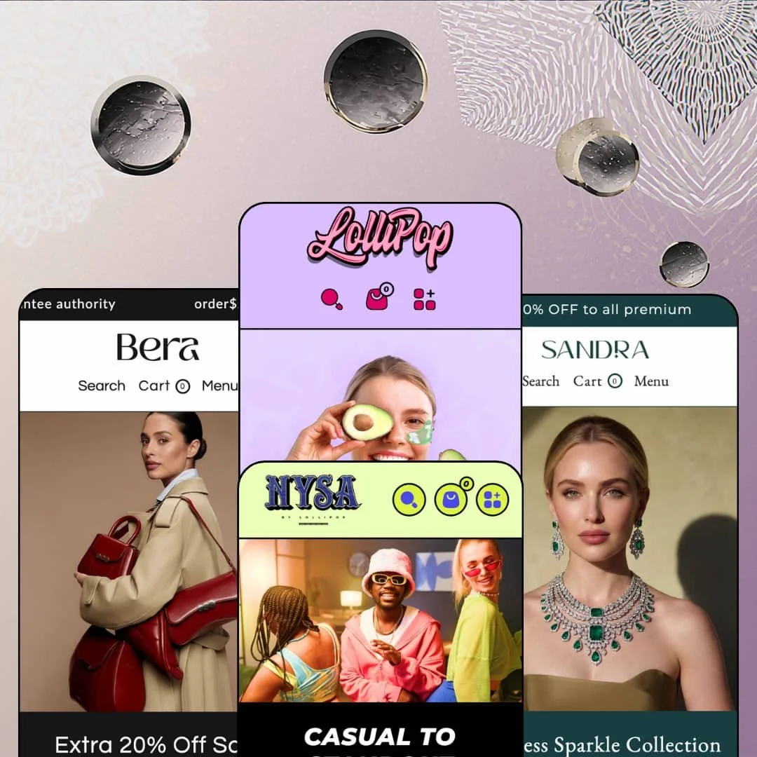
The skincare quiz on Lollipop's homepage asks three questions, and every answer doubles as a product tag you can filter by in the collection sidebar. I didn't expect that level of wiring from a beauty-first theme, and I expected it even less once I saw the same package stretch to fashion, bags, and fine jewelry. It's built on Online Store 2.0 by WeDesignTech, a studio in Coimbatore, India, and the feature sheet runs far longer than the asking price suggests. What I wanted to find out is how much of that sheet survives outside the beauty demo it was designed around.
A cart that does its own upselling
The cart can run as a drawer or a full page, and both take an order note, a free-shipping progress bar with a threshold you set, and an upsell row fed by either recommendations or a collection you pick. Gift wrapping and in-store pickup round it out. For gift-led beauty and jewelry stores with average orders hovering just under a shipping threshold, that's the difference between a cart that records the order and one that grows it, with no add-on involved.
A promo kit that covers the whole calendar
Set this next to Dawn, Shopify's free baseline, and the gap is obvious: Dawn has no countdown, no popup, and no back-in-stock form, while Lollipop ships a countdown section, promo popups, scrolling marquees, a stock counter, back-in-stock alerts, pre-order, and custom product badges. It works as one coordinated kit. Apparel and accessories brands running seasonal sales or flash drops can stage a launch, a sell-through, and a restock without touching the app store.
Shoppable video without the embed hassle
Each clip in the shoppable video section carries a product card pinned beneath it, with thumbnail, title, and live price, so the viewer is one tap from the product. Version 3.1.0 added a floating placement that keeps a video docked in the corner while the shopper scrolls. It's native. For beauty and fashion brands whose traffic arrives from TikTok and Reels in an impulse-buy mood, short vertical video with a buy path attached matches how those visitors already shop.
A release log that keeps moving
For solo founders and small single-brand teams buying at the budget end, the quiet fear is a theme that ships once and goes silent. Lollipop hasn't. Eight updates have landed since the August 2025 launch, and the two largest added two new presets, Shopify's new Account component, three global icon styles, cart upsells, a breadcrumb section, and a round of accessibility fixes for product cards and screen-reader labels.
Social proof is display-only
The testimonial slider shows a photo, a headline, a name, and a location or job title, all typed by hand in the editor. A name and a job title isn't evidence. Product pages carry no ratings or review list of their own, so skincare and jewelry brands selling to cautious, research-heavy buyers will need a review app such as Judge.me or Loox before those pages can do any convincing.
Support keeps one time zone's office hours
The documentation is specific: support is in English, by email and help center, from 9 am to 6 pm India Standard Time, Monday to Friday. That's a narrow window. For North American founders without a developer on call, especially those running Friday-evening drops or weekend sales, a broken menu at launch can sit unanswered until Monday morning in Coimbatore, which is Sunday night at home.
Option density is real setup work
The documentation lists more than thirty sections plus overlay groups for popups, floating video, age verification, and recently viewed, and theme settings add two card styles, three button shapes, and three icon styles on top. None of it is hard. It's just a lot, and a first-time merchant with under 30 SKUs and no designer will spend their first week deciding what to switch off instead of what to sell.
What it takes to launch
Expect two to three days: a full copy pass across hero slides, showcase text, FAQ entries, and product tabs; desktop and mobile imagery for every slide and hotspot; a tag taxonomy for the quiz and filters; and a rebuilt mega menu with live links and vertical-appropriate labels.
-
What works in this preset
Three questions, four answers each. That's the whole quiz: skin concern, preferred makeup look, and the active ingredient you want, followed by a results panel headed Recommended Products. The logic runs on product tags, so an answer like Redness or Vitamin C pulls every product carrying that tag, and the same tags show up as checkboxes in the collection filter, which means one round of tagging feeds two discovery tools at once. For a skincare store, that's a smart return on an afternoon of catalog work.
Open the 5-in-1 Facial Serum and the page reads like a label. A row of five free-from icons (Dye Free, BPA Free, Cruelty Free, Lab Tested, GMO Free) sits above four size buttons running from a 100 ml travel bottle to a 300 ml family pack. Further down, a Key Ingredients section tabs through Vitamin B3, Vitamin E, Provitamin B5, and Vitamin K, each with its own image, explanation, and a tested-by lab logo. I spent more time here than on any other page in the demo.
The homepage leans on proof devices instead of lifestyle filler. A before/after slider, a strip of eight press logos that each link to a product, and a hotspot image with four pinned products and Choose options buttons all appear before the footer. The Shop menu opens three columns of ten product-level links, flanked by two image tiles wearing Sale and Hot badges.
Where it stumbles
Skincare is a repeat-purchase business, and nothing on the serum page offers a subscribe-and-save path. That's app territory (Recharge, Appstle, and similar), not a theme defect. Replenishment brands should plan for the install and for styling the widget to sit comfortably beside those size buttons.
-
What works in this preset
You land on a full-width slideshow, and directly beneath it a ticker of six outfits slides past, each with its name and a From price. Then comes Just Dropped: five tall panels, one per collection, each paired with a one-line caption and a Shop now link. It's a quick way to show range. By the time I scrolled to the first standard product grid, the demo had already opened eleven doors into the catalog without a single banner that was only decoration.
Color names do real work on the cards. Cascade Plain Shirt lists Botticelli, Rose Fog, Tea Green, and Bone right under its price, so shoppers see the palette before they click. A category index further down prints item counts beside each link (Loungewear 11, Ethnic Wear 8) and slips small thumbnails between the rows.
The product page keeps the pitch short. A two-sentence summary sits above the price, followed by four color options and sizes XS through L, with the selected pair echoed back as Rose Fog / S. Below the button, Description, Product Details, and Shipping Information stack as separate blocks, and the gallery carries four images with a thumbnail rail.
Where it stumbles
Nysa's demo stages the size picker without the theme's size chart beside it, and an apparel shopper choosing between S and M will want that table one tap away. The chart is part of the theme; wiring it in is merchant-side work. The header is staged the same way, with four flat links and a short Pages dropdown, which undersells a demo holding ten collections. The mega menu is available, so plan to build one.
-
What works in this preset
Bags sell on measurements, and Bera's product page acts like it knows. The Urban Tan Tote opens on a Dimensions tab with a style code, length, height, and width in inches, the handle drop, and both strap drops, before the Design and Description tabs get their turn. Six gallery images open into large zoom views. Nothing about it feels borrowed from the beauty preset.
Scroll past the tabs and a slim bar follows you down the page, carrying a thumbnail, the product name, the price, and a Choose options button. Color comes in Bronze, Evergreen, and Maroon, with S, M, and L sizes beside it. For a considered purchase where shoppers read everything first, keeping the button in reach matters.
The Shop menu spreads 24 links across Discover, Category, and Top Brands columns, framed by two lifestyle image panels. Further down the homepage, an Our Premium Brands block pairs a hotspot image with two pinned bags and a strip of eight brand logos, and a Journal row surfaces four recent posts with excerpts.
-
What works in this preset
I went looking for the ring-size picker first. The Orbit Line Ring has one: half sizes from 6 to 8, sitting under a metal selector with 18k Yellow, White, and Rose Gold, and the chosen pair is confirmed in plain text as 18k Yellow Gold / 6. A bold Complimentary shipping line sits directly under the price, which is the right place to settle that question on a fine-jewelry ticket.
Reassurance gets its own real estate here. Below the button, the page stacks Description, Shipping and Duties, Returns and Exchanges, Packaging, and Care and warranty as separate panels, so a nervous first-time buyer can check the return window and the repair terms without leaving the product. That's five answers on one page.
Sandra's homepage treats objections as content. An eight-question FAQ accordion (materials, tarnish, sensitive skin, gifting) sits above the footer, a six-point guarantee row spells out exchanges and returns, and a Recently Viewed row brings browsers back to the pieces they hesitated over. Two wide editorial banners under a 2026 Trend Report heading add a magazine beat between the grids.
Where it stumbles
For brands that sell engraved or personalized pieces, the ring page has no text field to capture a name or a date. Gift wrapping exists at cart level, but a per-product input would need an app or custom work. Bespoke jewelers should factor that in.
Four verticals, four product-page vocabularies
One $100 license covers beauty, apparel, bags, and jewelry, and the presets don't just swap palettes. Each demo rewrites what the product page talks about, from ingredients to measurements to warranty terms, using the same tab and accordion system underneath. That's information design planned as a system, not a one-off skin.
Mobile gets its own art direction
Across all four demos, every hero slide carries a separate mobile image, and the hotspot sections do the same. It's a small editor field with a large effect: phone visitors see a composition cropped for them, not a desktop banner squeezed into a column. I noticed it in the first demo and then kept finding it everywhere.
A sale voice under a luxury pitch
The listing sells Lollipop as luxurious, yet every demo leads with discounts: scrolling percent-off marquees, an extra-20%-off hero, an 80%-off announcement bar, a 60% offer banner. The default section mix is tuned for promotion-led retail. Brands that never discount can strip it back, but they'll be working against the grain of the starting points.
Hungry for assets
Read across the presets and the content bill adds up: paired desktop and mobile slides, vertical video clips, hotspot photography, before/after pairs, press and brand logo strips. The layouts look thin without them. A store with a handful of packshots and no video will struggle to fill the sections that give the theme its personality.
A young record
Lollipop launched in August 2025 and holds 100% positive feedback across 7 Theme Store reviews at the time of writing. That's encouraging and small. One reviewer describes the support team fixing a menu problem for them, which is a useful signal, but the sample can't yet tell you how the theme ages across major Shopify releases.
★ 7.6/10
Rating
-
Quiz, comparison table, shoppable video, cart upsells, and a full promo kit are all built in; review and subscription layers still need apps.
8
-
The documentation covers every section with screenshots, but 35 sections and stacked style options make the first configuration pass a long one.
7
-
Dedicated mobile images on slides and hotspots, a separate mobile menu tree, and a sticky add-to-cart bar on product pages.
8
-
Version 3.1.0 pruned unused theme files and carousels pause on hover, but the demo homepages run fifteen-plus sections with several video clips each. Trim before launch.
7
-
Four presets, editable color schemes, two card styles, three button shapes, three icon styles, and curve or border dividers on individual sections.
8
Frequently Asked Questions
-
Bera and Sandra arrived with version 3.0.0 in May 2026 (Sandra appears as "Jewel" in the release notes). Lollipop and Nysa are the original pair.
-
Yes. The documentation covers a Product comparison table section alongside a before/after Comparison banner. You add and populate the table yourself.
-
The interface strings ship pre-translated in English, French, Italian, German, and Spanish. Product and page content is still yours to translate.
-
Yes. Version 3.1.0 added an Age Verification overlay, which matters if you sell anything age-restricted.
-
A Quick Order List section arrived in version 3.1.0 for faster multi-variant ordering, and the theme supports quantity pricing, which requires Shopify Plus.
-
No. It's an Online Store 2.0 build: sections hold blocks such as quiz questions or footer columns, and you arrange them in the standard editor.
This review is based on hands-on testing of the publicly available preset demos of the Lollipop Shopify theme as of September 18 2026. Theme features, preset availability, and performance can change with subsequent updates from the theme developer.