
Lute isn’t just one Shopify theme; it’s a package of two distinct brand identities. It offers presets—Lute/Vibrant and Fauve/Brutalism—that feel less like simple reskins and more like entirely different themes built for specific, non-overlapping audiences. The Vibrant preset is soft and illustrative, a perfect match for gift shops or craft-based brands. In stark contrast, the Brutalism preset is bold and assertive, built for high-conversion sales with a design that suits supplements or tech products. This review unpacks the hands-on experience of both, revealing a versatile, if highly opinionated, theme.
Pros.
〰️
Pros. 〰️
✚ Strong Thematic Direction: Each preset offers a focused, opinionated starting point. This removes ambiguity and helps merchants with a clear brand identity launch faster, which reduces design overhead.
✚ Integrated Trust-Building & Social Proof: The theme provides versatile modules for building customer confidence. The Fauve preset showcases this with dedicated sections for "Independent Lab Tests" and Certificates of Analysis , while the Lute preset features a prominent "Our store reviews" testimonial block. This shared focus on integrating credibility signals is a powerful asset for converting skeptical shoppers.
✚ Cohesive Mobile Experience: The slide-out mobile menu is consistent and functional across both presets, featuring large, tappable buttons for primary navigation. This ensures a smooth and predictable user journey on smaller devices, protecting mobile conversion rates.
✚ Robust Information Architecture: Both themes effectively use accordion tabs on product pages to organize extensive information. This allows for deep product storytelling without overwhelming the customer, which builds trust and can reduce pre-sale support questions.
✚ Well-Structured Footer: Both presets utilize a well-organized, multi-column footer with clear headings for "Information" and "Help". This makes key policy and contact links highly accessible, which enhances customer trust and reduces friction.
Cons.
〰️
Cons. 〰️
− Lack of Visual Variant Swatches: The theme's biggest universal flaw is its reliance on text-based dropdowns for product options. For stores selling apparel, cosmetics, or decor, the inability to show color or material swatches is a significant usability gap that can directly harm conversion rates.
− The Minimalist Trap (Lute/Vibrant Preset): Lute/Vibrant’s clean, spacious design depends heavily on high-quality, professional photography and graphics. For merchants without a strong visual asset library, the design risks looking plain or unfinished, which can damage brand perception.
− Aesthetic Rigidity (Brutalism Preset): The Fauve/Brutalism preset is a niche tool, not a flexible framework. Its aggressive typography and layout are its identity, making it unsuitable for almost any brand outside its intended target of tech or supplements.
-
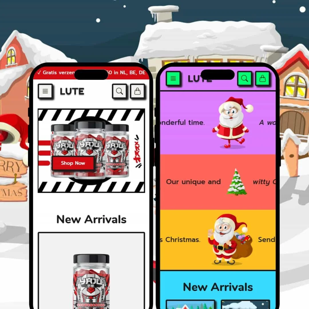
The Lute/Vibrant preset is engineered for brands that sell through charm and visual storytelling. It uses a spacious, clean layout with soft edges and friendly typography to create a welcoming digital storefront, making it a natural fit for gift shops, stationery stores, or children's brands.
⊕ Pros
✚ Collection-Focused Homepage: The layout prominently features large, clickable "Featured collections" blocks. This excels at guiding customers visually through different product categories, which can lower bounce rates for stores with diverse catalogs.
✚ Soft Promotional Banners: A dedicated homepage section effectively combines an image with headline text, ideal for telling a brand story or making seasonal announcements without the hard-sell feel of a typical banner.
✚ Clean Information Hierarchy: On product pages, details are neatly organized into accordion tabs for "Description," "Information," and "Shipping". This prevents visual clutter and allows shoppers to find answers easily, building confidence in the purchase.
✚ Visually Driven Product Grid: The "New Arrivals" grid is minimalist, focusing entirely on the product image and price. This works well for visually appealing products where the image itself is the primary selling tool.
⊖ Cons
− Passive Calls-to-Action: The homepage lacks immediate "Add to Cart" or "Quick Shop" functionality on its main product grids, forcing an extra click to a product page to purchase. This friction can slow down the buying journey for decisive shoppers.
− Understated Urgency: The preset doesn't showcase built-in, attention-grabbing elements like header countdown timers or low-stock indicators, making it less suitable for high-urgency sales events.
− Generic Variant Presentation: Product variants are shown as simple text-based dropdown menus. This is a missed opportunity for a more visual shopping experience, especially for products where color or style is a key differentiator.
-
The Fauve/Brutalism preset is the antithesis of Vibrant. It’s loud, confident, and unapologetically direct, using a stark high-contrast palette, bold block typography, and a functional layout designed for one purpose: to convert.
⊕ Pros
✚ Conversion-Focused Product Grid: Unlike its counterpart, this preset includes "Add to cart" buttons directly on the homepage product listings. This significantly reduces friction and is ideal for capturing decisive, quick-thinking buyers.
✚ Integrated Trust Builders: The homepage features dedicated sections for showcasing lab tests and certificates of analysis, complete with official-looking seals. This is a powerful feature for supplement, cosmetic, or tech brands where quality assurance is a critical selling point.
✚ Effective Bundle Showcase: The demo highlights product bundles clearly, displaying a discounted price next to the original. This is staged effectively to increase average order value (AOV).
✚ High-Visibility Promotional Bar: A persistent, high-contrast announcement bar at the top of the page keeps offers like "Gratis verzending vanaf $50" in constant view, reinforcing value at every stage of the journey.
⊖ Cons
− Aggressive Typography: The bold, all-caps, blocky typography can be visually fatiguing and may alienate brands aiming for a more refined or high-end aesthetic.
− Creative Inflexibility: The design is optimized for clean, studio-shot product photos on a plain background. It would likely clash with lifestyle, in-context, or more editorially styled product photography.
− Rigid Structural Design: The brutalist design is highly structured and utilitarian. Brands that require more fluid, storytelling-based layouts might find its fixed nature too restrictive.
Niche Suitability
Not Ideal For
Final Recommendation
-
Merchants who have a crystal-clear brand identity and see it perfectly reflected in either the Vibrant or Brutalism style. It's for those who want a strong, opinionated design out of the box and are prepared to build their content to match it.
-
Businesses that need a more flexible, "all-purpose" theme that can easily adapt to different branding styles. Any store in the fashion, home decor, or beauty space that relies on visual variant swatches should also think twice.
-
Low to Medium. Low, if your brand is a perfect aesthetic match for a preset. Medium, if you need to invest in high-quality, stylized photography to make the opinionated designs work effectively for your brand.
★ 7.8/10
Rating
-
All e-commerce essentials are present and well-implemented. However, the lack of built-in visual variant swatches is a major functional gap for entire categories of products, preventing a higher score.
7
-
For the end customer, the user experience is excellent. Navigation is logical, layouts are predictable, and information is easy to find, which creates a frictionless shopping journey.
9
-
The theme provides a clean and highly responsive mobile experience. Key interactive elements like the menu and cart are fast and intuitive, protecting the crucial mobile user experience.
9
-
The demos feel fast and responsive. Interactive elements operate without noticeable lag, and the relatively simple layouts suggest good loading performance, assuming optimized images are used.
8
-
While offering two very different presets is a form of flexibility, each individual preset is aesthetically rigid. It excels at its intended style but would be very difficult to adapt to a different visual identity.
6
FAQ
〰️
FAQ 〰️
-
👑 Yes, it is exceptionally well-suited for these exact niches. The Vibrant preset is perfect for gifts and crafts, while the Brutalism preset's trust-building features are ideal for supplements.
-
📱Yes, hands-on testing shows a consistently strong, responsive, and user-friendly experience on mobile devices across both presets.
-
🎨 Customization is limited by each preset's strong aesthetic. You can change colors and fonts, but the core layout and "vibe" of each preset are quite fixed.
-
⚡The theme feels fast and responsive in the live demos. Interactive elements like the slide-out cart and menus operate without noticeable lag.
-
👕It supports variants through basic text dropdowns only. The demos show no evidence of built-in support for visual color or image swatches, which is a key limitation.
-
🔎 The theme follows Shopify's standard SEO best practices, allowing merchants to edit titles, meta descriptions, and image alt text through the Shopify admin.
-
💱Yes, the theme has the necessary structure to support Shopify Markets for multi-language and multi-currency selling.
-
⚙️ Yes, as a modern Shopify theme, it is built to be compatible with apps from the Shopify App Store, allowing for extended functionality.
-
🛒 Yes, you can interact with live demos for both presets on the Shopify Theme Store, and all themes on the store come with an unlimited free trial period.
Disclaimer: This review is based on hands-on testing of the publicly available "Vibrant" and "Brutalism" preset demos of the Lute Shopify theme as of July 7, 2025. Theme features, preset availability, and performance can change with subsequent updates from the theme developer.