
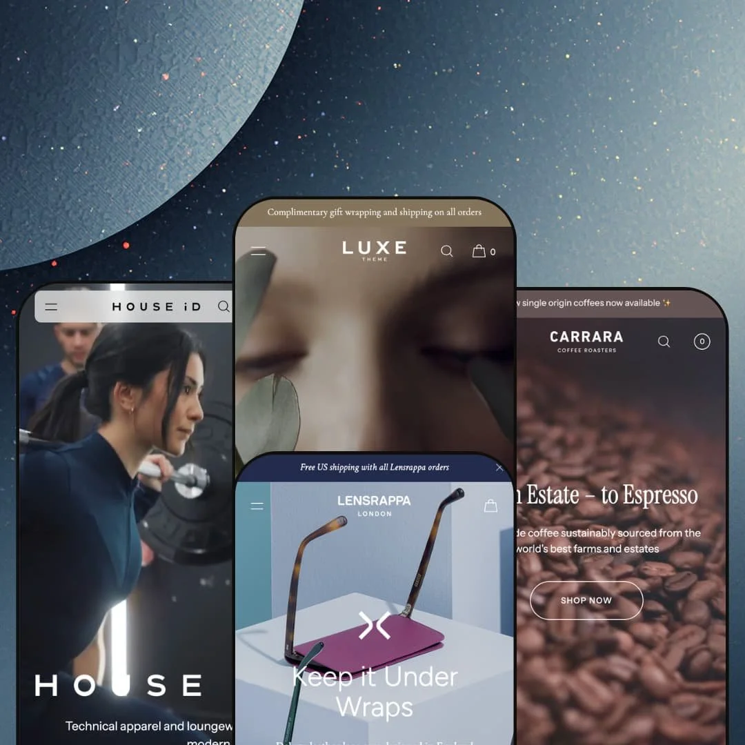
A perfume maison, a technical-activewear label, a single-product accessory brand, and a coffee roastery: Luxe ships demos for all four, and they don't read like one theme wearing four coats of paint. Winter Studio built it on Online Store 2.0 with a section library north of 25 blocks, and put a $490 price on it. At that figure the question isn't whether it looks expensive. It's whether the flexibility that lets one theme play fragrance, sportswear, accessories, and coffee holds its shape once you strip the demo photography away.
Video built into the section library, not bolted on
Every preset opens on autoplaying video and returns to it mid-page, and the theme ships a deep set of video section types to support that. On Milton the origin films stack directly into the merchandising flow; on Luxe the maison hero sets the mood before a single product appears. For beauty and apparel brands selling higher-ticket, considered products, motion is the most persuasive asset you own, and Luxe treats it as a primary building block rather than an afterthought.
Navigation that scales from one product to five categories
Pick almost any catalog shape and the header bends to fit it. The same theme runs Mayfair's bare three-link bar, Milton's image-tiled dropdown, and Soho's three-tier mega menu with a featured-image panel, all from the shared header system. That range matters because it means the navigation grows with you. A brand starting as a single-line accessory shop and a brand running a multi-category apparel catalog can both find their depth here without changing themes.
A product page that handles real variant complexity
Soho's product pages run colour as combined-listing swatches, size as a button group, and a Size Guide modal with full measurement tables, while Milton swaps in a grind selector and Roasting Notes tabs on the same underlying page. It's a coherent merchandising kit rather than a single trick. The accordion tabs keep description, details, and shipping tidy without burying them. Apparel and footwear sellers running colour-and-size variants across mid-sized catalogs get a page that won't buckle under the combinations.
Shoppable lookbooks that turn editorial into cart
Soho's "Shop the Style" section pins products to creator imagery, so a look photographed on an influencer becomes a direct route to the individual pieces. This is the bridge between inspiration and checkout that fashion merchandising usually struggles to build. Fashion and activewear labels that sell through outfits and lean on creator content can stage a whole campaign as a buyable gallery, which is exactly where that audience already shops.
Built for curated catalogs, not filter-first scale
Luxe is a boutique by temperament. The whole design language rewards a small number of products shown large and styled hard, and every demo stages a tightly curated assortment. A store running 500+ SKUs where customers shop primarily by filtering and search will spend its time working against that grain, fitting a mass catalog into a layout that wants to hero a dozen hand-picked pieces. If your merchandising is search-and-sort at volume, this isn't that theme.
The signature swatch experience leans on combined listings
The colour swatches that make Soho's product pages feel premium are built as combined listings, meaning each colourway is a separate product linked into one display. That's a specific data architecture, not a checkbox. Apparel brands offering many colourways across a working catalog will need to structure variants that way and keep them maintained, which is real setup and ongoing operational effort before the swatch row looks like the demo.
The premium look is front-loaded onto your assets
The thing that makes every preset sing is professional video and photography, and the theme assumes you arrive with both. I noticed how much of the impact drained out the moment I pictured the same layouts with stock imagery and a phone clip. Early-stage or bootstrapped brands without a production budget will get a flatter, quieter version of all four presets, and at this price that's a gap worth costing out before you buy.
What it takes to launch
Plan a multi-day pass across hero and section copy, high-resolution photography and video for every section, combined-listing and metafield population for variant swatches, and per-preset navigation re-staging to match your own catalog. Budget two to three days before a clean launch.
-
What works in this preset
The flagship preset sells a fragrance house called La Fleur, and it sells it slowly. Product grids sit on full-bleed lifestyle plates, packshots float on soft neutral backgrounds, and the pacing assumes a shopper who scrolls rather than hunts. I clicked into the section it calls "The Maison" expecting filler, and instead found a two-panel explore block pairing Ingredients with Our Story, each opening into its own page. For a £180 eau de parfum that depends on mood more than spec, the unhurried rhythm is the right call.
Collections get their own treatment here. Rather than a flat product wall, the preset stages named lines such as La Forêt and La Prairie as small curated sets, each with its eau de parfum, essential oil, and crème sitting together. It reads like a counter at a department store. That grouping does quiet merchandising work without a single banner shouting at you.
Typography carries a lot of the weight. The preset leans on generous letter-spacing and restrained serif headings, and the result feels closer to a print editorial than a storefront. It's a confident look. Nothing about the layout begs for attention, which is exactly why it earns it.
Where it stumbles
The flagship demo is the most editorial of the four, and that comes with a trade-off worth naming. Across the homepage I kept waiting for a moment of urgency or reassurance, a reason to buy now rather than admire and leave, and the preset stays serene to a fault. That's a deliberate staging choice rather than a limit of the theme, since the urgency and trust sections live in the shared library. A fragrance brand running this preset will want to decide early how much warmth to add before launch, because as staged it sells the world beautifully and the transaction barely at all.
-
What works in this preset
Run a multi-category apparel catalog and Soho is the preset that earns its keep. The activewear label here, HOUSE iD, splits cleanly into Women and Men, and each opens a three-tier mega menu that stacks Featured links, Categories, and a "Systems" column for product families like HOUSESeamless and HOUSESculpt. That third tier is the clever bit. It lets a brand merchandise by collection logic and by garment type at the same time, inside one menu.
A scrolling marquee band repeats the brand's "MOVE. EVOLVE. PROGRESS. CHANGE." line across the page, and it does more than decorate. On a sportswear store the motion reads as energy, and it breaks up an otherwise long homepage with a beat of rhythm. Small device, real effect.
The preset also folds in a Journal, with dated posts on city guides and run routes wired in alongside the shop sections. Content and commerce sit on the same page without fighting. For a brand whose customers cross-shop on lifestyle as much as on product, that integration is genuinely useful, and it keeps people scrolling past the fold instead of bouncing after the hero.
Where it stumbles
Soho is the densest preset in the family, and the homepage runs long. By the time I scrolled past new arrivals, two gender splits, a collection grid, the style section, a journal, and a store-locator band, the page had asked for a lot of patience. None of it is broken, and a committed activewear shopper will likely stay with it. A brand with a thinner catalog, though, should prune sections before launch rather than inherit the full demo, or the storefront will feel padded against a short product list.
-
What works in this preset
Mayfair does the hardest thing in retail design: it makes one product look like enough. The demo brand, Lensrappa, sells a single leather lens case in eight colourways at £23 each, and the whole preset is built around that constraint. Navigation collapses to Shop, Story, and FAQ. There's no mega menu, no category sprawl, just a clean run from hero to a colour-led product grid the preset calls "The Collection."
Trust gets handled with restraint too. Three short customer quotes sit inline beneath the collection, attributed to first names and countries, and a tidy row of promises covers shipping, gift wrapping, and returns. It's modest, and it suits a £23 impulse buy that lives or dies on looking giftable. The footer shrinks to a single row, which on a one-product store is the correct amount of footer.
Where it stumbles
The preset is tuned so tightly to one product line that growth becomes a build project. A single-product or few-SKU gift brand will launch fast here, which is the point. But the same brand adding a second category later inherits the theme's full section and menu library and has to construct the navigation the other presets demo from scratch, since Mayfair stages almost none of it. That's merchant-side work waiting down the road, not a fault in the layout, and it's worth knowing before you pick this preset as a starting point.
-
What works in this preset
Milton is the artisan-coffee preset, and its menu is the standout detail. The Shop dropdown pairs each link with a small product image, so Single Origin, Blends, and Pods arrive with a picture rather than plain text, and an announcement bar rides above the header flagging new arrivals. For a roastery whose ranges look similar in words but distinct in packaging, that visual menu does real navigational work.
The homepage merchandises through description as much as imagery. A "Shop By Collection" row gives each range a sentence of context, the explore blocks frame the roastery's process and sourcing as separate stories, and the product pages carry tabs for Roasting Notes and Delivery beside the main description. I went looking for filler copy and found genuine structure instead. A consumable brand selling on provenance gets a layout that respects the story behind the bag.
Genuine range from a single purchase
The strongest argument for Luxe is that its four presets don't share a face. Fragrance, sportswear, accessories, and coffee each arrive looking like a different studio's work, and that breadth is rare in a single theme. A merchant who isn't certain where their brand will land aesthetically gets four credible starting points instead of one template in four colours.
A coherent design language under the variety
For all that range, a consistent restraint holds the family together. The whitespace discipline, the typographic confidence, and the measured pace of motion carry across every vertical, so none of the presets reads as a free download dressed up. That through-line is what justifies the positioning, because the polish survives the change of subject.
One aesthetic ceiling
Every preset, however different the product, settles into the same quiet, editorial register. It's a beautiful register, but it's the only one on offer. A brand that wants loud, maximalist, or playful energy will be pushing the theme uphill the whole way, because the restraint that makes Luxe look expensive also caps how far its mood can travel.
The preset spread hides uneven starting lines
Reading all four together reveals how far apart they sit. The distance from Soho's dense, multi-tier build to Mayfair's near-bare layout is large, so the "four presets" headline undersells the work involved. Choosing the preset that matches your vertical can hand you far more structure than your catalog needs, or far less, and either way the gap between demo and launch-ready store is wider than the preview suggests.
Rating
★ 8.0/10
-
A 25-plus section library covering video, combined-listing variants, image-tiled mega menus, shoppable lookbooks, and product tabs, with little padding.
9
-
Drag-and-drop section control is approachable, but the volume of sections plus combined-listing and metafield setup adds a real learning curve.
7
-
Menus collapse to an accordion pattern, product grids reflow cleanly, and the footer columns stack into expandable lists on small screens.
8
-
Heavy autoplaying video and high-resolution imagery add weight across every demo, though lazy-loading and a restrained section count on lighter presets help.
7
-
Four genuinely divergent presets from one theme, plus aspect-ratio and focal-point controls on most sections, give wide latitude before any code.
9
Frequently Asked Questions
-
t helps more than almost anything else. Every preset is staged around autoplaying video, and while you can swap in image banners, you give up the theme's single biggest visual lever when you do.
-
Through combined listings, where each colourway is a separate product linked into one display. You structure and maintain variants that way rather than as a single multi-option product, so plan the catalog architecture accordingly.
-
No. Those are app features. Milton's "Subscriptions" trust badge is a label, with the actual function handled by an app such as Recharge or Appstle, and star ratings would come from a reviews app like Judge.me or Loox.
-
Mayfair. It's the stripped-down, one-line layout demonstrated on the Lensrappa lens-case store, where the others all assume a multi-category catalog you may not have yet.
-
Yes. Per Winter Studio's documentation, 3D models display directly in the product gallery and shoppers on a phone can use "View in your space" augmented reality, with no separate app required.
-
They cover the theme's own interface strings in English, French, Italian, German, and Spanish, things like button labels and form text. Translating your product and page content still runs through Shopify Markets, not the theme.
This review is based on hands-on testing of the publicly available preset demos of the Luxe Shopify theme as of June 3 2026. Theme features, preset availability, and performance can change with subsequent updates from the theme developer.