
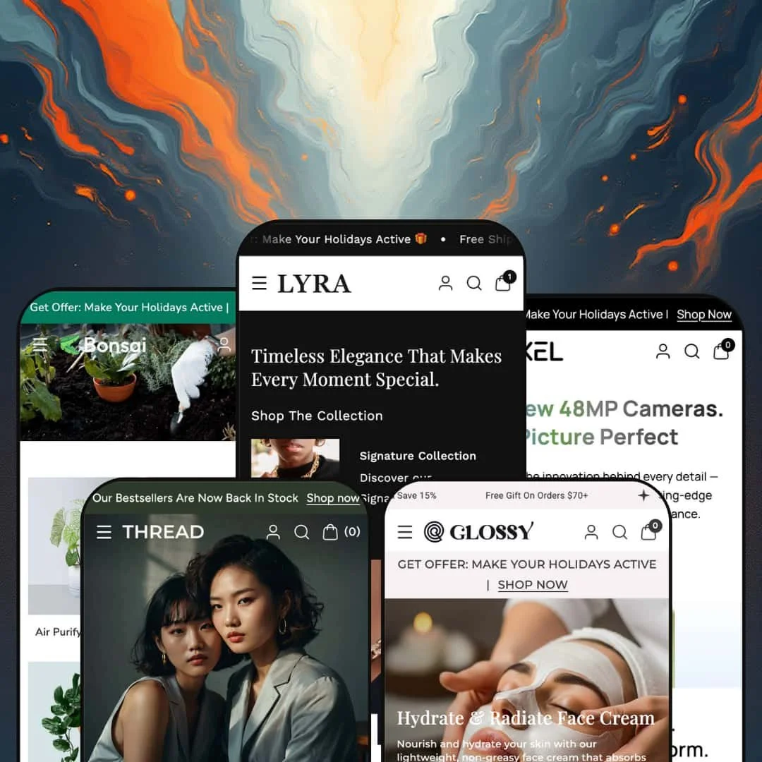
Lyra is a premium Shopify theme designed around modern lifestyle retail. Across all presets it shares a consistent framework: a fluid grid, large hero banners, rich product cards with swatches, a slide-out cart, mega menus and built-in marketing sections such as countdown timers, image hotspots and lookbooks. The common elements include a search overlay with auto-suggest, quick view modals, sticky or floating add-to-cart bars, and trust badges. Each preset restyles these modules for different industries: jewellery, fashion, electronics, cosmetics and plants, while keeping the same underlying capabilities. On first load, the theme draws visitors into bold hero images and clear calls to action, encouraging exploration.
Pros.
〰️
Pros. 〰️
✚ Flexible presets, consistent core
Lyra is built around one shared framework that is restyled across presets rather than rebuilt from scratch. That means Default, Thread, Pixel, Glossy and Bonsai can look and feel targeted to very different industries while still relying on the same underlying shopping modules. For merchants, this reduces the risk of choosing a preset for aesthetics and losing key functionality. You are mainly selecting presentation, pacing and tone.
✚ Rich product cards and quick view for faster browsing
Across the demos, product grid cards surface swatches, sale badges and a small quick view trigger that opens a modal. In testing, the quick view experience includes an image gallery, price, variant selection, quantity controls and add-to-cart actions. The shopper payoff is a faster compare-and-decide loop, especially for multi-variant items where people want to check options quickly. It keeps product discovery moving without constant page loads.
✚ Mega menus and search that keep discovery moving
Lyra pairs image-supported mega menus with a full-screen search overlay that surfaces live suggestions for products, collections and articles. From the overlay, shoppers can jump into a results view that supports sorting, keeping browsing structured even when the catalogue is wide. This combination helps visitors move from curiosity to a specific category or item without feeling lost. It is particularly valuable in stores where shoppers browse by category logic, not by a single hero product.
✚ Product pages built for detail, variants and customization
Product pages across the scanned presets are designed to carry more than a title and a gallery. The demos show thumbnail galleries, sale pricing with strike-through where applicable, variant swatches, quantity selection, and common detail blocks such as materials and care tabs plus specification tables. Jewellery-focused staging also includes an engraving field, which supports personalised products. For shoppers, the benefit is confidence because key questions are answered directly on the product page.
✚ Cart drawer that supports upsell moments
Adding an item routes the shopper into a slide-out cart drawer rather than interrupting the session with a hard page change. In the demos, the drawer includes a free-shipping progress bar, a countdown timer, trust badges and an order notes or special instructions field. These elements turn the cart into a mini conversion stage, nudging shoppers toward completing checkout or adding more items. When tuned well, it keeps the shopper focused on checkout while still presenting a clear moment to add more.
✚ Interactive merchandising sections for visual storytelling
Lyra includes interactive storytelling blocks, including image hotspots that appear as plus buttons on hero or lookbook-style sections. Clicking a hotspot reveals a product card overlay that links to a product page, so merchandising can happen inside editorial imagery. Combined with marketing-oriented sections such as countdown timers and pop-up offers, the theme supports campaign-style storytelling without needing a separate landing-page builder. For lifestyle brands, this matches how shoppers browse.
Cons.
〰️
Cons. 〰️
🚫 Countdown timers can misfire visually
In testing, the countdown component in the cart drawer occasionally displayed 00:00 values. Even when the rest of the cart experience works, a timer showing zeros can look broken or rushed. For shoppers, that kind of visual glitch can reduce trust at the exact moment they are deciding whether to check out.
🚫 Media-heavy staging can introduce performance overhead
Several demos stack high-resolution imagery, animations, pop-ups, videos and multiple promo sections in one session. In those scenarios, the experience can feel heavy, and the cart drawer occasionally lagged during testing. The core issue is not broken functionality, it is the overhead created by turning on many attention-grabbing sections at once.
🚫 Search suggestions are not always instant
The search overlay is designed to provide live suggestions, but during testing it sometimes took a second or more to populate results. That delay can frustrate shoppers who expect immediate feedback while typing. In a store where search is a primary discovery tool, even small pauses can add up to a slower browse.
🚫 Demo content and link QA still matters
Some of the rough edges seen in demos were content and routing issues rather than structural theme limitations. Bonsai included stray jewellery-focused demo text on plant pages, and early Glossy testing showed a few category links that triggered a browser error before later loading normally. These are fixable, but they still affect shoppers if left unattended.
-
Default is staged for jewellery and luxury accessories, and it leans into that category immediately. The landing hero pairs a bold slogan with a call to action and a countdown-style offer, directing customers toward men’s and women’s collections. Deep blacks and gold accents reinforce the premium tone and keep the first impression distinctly high-end.
What works in this preset
The black-and-gold styling is the clearest signal of intent, and it does most of the heavy lifting for a luxury positioning. In practice, it makes every headline and price call-out feel more formal, which suits jewellery where trust and perceived value matter. Because the palette is so decisive, the storefront reads as purpose-built rather than an all-purpose template. Shoppers land with a strong sense of category before they interact with anything else.
The hero composition is built to push browsing quickly. The bold slogan sets the tone, while the call to action and the offer timer give the page an immediate next step. That combination nudges visitors into collection exploration instead of leaving them to figure out where to start. It is a straightforward approach that fits giftable products and seasonal promotions.
A standout piece of staging here is the story-driven homepage flow. The Default demo includes a timeline section with milestone-style entries, which gives the shop a brand-history beat between shopping sections. It also uses video-background sections that add motion without forcing the shopper into a separate media page. Together, these blocks create a more narrative rhythm than a simple hero-and-grid storefront.
Navigation is presented in a deliberately structured way in this demo. Hovering over the Shop entry opens a multi-column layout organised by metal type and jewellery categories, complete with thumbnail images. This turns the header into a browsing map instead of a short dropdown, which helps shoppers jump directly to the material or category they care about. The result is a more guided top-of-funnel experience, especially for visitors who already know what they want.
Where it stumbles
The same styling choices that make the Default preset feel premium also make it quite specific. Deep blacks and gold accents are a strong match for jewellery and luxury accessories, but they may feel too formal for casual lifestyle brands without significant restyling. If your catalogue leans playful or colour-forward, this demo’s mood can work against you.
The countdown-driven offer framing is also a distinct tone choice in this staging. It creates urgency early, which can be effective for promotions, but it can also feel sales-forward in a category where some shoppers prefer a slower, considered browse. Merchants should decide whether that urgency matches their brand voice before keeping the same hero structure.
-
Thread targets fashion and apparel merchants and uses lifestyle photography to set an editorial tone. Warm imagery and soft typography create a magazine-like feel, while category blocks such as Chic Comfort and Modern Ease give the homepage a segmented, collection-first structure. The overall staging is designed to sell a style world as much as a set of products.
What works in this preset
The strongest part of Thread is its editorial density. The mix of lifestyle images and overlay copy makes the shop feel like a lookbook, which is a natural fit for apparel where context and styling matter. Instead of relying on product grids alone, the demo uses large blocks that read like campaign panels. That approach encourages browsing because each section feels like a new chapter rather than a repeated layout.
Thread also uses homepage categorisation as a primary navigation cue. The named category blocks act like a guided storefront map, pointing shoppers to distinct apparel moods without asking them to interpret a long menu. This is especially useful for brands that sell multiple aesthetics under one label. It can also reduce decision fatigue because the page offers a few clear paths instead of dozens of options at once.
On product pages, this preset leans into add-on styling and storytelling. In this demo staging, cross-sell carousels are clearly labelled Pair it with, and they sit alongside large editorial sections that use video overlays. The effect is to keep shoppers thinking in outfits and combinations, not single items. When it works, it nudges shoppers to add coordinated pieces instead of stopping at a single item.
The header navigation is staged as apparel-first in this demo. The menu expands to show top-wear, bottom-wear and Western-wear groupings with sub-items and images, which makes browsing feel closer to a department layout than a simple list. For returning shoppers, that structure can speed up repeat journeys to key categories. For new visitors, it signals breadth without forcing a deep scroll.
Where it stumbles
In this demo staging, the quick view trigger is easy to miss. On some grid cards the icon feels small and seems to require precise cursor placement before it becomes obvious. That can make the browsing experience feel less forgiving, especially for shoppers who expect fast, obvious interaction points. If quick-buy moments matter to your store, this is the kind of staging detail worth adjusting after installation.
Thread's emphasis on large imagery is part of its appeal, but it is also the main risk. The heavy lifestyle photography can add visual weight and may slow the experience on weaker connections, especially when several image-forward sections stack back to back. Merchants who love the editorial feel should still be selective about how many campaign blocks they keep on the homepage. A tighter edit can preserve the look while reducing the load.
-
Pixel is tailored for electronics and tech accessories, with bright colours and crisp typography that push a modern, spec-forward vibe. Sections call out features such as camera megapixels and durability, and the page rhythm leans into promotion and urgency. The staging is designed to feel energetic and gadget-centric rather than calm and lifestyle-led.
What works in this preset
Pixel's hero and early sections are built around technical reassurance. The landing hero emphasises a 48 MP camera, and the follow-up blocks highlight durability, sound accessories and drop-testing style claims. That kind of staging makes sense for electronics shoppers who want a reason to trust the product quickly. It also makes the homepage feel like a product briefing, not just a storefront splash.
This preset demo surfaces availability cues more aggressively than the others. Product pages display a small stock indicator such as Only X left alongside swatches for colours or memory sizes. That pairing helps shoppers understand both choice and scarcity in the same visual zone. For fast-moving accessories, it can push decision-making forward without requiring extra clicks.
Countdown promotions are a recurring rhythm in this demo. Timers show up across multiple sections to reinforce limited-time deals, and they work in tandem with feature call-outs to keep the page feeling active. For promotional calendars and launches, that can be an effective tone match. It also makes the storefront feel closer to a campaign landing page than a catalogue index.
Product discovery is staged to feel immediate. In this demo, quick view appears not only on collection grids but also on the search results grid, so searching does not force a full product-page click for every comparison. That is useful when shoppers are trying to compare small accessories or minor spec differences. The net effect is a faster browse loop, which suits gadget shopping where people tend to scan and compare.
Where it stumbles
Pixel's navigation can feel crowded in this demo. The mega menu packs many categories and thumbnails into a tight area, and while it remains usable, it demands more careful cursor control than a simpler layout. For a tech store with a large taxonomy, that density may be intentional, but it can still read as cluttered. Merchants should consider whether fewer images or fewer columns would improve scanability.
There is also a point where the promo language becomes the page. With numerous timers and animated call-outs, the demo can feel busy and occasionally distracting, especially for shoppers who are trying to focus on product differences. The extra motion and repeated urgency cues can also add to overall page weight. Pixel works best when the promotional sections are edited to support the products, not compete with them.
-
Glossy is oriented toward cosmetics and skincare, and its staging focuses on softness and clarity. Light backgrounds, pastel tones and elegant typography keep the storefront feeling gentle, while the hero places a featured serum front and centre. Category sections then reinforce the core ranges, including perfumes, makeup and serums.
What works in this preset
The first impression is deliberately clean. The landing hero features a large product photo with overlay text, so the shopper immediately understands what is being sold without scanning a busy layout. For skincare, that kind of focus works well because it mirrors product-led advertising. It also makes the storefront feel calm, which can be a conversion positive for wellness and beauty.
Glossy shines on the product page staging. In this demo, product pages include a row of promotional feature boxes positioned under the title, with benefit-style labels such as Strengthens Barrier and Soothes Irritation. Those call-outs act like a quick summary for shoppers who skim before reading longer descriptions. They also make the page feel more structured, with clear benefit anchors before the deeper content.
The pastel palette supports an easy browse. By keeping the visual tone light, the demo gives product photography room to lead and avoids turning every section into a high-contrast billboard. That restraint pairs well with skincare branding, where trust cues often come from simplicity. Merchants selling beauty products can use this preset as a starting point for an elevated, gentle storefront mood.
Where it stumbles
During early tests, a few category links in this demo triggered a browser error, even though later testing showed the pages loaded normally. That kind of inconsistency is not something to ignore, even when it appears resolved. Merchants should still click through collections and product links after installation to confirm everything routes correctly. It is a small QA task, but it protects the customer journey from avoidable dead ends.
-
Bonsai brings a calming, botanical aesthetic suited to plants, gardening and home decor. Soft greens and natural imagery create a serene mood, and the demo leans into education as much as merchandising. The result is a storefront that feels like a guided plant shop rather than a generic retail layout.
What works in this preset
Bonsai's tone is immediately clear. The colour palette and imagery aim for calm and natural, which fits categories where shoppers want reassurance and inspiration. Instead of pushing hard promotions in the first breath, the preset lets the botanical mood do the selling. That makes it easier to position products as lifestyle upgrades rather than impulse buys.
A distinctive piece of staging in this demo is the quick view presentation. Product cards use green plus icons instead of the typical eye symbol, and clicking opens a modal that includes tabs such as Plant Setup, Daily Care and Blooming. Each tab contains care-focused information alongside the add-to-cart option, so quick checks feel educational, not purely transactional. For plant shoppers, this can reduce uncertainty before committing.
The product page staging is intentionally comprehensive and long. Further down the page, the demo includes bullet-style care benefits, collapsible policy sections such as Shipping Policy, and cross-sell sliders labelled Pair It With. It also stacks inspirational hero banners, countdown-driven promo sections such as Green Vibes Only, and a View More Like This recommendation grid. For plant retail, that density can feel helpful because the page answers common questions without demanding extra navigation.
Botanical hero sections reinforce the niche. Large banners with gardening quotes and calls to action keep the experience cohesive, and later sections introduce category tabs such as Herbs and Edibles and Indoor Plants. Those tabs invite exploration in a way that feels like browsing a nursery aisle rather than clicking a plain menu. The overall rhythm supports discovery, which suits shoppers who want to wander and learn.
Where it stumbles
This demo includes stray copy that does not match the plant category. On the plant detail page, there is leftover jewellery-focused text about custom gifts like necklaces or bracelets, plus a general contact request line. If left in place, those sentences can confuse shoppers and make the store feel unfinished. Merchants will want to audit and replace demo text before publishing.
The second issue is weight. With multiple hero sections, image hotspots, videos, countdowns and carousels stacked on a single product page, Bonsai can feel heavy. Shoppers on slower connections may notice lag while scrolling, and the overall experience can become tiring when too many modules compete for attention. This preset works best when the most useful educational blocks remain and the rest are pared back.
Niche Suitability
Not Ideal For
Final Recommendation
-
Lyra is best for merchants who prioritise visual storytelling and interactive product discovery, especially across lifestyle categories. If you want big hero moments, rich product cards, and merchandising sections that keep shoppers exploring, the theme's framework supports that style of selling.
-
Stores with extremely large catalogues or brands chasing a truly minimal, low-script storefront may find Lyra's default flourishes too heavy without significant trimming. If your brand depends on a quiet, utility-first experience, you may prefer a theme that ships with less editorial density and fewer marketing modules
-
Medium — Editing demo content and tuning which sections stay live takes time. The theme's modules are largely plug-and-play once you have trimmed the staging to match your brand.
★ 7.6/10
Rating
-
Lyra offers comprehensive features, including quick view, mega menus, a search overlay, countdown timers, lookbooks and variant swatches. Minor inconsistencies and page heaviness prevented a higher score.
8
-
The theme is straightforward to navigate once pop-ups are closed, but new users may struggle with small quick view icons and locating the search trigger quickly
7
-
In testing, core flows such as search, product browsing and cart interactions remained usable on phone-sized screens. The overall experience holds up well as layouts compress, even when pages are media-heavy.
8
-
Pages load reasonably well, but heavy imagery and scripts such as pop-ups and timers can slow initial load, particularly in Thread and Pixel staging.
7
-
The theme offers extensive section blocks and styling controls, making it adaptable to various industries. Each preset demonstrates a different aesthetic approach while keeping the same core shopping framework.
8
FAQ
〰️
FAQ 〰️
-
👑 Yes. Each preset targets a different vertical. For example, the Default preset uses elegant blacks and golds for jewellery, while Pixel emphasises bright colours and technical specifications for electronics.
-
📱In testing, the cart drawer, search overlay and product pages stayed usable on phone-sized screens, and core add-to-cart flows worked cleanly. As with any media-rich demo, the smoothness you get will depend on how heavily you stack imagery, video and promotional sections.
-
🎨 The theme editor exposes numerous sections and options for colours, typography, announcement bars, mega menus, countdown timers and product page layouts. Store owners can enable or disable elements such as sticky headers, back-to-top buttons and quick view without coding.
-
⚡ During testing, pages loaded smoothly overall, but the heavy use of high-resolution images and pop-ups caused occasional delays. Those slowdowns were most noticeable when loading elements such as the search overlay or large navigation menus.
-
👕 Yes. Product pages show swatches for colours, sizes and other options. Quick view modals for multi-variant products prompt customers to select an option before adding to the cart.
-
🔎 Lyra does not add proprietary SEO features. You will still rely on standard meta titles, descriptions and image ALT text, and the theme's clean structure helps search engines index pages effectively.
-
💱 Yes. Lyra can display Shopify Markets language and currency selectors, and in the demos they are presented as dropdowns in the footer. You can configure which selectors appear and how they are presented through your store's Markets settings.
-
⚙️ The theme follows Shopify 2.0 standards, so most apps are compatible. For example, subscription tools, review widgets and upsell blocks can be added via app blocks on product or cart pages.
-
🛒 Yes. The live preset demos let you explore functionality without installing. This makes it easy to compare preset staging while the core shopping modules remain consistent.
This review is based on hands-on testing of the publicly available preset demos of the Lyra Shopify theme as of 3 January 2026. Theme features, preset availability, and performance can change with updates from the developer.