
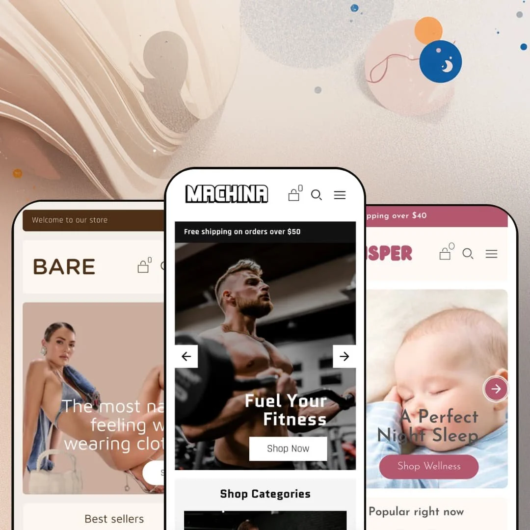
A supplement brand, a baby-care line, and an underwear label, all running off one theme. That's the spread Koding Themes packs into Machina, a $220 theme built on Shopify's Online Store 2.0 architecture, and the three demos share a codebase without sharing much of a look. Breadth that wide usually raises a fair question: is any single configuration deep enough to launch on as-is?
A product page built to close
The product page bundles the conversion essentials onto one screen: a sticky add-to-cart bar that follows the scroll, accordion tabs for Details, Shipping and Returns, a stock counter reading live inventory ("20 In stock"), and a "Pairs well with" cross-sell row underneath. It holds together. These read as one buying surface rather than parts glued on after the fact, and for considered-purchase products with real detail to communicate, in the 20-to-200-SKU mid-market range, it's a page you can sell from on day one.
Discovery that keeps up with a full catalog
For stores where shoppers cross-shop a mid-to-large catalog before committing, the discovery layer matters more than the hero, and Machina answers with a predictive search overlay that surfaces recommended products as you type, swatch filters on collection pages, infinite scroll, and breadcrumbs for backtracking. Search opens fast and returns thumbnails, not just text. Put together, it's a finding-things layer that suits browse-heavy catalogs in apparel, beauty, or supplements.
A promo kit, not just a promo banner
Machina ships a coordinated merchandising kit rather than a lone sale strip: promo banners (the demo runs a "SAVE20" code block), promo popups, promo tiles, and in-menu promotions that live inside the mega menu itself. It adds up. Treated as one surface these run a layered campaign without a separate app, and for discount-led brands running seasonal promos and flash drops, that built-in promo capability earns its place.
One slide-out cart across every preset
Every preset routes to the same slide-out cart drawer instead of a full cart-page detour, with cart notes and cart cross-sell available in the same panel. The buying path stays on the page. For impulse-driven, multi-item baskets in DTC, keeping shoppers in a drawer rather than bouncing them to a separate cart page reduces the friction that quietly loses add-ons.
Limited track record
The numbers are thin. Machina sits at zero reviews on the Theme Store, and while it launched in 2024 and reached version 2.0.0 in January 2026, it still carries no public rating to lean on. For first-time owners without a developer to vet the code, and for merchants who rely on peer reviews before spending $220, that absence of social proof is a real consideration at purchase time.
No vertical-specific merchandising tools
Machina's section set is broad but generalist. It covers galleries, spotlights, product tabs and image rollovers, yet there's no lookbook, no shoppable hotspot section, and no outfit builder anywhere in the library. I went looking for one on the apparel preset and came up empty. For fashion and apparel brands that sell through editorial lookbooks and styled shop-the-look imagery, that's a door the theme simply closes.
Theme translations stop at five EU languages
Out of the box, the theme bundles pre-translated interface strings for English, French, Italian, German, and Spanish only. That's a clean fit for Western-European and DACH storefronts. For cross-border merchants selling into non-EU-language markets, though, every other language means translating the theme's strings yourself before launch, on top of the usual content work.
What it takes to launch
Expect a two-to-three-day pass before launch: replacing demo copy across hero captions, About-page narrative, FAQ entries and footer text; configuring the related-product and cross-sell blocks so they point at real inventory; and aligning brand naming and currency defaults to your own store.
-
What works in this preset
You land on the Machina demo and the energy hits right away. A two-slide hero rotates between "Fuel Your Fitness" and "Get The Edge You Need," a three-tile category row splits Supplements, Food, and Accessories, and a scrolling "Make Every Workout Count" marquee keeps the page in motion. It commits to the loud gym-brand look, and the staging never hedges on it.
The featured-collection grid runs inline add-to-cart on every card, with "From $59.00" pricing pulled straight from the variant data. Below it, a single featured product gets the spotlight treatment with its own quick-add button. For a supplement seller who wants shoppers buying from the homepage without a detour, that quick-buy staging earns its keep.
Trust is the hard part of selling supplements. The Machina demo answers it on the homepage itself, stacking an FAQ accordion covering dosage, side effects and timing alongside a contact form built straight into the layout, so objection-handling sits inches from the buy button instead of buried on a separate page.
Where it stumbles
The demo's instinct is to show everything. Nearly every section the theme offers gets stacked onto this one page, which turns the homepage into a capabilities tour more than a focused storefront, and a merchant's first job here is cutting sections rather than adding them.
-
What works in this preset
Whisper swaps the gym energy for a soft, editorial palette and an image-led mega menu. I hovered the nav and Bath & Body, Household, Wellness, and Health Care each opened as a captioned image tile rather than a plain text column. For a wellness catalog with browsable categories, that visual navigation suits the slower, gentler buying mood.
This preset wants to be read, not just shopped. A four-post blog row sits high on the page, paired with two image-and-text storytelling blocks about gentle, plant-based care, which makes Whisper the natural pick for a brand that sells through content and reassurance as much as through a product grid.
The footer is where Whisper quietly shows its depth. It runs three labeled columns for Shop, Support and Legal, alongside a follow-us row, a newsletter signup, an Acknowledgement of Country block, and region plus language selectors. That's a lot of organized real estate down there.
Where it stumbles
Whisper's storytelling lean pushes the catalog down. The "Popular right now" row appears, then the page hands over to brand narrative and blog posts, so a wellness shop with a deep catalog risks burying its own products beneath the editorial layer before a browser ever scrolls to them.
-
What works in this preset
Where the other two presets fill the screen, Bare empties it. A flat five-link header replaces the mega menu, a single-statement hero reading "The most naked feeling while wearing clothes" carries the top of the page, and the whole thing feels stripped-back and confident. This is the preset for a single-product DTC brand that wants restraint.
Bare is also the one that proves the variant handling. I clicked into a thong product and got a true two-axis picker: Size as a button group running S to XL, Color as labeled swatches, with the gallery and image rollover swapping per selection. The collection cards carry the same option logic, so the apparel buying flow holds together from grid to product page.
The brand voice gets its own staging room. A "New Nudes" multi-image spotlight cycles product shots, and a marquee runs "Warning: these undies may cause highly flirtatious behaviour" across the page. It's playful, and it fits.
Where it stumbles
The two-axis matrix has a ceiling. On the multi-pack product the full Size-by-Color grid expands to sixteen combinations rendered as stacked button rows, and on a phone that picker gets tall fast, asking for a lot of scrolling before a shopper reaches the add-to-cart.
One component set, three identities
The most interesting thing about Machina shows up only after you view all three demos back to back. They look unrelated. The same Online Store 2.0 section library renders as a fitness brand, a baby-care line and an intimates label, with the components disappearing so completely into each skin that nothing gives away the shared parentage. That range from a single $220 purchase is the theme's real argument.
Range you can actually use
Machina's three presets are genuine starting points, not three recolors of one layout. They differ in navigation, page rhythm and merchandising emphasis. For a merchant still deciding on direction, or an agency reusing one license across different client types, that's usable optionality rather than a line on a feature list.
The demos reach for everything
Across all three presets, the homepages stack section after section, which makes the out-of-box impression a tour of what the theme can do rather than a disciplined store. The restraint has to come from you. A buyer expecting a launch-ready storefront will instead spend the first day removing sections to find the focused version underneath.
Identity that lives in the content, not the structure
The flip side of the shared component set is that the distinct vertical feel comes mostly from imagery and copy. That cuts both ways. Strip the demo content out and the three presets converge quickly toward the same shapes, which means your brand's distinctiveness will rest on the assets you bring rather than on genuinely different layouts.
★ 7.4/10
Rating
-
A wide theme-wide set: product tabs, swatch filters, predictive search, a promo-section kit, and a slide-out cart. The gap is signature vertical tools like lookbooks or outfit builders.
8
-
Standard Online Store 2.0 section editing, but the dense demos mean the early work is trimming and re-staging rather than adding.
7
-
Responsive markup with a slide-out menu and lazy-loaded media; long two-axis variant button groups get tall on small screens.
7
-
Lean signals like webp images and lazy loading, offset by image-heavy hero slideshows and marquees that add page weight.
7
-
Three genuinely distinct presets from one component set, with adjustable color and type tokens; differentiation leans on content more than layout.
8
Frequently Asked Questions
-
Bare. It uses a flat five-link header, a single-statement hero, and a two-axis Size-by-Color variant picker, which is the closest fit for a fashion or accessories catalog.
-
Yes, both are theme-wide. Machina and Whisper stage image-based mega menus, while Bare deliberately opts for a flat text nav, so the difference you see is a staging choice, not a capability gap.
-
The footer is editable theme work, not a fixed bar. Whisper stages a three-column footer with menu, newsletter, social and region blocks, and you can rework the columns and block types in the Online Store 2.0 editor.
-
No. Those are app-driven, think Judge.me or Loox for reviews and Recharge or Appstle for subscriptions; the theme gives them standard product-page areas to slot into but doesn't run them itself.
-
Quite. Machina is loud and feature-dense, opening with a slideshow hero and a marquee, while Whisper is soft and editorial, leading with an image mega menu and a four-post blog row, so they suit very different brand moods.
-
It's on version 2.0.0, released January 2026, which updated cart styling and fixed an index template issue that affected installing a preset.
This review is based on hands-on testing of the publicly available preset demos of the Machina Shopify theme as of May 29 2026. Theme features, preset availability, and performance can change with subsequent updates from the theme developer.