
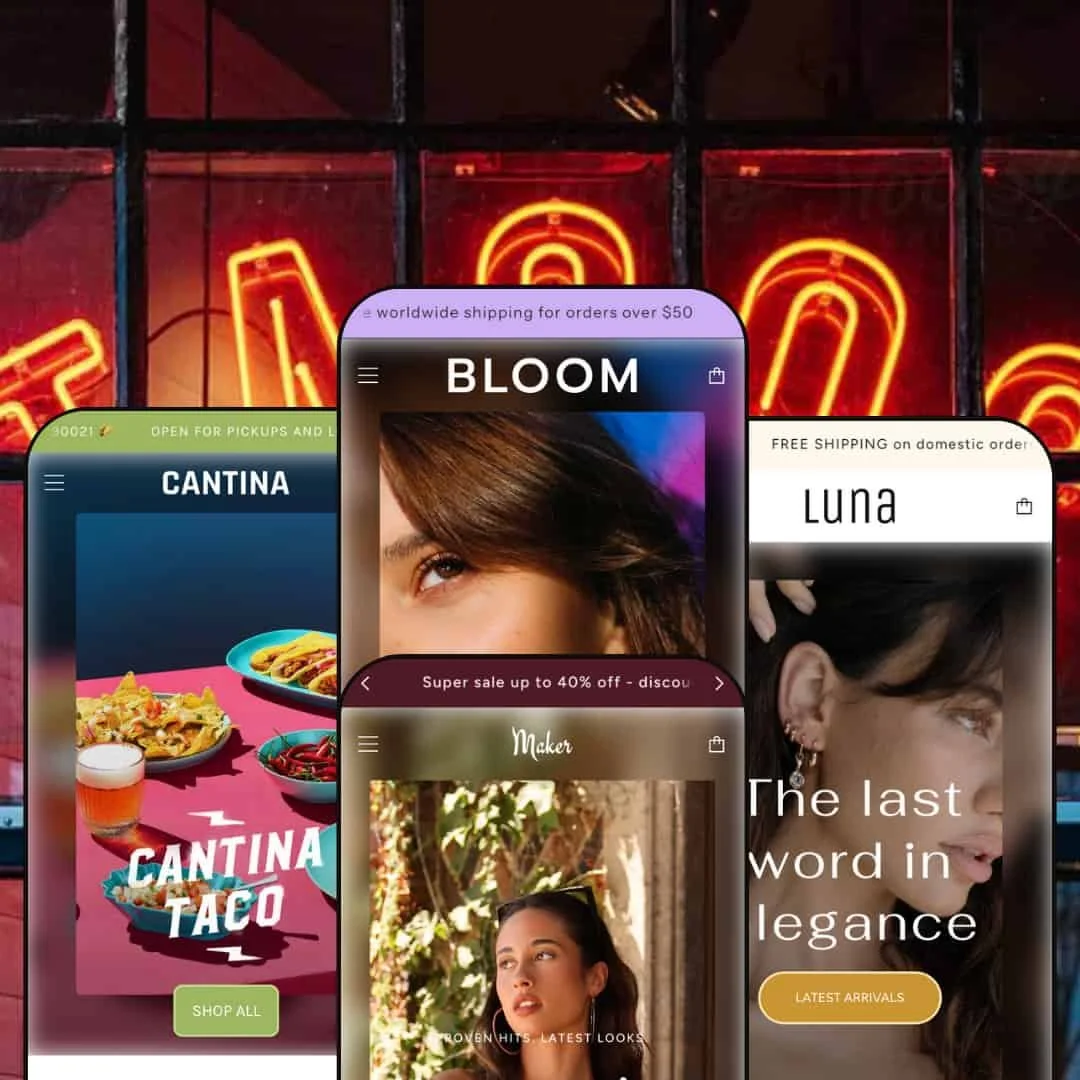
The Maker theme positions itself as a flexible Shopify template for brands that want to pair editorial storytelling with fast shopping. A rotating announcement bar, slide-out cart and predictive search appear across all presets, while each preset layers on distinct aesthetics aimed at very different audiences. First impressions are strong: large hero images draw the eye, multiple call-to-action buttons encourage exploration and the navigation stays clear thanks to simple typography and generous spacing. If you’re after a theme that lets you weave content and commerce together, Maker offers plenty to work with.
Pros.
〰️
Pros. 〰️
✚ Flexible presets, consistent core
Maker’s four presets deliver distinct visual moods while keeping the underlying shopping mechanics consistent. That lets teams explore very different aesthetics without relearning how the store behaves or compromising the purchase flow.
✚ Slide-out cart with progress feedback
The cart opens as a drawer and updates live, and progress messaging toward free shipping appears right where shoppers make decisions. That reduces friction on small adds and gives a gentle nudge to increase order value.
✚ Robust search overlay
A full-screen search surfaces suggestions instantly and offers a clean results path when shoppers want a deeper list. It supports quick wayfinding for returning customers and speeds up discovery for those who know what they want.
✚ Rich storytelling modules
Maker’s library supports editorial sections and shoppable storytelling, including lookbook-style moments, result-oriented visuals and benefit-driven highlights. The effect is a storefront that reads like a brand magazine while still converting.
✚ Cohesive content pages
Secondary pages—journal, about, values—inherit the same typographic system and spacing as the shop. That cohesion makes brand narratives feel intentional and avoids the “two sites stitched together” problem.
Cons.
〰️
Cons. 〰️
− Hover-reliant affordances on touch
Key affordances such as quick-add icons are tucked behind hover in grid views. On touch devices that behavior is easy to miss, which can add extra taps and slow down routine adds.
− Occasional tab/accordion hiccups
Collapsible content on product pages doesn’t always expand cleanly. When details or size notes stick closed, shoppers must retry or refresh, adding friction at a critical decision point.
− Overlays can interrupt the flow
Newsletter and promo overlays are tastefully styled but can reappear during navigation. Interruption at the wrong time—especially mid-browsing—breaks momentum.
− Asset-heavy sections can feel slow
Large, high-resolution imagery is core to Maker’s editorial look. On mid-range devices or slower connections, those assets can introduce minor scroll stutter and lengthen first impressions.
-
The default preset marries lifestyle photography with a straightforward shopping journey. It leans on big hero visuals so brand and catalog live side by side without visual clutter. Typography is simple and generous, which helps the imagery carry the narrative.
What works in this preset
A bold hero sets an immediate editorial tone, using large imagery and clear calls-to-action to funnel attention into featured collections. The pacing is measured and keeps shoppers browsing without losing the thread, which supports a relaxed, magazine-like rhythm through the page.
-
Bloom adopts a pastel palette and soft typography tailored to beauty and wellness. The page frames transformation and care, with aspirational photography upfront and gentle UI accents that keep the mood calm.
What works in this preset
The pastel color system and airy type choices create a polished, trustworthy feel out of the box. It signals “care” and “calm,” which aligns with skincare, cosmetics and wellness routines.
Storytelling emphasizes transformation and routine, so merchants can frame products as steps within a regimen rather than isolated SKUs. That structure encourages exploration across related items and supports bundle-friendly merchandising without feeling pushy.
Where it stumbles
Smaller or less photogenic products can feel lost amid full-bleed visuals. When a SKU doesn’t come with strong lifestyle imagery, the preset’s expansive layouts can make the item feel secondary rather than central.
-
Luna channels a boutique with muted tones and refined serif headings. It’s understated by design: products and lifestyle shots sit on quiet canvases so photography can do the heavy lifting.
What works in this preset
The neutral palette and classic typography read as premium, which flatters jewelry and elevated lifestyle goods. With fewer chromatic distractions, metal finishes, stones and textures surface clearly.
Editorial restraint is the point. Sections give images breathing room and avoid heavy graphic devices, so even modest art direction looks considered. This restraint also keeps the store from aging quickly as campaigns rotate.
-
Cantina is vibrant and food-forward. Bright colors, playful type and illustrated motifs bring hospitality energy to the storefront, while big circular imagery makes dishes instantly scannable.
What works in this preset
The visual language is appetizing and immediate. Color pops and cheerful iconography convey warmth and fun, which suits taco shops, cafés and food brands with personality.
A dedicated delivery or menu-style collection gives dishes marquee treatment. Large, round crop images make individual items recognizable at a glance, and the layout keeps weekly specials and staples in one lively frame.
Content pages embrace the same voice. Hours, address and contact details are presented in a friendly, branded way that feels like signage rather than admin, which helps hospitality operators keep everything on-brand.
Where it stumbles
Food items do not expose a one-tap add in grid view, so customers open each dish before adding it to the cart. That extra step slows bigger orders when customers want to stack multiple items rapidly.
Niche Suitability
Not Ideal For
-
Brands that sell on imagery and narrative—beauty, fashion, jewelry, hospitality—where editorial framing and shoppable storytelling pull the weight.
-
Merchants whose success hinges on dense, utilitarian product lists or highly technical comparison tables; the theme’s pacing favors mood over maximum information density.
-
Medium — You’ll get strong results with thoughtful sequencing and high-quality photography. Expect to spend time curating images and tuning section order to balance story and shop.
Final Recommendation
★ 7.4/10
Rating
-
Maker covers quick add/quick shop, predictive search and promotional tools like lookbooks and countdown timers. Minor quirks (collapsible tabs, hover reliance) prevent a perfect score.
8
-
Setup is straightforward, but arranging imagery-heavy sections and ensuring consistent hover behavior takes time.
7
-
The cart works well, but hover-tucked actions and large assets can add taps and slow interactions on some devices.
7
-
Heavy imagery and decorative flourishes can introduce slight lag on slower connections or mid-range hardware.
6
-
Multiple presets and a wide range of configurable sections provide ample room for brand expression without custom code.
9
FAQ
〰️
FAQ 〰️
-
👑 Yes. Bloom’s calm palette and results-forward staging give beauty merchants the right framing for routines and transformations.
-
📱The cart drawer behaves well on small screens. Hover-tucked quick-add means some users will tap into the product page before adding.
-
🎨 You can rearrange sections, upload your own images, adjust typography and select colors in the theme editor without touching code.
-
⚡ Navigation and the cart are quick thanks to AJAX loading, but large hero images and editorial sections can slow first impressions on weaker connections.
-
👕 Yes. Multi-variant items surface options before adding to cart; single-variant SKUs support faster adds.
-
🔎 There’s no dedicated SEO app, but clean markup and content-rich pages (blogs, about, alt text) provide a solid base, and you can integrate Shopify SEO apps.
-
💱 You can enable additional languages and currency handling via Shopify Markets, and surface selectors in the header as needed.
-
⚙️ Yes. Maker is built to work with common apps like reviews, loyalty and pop-ups, though heavy add-ons can affect performance.
-
🛒 Live demos for each preset are available so you can explore before purchasing. A standard Shopify theme trial applies when you install it.
This review is based on hands-on testing of the publicly available “Maker”, “Bloom”, “Luna” and “Cantina” presets of the Maker Shopify theme as of November 12 2025. Theme features, preset availability and performance may change with future updates from the developer.