
Marble positions itself as a lightweight, mobile-first design system for merchants who want mix-and-match section styling with a polished, editorial look. In testing, its most consistent strengths were a fast, variant-aware cart drawer, a responsive sticky add-to-cart bar on product pages, a clean search overlay, and a broad section library for storytelling, merchandising, and brand content.
Pros.
〰️
Pros. 〰️
✚ A flexible editorial section system
Marble supplies a deep bench of sections—lookbooks, sliders, countdowns, testimonials, FAQs, blogs—and they can be mixed freely to build campaign pages or long-form product stories without code. The storefront can skew magazine-like or commercial on demand, which is rare at this price point.
✚ Fast, variant-aware cart flow
Across presets, the slide-out cart captures selected variants cleanly, exposes quantity steppers and removal, and surfaces progress toward perks like free shipping. Shoppers remain in context; the drawer feels immediate rather than modal-heavy.
✚ Sticky purchase affordance on long PDPs
A responsive sticky add-to-cart bar follows the scroll on product pages, which preserves intent through education blocks and user-generated content. It removes the “where’s the button?” hunt and shortens decision friction on mobile.
✚ Predictive, full-bleed search overlay
Search opens as a modern overlay and returns products, suggestions, and content in one place. For larger catalogs, that unified entry point doubles as navigation and discovery, reducing dead-end queries.
✚ Solid support for product customization
Line-item properties and variant selections carry into the cart drawer as expected, which is essential for things like engraving or personalization. Buyers see what they configured; merchants avoid “what did I order?” anxiety.
Cons.
〰️
Cons. 〰️
− Performance overhead if you over-decorate
Lookbooks with hotspots, multiple sliders, countdowns, and high-resolution media can add up. On mid-range devices or slower networks that cost shows up first paint-wise; thoughtful pruning and compression are mandatory.
− Cart-drawer friction from terms acceptance
Requiring a T&C checkbox inside the drawer blocks checkout until ticked. If the control lacks contrast or context, it becomes an avoidable drop-off point; style it deliberately and position it near the primary action.
− Navigation and state quirks
Hamburger-heavy setups help calm the chrome but hide routes for desktop skimmers. We also saw occasional search/result oddities and state resets when moving between search and content. These are edge cases, yet they puncture flow when they happen.
-
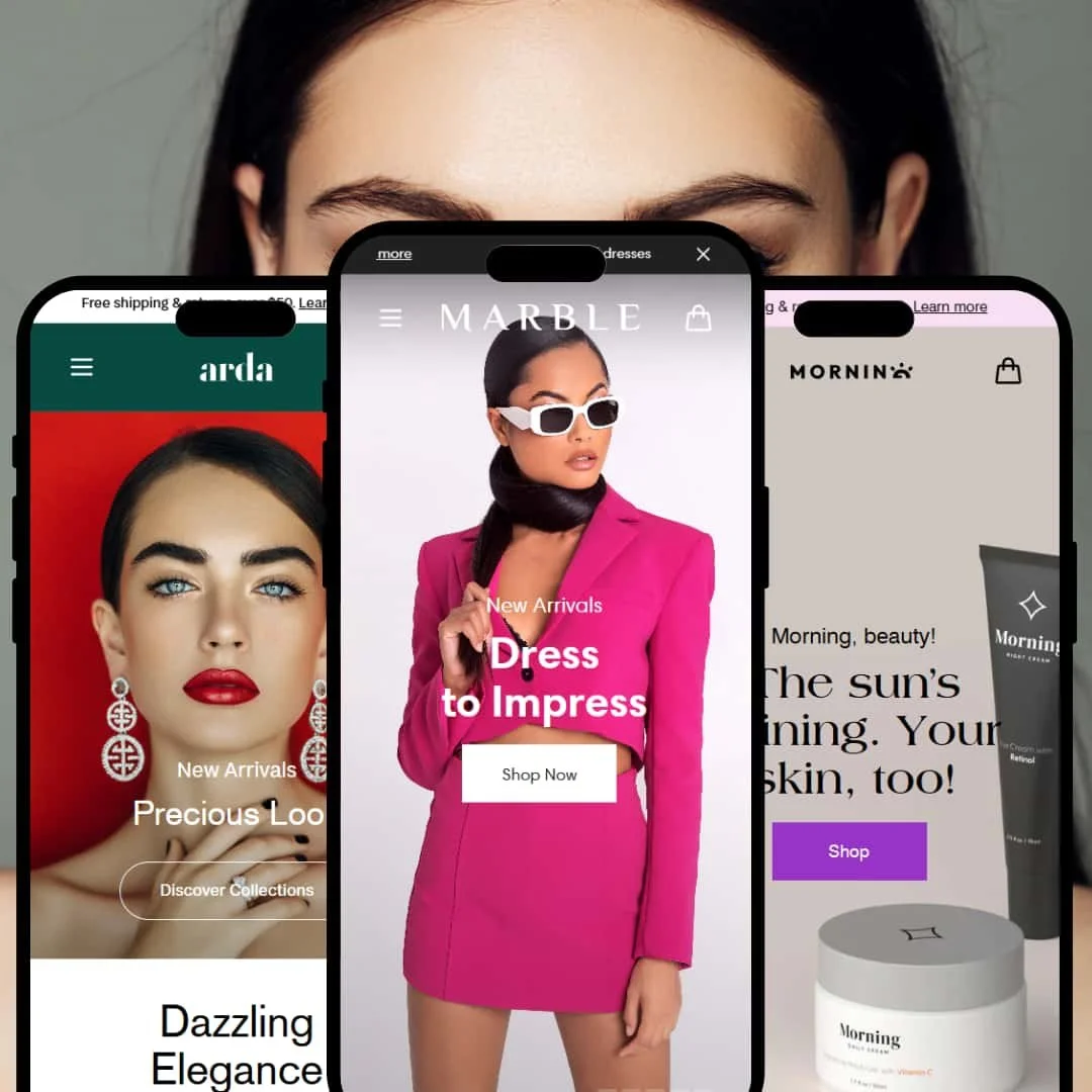
A fashion-forward default with an editorial rhythm: airy off-white backgrounds, muted pink accents, and big, image-led hero placements that favor lookbook-style storytelling. The vibe is modern retail magazine rather than bare-bones catalog.
What works in this preset
The palette leans soft and flattering, so photography takes center stage without feeling washed out. Typography tracks that same editorial intention; calls-to-action sit confidently on large imagery, which helps frame outfits and sets. The opening dual-hero layout creates a quick one-two showcase that feels curated rather than templated. Together, these choices make browsing feel like flipping through a styled lookbook instead of scanning product rows.
Section pacing encourages scanning. Large, cinematic visuals break up product clusters; smaller headline blocks act as visual rest stops. When used with restraint, the page keeps momentum while still letting shoppers pause on the images that matter. The net effect is a storefront that feels “edited,” not dumped from a feed.
The header remains present as you scroll, which suits image-heavy pages where orientation can slip. Paired with a clear cart icon and search entry point, it keeps buyers grounded and cuts back-tracking. This steady navigation frame is especially helpful on long homepages.
Where it stumbles
Marquee banners can turn gimmicky when stacked. If every fold pulses with motion or repetition, the message blurs; the design starts shouting where a whisper would sell better. Keep the marquee as an accent, not a metronome.
-
A luxe jewelry identity with a deep green canvas and elegant type that signals premium from the first scroll. It favors intimacy and deliberation over speed.
What works in this preset
The dark, saturated palette pulls metallic finishes and stone facets forward, making highlights pop and micro-textures read. Buttons and overlays harmonize with the brand tone rather than floating as generic UI; it feels like a boutique, not a framework.
Typography is jewelry-appropriate: refined sizing, generous spacing, and restrained caps help copy feel measured. It frames optional services and finishing details without crowding the image rail. The overall composition reads as curated rather than promotional. Space is a design element here; it grants pieces presence and makes comparison feel calm, not rushed.
-
A beauty/skincare take with pastel purples and pinks, full-screen heroes, and “treat yourself” copy. Navigation compresses into a hamburger to keep the chrome quiet.
What works in this preset
Color does the heavy lifting: the pastel range flatters skin tones and plays nicely with white containers and glass. It also keeps educational blocks approachable, which matters when you interleave benefits, ingredients, and usage tips. The overall tone stays gentle and inviting, so long reads feel less like instruction and more like guidance.
Cart and announcement elements inherit the palette, which keeps the brand mood intact during micro-interactions like adding to cart or meeting a free-shipping threshold. Nothing feels bolted on; the frame stays cohesive as shoppers move between content and commerce.
Where it stumbles
Newsletter pop-ups that trigger mid-read can interrupt product education; time them to post-scroll or exit so they don’t break the flow.
Niche Suitability
Not Ideal For
-
Merchants who trade in visual storytelling—fashion, beauty, jewelry, lifestyle—will get the most from Marble’s editorial sections, sticky purchase cues, and modern search. It rewards teams willing to curate images and sequence a page.
-
Single-product shops or operators chasing absolute minimalism and maximum speed may prefer a leaner theme that discourages decoration and prioritizes bare-bones grids.
-
Medium — You’ll configure many sections and images to keep pages cohesive and performant; the toolkit is generous, but curation and restraint are on you.
Final Recommendation
★ 8.4/10
Rating
-
Broad section library, mega-menu, sticky carts, modern search, and variant-aware cart flows cover most storefront needs; staging differences around quick-add prevent a perfect score.
9
-
Clear settings and drag-and-drop sections; you’ll still need to educate users on the chosen purchase path and keep content tidy.
8
-
Sticky purchase affordances and overlay search travel well to phones; carousels and long PDPs remain usable.
9
-
Optimizes well when disciplined; heavy media and stacked sections slow first impressions if left unchecked.
7
-
Mix-and-match sections and coherent theming enable bespoke storefronts without code while maintaining brand tone.
9
FAQ
〰️
FAQ 〰️
-
Yes. Presets can expose faster add flows or route to PDPs; pick the path that fits your catalog’s buying rhythm.
-
They did in testing: selected sizes/colors and custom text flowed into the drawer cleanly.
-
Yes, and it’s particularly helpful on long, education-heavy PDPs where the button would otherwise slip off-screen.
-
Search opens as an overlay with product and content suggestions, which doubles as discovery for bigger catalogs.
-
Yes. The section library covers hero, storytelling, social proof, and campaign modules you can sequence visually.
-
Avoid stacking high-weight sections and uncompressed media; test on mid-range phones before publishing.
-
If you require a terms checkbox in the drawer, style and place it clearly or you’ll block checkout unnecessarily.
-
Hamburger-heavy headers look clean but can hide routes; expose top paths on desktop if your catalog is broad.
-
You can preview the presets and test them in a development store; the demos referenced here reflect the version as of September 2025.
This review is based on hands‑on testing of the publicly available “Main,” “Arda” and “Utro” preset demos of the Marble Shopify theme as of 19 September 2025. Theme features, preset availability and performance can change with subsequent updates from the theme developer.