
The Masonry theme is a premium Shopify theme that blends editorial storytelling with solid e‑commerce tools. It leans on a fixed side navigation and bold imagery to funnel visitors toward products and content, keeping key sections visible while shoppers scroll. Quick‑view modals let people explore variants and pricing without leaving the product grid, and the search experience surfaces product suggestions as you type. Story pages and blogs create space for brand narrative, while home pages greet first‑time visitors with striking heroes, clear typography and call‑to‑action buttons that encourage exploration.
Pros.
〰️
Pros. 〰️
✚ Flexible presets, consistent core
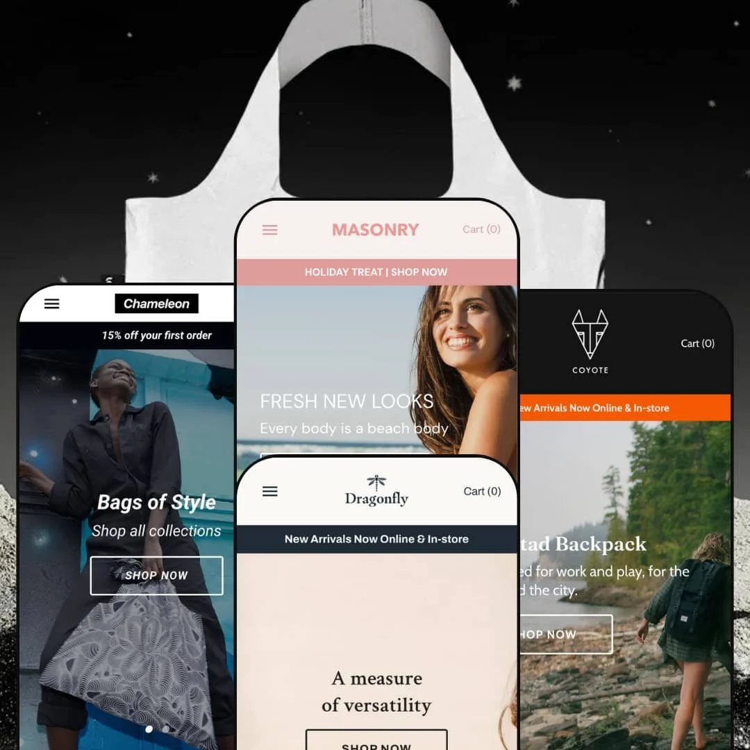
Across Default, Dragonfly, Chameleon and Coyote, Masonry offers flexible aesthetics while keeping the core shopping experience steady. Each preset targets a different visual niche – from spa‑like swimwear to kidswear to outdoor gear – but they all share the same underlying product grids, quick‑view flows and cart structures. That consistency makes it easier for merchants to switch looks without relearning how the theme behaves.
✚ Quick‑view modals that carry real weight
Mansonry’s quick‑view implementation goes beyond a simple thumbnail pop‑up. From the grid, shoppers can open a modal that shows product images, colour and size swatches, pricing and quantity controls, along with Add to Cart and Shop Pay options. After adding an item, a link to the cart appears so people can review their selection when they are ready. This keeps buyers in the browsing context while still letting them commit to a product in just a few clicks.
✚ Search and discovery that keep shoppers moving
In presets that use a full‑screen overlay, the search icon opens a panel with live suggestions for products and categories as you type. Other presets route search through a full results view that still provides on‑page controls and clear empty‑state messaging. Across both styles, search results pages show helpful “no results” messages and recommended items, which nudges visitors toward alternatives rather than ending their session with a dead end.
✚ Fixed side navigation and clear content structure
A fixed vertical side navigation anchors the experience across the theme’s demos. It keeps access to key collections, journal content and story pages visible while visitors scroll through products or editorial sections. This structure benefits larger catalogues in particular, since shoppers rarely feel “lost” inside deep pages – there are always obvious routes back to high‑level categories and brand content.
✚ Story pages, blogs and friendly empty states
Masonry treats narrative content as a first‑class citizen. Brand‑story pages mix heroes, imagery, copy and, in some cases, video to tell the brand’s story without resorting to custom development. Blog and news pages list articles with dates, titles and excerpts, and home pages can surface snippets of that content. When visitors hit a 404 or empty cart, the theme shows clear messages and suggested products, turning potential dead ends into chances to re‑engage.
✚ Checkout‑adjacent touches that reduce friction
From quick‑view modals through to the full cart page, Masonry exposes express checkout options such as Shop Pay and Google Pay where they are available. Line items show variant details and quantities, and actions like removing items or changing counts are straightforward. These small, consistent interface choices make it easier for shoppers to move from browsing to paying without confusion.
Cons.
〰️
Cons. 〰️
🚫 Dependence on quick‑view for adding items
Across the demos, product cards consistently open quick‑view modals rather than offering a direct “Add to cart” button on the card itself. While that keeps the grid visually clean and ensures variant selection happens in a controlled space, it also means there is always a modal step between browsing and adding. Stores that rely on rapid, basket‑building behaviour may find this slows down power users who already know what they want.
🚫 Search behaviour varies by preset
Masonry’s search experience shifts between presets: some use a dramatic full‑screen overlay, others rely on a full results page. This flexibility can be powerful, but it also means the out‑of‑the‑box demos feel slightly inconsistent. Merchants need to decide which approach best matches their customers’ habits, and stores with tiny catalogues may find the overlay pattern feels heavier than necessary.
🚫 Utility pages do not always match the main polish
While error and empty states are functional and generally friendly, some presets show these pages with less visual personality than the primary layouts. The 404 in Dragonfly, for instance, feels plainer than its warm, playful main pages. It is a small point, but for brands that care about every touchpoint, extra design work on those screens may be necessary.
-
The Default preset balances editorial storytelling with a spa‑inspired product catalogue. Bold hero banners and lifestyle photography steer attention toward collections such as swimwear and lingerie, giving the storefront a calm, boutique feel. The overall impression is that of a relaxed, image‑led layout that still keeps products within easy reach.
What works in this preset
Default leans hard into aspirational imagery. The opening hero spans the page, pairing soft tones with copy that feels more like a magazine headline than a product label. Beneath it, large category tiles for swimwear and lingerie extend that spa‑like atmosphere, using photography rather than heavy interface chrome to guide visitors toward key collections. For fashion and swim brands that already have strong creative assets, this structure gives those visuals room to breathe.
The home page continues that calm feel as shoppers move down the page. Category images with overlay text lead into a product grid, so visitors shift naturally from the opening hero into browsing real items. The lifestyle photography used for these tiles mirrors the imagery in the main banner, which helps the whole page feel cohesive rather than like a collage of unrelated blocks. It feels like a small editorial site and a storefront sharing the same space.
Default’s dedicated story page doubles down on this narrative approach. A large hero image introduces the brand and leads into sections that mix full‑width images with copy in the same calm, spa‑inspired style as the home page. The page ends on a clear call‑to‑action so the story flows naturally into the rest of the shop.
-
Dragonfly leans toward children’s apparel and family‑focused lifestyle products. Warm pastels, playful photography and gentle typography choices give it a friendly tone that feels at home with kids’ clothing, toys or giftable accessories. The layout is still commerce‑forward but framed by optimistic imagery and messaging.
What works in this preset
On the home page, Dragonfly’s mosaic call‑outs are its defining flourish. Split‑image banners promote store pickup, new drops and other key offers, stitching together photography and short lines of copy. Each tile links directly into a promotion or collection, so shoppers see something charming and immediately actionable. For brands that rely on click‑and‑collect or frequent drops, these mosaics are an effective stage for those messages.
Dragonfly’s overall composition keeps that playful energy running through the page. Hero banners highlight children’s collections, then hand off to a product grid that supports quick browsing. Copy and imagery are arranged so that the home page reads like an ongoing story about the brand’s world rather than a simple list of items. Parents landing here get both a sense of lifestyle and a clear path into categories.
The dedicated story page pushes into values‑led storytelling. Sections labelled around “New collection” and “Our ethical approach” foreground how products are made and what they stand for. Imagery, copy and calls‑to‑action combine so that ethics are presented as part of the shopping journey rather than an afterthought. Brands with a strong sustainability or fair‑production message can surface that narrative without building custom layouts from scratch.
Where it stumbles
In Dragonfly, the 404 page gets the job done but feels noticeably plainer than the rest of the experience. While the main pages are warm and expressive, the error state steps back into a more generic presentation. For merchants who care deeply about every touchpoint carrying the brand voice, that contrast may stand out.
-
Chameleon adopts a clean, minimalist aesthetic with muted colours and lots of white space. The layout emphasises product photography and modern typography, lending itself to boutiques and accessories where individual items need to stand out. It feels contemporary without tipping into stark or clinical.
What works in this preset
The home page in Chameleon opens with a focused hero and a prominent “New arrivals” section. Instead of an overload of banners, it quickly pivots from a short tagline into a grid of fresh products, making it easy for returning customers to see what has changed. This rhythm suits brands that update collections regularly but want to keep the front page simple.
When shoppers move into search in Chameleon, they land on a results view with a clear bar at the top and controls above the grid, so they can refine what they are seeing in context. The layout feels close to a classic catalogue page and can be comfortable for people who like to scan and adjust results in one place.
Its About page continues the minimalist storytelling. Large imagery is paired with carefully set copy blocks that tell the brand story in a straightforward, design‑driven way. The page feels like a lookbook and an “About us” section combined, which can work well for smaller labels that want to show personality without building complex landing pages.
Where it stumbles
The side navigation in Chameleon can feel dense when many collections and pages are listed. Because the overall design is so minimal, a long vertical list of links stands out strongly, so merchants with very broad catalogues will need to be intentional about grouping and pruning links.
-
Coyote is geared toward outdoor and adventure brands. Earthy hues, rugged photography and bold headlines convey a sense of exploration, while gear‑themed call‑outs focus attention on camping and hiking essentials. Overall it feels more trail‑head than showroom, which is exactly what many gear retailers want.
What works in this preset
Coyote opens with a bold hero that sets the tone immediately. The headline (“Small steps to big adventures”) and supporting imagery plant visitors firmly in an outdoor context. Prominent category tiles for men’s and women’s gear sit nearby, turning that initial inspiration into clear paths toward relevant products.
Further down the page, Coyote leans into campaign‑style storytelling. Banners such as “Socktober” and “Gear Patrol” highlight seasonal pushes and curated gear sets. Clicking through takes shoppers into collections that feel like editorial features, which can be effective for brands that organise their catalogue around trips, seasons or themes. It is a good match for retailers who build narratives around complete kits rather than isolated products.
Where it stumbles
During testing, using the search icon in Coyote sometimes led to results that redirected in ways that felt unexpected. For shoppers who rely on search as their primary way of finding products, that lack of predictability can be confusing and warrants close testing before launch.
Niche Suitability
Not Ideal For
-
Atlantic is best suited to fashion, swimwear, kidswear and lifestyle brands that value strong visuals and storytelling alongside straightforward commerce. If your store can supply good photography and you want to mix journal‑style content with shoppable grids, the theme’s presets give you several aesthetic directions without sacrificing day‑to‑day usability.
-
Merchants who prioritise ultra‑fast, one‑click adds from product cards or want a single, highly standardised search pattern across every page may find Atlantic less aligned with their preferences. If your buyers treat the catalogue like a checklist and expect the fastest possible path to cart, themes with inline add‑to‑cart buttons and a more uniform search model might be a better match.
-
Medium — the theme ships with many built‑in sections and narrative templates, but real impact depends on the quality of a merchant’s imagery and copy. Store owners will also need to configure navigation carefully, choose their preferred search style and invest time in story pages and campaigns so the design does not feel like an empty shell.
Final Recommendation
★ 8.2/10
Rating
-
Medium — the theme ships with many built‑in sections and narrative templates, but real impact depends on the quality of a merchant’s imagery and copy. Store owners will also need to configure navigation carefully, choose their preferred search style and invest time in story pages and campaigns so the design does not feel like an empty shell.
8
-
Fixed side navigation and clear calls‑to‑action make browsing intuitive, though search accessibility and behaviour vary between presets.
8
-
Quick‑view panels remain usable on small screens, and shoppers still transition into a full cart page to complete checkout.
8
-
Pages load smoothly and modals open quickly in testing; long‑term performance will depend on image optimisation and installed apps.
8
-
Multiple presets, narrative sections and configurable content blocks offer room to tailor the storefront to different fashion and lifestyle niches.
9
FAQ
〰️
FAQ 〰️
-
👑 Yes. The Default preset’s image‑rich heroes and quick‑view modals make it particularly well suited to swimwear and boutique apparel, where photography and variant selection are both important.
-
📱Yes. The side navigation collapses on smaller screens, and quick‑view modals are sized and spaced for touch input, though shoppers still move into a cart page to complete their purchase.
-
🎨 Atlantic is highly configurable for branding. Colour schemes, typography and content sections can all be adjusted in the theme editor, and the dedicated story pages give merchants space to develop their own narrative voice.
-
⚡ In testing, pages and quick‑view modals loaded promptly and interactions felt smooth. As with any Shopify theme, overall speed will depend on image optimisation, third‑party apps and the size of the catalogue.
-
👕 Yes. Variant swatches and size selectors are available both in quick‑view modals and on product pages, and the modal updates pricing and availability as shoppers choose different options.
-
🔎 You manage SEO for Atlantic through the standard Shopify settings for titles, meta descriptions and content fields, using blog posts, collection descriptions and meta fields where needed. The theme does not add a separate SEO layer on top of that.
-
💱 Yes. In the demos, there is a header selector for currencies, and languages are handled through Shopify’s translation and localisation tools; Atlantic follows Shopify’s standard setup here.
-
⚙️ Yes. Atlantic follows Shopify’s theme standards, so merchants can install most apps from the Shopify App Store; features like slideshows, reviews and promotions were tested without conflicts.
-
🛒 Yes. Atlantic offers live demos for each preset and can be trialled inside a Shopify store before purchase, so merchants can test it with their own products and content.
This review is based on hands‑on testing of the publicly available “Default”, “Dragonfly”, ‘‘Chameleon’’ and ‘‘Coyote’’ preset demos of the Masonry Shopify theme as of 22 November 2025. Theme features, preset availability and performance can change with subsequent updates from the theme developer.