
Master is a fashion-first Shopify theme that leans heavily on large editorial imagery and clean spacing to keep the store feeling premium instead of cluttered. In the Default demo, the very first screen is a split hero that instantly funnels you into either the women’s or men’s side of the catalog, which makes the “where do I start?” question easy. Typography is bold and simple, and the calls-to-action are high contrast, so it doesn’t take long to find a path forward. Overall, the demo is staged like a magazine storefront: big visuals, minimal noise, and lots of room for product photography to do the convincing.
Pros.
〰️
Pros. 〰️
✚ Editorial homepage layouts that guide first clicks
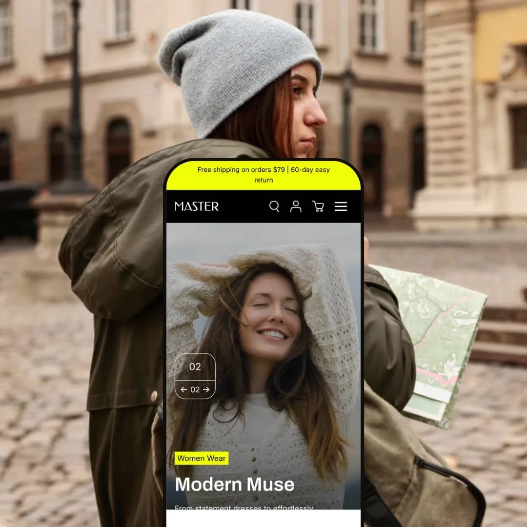
The demo uses a split hero that presents two parallel entry points (women’s and men’s) with direct “Shop now” calls-to-action, so shoppers can choose a lane immediately instead of hunting for direction. The numbered pagination makes the hero feel curated, more like an issue-based lookbook than a generic banner. Elsewhere, the demo’s lifestyle-heavy sections create natural pauses between shopping moments, which breaks browsing into “chapters” rather than one continuous grid. The practical impact is a storefront that encourages exploration while still keeping the path to product discovery obvious.
✚ Quick-view shopping that keeps momentum
The theme’s product quick view opens a modal that’s capable of handling real buying steps, including variant selection and quantity changes. In practice, that means a shopper can confirm options and add to cart without constantly bouncing between grid and product page. When it’s used well, it encourages fast “add and continue browsing” behavior. That’s especially valuable for apparel catalogs where customers want to compare several items quickly.
✚ Cart drawer that’s meant to drive a bigger basket
The slide-out cart is more than a simple item list: it includes a free-shipping progress indicator, quantity controls, an order note area, and product recommendations. That combination makes the cart feel like an active part of the shopping experience rather than a dead-end. For shoppers, it reduces friction because updates and next steps are available immediately. For merchants, it creates natural upsell moments without forcing an extra app into the flow.
✚ Search that behaves like a shopping shortcut
Search opens as a full-screen overlay and is staged to push discovery rather than just returning a blank results page. The demo experience includes suggestions and lets shoppers switch between different result types (products versus content). That matters for stores that publish blog content or FAQs and want discovery to feel intentional instead of buried. The end result is a search flow that feels like navigation, not a last resort.
✚ Product pages built around media first, details second
On product pages, the media experience leads: a multi-image layout and a full-screen viewer make it easy to inspect visuals before committing. Product information and FAQ-style content are organized into collapsible sections so the page doesn’t become a wall of text. This arrangement works well for apparel because shoppers often want to check imagery and key details quickly, then dig deeper only if needed. It’s a clean structure that supports both “fast glance” and “careful read” buyers.
✚ Built-in merchandising widgets that reduce app dependence
The demo showcases several marketing-oriented modules, including urgency-style elements (like countdowns and stock counters), promo banners, testimonials, and recommendation carousels. Instead of feeling like random add-ons, these appear as first-class theme sections that can be placed where they support the story of the page. For merchants, that can reduce the need for extra plugins just to get basic promotional mechanics. For shoppers, the experience stays visually consistent because the widgets match the theme’s design language.
Cons.
〰️
Cons. 〰️
🚫 Some fast-purchase staging can skip option confirmation
In the home-page list-style product rows shown in this demo, the “Add to Cart” action adds a variant directly rather than pausing for selection. That’s great for speed when the default option is acceptable, but it can also create “wrong size/color” moments if a shopper assumes they’ll be prompted. If you plan to rely on this style of list-row merchandising, it’s worth thinking carefully about where it belongs in the journey. Used in the wrong context, it trades clarity for velocity.
🚫 Heavy visual builds can strain weaker setups
A big part of Master’s appeal is its high-impact imagery and multiple interactive sections, but that also means the pages can become heavyweight quickly. In this demo, fast scrolling deep into the home page intermittently triggered a browser “Aw, Snap!” error, which is a red flag for resource-constrained devices. Even when the page didn’t crash, the overall structure suggests that overloading the homepage could create avoidable sluggishness. The safest path is to be selective with how many high-impact modules you stack on one page.
🚫 Expect meaningful setup time to get the best result
This theme is clearly built to be configured: there are many sections and promotional modules that can be arranged to match a brand’s story. The trade-off is that it’s not a “publish it in an hour” experience if you want the demo-level polish. You’ll likely spend time dialing in imagery, section order, and which merchandising widgets to actually keep. The payoff is flexibility, but you earn it through setup work.
-
The Default preset is staged for contemporary fashion boutiques that want an editorial feel, but with a calm, minimal tone rather than constant promotional noise. The overall presentation leans on subdued styling and generous breathing room, so the visuals do most of the selling.
What works in this preset
The color direction in this demo stays refined and monochrome-leaning, which gives the storefront a “quiet” premium vibe. That restraint keeps product and lifestyle photography from competing with loud UI accents. It also means the occasional promo callout can pop without needing to shout. If your brand identity is minimalist, this staging is an easy match.
The page spacing and visual hierarchy support a slower, more considered browsing style. Instead of pushing you into wall-to-wall grids, the layout leaves room for section breaks so the site feels composed rather than crammed. That can be a real advantage for fashion stores because it encourages scrolling without making the page feel like an endless catalog dump. It’s the kind of pacing that fits shoppers who browse for inspiration before they commit.
The typography choices in the demo are assertive but uncomplicated, with big headlines and straightforward supporting text. That keeps the editorial mood intact while still making the next action obvious. Calls-to-action are clear enough that the visual storytelling doesn’t become a navigation puzzle. The net effect is a storefront that looks styled, but still behaves like a store.
Where it stumbles
In this demo, every product I interacted with included color and size options, so single-variant (or truly simple) product behavior couldn’t be verified from the preset as presented. That doesn’t mean the theme can’t handle simple catalogs, but it does mean the demo isn’t a clean stand-in for a one‑SKU merchandising model. If you sell mostly single‑variant products, you’d want to validate how your preferred quick‑purchase flow behaves once you load your own inventory. Consider that a limitation of the demo staging rather than a definitive theme weakness.
Niche Suitability
-
Fashion and lifestyle stores that want a restrained, editorial presentation where photography carries the storefront. If your brand benefits from a minimal palette and lots of whitespace, the Default staging aligns well with that look.
Not Ideal For
-
Merchants who need a demo that mirrors a simple one‑variant catalog right out of the box. Since this preset’s demo inventory skews toward multi‑option products, you’ll need to confirm the exact purchase flow you want using your own product setup.
-
Master is best suited to fashion boutiques and lifestyle brands that want an editorial storefront and plan to use visuals, promotions, and recommendations as part of the shopping journey. If your catalog browsing strategy depends on quick comparison and frequent “add and keep moving” behavior, the theme’s shopping flow supports that well.
-
If your store is built around very simple, single-variant products and you want the demo to mirror that experience directly, you may find the Default staging less representative. Merchants who prefer extremely lightweight pages and minimal sections everywhere may also want a simpler theme approach.
-
Medium — The theme offers many configurable sections and merchandising modules, and getting the best outcome depends on careful selection and staging. With strong imagery and intentional section choices, it can look excellent, but it’s not a one-click setup.
Final Recommendation
★ 7.4/10
Rating
-
The theme supports fast shopping via quick view, a slide-out cart, and a structured product page with media and collapsible details. Merchandising modules like promo banners, urgency widgets, and recommendations are integrated into the theme experience.
8
-
There are many sections and blocks available, which is helpful, but it also means you’ll spend time choosing what to keep and how to stage it. The end result can be very polished, but it rewards patience.
7
-
Core shopping actions (navigation, cart access, and product interaction) remained straightforward during testing, and the design did not feel cramped. The overall layout style is visual-first, so image choices and section density will matter even more on smaller screens.
8
-
Most interactions felt reasonably smooth, but the demo’s heavy imagery and multiple sliders can weigh down the experience. Rapid deep scrolling on the homepage occasionally triggered a browser crash, which is worth taking seriously.
6
-
The range of sections shown in the demo (testimonials, blog blocks, promo modules, lookbook-style layouts, and collection displays) supports a wide variety of page compositions without custom code.
8
FAQ
〰️
FAQ 〰️
-
👑 Yes, the Default demo is staged specifically like a fashion storefront, with editorial-style imagery and a layout that pushes photography to the front. The quick shop flow also suits browsing-heavy apparel catalogs where customers compare multiple items quickly.
-
📱In my testing, the key shopping tasks stayed usable, and the overall layout scaled down without feeling chaotic. Because the theme relies on large visuals, keeping pages focused (instead of stacking too many big sections) will help maintain clarity in smaller viewports.
-
🎨 The draft setup reflects a strong ability to adjust brand presentation, including typography choices and palette direction. The larger win here is that many sections can be rearranged or toggled, so stores can change the “storytelling mix” without editing code.
-
⚡ Transitions generally felt smooth, but the demo also shows how easy it is to build a heavyweight page. If you use lots of high-resolution imagery and multiple sliders on the homepage, you may see slowdowns on weaker devices.
-
👕 For multi-option products, the experience is strong: the demo shows color swatches and size selection on product and quick-view flows, and variant choice affects what’s added to cart. One caution from the demo staging is that some fast-add areas prioritize speed and may add a default variant without prompting.
-
🔎 The theme relies on Shopify’s standard SEO setup (editable titles/meta and a clean page structure). There’s no dedicated “SEO app” layer shown inside the theme, so your results will come down to content quality, structure, and performance discipline.
-
💱 Yes. If you configure languages and currencies through Shopify (Markets and language settings), the theme can present locale switching and serve the appropriate storefront version for shoppers.
-
⚙️ In general, yes: apps that use Shopify’s standard theme integrations and app blocks should fit like they do in most themes. In this demo, accelerated checkout buttons (like Shop Pay and Google Pay) appeared in the buying flow, and recommendation-style sections aligned with Shopify’s typical merchandising pattern.
-
🛒 Yes, you can use the public demo to explore the storefront experience, then test the theme inside Shopify before publishing. That makes it possible to validate your own product setup and page structure before committing to a live launch.
This review is based on hands‑on testing of the publicly available “Default” preset demo of the Master Shopify theme as of 03 December 2025. Theme features, preset availability, and performance can change with subsequent updates from the theme developer.