
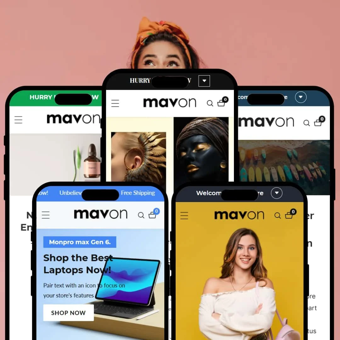
Mavon presents a versatile storefront with a premium finish and plenty of built-in merchandising blocks. Across presets, shoppers move from large, confident heroes into product discovery quickly, with consistent access to quick-shop and a responsive cart drawer. A full-screen search, polished product cards and thoughtful page transitions keep the experience cohesive. First-time visitors are steered toward clear CTAs, while strong typography and considered spacing prevent clutter.
Pros.
〰️
Pros. 〰️
✚ Fast cart flow that stays on the page
Across presets, product cards open a quick-shop panel and the cart slides out from the side. Shoppers can pick variants, tweak quantities and check totals without a full reload. Keeping the flow inline reduces friction and makes “just one more” add feel effortless.
✚ Interactive merchandising you’ll actually use
Mavon’s library goes beyond static banners: you get comparison areas, launch timelines, embedded video blocks and styled lookbooks. Each module is presented as a native section, so stories feel part of the page rather than bolted on. The result is richer product education with less template work.
✚ Navigation that scales with your catalog
Between multi-column menus, icon rows and clear sticky headers, large catalogs remain scannable. It’s easy to surface deep categories without sacrificing clarity. Merchants can dial complexity up or down by choosing simpler drop-downs or full mega menus.
✚ Distinct presets that map to real brand styles
Rather than shipping five near-clones, Mavon’s presets read differently—classic fashion, soft wellness, tech, luxury and sport. Starting closer to your brand’s visual language cuts down on early redesign and lets you focus on content and merchandising.
Cons.
〰️
Cons. 〰️
− Where the theme gets in its own way
Search uses a full-screen overlay but doesn’t show predictive suggestions; forcing a submit slows discovery for quick-typing shoppers. Email pop-ups trigger eagerly, and on some presets, interactive controls (like compact timeline buttons) feel small on mobile. In high-energy presets, stacking many animated or promotional blocks can make mid-page dense; a lighter arrangement will preserve focus.
-
What works in this preset
The hero is deliberately oversized and pairs a dark header treatment with dual CTAs; this staging creates a decisive first click and sets a confident, editorial tone. Immediately below, benefit icons and tidy collection staging reinforce trust while keeping the path to products short. Throughout the page, the contrasty black-on-white palette helps buttons stand out, so promotional tiles feel actionable rather than decorative.
Where it stumbles
On select products, the stock/progress bar sits close to adjacent text on small screens; when this happens, the overlay can reduce legibility and distract from the primary action. The home hero’s bold weight does the heavy lifting, yet if the surrounding tiles are similarly strong, the page can feel visually top-heavy and demand extra scroll to re-establish rhythm.
-
What works in this preset
A calm, natural palette frames a soft hero and keeps copy friendly to read; the tone cues self-care and trust. Mid-page, the layout foregrounds a comparison area and gently animated product sliders, which adds proof and motion without shouting. Testimonials and newsletter capture are styled to feel like part of the story rather than ad units, so they don’t derail the scroll.
Where it stumbles
The mid-page image with circular “hotspots” looks interactive, yet tapping doesn’t reveal details in the demo; the result is a moment of confusion before shoppers continue. Email capture appears early in the session; if the modal fires after just a short scroll, it can interrupt browsing for first-timers.
-
What works in this preset
The mosaic hero splits attention across three promotions at once, so a broad electronics catalog gets immediate coverage of key categories. Category icon rows and bold banners keep momentum through the fold, helping shoppers jump quickly to the sub-ranges they care about. A mid-page video panel adds pace and gives launch moments room to breathe.
Where it stumbles
Because the hero divides focus, some visitors will pause to decide which CTA to try first—great for breadth, less ideal for a single push. In dense sections with several promotional tiles back-to-back, the layout can momentarily feel busy and benefit from a spacer or quieter block.
-
What works in this preset
Diagonal section separators and a cream-gold palette create a quiet sense of luxury; the page feels editorial without losing shopability. A product spotlight section with generous imagery and delicate labels gives a hero piece the space it deserves, making price and options feel deliberate rather than crowded. The lookbook area reads like a magazine spread, encouraging browsing for style inspiration.
Where it stumbles
Dark blocks paired with fine white type can slip below ideal contrast, especially on small screens, which reduces instant readability. Large, atmospheric images look beautiful but lengthen the scroll; on mobile, the effect can feel slow if every section asks for full-bleed attention.
-
What works in this preset
A bold, kinetic hero sets an energetic mood right away, and circular category imagery keeps the sport theme playful. Mid-page, lifestyle imagery arranged like a lookbook invites exploration; it’s an easy way to “shop the scene” while staying in a visual story. Sale staging with a live timer adds urgency at the right moment in the scroll.
Where it stumbles
The circular category row uses imagery without persistent labels; unless the hover/tap state is obvious, some shoppers will hesitate. Stacking video tiles, urgency blocks and lookbook imagery back-to-back creates excitement, but it can feel crowded without a breathing spacer.
Niche Suitability
Not Ideal For
-
Brands with rich imagery and multi-category catalogs that want native storytelling modules—fashion, beauty, tech, jewellery and sport will all find a strong starting point.
-
Single-product or ultra-minimal stores, or teams seeking predictive search out of the box, may prefer a lighter theme with fewer moving parts.
-
Medium — You’ll get farther, faster with good photography and a clear plan for pop-up timing and menu structure.
Final Recommendation
★ 7.6/10
Rating
-
Quick-shop, slide-out cart, video, comparison and lookbook modules cover most modern storefront needs without apps.
8
-
Sections are straightforward, but depth means more decisions; careful curation avoids visual overload.
7
-
Layouts adapt cleanly and gestures feel natural; a few small controls would benefit from larger tap targets.
8
-
Smooth interactions overall; heavy imagery and multiple sliders can slow first paint if not optimised.
7
-
Five distinct presets plus granular styling controls offer broad room to move without code.
8
FAQ
〰️
FAQ 〰️
-
👑 Yes—each preset aligns with a different niche, and the section library supports both editorial and product-first storytelling.
-
📱Yes. Pages adapt well and interactions are smooth; a few small controls on certain modules could be larger on phones.
-
🎨 Colours, typography and sections are all adjustable in the editor; you can also upload custom fonts to match brand guidelines.
-
⚡ Interactions are responsive, though multiple videos and sliders demand compressed assets to keep pages snappy on slower connections.
-
👕 Yes. Variant pickers and swatches are available in quick-shop and on product pages, with quantity steppers and clear CTAs.
-
🔎 You’ll use Shopify’s standard SEO fields; Mavon’s job is to present content cleanly so titles, meta and media shine.
-
💱 Yes. Switchers are available and integrate with Shopify Markets for configuration.
-
⚙️ Most section- or block-based apps slot in cleanly thanks to the theme’s standard section architecture.
-
🛒 You can preview all presets and trial the theme in your own store before purchase via the Shopify Theme Store.
This review is based on hands-on testing of the publicly available “Main”, “Dewy”, “Nimble”, “Brilliant” and “Buoyant” preset demos of the Mavon Shopify theme as of 13 September 2025. Theme features, preset availability and performance can change with subsequent updates from the theme developer.